Save
Originally published by Diana Wolosin on Indeed Design.
My introduction to design systems was like getting sucked into a black hole.
It happened when I was working as a product designer at a trucking software company. We were growing exponentially, so our UI library needed critical enhancements to keep up with the business needs. As I ran an audit to determine what to optimize, I learned Figma had released the auto layout feature. I applied that new functionality to our library, but the task became more complex. I didn’t stop at the audit; I ended up creating a whole design system. During that project, I wore multiple hats: building the components, doing research, creating documentation, and training my design peers on how to consume and contribute to our new design system.
The first design system I created was born out of necessity to solve the lack of consistency between design and development. After this intense immersion into the design systems world, as well as experiences at other companies, I learned quite a few things I wish someone had told me at the beginning.
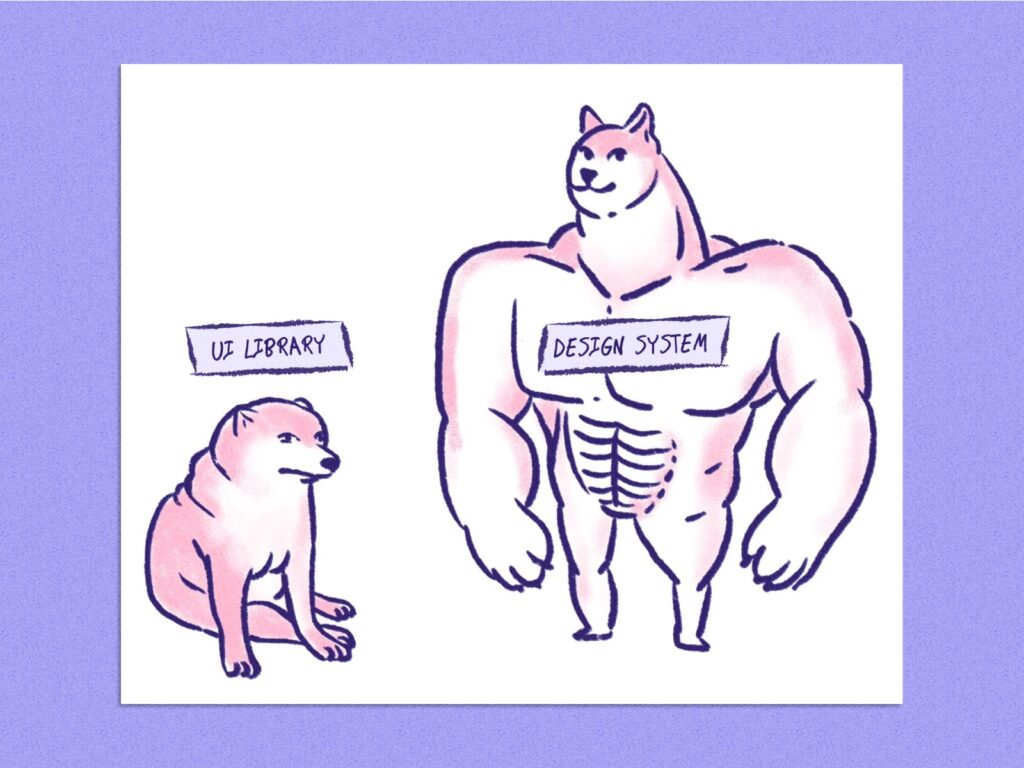
1. A design system is not the same as a UI library
When Figma released its auto layout, it changed the way that designers built components. I performed an audit to determine what elements could be rebuilt with this new feature. I found a large number of component discrepancies between the designs and the in-production product. The developers and product designers had access to all the components, but they didn’t have any guidelines on when or how to use them. I wasn’t expecting the original task of updating some components to turn into a big project, but it did. Not only did I apply the auto layout to some components, but I also had to create documentation to add consistency to our product. The UI library became a design system. Through this, I learned that a UI library is a collection of components and styles, while a design system is a set of guidelines to manage a collection of components and styles.

2. Productize your design system and your users will thank you!
A software product solves users’ problems and addresses specific business needs. One of the first steps to building an effective product is identifying the users, their workflows, and their pain points. The same is true for your design system.
You’re designing for two sets of users when you build a design system. First, you’re building for the end users who will be the customers of your company’s final product. But you’re also designing for the product designers who build those services and rely on the design system to create effective products. When you treat your design system as a product, the product designers who adopt it can focus on how to create a smooth UX navigation for the end user instead of spending time choosing things like the most suitable color for a button. The devs can then easily grab a ready-made component and assemble it. The main goal of a design system is to optimize the users’ workflow and save time. Design systems are simply a product for building products.
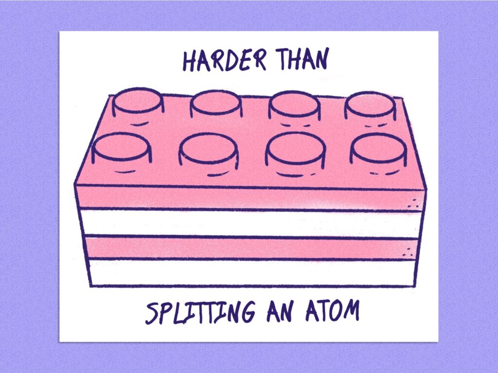
3. Designers and developers should be like an atom: inseparable
Similar to designers, developers can speed up their workflows when building products with ready-made components from design systems. The real challenge is maintaining consistency between these two crews.
The end users don’t interact with the design tool (like Figma, Zeplin, Invision, or Sketch), but they do interact with the in-production product. They can tell when there’s a disconnect behind the scenes, especially if it originates from the design system. Functionality consistency is also relevant. The end users want to predict how the components will behave. If components don’t behave as expected, the users can feel frustrated and we may lose their trust. Developers and designers have to work together at all stages of a design system to maintain consistency. I learned that collaboration is the one and only secret to a successful design system.

4. Fancy naming conventions aren’t always practical
When I first created a design system, I was very proud of my outstanding color palette scale. I developed the coolest color style names; Denim, Chambray, Malachite, and Cinnabar. I thought it was going to be flexible enough, but then our fleet management product needed a dark mode. The first issue we faced was the lack of standardization regarding the use of each color across all the components. The designers and devs didn’t know when to use which color. Some borders were gray and some were blue. Assigning an equal color pair on the dark theme was not helpful.
We solved the issue by naming the color tokens based on context-agnostic usage, which simplified introducing theming to the design system. There are multiple ways to tokenize color values. Each company uses its own structure. Asana uses [sentiment-sage-prominence-interaction]; Material Design suggests [design-system-type-purpose]. My recommendation is to research and apply the most suitable semantic or global naming that can scale with your current and future design system’s needs.
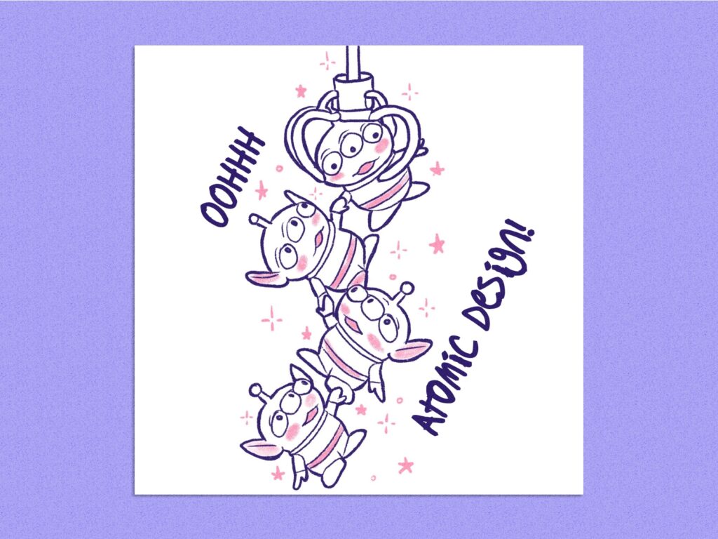
5. Atomic design helps you remember the magic of basics
Before starting the first version of our design system, I researched best practices to build the foundation. I found an exceptional method to create modular systems called Atomic Design, created by Brad Frost. It highlights how components can be broken into independent smaller components to be replaced, modified, or exchanged with other smaller parts, without breaking the component structure. Following this method allows us to assemble designs faster and update components across multiple designs automatically. This was a game-changer! I recommend applying this to any design system.
6. Collaboration promotes refinement, which supports business goals
A design system team shouldn’t be isolated from their primary users. The interaction between the design system and the product teams that use it is not one-way. Design systems mature as the products evolve. However, the reports and requests from multiple teams can get overwhelming if the company grows exponentially.
Opening a design system to cross-functional contributors and empowering them to service their own requests is the best strategy for keeping up with business needs. One of the major concerns could be breaking changes. Set a contribution process to ensure consistency. Provide guidelines and materials for the contributors so they feel comfortable and confident with the process. Cross-functional collaboration provides new perspectives that prompt design system growth and drive business goals.

7. A lasting design system needs collaboration beyond product and development
Tying up to the last point, big companies treat their design systems as the core of their brand and product vision. The guidelines don’t exclusively impact software products but also establish a holistic brand experience. A design system team should respond to continuous feedback from the stakeholders and primary users. The collaboration across product teams, marketing, branding, customer experience, managers, and the design system team drives the evolution of our design system. Additionally, it’s easier to adopt something when you’re part of it and more familiar with it. Listing stakeholders and identifying how the design system would optimize their workflows is the best strategy for a consistent experience for the customers.

8. Adoption is the most challenging part
There are multiple considerations during the adoption phase. To find solid footing, creating training material for the involved teams is a great strategy. Those can be in the form of videos, playgrounds, workshops, courses, or any other channel that you can think of. The distribution process depends on your company and its capabilities. The ultimate goal is to create awareness of the advantages of adopting the design system. If your stakeholders don’t understand how to introduce the design system into their workflows, they won’t use it, which could break a consistent experience for the end users. If your stakeholders introduce the design system but don’t understand how to continuously apply its updates, they’ll find a way to make it work for them—even if that means detaching components or working without the design system guidelines.
9. Accessibility is a must
Access to communications technology and equal opportunities are human rights, and accessibility is an inclusive practice every team should apply from the foundation of any design system. This adds more steps to the process but enhances the business value of the product and meets the needs of more customers. Companies that include Web Content Accessibility in their guidelines improve the accessibility for all users, increase consistency, and optimize the user experience. I learned that you don’t need to be an expert in this field, but being cognizant of inclusion will make you a more ethical professional and a more empathetic individual.

10. A Design system is endless
Just like any product, a design system goes through an intense recursive process after its initial launch. The product designers will report bugs and new requests and need constant support from the design system team. As the company evolves, the product team’s priorities will too, so they’ll lean on the design system to attend to new requests in a timely fashion. Along with creating training materials, keep track of work and improvements so you can trace who did what and when. To avoid the risk of regression, I recommend updating bug requests and adding new features by using individual releases so you can restore the library if needed. And don’t forget that empowering your collaborators with knowledge is key to lasting improvements.
During my experience with design systems, I’ve had to rework and deprecate multiple tasks. To avoid wasting time, think ahead about how to create modular, scalable, and flexible solutions to facilitate future enhancements. Design systems might sound like a set of steps in a linear process that you follow, but in reality, it’s a cyclical process that includes endless releases, periodic maintenance, and cross-functional contribution.
Diana Wolosin
A Design Systems enthusiast, originally from Colombia, now thriving in California's innovation hub. Seven years of experience in product design and design systems. Currently at Indeed.com, dedicated to optimizing and sustaining the design system that consistently serves Email, Branding, and Product teams.
- The article explores essential insights into design systems, uncovering often-overlooked aspects and lessons from the experience as a UX designer.


