Years ago, my mother got a nasty case of food poisoning from an order of chicken tikka at a restaurant. For years after that, if I’d sneak up behind her and say, “Chicken tikka!” she’d crumple into a bout of dry heaves.
Translating that into biz-speak, any brand affinity she had for chicken tikka was obliterated by a critical failure event in the meal’s service delivery. Her reaction to the two words “chicken tikka” altered radically from, “Delicious in my mouth!” to, well… something opposite.
That incident has been on my mind a lot ever since I purchased a Vizio television. One of the strange signs of the times is that televisions, being increasingly computerized with apps and image correction features, occasionally crash and have to reboot. This might be evidence that we’re reaching the limits of the convergence trend and need to go back to letting televisions just be televisions, but for now it’s something consumers just have to accept.
Whenever my TV crashes and reboots (which is frequently), the Vizio logo flashes orange and white:
The decision to use the logo as an error indicator probably made sense on some engineering level. But from a brand and user experience perspective, making the company’s logo the most salient visual aspect of a critical failure event can’t have been a wise choice. While my TV silently but brightly proclaims, “VIZIO! VIZIO! VIZIO! VIZIO!” I’m mumbling curse words and heading to the kitchen for a few minutes to make a drink to occupy myself for the duration of the boot cycle.
I don’t remember what associations I might have had with Vizio as a brand before I bought this thing, and I’m not sure what Vizio’s marketers want me to think. Probably it’s something like, “Low cost, great features,” or some tagline like, “Taking entertainment freedom by storm!” Certainly they don’t want me thinking, “G*ddamned f@%#ing piece of s%#&.”
And yet, every time, “VIZIO! VIZIO! VIZIO! VIZIO!”
So now the word “Vizio” is my “chicken tikka.”
Avoiding Brand Contamination
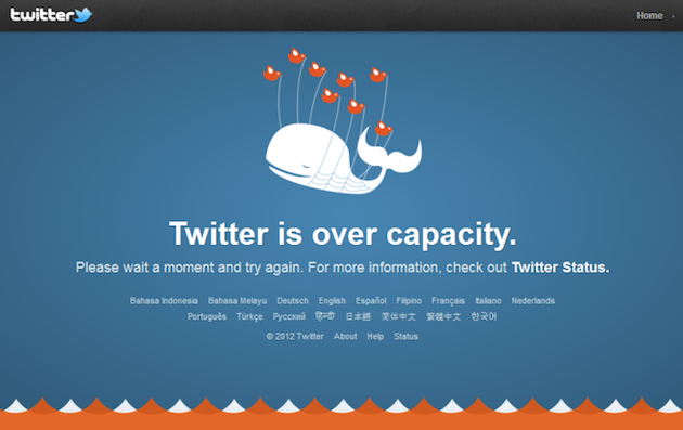
This clearly suggests that negative experiences and error indicators probably shouldn’t be branded. This argues in favor of using fail pets like Twitter’s Fail Whale:
The page is still branded, but the most salient visual element is a charming, non-brand illustration that can bring a small amount of pleasure to an otherwise irritating experience.
No article about UX and branding can be complete without some mention of Apple, but in this case—gasp!—their example shouldn’t be slavishly copied. Behold, the Grey Screen of Death:
In fairness, this screen isn’t a result of a failure (that would be the Spinning Beach Ball of Death), it’s what you see while a Mac is installing updates. But unlike Windows users, Mac users aren’t accustomed to always having to wait for their computers to grind through long reboot cycles, so the experience still tastes like burning. Why does the Apple logo need to be the most salient visual on this screen?
Somewhere along the spectrum between “VIZIO!” and a fail pet is the Xbox Red Ring of Death that indicates a hardware failure:
Although the ring of lights is the signature characteristic of the Xbox’s physical appearance, at least it’s not a logo screaming “MICROSOFT!” And it has an ominous, HAL-9000-esque look of a machine saying, “Doom, doom, doom…” which kind of makes sense in the context of console gaming.
In Conclusion
Every product will at some point encounter a critical error and/or force the user to wait. Don’t let those moments become synonymous with your brand.
UX designers should:
- proactively identify potential error conditions and failure use cases.
- collaborate with their engineering colleagues to ensure they’re on the lookout, too.
- design the UI elements of an error condition or failure to, at the very least, distance it from the brand, if not to also lessen the pain it causes.
- ensure their chicken dinners have been fully cooked.


