Great things are done by a series of small things brought together.
– Vincent Van Gogh
Helping people find meaning in large, complex datasets is becoming an increasingly important consideration in UX design. While the need may be clear, the steps of transforming unprocessed data into effective visualizations are not always so apparent. Data are of various distinctive types, and different data types lend themselves more naturally to certain kinds of visual representation than to others. In addition, some visualization designs are more effective than others in summarizing and highlighting various characteristics of data. How do you assess and assemble all of the disparate elements in the most informative way? At least for me, the more familiar I become with different data types and their related depictions, the more confident I feel in applying and exploring visualization design ideas.
Basic Ingredients: Types of Data
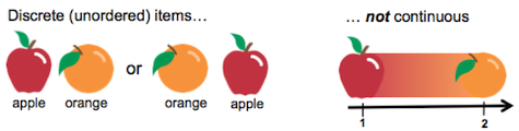
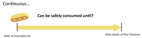
I’ve seen several variations, not to mention a few philosophical discussions, on how to break out and describe data types, and it can sometimes get confusing, but here’s a basic way to look at it. At a broad level, data can be broken into two major classes: discrete and continuous. Discrete data specify distinct, separate items that fall into qualitative categories. An apple or an orange, for example, are discrete or nominal items that have no intrinsic order in relation to each other. Conversely, continuous data are things that are in a particular ordered way—e.g., days of the week, temperature, the shelf life of a snack cake.
Along with discrete and continuous data, other kinds of broad classifications are also used, but we’ll keep focused on a few.
Measuring the Ingredients
Different types of data are associated with various kinds of measurements whose characteristics define what kinds of information the data convey. That, in turn, guides choices about the specific forms of representation.
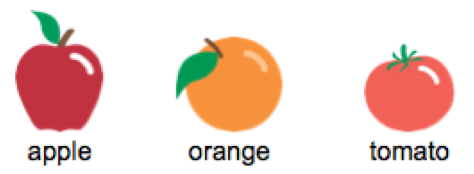
- Nominal Scale: This is simply putting items together without ordering or ranking them (e.g., an apple, an orange, and a tomato). These items can be arranged in various ways that all still convey the same basic information.
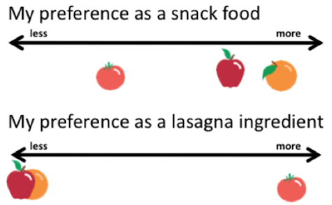
- Ordinal Scale: Elements of the data describe properties of objects or events that are ordered by some characteristic (e.g., how would you rank oranges as a snack food compared to tomatoes?) The order of the objects does not, however, provide any information about the distance along the continuum between any two adjacent items.
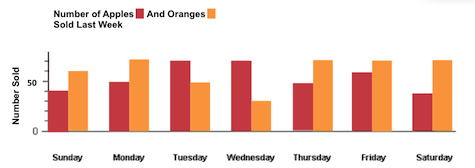
- Interval Scale: These are data that are measured on some kind of scale, often temporal (e.g., the days of the week, hours of the day) where the differences between adjacent scale numbers are equal. A degree of temperature is the same size in the 95-100 degree Celsius range as it is in the 0-10 degree range. Another example: how many apples and oranges were sold each day last week?
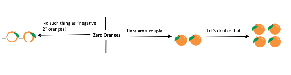
- Ratio Scale: An ordered series of numbers assigned to items (objects, events, etc.) that allow for estimating and comparing different measures in terms of multiples, such as “half as many” or “four times as heavy.” What makes this scale possible? Zero. That is, it has to start with a value of zero (as in, the current orange inventory = 0) and things can scale up from there.
Setting the Table: Data Types and Representative Forms
Question: What’s wrong with this chart displaying data about the number of these items sold last August?
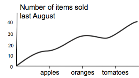
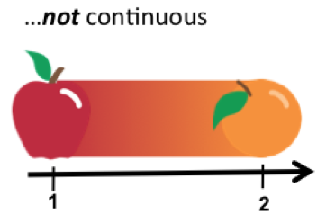
Answer: Among other things, the line is, in this context, not an appropriate visual representation of this kind of discrete, categorical data because a line represents a continuum with no delineation of the discrete items of fruit.
Finding the right fit between data and visualizations can get more complex and subtle. As a consumer of infographics and other visual representations, it can be well worth asking if the image does justice to the meaning. For designers, it is important to consider how the visual may be clarifying or confusing the point. This process is called “visually encoding” the data. Here are two generalizations from information visualization researcher and author of Visual Thinking for Design, Colin Ware, about relating different kinds of data type displays:
- Using graphic size (as in a bar chart) to display category information is likely to be misleading because we tend to interpret size as representing quantity.
- If we map measurements to color, we can perceive nominal or, at best, ordinal values, with a few discrete steps. Perceiving metric intervals using color is not very effective. Many visualization techniques are capable of conveying only nominal or ordinal qualities.
These kinds of considerations are only just scratching the surface of chart selection. That said, I find it can be good to keep in mind broader themes of chart usage for myself and also for anticipating potential usability issues for the people who will be using the charts.
Here are some common examples of basic charts that work well with discrete data:
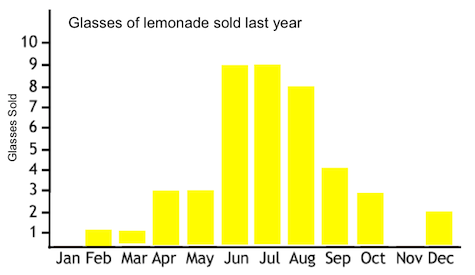
The histogram is an example of a chart of continuous data. the X-axis has the intervals of months which, unlike oranges and pears, have a particular order:
Bringing Out the “Flavors” in the Data with Visuals
In cooking, a few basic ingredients such as sugar, salt, and pepper can be added to a wide variety of foods, but depending on the dish, the inclusion of those spices can either enhance or detract from the flavor and digestibility of the meal. The key is considering every ingredient in relation to the whole preparation. The same basic idea is true of visualizing data. Every kind of chart, graph, or other visual form has its own unique set of strengths, weaknesses, and limitations in displaying and bringing out important features in the data. Although a few different displays may be appropriate for a given type of data set, one visualization many be particularly suited and preferable to the other options.
There are also many different questions and aspects of data to summarize, showcase, or explore with visual representation: Are there any notable patterns or “shapes” of the data? Where is the “center” of the data and what are the extremes? What are the potential connections and relationships in the data? Are any meaningful patterns and trends suggested by the numbers?
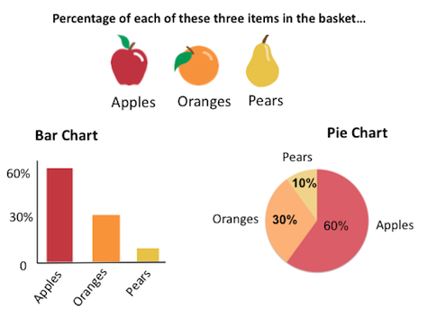
As a simple example, let’s say we only want a succinct, precise summarization of the Q3 sales of apples, oranges, and tomatoes. A bar chart makes it easy to do just that kind of evaluation. In this example, the bar chart would depict absolute numbers. However, if we wanted to get a sense of the respective sales percentages of these three items in Q3, then a pie chart could be a better fit. For some people, the form of the (often maligned) pie chart can provide an immediate and accessible general sense of the sum and the parts more than the separated rectangles of a bar chart.
Playing Well Together: Data, Visualizations, and People
It is as deadly for a mind to have a system as to have none. Therefore it will have to decide to combine both.
– Karl Wilhelm Friedrich Schlegel
The big opportunities for problem solving and gleaning insights from large, complex, and diverse datasets require that people with very different skills and mindsets all share in the sandbox. When Raffael Marty started looking into computer security and visualization, he found that “the visualization people don’t know about security concepts and security people didn’t know about visualization.” Many of the different groups that need to collaborate on visualization efforts come from very different backgrounds and have very different ways of thinking about, representing, and communicating related ideas.
The essential skill of effectively combining visual principles and theory to make meaningful representations of the data requires an element of creativity. “In the end, I think visualization is not a hard science but an art,” Marty says. For example, he says, “if you had a simple bar chart to convey information, and added a little color to it in an interesting way, it might make it more decipherable, understandable. How do you show the most information with the least amount of complexity?”
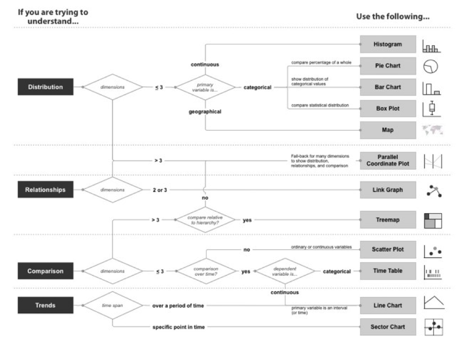
Marty created a diagram (below) for his book Applied Security Visualization to help users decide how they might take certain forms of data and present them in the most effective way. He says he has felt the pain himself of wrestling with how to represent the data that he needs to communicate. “I’ve had frustration that comes out of my own challenges about not being able to visualize data the way I want it.” As a result, Marty has been inspired to start his own company, PixlCloud, to work on these issues.
Note: in this article I have only looked at single variable (univariate) data as a starting point. However, paired (bivariate) and multiple (multivariate) data play a role in many visualizations. That is a topic for another time. The diagram below includes charts that can display more than one-dimensional data.
Conclusion
Just as kitchen implements can help you make a great meal, they can’t do it on their own. The same idea applies to preparing data visualizations. In many ways, the human mind is the essential ingredient. But with this power of decision-making also comes the responsibility for those choices and some basic grounding in fundamentals. UX designers can play a key role in helping users grapple with large amounts of complex data and the considerations of how to combine and present different elements. Sometimes this process can be as easy as pie and other times not, but the final results should always be satisfying.
Illustrations by Hunter Whitney and Allison Bruce