Most websites are designed with the intent, or the assumption, that people who visit those sites will do something, that they will take some sort of action. Indeed, website goals are rarely achieved unless users of the site do take action. Nonprofit organizations, for example, often depend on website visitors taking the action of donating.
But what is it that influences or determines whether people will take action? To answer this question, let’s compare two websites to see how they approach the challenge of getting people to donate, and whether one approach seems better than the other, and why.
|
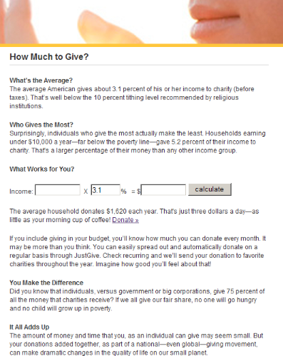
Example 1: www.justgive.org |
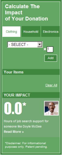
Example 2: www.goodwill.org |
 |
 |
Which of these two examples makes you feel more inclined to engage with the content? If you’re like me, the second example feels much more compelling.
Motivating People to Donate
The first example tries to persuade users through the use of words. But will users actually read all that text? Probably not. Density of text usually acts as a barrier to user engagement. Reading, after all, is work, and humans are remarkably averse to the effort it requires.
In contrast, the second example contains almost no words. It invites interaction by providing a means to answering a question on most potential donators’ minds: How will my donation be used? Or what is the impact of my donation?
For each category, users can select the type of item they wish to donate. For example, if I click on the “Electronics” category, I get a list of items included in that category. And as I add items from that list, they are displayed in the “Your Items” section:
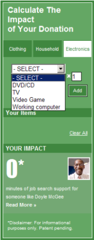
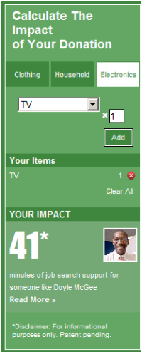
I can see from the “Your Impact” section that the donation of a TV results in 41 minutes of job search support for someone like Doyle McGee. This information is critical because it creates meaning. It answers the question: How is my donation of a TV actually used? Or how will my donation actually help someone else? I also get a picture of Doyle, and I can read his story by clicking the “Read More” link, which takes me to a page where I can post a comment. On Doyle’s page there were already 17 comments posted, indicating that this approach has been effective in engaging users.
The designers of this widget did several things that are key to increasing users’ willingness to donate. First, the widget immediately invites interaction. Users can explore the options available in the drop-down while getting immediate information about what impact each donation can make. The opportunity to peruse the options within each category may also suggest to users items they could donate that otherwise may not be top of mind.
Second, the widget makes the donation personal by supplying the name, picture, and story (written in the first person) of Doyle McGee. Doyle is a real person who we can personally relate to on an emotional level. Research shows that stories are extremely influential, as they are the means by which people communicate and relate to one another.
In short, the widget is successful because it makes donating salient. Users can readily determine what they can donate, who it will help and, specifically, how it will help. This is the type of information that helps users glean meaning. It may also motivate them to donate more.
Designing for Salience
From a design perspective, salience is important because it drives what users pay attention to. In turn, what users pay attention to drives their decisions, and their decisions drive their actions. This is important because ultimately user actions drive the bottom line.
We affect user actions, then, by designing for decision-making. A key aspect of designing for decision-making is to use salience to influence what users pay attention to. When considering the effectiveness of a web page, it’s useful to ask two questions:
- What is most salient on the page? What stands out and commands attention?
- What should be salient on the page?
Websites are typically used as tools to get users to do something. Getting people to donate to a worthy cause is challenging, as are many other initiatives, such as getting people to save for retirement.
Motivating people to save for retirement
Getting people to save for retirement is a tough nut to crack, and the problem has been approached from a few different angles, some of them more effective than others. A traditional approach has been to simply show people the numbers:
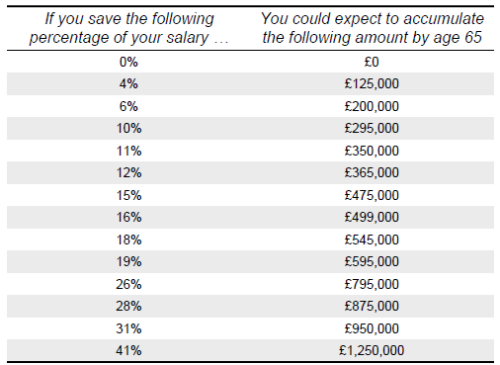
This approach assumes that numbers like these are meaningful to people, but are they really? Are people able to somehow determine what the right number is? Research shows that people are largely unable to meaningfully understand large numbers like these. People have no innate feeling for the difference, for example, between 350,000 and 365,000. Numbers like these become meaningful only when people can equate them to actual quality of life in retirement.
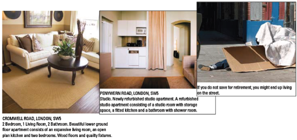
To that end, another approach has been to show people what kind of home they will be living in based on the amount of savings they are expected to have at retirement age. Studies have shown that this approach is much more effective than merely showing people the numbers. This is because the images provide a means of translating the numbers into something concrete that reflects quality of life in retirement:
A similar approach is to encourage people to envision the type of retirement they want. The goal is to direct people’s imagination to future uses for money, thereby enticing them to reduce spending so they will save more:

These approaches have been more successful than simply showing people lists of numbers. A more recent approach, however, works by using a somewhat different approach. Instead of asking people to envision their future retirement, they are asked to empathize with their future selves.
Researchers have experimented with enabling people to interact with age-progressed images of themselves as they make decisions about how much to allocate for retirement savings. Findings from this research show that ordinarily, people are not able to realistically identify with the person they will become decades into the future. Indeed, for most people, thinking about their future selves is like thinking about future generations; they know there will be future generations and that what they do now will impact them positively or negatively, but they are not “me.”
Brain scans show that when people think about their future selves, the brain region that becomes active is the same as when they think about strangers! This disconnect between the present and future self correlates with their reluctance to save for retirement. For those who can’t identify with their future selves, saving is like a choice between spending money today or giving it to a stranger many years from now.
Because of the myriad things that could happen in life, it is difficult for people to imagine themselves decades into the future. At best, the image invoked in people’s minds is uncertain and vague. But in research studies, when people were shown age-progressed images of themselves, they were better able to identify with their future selves because it was definite and specific. The future self, then, became salient, which in turn motivated them to allocate more savings for retirement.
Lessons for Design
Through the examples in this article, we’ve seen how salience affects what people pay attention to, as well as their ability to glean meaning from information. On a website, what people give their attention to drives their decisions, their decisions drive their actions, and their actions drive the bottom line. If we want to affect user actions, we need to design for the decision-making that precedes those actions.
Designing for effective decision-making requires that you first clearly identify what you want users to do. Knowing what you want them to do frames the next step: determining what you need them to focus on (or not focus on) so they are able to derive meaning from the information you’re providing.
People can’t make effective decisions unless they are able to meaningfully understand their options. This is why it’s essential to design for meaning. From the examples above, we’ve seen that it’s difficult for people to derive meaning from numbers alone. People need to be able to translate those numbers into something that concretely represents the value of those numbers. The designer’s job is to help people see the meaning of the data—to make it visually and/or emotionally tangible.
Also, because people are largely averse to the effort of work, they typically take the path of least resistance, focusing their attention on whatever is most salient in the design even if it’s not necessarily the thing they should be focusing on. It’s important to understand that users generally consume the design (or information) exactly as it is presented to them.
This is both a blessing and a curse. The good news is that the design itself has considerable power to influence user perception, decision outcomes, and user actions. The challenge, however, is to ensure that the design creates a path of least resistance that leads users to the right decision outcomes.
This is why it’s so important for designers to thoughtfully and proactively think about what users should focus on, and then on how to make that most salient in the design. The designer’s job is to create the path of least resistance that enables people to extract the right meaning so they can make effective decisions that lead to appropriate actions on the site.
Decision Architecture
Historically, the UX design toolbox has not included a focus on the importance of designing for decision-making. This needs to change. User decision-making plays a critical role in the achievement of website objectives.
It’s important to understand that there is no such thing as a neutral design. Every design has an effect on user decision-making, regardless of whether designers have proactively designed for effective decision-making. It’s no different from designing for usability. Every website is more or less usable, regardless of whether it was designed for good usability.
Architecting for decision-making results in a win/win/win outcome for designers, for businesses, and for users. This is why decision architecture—architecting for an optimal user decision-making experience—deserves a prominent place in the UX toolkit.