Save
The history of the visual design of user interfaces can be described as a gradual change towards more realism. As computers have become faster, designers have added increasingly realistic details such as color, 3D effects, shadows, translucency, and even simple physics. Some of these changes have helped usability. Shadows behind windows help us see which window is active. The physicality of the iPhone’s user interface makes the device more natural to use.
In other areas, the improvements are questionable at best. Graphical user interfaces are typically full of symbols. Most graphical elements you see on your screen are meant to stand for ideas or concepts. The little house on your desktop isn’t a little house, it’s “home.” The eye isn’t an actual eye, it means “look at the selected element.” The cog isn’t a cog, it means “click me to see available commands.”
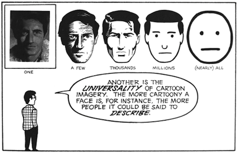
Details and realism can distract from these concepts. To explain this, I’ll take a page from Scott McCloud’s Understanding Comics, a book which should be required reading for all designers.
The image on the left is a face of a specific person. The image on the right is the concept “face;” it could be any person. When designing user interfaces, we rarely ever want to show a specific entity; typically, we want to convey an idea or a concept. Details can easily distract from that idea or concept.
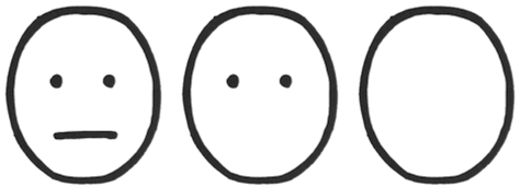
At the same time, it’s obvious that some details are required. Too few details, and the user won’t recognize the idea at all.
The circle on the left clearly shows a face. The circle on the right isn’t recognizable as a face anymore.
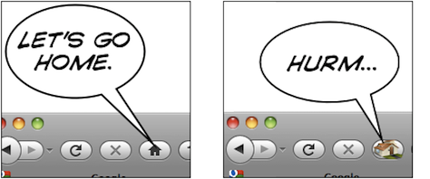
Let’s look at a symbol we actually see in user interfaces, the home button. Typically, this button uses a little house as its symbol.
The thing on the left is a house. The thing on the right means “home.” Somewhere between the two, the meaning switches from “a specific house” to “home as a concept.” The more realistic something is, the harder it is to figure out the meaning. Again, if the image is simplified too much, it’s not clearly and immediately recognizable anymore.
The thing on the left is a home button. The thing on the right might as well be an arrow pointing up; or perhaps it’s the ⇧ key.
Let me explain this concept using an entirely unscientific graph:
People are confused by symbols if they have too many or too few details. They will recognize UI elements which are somewhere in the middle.
The trick is to figure out which details help users identify the UI element, and which details distract from its intended meaning. Some details help users figure out what they’re looking at and how they can interact with it; other details distract from the idea you’re trying to convey. They turn your interface element from a concept into a specific thing. Thus, if an interface element is too distinct from its real-life counterpart, it becomes too hard to recognize. On the other hand, if it is too realistic, people are unable to figure out that you’re trying to communicate an idea, and what idea that might be.
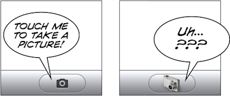
The button on the left is too realistic. The button on the right does not have enough details to be immediately recognizable as a button.
The same applies to these toggles. Shadows and gradients help the user figure out what he’s looking at and how to interact with it. Adding too many details, however, ends up being confusing. The toggle switch is no longer just a toggle switch that is part of a user interface, it is clearly recognizable as a photograph of a specific toggle switch; it loses its meaning. It’s no longer a symbol, it has become a specific thing.
An Exception
There is at least one specific area where more details are good: application icons. You want your icon to depict one specific idea: your application.
Coda’s leaf isn’t a representation of the idea of a leaf; it’s a very specific leaf, the Coda leaf. Acorn’s acorn isn’t just any acorn, it’s the Acorn. Adding details moves these images from a generic concept towards a specific entity, and in the case of an application icon, this is exactly what you want.
Conclusion
Graphical user interfaces are full of symbols. Symbols need to be reduced to their essence. This helps avoid cluttering the user interface with meaningless distractions, and makes it easier for people to “read” the symbol and figure out the meaning of an interface element. Realistic details can get in the way of what you’re trying to communicate to your users.
The goal is not to make your user interface as realistic as possible. The goal is to add those details which help users identify what an element is, and how to interact with it, and to add no more than those details. UI elements are abstractions which convey concepts and ideas; they should retain only those details that are relevant to their purpose. UI elements are almost never representations of real things. Adding too much realism can cause confusion.
Thanks to Max Steenbergen and Cameron Kenley Hunt for helping me form a coherent opinion on this topic. The second house icon is from Dellustrations’s icon set “Dellipack”.
This article was original posted on Lukas’ blog, Ignore the Code.
Lukas Mathis
Lukas Mathis works as a software engineer and user interface designer for a Swiss software company creating workflow management software. He lives in a small village in a remote part of the Swiss Alps. Visit Lukas' website at https://.ignorethecode.net/ or follow him on Twitter @LKM.


