Flag

We stand with Ukraine and our team members from Ukraine. Here are ways you can help

Get exclusive access to thought-provoking articles, bonus podcast content, and cutting-edge whitepapers. Become a member of the UX Magazine community today!

Home ›› Business Value and ROI ›› 6 Key Questions to Guide International UX Research ›› POP UX! Scrabble Teaches Restraint

POP UX! Scrabble Teaches Restraint

by Andrew Zusman
3 min read
Share this post on
Tweet
Share
Post
Share
Email
Print

Save

In both design and the strategy its gameplay requires, Scrabble teaches us the value of restraint.

The game of Scrabble has changed little since its inception in the 1930s. There have been minor rule tweaks, but players today use basically the same rulebook and game board as players did 75 years ago. Much to game creator Alfred Mosher Butts’ credit, the distribution of letters and the point values for each letter have never changed. Continuity is certainly a notable attribute to Scrabble’s gameplay and success, but what the game really teaches UX practitioners—both in it’s design and in the way it’s played—is restraint.

Simplicity is sometimes mistaken for restraint, but restraint can only occur when there is the possibility of being complex or elaborate. Here, a choice is made to hold back and avoid complexity. Something that is merely simple may or may not offer the option to be complex. Butts had the opportunity to make Scrabble a complex game designed for only the best wordsmiths, but instead he held back and made the game widely accessible.

The game’s rules, its playing surface, the equipment, and the player’s strategy characterize restraint. It’s often tempting to play your best letters as soon as you get them, but the better strategy is to wait until you can use them most effectively to make a really great play. In this way, Scrabble, like the best websites and mobile applications, requires you—as player in the latter case and designer in the former—to exhibit restraint.

Designing with restraint means ensuring that the limits and boundaries of a website or application are clearly defined to the user. The best designs define those limits and boundaries without any explanation. As with Scrabble’s short rulebook and standardized game board, web designers must consider what the rules are for a website or application and maintain convention and standardization. The website DIY.org is an example of a site that is very complex, but has set boundaries and limitations.

The home page has just three options and there are clear and concise boundaries. The site’s rulebook is short and its navigation, succinct.

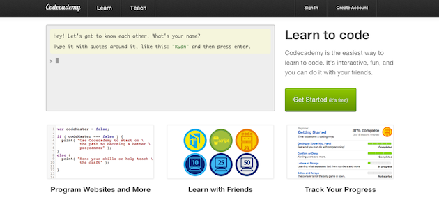
Codeacademy.com is another website that shows restraint. While it’s certainly possible to teach people how to code in a vast multitude of ways, Codeacademy has a standardized method built around quick, simple explanations. A site with as much information as Codeacademy provides could easily be flooded with intricate features and complex designs. Just like the design strategy behind Scrabble, however, the site is accessible to anyone, regardless of skill level, while simultaneously catering to people with advanced skills.

Graphic designers may want rich graphics and programmers may want to write broad, all-encompassing code, but way more often than not, the best experience for the user is a simple one. Part of the challenge of user experience design is to build systems using restraint. Rather than showing off, websites and applications often do better by holding back.

Keeping things simple and accessible certainly worked for Scrabble, which has been translated into about thirty languages and can be found in over half of the countries in the world. The game has sold millions of copies and there are dedicated players who take part in heated international tournaments.

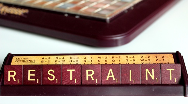
(“Restraint” is, for our purposes, an ironically low-scoring word)

Scrabble could have been complex—it could have been crafted only for those with large vocabularies. Instead, Butts did something the best user experience practitioners do all the time: he designed a hugely accessible product using restraint.

post authorAndrew Zusman

Andrew Zusman
Andrew Zusman is a user experience designer at Inkod-Hypera and the creator of the 52 Designers project. Andrew is also the writer of a popular user experience design blog. He lives in Tel-Aviv, Israel with his girlfriend Natasha and their dog Indy.

Tweet
Share
Post
Share
Email
Print

Related Articles

What makes players keep coming back? This piece explores the psychology of hot streaks — how momentum, perception, and smart design can turn short wins into lasting engagement.

Article by Montgomery Singman
The Psychology of Hot Streak Game Design: How to Keep Players Coming Back Every Day Without Shame
  • The article shows how hot streaks tap into players’ psychology, turning momentum into motivation.
  • It highlights the hot-hand fallacy, where players overestimate their chances of continued success.
  • The piece argues that ethical streak design should enhance engagement without exploiting addictive behavior.
Share:The Psychology of Hot Streak Game Design: How to Keep Players Coming Back Every Day Without Shame
26 min read

Trusting AI isn’t the goal — relying on it is. This article explores why human trust and AI reliance are worlds apart, and what UX designers should focus on to make AI feel dependable, not human.

Article by Verena Seibert-Giller
The Psychology of Trust in AI: Why “Relying on AI” Matters More than “Trusting It”
  • The article argues that “reliance,” not “trust,” is the right way to think about users’ relationship with AI.
  • It explains that human trust and AI reliance are driven by different psychological mechanisms.
  • The piece highlights that predictability, transparency, and control make users more willing to rely on AI.
  • It concludes that users don’t need to trust AI as a partner — only rely on it as a dependable tool.
Share:The Psychology of Trust in AI: Why “Relying on AI” Matters More than “Trusting It”
4 min read

What if your productivity app could keep you as focused as your favorite game? This article explores how game design psychology can transform everyday tools into experiences that spark flow, focus, and real engagement.

Article by Montgomery Singman
Flow State Design: Applying Game Psychology to Productivity Apps
  • The article shows how principles from game design can help productivity tools create and sustain a flow state.
  • It explains that games succeed by balancing challenge and skill, providing clear goals, and offering immediate feedback — elements most productivity apps lack.
  • The piece argues that applying these psychological insights could make work tools more engaging, adaptive, and motivating.
Share:Flow State Design: Applying Game Psychology to Productivity Apps
12 min read

Join the UX Magazine community!

Stay informed with exclusive content on the intersection of UX, AI agents, and agentic automation—essential reading for future-focused professionals.

Hello!

You're officially a member of the UX Magazine Community.
We're excited to have you with us!

Thank you!

To begin viewing member content, please verify your email.

Tell us about you. Enroll in the course.

    This website uses cookies to ensure you get the best experience on our website. Check our privacy policy and