Flag

We stand with Ukraine and our team members from Ukraine. Here are ways you can help

Home ›› UX Magazine ›› Page 15

UX Magazine

Read these first

The features and testing algorithm of good design

Article by Erik Messaki
How to Evaluate Design Quality
  • It’s important to learn to see our own and other people’s designs through critical eyes.
  • The author suggests 3 layers of evaluating design:
    1. Marketing
    2. Usability
    3. (Visual) Design
Share:How to Evaluate Design Quality
6 min read
How-to-Evaluate-Design-Quality

Imagine a situation — you fancy a night out, so you do your hair or makeup, carefully take the time to pick out the best clothes for the occasion or put some perfume on, and then, instead of heading out, you just stand in your own hall, at the front door the whole night. This is your research without properly sharing the findings. You did all the preparations and all the work but the impact is not there.

Article by Adela Svoboda
9 Things You Can Do to Make User Research Stick
  • The author shares the story about how she started working on new personas for her product and how user research helped her along the way.

  • The author believes that just “having” the research findings doesn’t really mean anything — we have to make some effort ****to let the research findings sink in properly and support adoption across the whole company.

  • Here are 9 tips on how you can share any of your research findings:

    1. Be concise and clear

    2. Co-create

    3. Make the findings easy to take in

    4. Create different artefacts

    5. Test the findings

    6. Quiz and games

    7. (Over)communicate

    8. Top-down approach

    9. Forget about on-site only

Share:9 Things You Can Do to Make User Research Stick
8 min read
9 things you can do to make user research stick

The following manifesto represents my answer to the question — “As a UX or UI, designer, how do I know when and where to implement motion to support usability?”

Article by Issara Willenskomer
Creating Usability with Motion: The UX in Motion Manifesto
  • After over fifteen years of studying motion in user interfaces, the author believes that there are 12 specific opportunities to support usability in UX projects using motion.
  • UI Animation is to the ‘12 UX in Motion Principles’ as construction is to architecture.
  • The author unpacks the following 5 ideas that help you understand when and where to implement motion to support usability:
    1. Addressing the topic of UI Animation — it’s not what you think.
    2. Realtime vs non-realtime interactions.
    3. Four ways that motion supports usability (expectation, continuity, narrative, and relationship).
    4. Principles, Techniques, Properties, and Values.
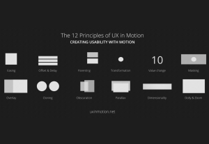
    5. The 12 Principles of UX in Motion (easing, offset&delay, parenting, transformation, value change, masking, overlay, cloning, obscuration, parallax, dimensionality and dolly & zoom).
Share:Creating Usability with Motion: The UX in Motion Manifesto
19 min read
Creating Usability with Motion: The UX in Motion Manifesto

Predictions for UX Industry in 2022

Article by Grand Studio
The State of UX Design in 2022: What Lies Ahead
  • Grand Studio explores the changes that UX industry is observing in 2022:
    • Better connections with peers, customers, and users
    • Accessibility: creating for everyone, not just the majority
    • Data accumulation and the value of data
    • The importance of data visualization
    • No code technology prospects
Share:The State of UX Design in 2022: What Lies Ahead
5 min read
The State of UX Design in 2022: What Lies Ahead

At a time when designs are constantly changing, it is important that UI/UX designers understand and focus on the main principles of design. And information architecture might be just the thing to focus on.

Article by Alanna Bent
The Importance of IA in UX Design
  • When focusing on ways a user interacts with design, information architecture is one of the things you need to pay attention to.
  • The article covers:
    • Basis of Information Architecture within Design
    • Relevance of Information Ecology
    • Incorporation of IA in UX Designs
  • As UX designers, incorporating information architecture into your designs is vital in creating a positive user experience.
Share:The Importance of IA in UX Design
5 min read
The-importance-of-IA-in-UX-design

Hear me out for a second: What if we tried bee-centered design?

Article by Jesse Weaver
Human-Centered Design Is Broken. Here’s a Better Alternative
  • The author questions the value of human-centered design and suggests thinking of a new approach — bee-centered design.
  • The idea of bee-centered suggests that successful for human ecosystems comes more easily when you design as if you’re designing for more sensitive creatures like a bee.
  • While centering the human perspective allows us to make important gains, it doesn’t scale. In an interdependent system, continually over-prioritizing the needs and desires of a single component will eventually cause the entire system to collapse.
  • Bee-centered design is about shifting our mindset to open up a much-needed new perspective for the things we create.
  • Reasons why bee-centered thinking is effective:
    • The “canary in the coal mine” mentality
    • Common goal
    • Bee-centered design widens our view of the world
Share:Human-Centered Design Is Broken. Here’s a Better Alternative
6 min read
Human-Centered-Design-Is-Broken.-Heres-a-Better-Alternative-article

Tell us about you. Enroll in the course.

    This website uses cookies to ensure you get the best experience on our website. Check our privacy policy and