Can you quickly tell whether a design is good or mediocre? The quality of design is not a matter of taste or intuition. “This is awesome!” or “This is meh” are reactions better left to the users.
Knowing how to determine the quality of design is important both for designers and developers and for website owners. This requires practice. If you are a designer who wants to grow professionally, you should turn this skill into a regular habit, like brushing your teeth. At first, it will take some time, but you will learn to do it quicker with every new case. Professionals analyze design automatically. With their eagle eyes, they can see all the advantages and drawbacks — as long as it’s someone else’s design. But what about their own work?
Even experienced designers can overlook their own missteps. When we spend a long time working on a project, we lose some of our ability to see critically. Our attention gets focused on the things that look problematic, making us miss other things. What do we need to be able to see our own and other people’s designs through critical eyes?
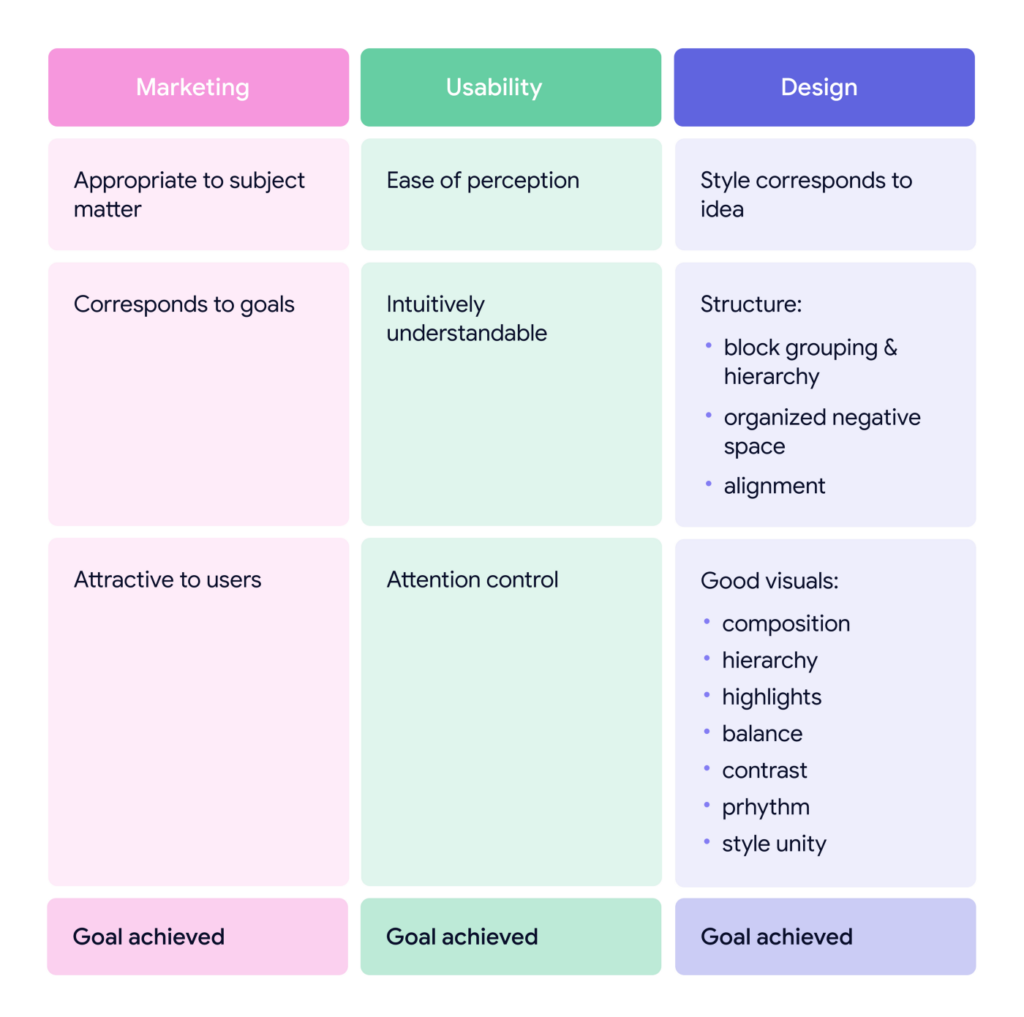
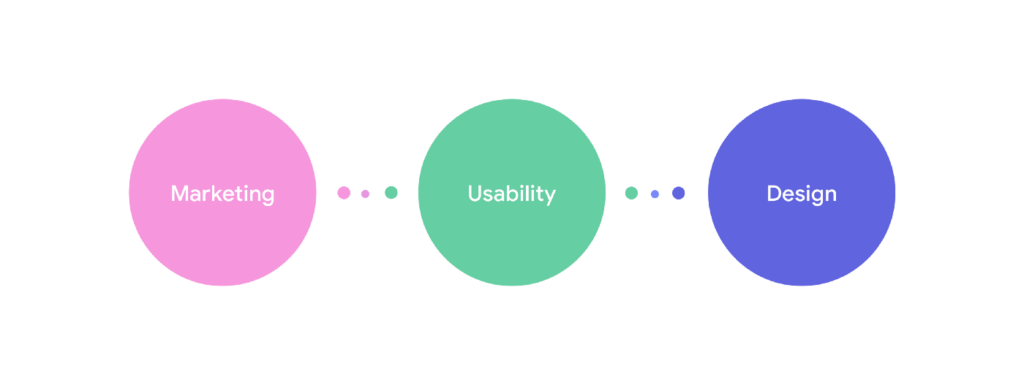
We need to analyze three layers:
- marketing
- usability
- design
Design testing lifehack
If you are a designer, forget about it for a while. You are a critic now. Observe as a marketer first, as a user second, and as a designer last. Take on these personas in turn, focusing only on what each of them needs to see. This exercise is much more productive than a mere “designer’s eye view.”
Now, let’s test the quality layer by layer. The layers are arbitrary and only used as a convenience.
1. The marketing layer
Appropriate to the subject matter
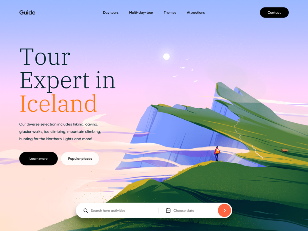
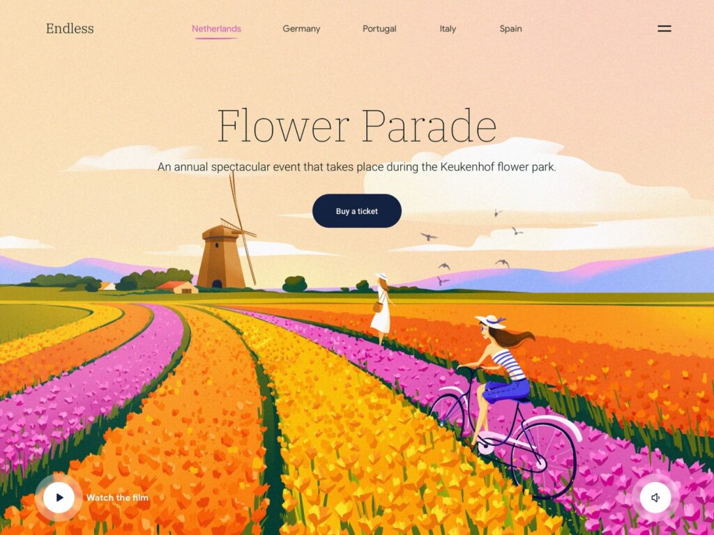
The visuals must be appropriate for the chosen subject matter. A currency exchange webpage should not be designed in a Hello Kitty style. Sure, users don’t consciously think about the style, but they will immediately sense the inadequacy. Style is the language that a business uses to speak to the audience. Make sure they understand this language, i.e. that the design style and color palette are appropriate for the type of business.
Corresponds to project goals
Every design is supposed to solve a specific task. Does the design help the project achieve its goals?
For example, in analyzing a landing page design, pay attention to how the offer is made. Does the CTA block look convincing? Does it make you want to click “Buy” or perform some other target action? If it’s a logo design, consider whether it matches the brand in meaning and visual implementation?
Appropriate colors
Color is the first thing that grabs a user’s attention, so it’s essential that it be appropriate to the subject matter. It’s a matter of visual marketing rather than design. Make sure the color palette is optimal. Does it answer the needs of the business? Do the colors or their combinations trigger the necessary emotions in the target audience? Does the color scheme correspond to the features of the sales offer?
Attractive offer
Is the main offer attractive, interesting, and esthetic? Is there anything special and unique about it, anything that makes you want to examine it and learn more?
2. The usability layer
Ease of perception
Is it immediately clear what the design is and what task it solves? The immediacy of perception depends on how the design controls your attention.
Ease of perception depends on the following:
- layout structure
- content hierarchy
- highlights
- visual leads
Try to consciously track your eye movements around the page.
- Does your eye linger on the necessary highlights?
- Does your eye move smoothly or does it “stumble”?
- Does it get distracted by secondary elements?
- Does it lose focus with nothing to focus on?
- Does it lead to the main goal? How quickly does it happen?
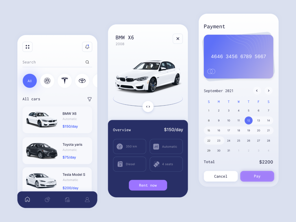
Functionality
Functionality is basically everything that helps the user reach the goal quicker and easier. Website options, tools, or micro interaction elements cannot be tested quickly with the naked eye. However, any visuals can be evaluated by the following parameters:
- intuitiveness of use
- recognizability of elements
- lack of visual obstacles
- a visually clear path to the goal
3. The design layer
The design is the idea, the image, and its visual expression. Our task is to check whether that idea has been realized well enough.
Concept
- Is the design interesting?
- Does the visual reflect the project’s central idea?
- How unique and memorable is the resulting image?
- Does the style match the idea of the project?
Relevance
The design has a tendency to quickly become dated and thus less attractive to users. Make sure the design is relevant and has no boring old images that will make it stale.
Layout structure
As early as the layout approval stage, the client can tell if their website design is going to be good. All they have to do is look at the layout structure. Here are the main criteria for a good layout:
- grouping
Content blocks must be grouped according to the logic of the project and the hierarchy of meaning. Every block contains its own set of data and has its own purpose (mini-goal). In every block, the user finds specific info or performs a target action.
Blocks are separated by negative spaces that make it clear which group is which. Negative space is better viewed as white elements of regular size (this is the best way to be more respectful and attentive to it). The indents between the blocks must be strictly uniform, just as the indents within each block. The inside and outside indents must be proportional and balanced in relation to one another.
Bad designs often have blocks or block elements “stuck together” (indents too small) or “falling apart” (indents too large).
- alignment
Good alignment makes the design ordered and organized. Check how the elements are aligned and whether the alignment is uniform across the board.

Good execution
Once you have made sure that the first two layers (marketing and usability) are fine and the structure is good, you can move on to evaluating the visual component.
Composition: Beauty and Functionality
These are the essential criteria for a high-quality design:
- hierarchy
Visual hierarchy rests on a “skeleton” of the layout. Make sure the layout-based design not only follows the hierarchy but also enhances and emphasizes it. This is important. If you are checking your design, take the time to examine the structure. It’s very easy to ruin the initial order with wrong highlights without even noticing.
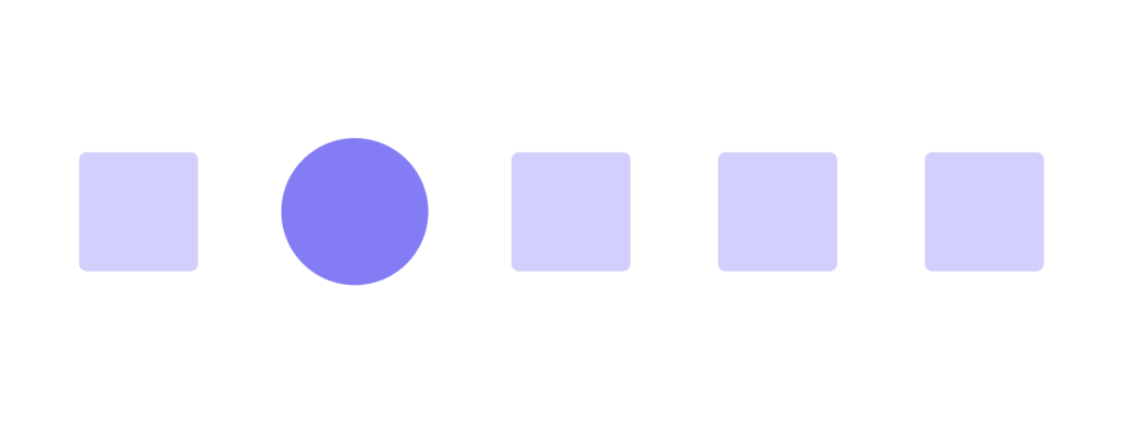
- focus
The focus is a call of “Look here!” All the focal points of the design must be functional. Do these points draw attention to important information? If a design’s highlights are based on purely aesthetic considerations and have no meaningful purpose, the design is bad, no matter how good it looks.
Any visual focus must carry a specific message. “Look here, it’s just a neat circle!” has no place in good design.
Emphasis in Design. How to Draw Attention
- balance
You don’t need to be a designer to sense visual balance. Design elements feel like they have physical weight. Does the design look balanced? Where is its visual center of gravity? Does it emphasize the most important information?
- contrast
Contrast helps to emphasize information, build a content hierarchy, and add the necessary highlights.
Check if your design has sufficient contrast. Does it look monotonous due to a lack of contrast? Or is it too cluttered due to too much contrast?
Top Secrets of Contrast in Design
- repetition
If the project contains no repetitive visual elements (color scheme, shapes, fonts, images, spatial relations), the design loses cohesion and users cannot tell info blocks apart.
Too much repetition is no good either because it may become annoying.
- style unity
All the above features must be visually unified in an ordered system and agree with one another. This system must work toward the idea.
In conclusion
You can make your list of features that need to be checked. Design quality can be evaluated either more thoroughly or superficially. In any case, it’s better to do it in layers.
Every parameter (marketing, usability, design) must correspond to the project’s goal. If it does, then your design deserves top marks!