Flag

We stand with Ukraine and our team members from Ukraine. Here are ways you can help

Home ›› Interaction Design ›› Page 16

Interaction Design

Read these first

Dear ATM machine, if I can only take out money in $20 increments, why are you presenting me with 1,3,5,7 and 9 buttons?

Article by Daniel Brown
Share:ATM Interfaces, Multiples of 20, and Too Many Buttons #wtfUX
1 min read
atm-wtfux-small

Modal dialogs have become a ubiquitous feature of mobile web design, but designers need to put more thought into when to use them, and when to leave them out.

Article by Chris Wigley
Share:Modals on Mobile: How to use them wisely
5 min read
modals-for-mobile-small

A review of the ill-conceived Mobile World Congress event app shows how poor design can have a broad impact on attendee experience.

Article by Will Scott
Share:Event Apps: Think Tapas, not Smörgåsbord
3 min read
event-apps-tapas-not-smorgasbord-small

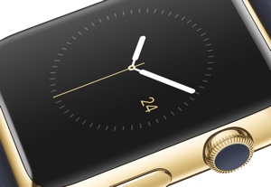
A Q&A with Matt Morey, the guy who wrote the book on developing apps for the Apple Watch.

Article by Josh Tyson
Share:Experience Design and the Apple Watch
5 min read
iwatch-dev-small

Here they are! The winners of the 2014 international Design for Experience awards.

Article by UX Magazine Staff
Share:Announcing Winners in the 2014 Design for Experience Awards
10 min read
dfe-winners-2014-small

Tell us about you. Enroll in the course.

    This website uses cookies to ensure you get the best experience on our website. Check our privacy policy and