Flag

We stand with Ukraine and our team members from Ukraine. Here are ways you can help

Get exclusive access to thought-provoking articles, bonus podcast content, and cutting-edge whitepapers. Become a member of the UX Magazine community today!

Home ›› Apple ›› An Error Number from Apple? #wtfUX

An Error Number from Apple? #wtfUX

by Daniel Brown
1 min read
Share this post on
Tweet
Share
Post
Share
Email
Print

Save

In a surprising experience design slip, Apple gives users an inscrutable error message.

​For all of Apple’s usability efforts, one department seems to have missed the company-wide memo sent out 30+ years ago. Under no circumstances should a user be presented with a message like this. If the system knows enough to display an error number, it can certainly cross-reference that into a human-consumable message. (FYI: I was attempting to rename a folder that was being copied.)

Apple error message

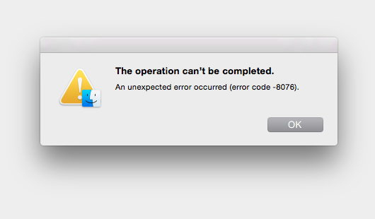
On top of all that, what could a negative number in an error message possibly imply? Shouldn’t a negative error indicate a good thing?


Keep these coming. Send them to us via Twitter or Facebook using the hastag #wtfUX or email them to: [email protected] with “#wtfUX” in the subject line. Include as much context as you can, so we get a full understanding of what the f%*k went wrong. Image of worm in apple courtesy Shutterstock.

post authorDaniel Brown

Daniel Brown
Daniel has spent the past 20 years in software companies both large and small. From web design and development for a “boutique” web design firm to Evangelism for Adobe Systems, to helping budding startup companies get a foothold in the market, he’s worn a variety of “hats". Daniel has spoken at a variety of events worldwide including the Sundance Film Festival, Anderson Ranch Arts Center, Santa Fe Digital Workshops, and the Pacific Imaging Center in Hawaii on the topics of web design, digital imaging, photography, and user experience. Daniel currently serves as the head of the interface and user experience department at a small medical software company in Providence, Rhode Island.

Tweet
Share
Post
Share
Email
Print

Related Articles

Data visualization isn’t just about charts — it’s about telling a clear and compelling story. This article unpacks a wide spectrum of essential principles for making data easy to understand, honest, and engaging. Ready to transform complex numbers into meaningful insights?

Article by Jim Gulsen
The Ultimate Data Visualization Handbook for Designers
  • The article serves as a comprehensive guide for elevating visualization work, combining technical expertise with design principles to help designers transform raw data into meaningful insights.
  • It provides a point of reference for strategies, methods, and best practices to create more effective and impactful data visualizations.
  • The piece recommends tools and resources that design professionals can immediately implement to enhance the clarity and persuasiveness of their data storytelling.
Share:The Ultimate Data Visualization Handbook for Designers
23 min read

Discover how breaking down silos and embracing cross-functional collaboration can lead to smarter, more user-centered design — and better products for everyone.

Article by Rodolpho Henrique
Beyond the Design Silo: How Collaboration Elevates UX
  • The article explores how siloed UX design practices can hinder product success and argues for cross-functional collaboration as essential to creating meaningful user experiences.
  • It outlines the benefits of working closely with product managers, engineers, and stakeholders to align user needs with technical feasibility and business goals.
  • The piece provides real-world collaboration examples across research, prototyping, design systems, and accessibility to show how teamwork leads to more innovative and effective UX outcomes.
Share:Beyond the Design Silo: How Collaboration Elevates UX
4 min read

Designing for AI? Know what your agent can actually do. This guide breaks down the four core capabilities every UX designer must understand to build smarter, safer, and more user-centered AI experiences.

Article by Greg Nudelman
Secrets of Agentic UX: Emerging Design Patterns for Human Interaction with AI Agents
  • The article examines how UX designers can effectively work with AI agents by understanding the four key capability types that shape agent behavior and user interaction.
  • It emphasizes the importance of evaluating an AI agent’s perception, reasoning, action, and learning abilities early in the design process to create experiences that are realistic, ethical, and user-centered.
  • The piece provides practical frameworks and examples — from smart home devices to healthcare bots — to help designers ask the right questions, collaborate cross-functionally, and scope AI use responsibly.
Share:Secrets of Agentic UX: Emerging Design Patterns for Human Interaction with AI Agents
10 min read

Join the UX Magazine community!

Stay informed with exclusive content on the intersection of UX, AI agents, and agentic automation—essential reading for future-focused professionals.

Hello!

You're officially a member of the UX Magazine Community.
We're excited to have you with us!

Thank you!

To begin viewing member content, please verify your email.

Tell us about you. Enroll in the course.

    This website uses cookies to ensure you get the best experience on our website. Check our privacy policy and