How many times do you close a pop-up without knowing what are you clicking and then you see you did something you don’t want to for clicking or tapping faster? There is a kind of user that never reads and others that of course reads it all. We need to be prepared to this both users so this could help them to detect if is something that has to pay attention.
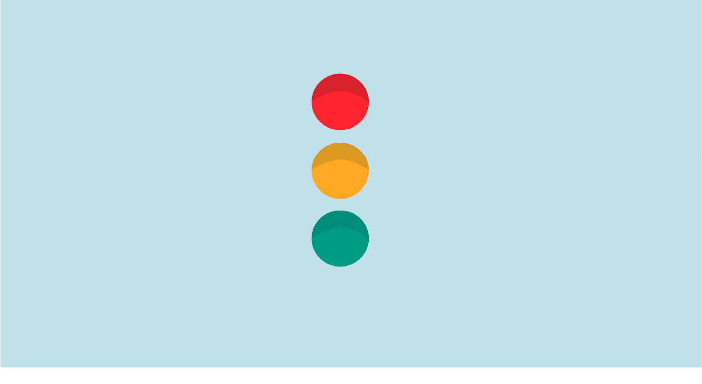
The first thing that every human being who walks through the street surrounding by traffic is this basic colour theory: Red is bad (you cannot pass), Orange is close to bad (you must stop and not run!) and Green is the best because is not warning and we can walk through our destiny.
The same basic theory is for any digital product, and yes, I truly know that it isn’t easy for us as designers to make the colour match with the brand colour or is not the best for our minimalistic brand (we can see how we can improve this).
So let’s see a good practice of these colours.
With these colours, your user will notice a visual disturb on the colours. We have a problem the users accept all the messages without reading it. So we need to key points to let them visuality knew that the message, pop-up or modal it’s not of the same of the before.
First step: Use this traffic light colours.
RED:
Since red is the colour of blood, it has historically been associated with sacrifice, danger and courage. Modern surveys in Europe and the United States show red is also the colour most commonly associated with heat, activity, passion, sexuality, anger, love and joy. In China, India and many other Asian countries, it is the colour of symbolizing happiness and good fortune
This colour has to be for warning the user that they will delete everything, burn the server down or the upload doesn’t work at they expected. So use it carefully.

You can use an orange colour close to red.
GREEN:
In surveys made in American, European, and Islamic countries, green is the colour most commonly associated with nature, life, health, youth, spring, hope, and envy. In the European Union and the United States, green is also sometimes associated with toxicity and poor health, but in China and most of Asia, its associations are very positive, as the symbol of fertility and happiness. Because of its association with nature, it is the colour of the environmental movement.
Green Is the colour of hope. This is the best colour you can show in your design. The colour of the good look. Is the success of everyone wants to see? Yes, it is! Green is the colour to tell the user everything is ok and all going to be alright (but without being in lockdown)

Green could be replaced by blue, although this colour should be used more as informative colour.
ORANGE/YELLOW:
In Europe and America, surveys show that orange is the colour most associated with amusement, the unconventional, extroverts, warmth, fire, energy, activity, danger, taste and aroma, the autumn and Allhallowtide seasons, as well as having long been the national colour of the Netherlands. In Asia, it is an important symbolic colour of Buddhism and Hinduism.
Well, this is the beauty cousin of the Red. It is a warning but not is a red flag. is only informing non-critical errors, just a something went wrong.

Second step: Use the power of UX writing.
Words are something that we cannot live without and also we cannot delegate to anyone. For me, it is one of the fundamental aspects of design and something that designers and companies leave behind.
We talked about the importance of a copy in another post (I know, I could be a bit persistent). But there are two things that are relegated to the latest in software or digital product production. These two things are design and even behind of it, is the microcopy that is leaving behind and in many cases leaving it to the hands of the developer. So is normal to find some messages that freaking you out, doubting in when the option you should choose. I give you an example from Youtube.

Yeah! We made it! We create a Youtube channel but only in Spanish for now.
Do you want to cancel your subscription? If you go fast, you will surely cancel (the second) and you will stay following us even if you don’t want to. Thanks, Youtube!
Third step: Use illustrations
Illustrations are the best way to communicate any message, but in product is a plus. The illustrations humanize, empathize, express emotions and add personalization to your product that makes it looks high quality.
If you can animate it! There is nothing that could stop you!

Illustration from Open Peeps by Pablo Stanley.
Pro-tip: Work on phases
Okay, now that we have everything clear. If the project does not have that budget, you can plan it in stages.
Although I would prioritize colours in UI and UX writing at the same time to have it in the first version.
The illustrations could be two phases more: first static and then we can animate it. To make this easier, use libraries, but my recommendation is that have to hire a professional illustrator to work it on vectors to use them in SVG format to minimize the weight, and also you can animate them in the future.
The steps to make this traffic light super effective are:
The first thing is knowing the cultural context and get to know your user in order to empathize with that person and create a good experience.
Use colours for different states to improve the user experience and notify the user if something is good or bad with a simple visual code.
Adding a good copy will make the user smile or empathize with the company at a difficult time and be happy when something is going well.
Have a good variety of illustrations with your own style (or use a library customized with your colours). An image is worth more than a thousand words, but if you do it all the things I mentioned, the user is going to read your information and the will remember. A clear example of this is Mailchimp high five.

High five with your client! and make all your messages an experience worthy of mention to another colleague.