Save
UX Lx bills itself as a premier UX conference, and they are absolutely correct. Held over three days in Lisbon, Portugal, this conference is truly unique compared to other UX conferences. It is run by Bruno Figueiredo, who deserves kudos for assembling a fine cast of speakers, planning incredible social events, and creating an overall environment of learning and sharing that I think everyone benefited from. The speakers were also very approachable at this event and a lot of thought-provoking conversations happened between workshops and after hours.
UX Lx bills itself as a premier UX conference, and they are absolutely correct. Held over three days in Lisbon, Portugal, this conference is truly unique compared to other UX conferences. It is run by Bruno Figueiredo, who deserves kudos for assembling a fine cast of speakers, planning incredible social events, and creating an overall environment of learning and sharing that I think everyone benefited from. The speakers were also very approachable at this event and a lot of thought-provoking conversations happened between workshops and after hours.
The location of UX Lx is worth noting. It is held in the Lisbon Eastern Business District which was the center of the 1998 World Expo celebrating 500 years of Portuguese discoveries. All the buildings in the area have a modern, organic aesthetic that is in stark contrast to the centuries-old castles surrounding the area. This is a great metaphor for the people attending the conference. UX professionals are in the midst of this post-Flash, fledgling environment of gesture-based phones and tablets that beg for immersive applications, while most large companies are comprised of rusting processes and anachronistic hierarchies.
Here are some of the highlights from UX Lx, which had far too many interesting aspects for me to capture in one article.
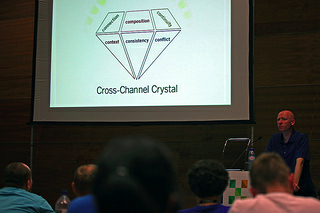
Peter Morville: Cross-Channel Strategy
Day one began with the good problem of having to choose which workshop to attend from among four very interesting options. I opted to attend Peter Morville’s workshop on cross-channel strategy, and I’m really glad I did.
Peter’s talk started the conference off with a bang by immediately articulating and validating the fluid state UX is experiencing. Designing user experiences has become more multi-dimensional than ever before. It’s gone far beyond the old model of relationships between users and their computer; UX design now encompasses web, mobile, tablet, social, QR Codes, signage, and more. From Peter Morville: “The easiest thing to do is for a consultant to come in and tell you how inconsistent you are, because everything is. It’s really about brand, features, organization, and interaction balanced against value of optimization.”
Peter shared a story about a research project he did for the Library of Congress. When they received his findings, they realized that in order to truly embrace them they would need to restructure themselves, which is not a trivial task. This is something that UX designers should anticipate beforehand to help clients to cope with findings that sometimes don’t map to the current corporate structure. He also talked about something that’s very evident when UX work unearths deeper findings like this: the value isn’t in the wireframes, but about the concepts that you need to imbue into the company’s culture. Those are the things that ignite the necessary change in order for companies adapt. Providing strong research will help a company to better illuminate the challenges they have before them that can go well beyond a website redesign.
He also talked about his recent work with a large retailer. The UX team at the retailer was fairly new, and it became clear they were going to have issues implementing their findings. The UX team initially only had responsibility for a subsection of the company’s website, but in order to be truly successful, the company had to change its structure to adopt a more holistic approach to its website. This is something most companies need to address, but it is not easy to change culture.
Another quote from Peter jumped out at me: “Everything is coming together in this mess.” He said UX professionals need to be “triathletes” in this era of change because it is necessary to be multidisciplinary and multichannel. According to Peter, “it is our job to keep reframing things” in order to navigate this change and keep current. Today’s technological flux is leading somewhere but we’re not there yet, so UX professionals need to take on new skills and be aware of new technologies and platforms. During this time of change, Peter suggests that it’s the responsibility of UX professionals to help shepherd organizations. UX professionals can be the catalyst for change in stodgy organizations by providing the research, coming up with compelling concepts and stories, and propagating these throughout the organization.
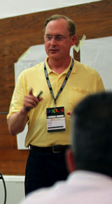
Arnie Lund: Strategic User Experience Management
Arnie Lund’s talk addressed the critical issues of creating quality UX teams and having them placed correctly within an organization.
He had a great quote about how “antibodies form within companies that thwart change and UX design.” This is mostly due to the fact that people don’t understand how they will be compensated in the future state of the company.
UX needs to be supported from the top. To get this, UX teams need a strong idea of their goals as well as an “elevator pitch” of their UX roadmap. Elevator pitches become powerful stories that travel within a company. For example, the elevator pitch for the movie Alien was “Jaws in space.” Effective elevator pitches are simple and easily retold so they’re easy to pass it along within an organization.
Arnie went on to say that if you don’t have UX champions at your company, you have to cultivate them. Take people to lunch. Buy them beer. “Help me understand your business” is a great way to start a conversation instead of, “How can you fund my initiative?” Talk to people around your company and learn enough to include their stories in your vision.
Lastly, Arnie gave examples of the elevator pitches from major companies:
Ford: Produce a car that everyone can afford
Microsoft: A personal computer in every home running MS software
Zappos: The online service leader
Disney: Create a place for people to find happiness and knowledge
Girl Scouts: Help a girl read her highest potential
Translating your UX team goals into a very clear and concise elevator pitch and including outside teams into your vision will give you a much greater chance of success.
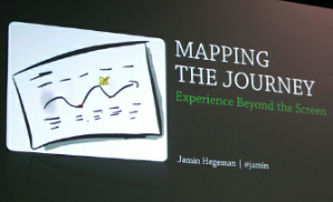
Jamin Hegeman: Mapping the User Experience
Jamin’s talk regarding journey mapping was timely, and demonstrated how powerful this tool can be in today’s environments. This is because it helps organizations understand a user’s experience by visualizing the intangibles, and helps in “designing the forest through the trees.” Jamin talked about how Adaptive Path does this by “designing from the outside in.”
Companies see superficial statistics but don’t really have a deep understanding of how their products and services fit into people’s lives, and overlook relevant things that go on outside of them. For example, it is easy to see how many people are adding things to carts and completing purchases, but what surrounding activities are they doing outside of these clicks? Journey mapping allows you to visualize the persona’s emotional high and low touchpoints that lead up to the clicks and continue beyond them—to see where emotions such as anxiety, joy, anger, overwhelmed, occur in a user’s journey. Creating journey maps begins in the same way most great techniques do: with research. At Adaptive Path, they take into account more than just the activities surrounding the product; they also look at the full journey of the user.
Jamin compared journey mapping to the famous Minard graphic of Napolean’s march on Russia. This was particularly exciting to me because of how compelling the Minard flow map is. If journey mapping is similarly effective, it’ll become a standard part of the UX toolkit.
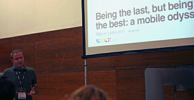
Marcio Leibovitch: Being the Last, Being the Best – A Mobile Odyssey
Marcio began his career in UX in 1992 in his homeland of Brazil. He is now UX Director of Yu Centrik, and at UX Lx he presented insight on a mobile application design project he worked on last year.
The National Bank of Canada realized they were late to the mobile application party, so they came to Marcio’s firm with the goal of being the best, even if they were last. They also told them they wanted the new mobile application built in just six months. To accomplish this, they utilized an “agile-fall” (agile + waterfall) approach. Big organizations can’t shift to an agile process from a waterfall software development lifecycle overnight, but by applying a lean UX approach they can begin to bridge the gap.
Marcio also talked about Axure, a popular wireframing software product, which Centrik uses as a collaborative tool for designers and clients. It turns out that Axure is a fantastic communication utility, not just an tool for generating design artifacts. Centrik uses it to quickly create wireframes, export them to HTML, put them on devices, and show them to the client for feedback.
One of Centrik’s biggest challenges is clients refusing to do usability testing due to time constraints. Marcio’s team adapted an informal usability test because, as he put it, “There is no excuse to not run usability tests. A motivated team can reinvent the way they work. New processes, new tools with risk and fast timelines can be navigated when you have a great goal in sight.”
Day Three: Talk Highlights
The last day of UX Lx was all about short and powerful talks by rockstar UX thought-leaders. Here are some of the best tidbits I heard on this last day:
Peter Morville on listening vs. telling during field research: “You can’t sell and help at the same time. They conflict like breathing in and out.”
Steve Portigal on battling verbatims: “’I wish I had a handle’ doesn’t mean you give them a handle. It means they want to easily move something around.” Steve also talked about doing “story-worthy things” because that is what shifts a company’s culture.
Joshua Porter talked about the power of microcopy. Josh has come up with a concept of using snippets of text at pain points uncovered by usability testing. The introduction of small bits of helpful copy at problem points within an application can reduce user error dramatically. He also noted that humor and personality go a long way in creating a great user experience by evoking positive emotions, such as trust. A great example of a company using this concept to an extreme is Dollar Shave Club. Their tagline is, “Our Blades Are F***ing Great,” and their signup form is littered with great microcopy.
Jeff Gothelf talked about when he was Director of UX for The Ladders, he would bring “persona playing cards” to meetings so people would bring users and not themselves. He talked about the value of having “agile-fall” processes at a company to bridge between agile and waterfall lifecycles.
The last speaker at the conference was the proud Canadian Bill Buxton. Bill’s fiery talk was like a William Wallace battle speech, inspiring everyone to march off into UX design combat. A quote that really resonated with me was, “Consistency is about the quality of experience.” It is easy to create consistent look and feel, but creating a consistently good experience is the fundamental quality of establishing a brand.
Closing Thoughts
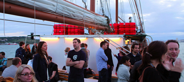
One of the most special and unique aspects of UX Lx was how approachable the speakers were, especially since the topics here were more cerebral. Talking about the state of UX with other attendees while eating classic Portuguese fare and drinking sangria was a great way to get different perspectives and new ideas. The quality of attendees was different as well. Participants and speakers were engaged, and there was a real sense of camaraderie. I have never been to a conference that planned out such nice post-conference social activities. From rodizio, to local fish, to a sunset sailboat cruise on the Tagus river, the entire experience was rich and enjoyable.
All of the attendees were exposed to the culture and food of Lisbon, such as the small cakes called, quejadas from Sintra. The castles and palaces also provide lingering memories that one won’t soon forget. Other conferences have content that is either too “in the weeds,” focusing on style sheets and technologies that fade fast, or are too lofty and academic so people can’t draw connections to their daily work. UX Lx found the sweet spot in the middle where all the workshops and speakers were very thought-provoking during a time when UX and technology are going through a renaissance.
Michael merged his skills in graphic design and multimedia into a career in User Experience Design after graduating with a B.S. in Jazz in 1989. He has delivered projects for clients including Kenneth Cole, Merrill Lynch, Apple, Time Warner, NFL Properties, AOL, Toshiba and W&R Grace. He has spent the last 20 years designing great experiences. Visit his UX Blog, his website, or follow him on Twitter.


