Save

Pew Research Center reports that the majority of kids in the US actively use digital devices, and many of them have smartphones or tablets of their own. The number of young users tends to increase over time. And design for this interesting (and somewhat challenging) audience is a responsible mission.
UX design for kids is not as simple as to just have a few clowns looking funny and some music playing while they use the product. First of all, you must know what difference in terms of demands lies between children and adults.
As a design agency we understand the importance of UX specifics when targeting a particular audience, especially a younger one. In this article, we would like to provide insights on what you need to pay attention to when designing a kid-friendly interface.
Main niches where design for children is applicable
To better understand where a solid design for kids is especially important, take a look at statistics on what content children most interacted with in 2021.
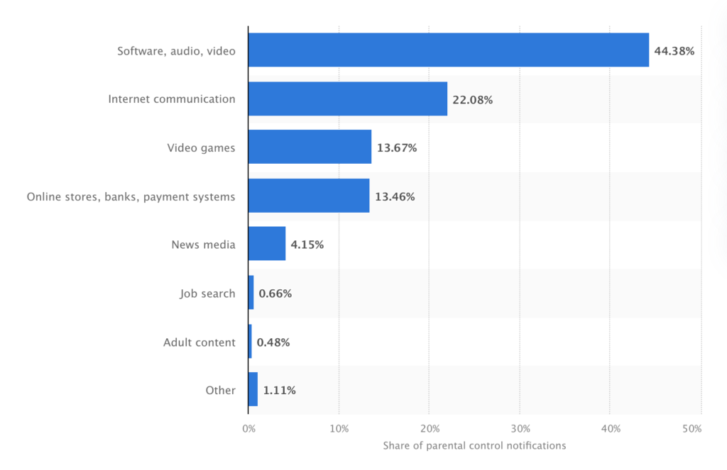
As we can see, software products and video content are among the most popular. We can name three main niches where child-friendly design is especially needed.
- Entertainment
Entertainment is the main reason why children use digital products, so it’s no wonder that gaming apps, entertaining platforms and websites make the biggest niche. When designing an entertaining product for children, keep in mind that kids develop an addiction easier, so you need to be ethical in your design decisions. - Online learning
It is hard to get children engaged in learning and keep them interested in whatever they study. However, if done right, it can be a very positive experience. Students can appreciate learning something new or improving on what they already know. You can use this insight as a base for online educational platforms for children. For example, include design elements that show progress and achievements. - Fintech for children
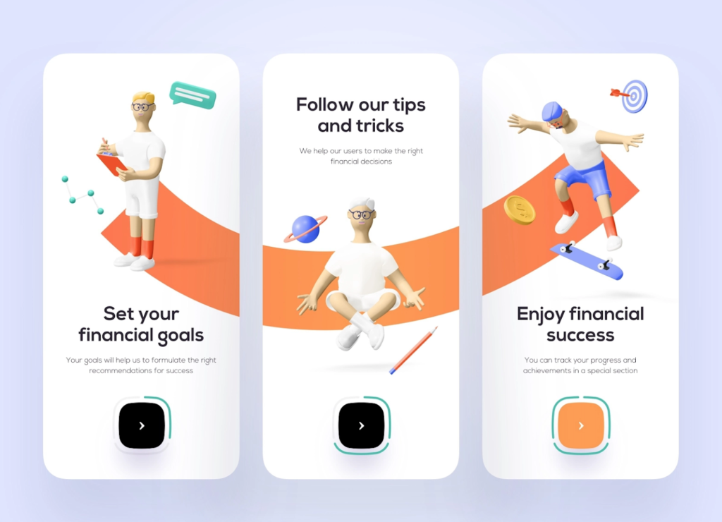
Yes, children nowadays use fintech products along with adults. The days of cash are behind and the demand for mobile banking and other fintech products for children is growing. Pay extra attention to the safety and usability of such complex products and don’t forget to include and design educational components to increase your teenage users’ financial literacy.
What differs children from adults?
Children are a new, unique, and more demanding audience. Stating the obvious, there are many differences between them and adults. And these differences matter for design.
Physical difference is the first thing to take into account when designing for kids. Children’s motor skills (especially at a young age) are different from those of other age groups. Younger kids’ motoricts change their user behavior. For example, at early age children typically type slowly or have limited control of the mouse. This is something designers have to pay attention to when creating UI for children.
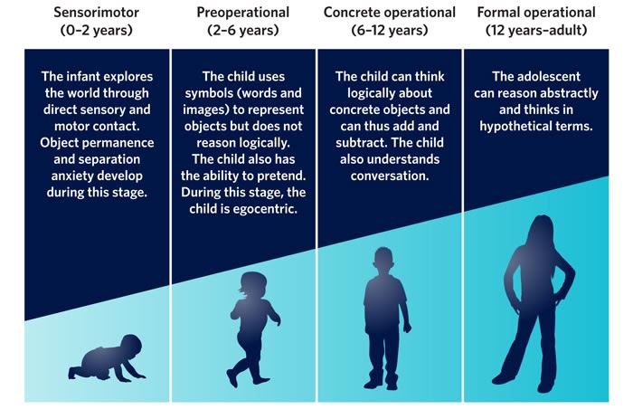
Cognitive difference is an even bigger matter to consider if you want to create a great user interface for kids. That’s why it makes sense to dive a bit into the theory of cognitive development. Children’s mental abilities are quite different. Depending on the age, they may lose focus or get bored quickly and in general, are less patient than grown-ups. Kids want interaction, so to keep your little users’ attention, you need your design to keep them engaged. It can be constant feedback or a little challenge that will make the experience interactive enough. Unlike adults, children like animation and sound effects.
Extra safety precautions. It is also a part of mental development but children might not know the consequences of some actions. For this reason, your design should be very transparent about what’s going to happen. The same goes for the advertising and purchase within products for children. Make sure your design doesn’t trick young users into something they are not conscious of. Nielsen Norman Group research shows that children can barely distinguish advertising and promotions from real content.
What’s similar between children and grown-ups?
Apart from differences, there are also similarities that can help you create a better user experience for children.
Kids just like adults appreciate consistency in design. A consistent design pattern helps to learn to navigate through the app or website faster. And it’s a matter of common sense, not a specific age.
Little users don’t like unnecessary complexity just like grown-ups. Too many design elements make it unclear to users which ones they can interact with. Extra unnecessary elements in the app or on the webpage can be confusing to both adults and kids.
Kids are a user group whose needs should be properly researched. The key to good design for children is to treat them just like adults and pay extra attention to user research. Study your user group, understand their needs, and create the best user experience possible..
5 principles for better UX for children
Design for your target age group. Kids develop fast and their abilities and needs are not the same at the age of four and at the age of ten. That is why to create a better design, divide children into smaller age groups and define your target audience.
Choose the color palette and fonts carefully. Colors matter much more in design for children than for adults. So, choose child-friendly fonts like Sassoon Primary, Gill Sans Infant Std., or Futura. And use 14 point font size for younger kids and 12 for older. Don’t be afraid to add more colors than you would when designing for grown-ups.
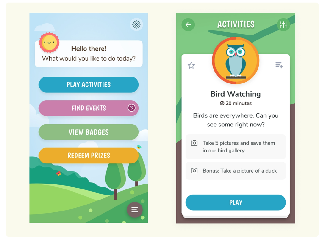
Image credit: Jenelle Miller on Dribble
A friendly digital helper is a good idea in digital products for children. Designing a virtual helper, cool and cute character that will help children to navigate through the product, can make the user experience smoother and more interactive.
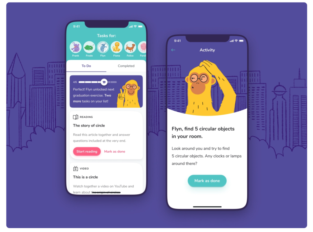
Constant feedback and reward. As we mentioned before, children, due to their age specifics, lose focus and motivation faster than adults. Design can help solve this issue. Add progress tracking elements and proofs of achievement. UX elements should constantly speak to children giving them feedback and keeping them engaged.
Make it as intuitive as possible. Modern kids are growing up with gadgets in their hands 24/7 and we can even call them digital natives. However, kids, just like older users, base their knowledge on their previous online experiences. So a good practice will be to implement general and familiar design patterns rather than inventing new user interfaces for kids. And keep in mind – your youngest users might not be even able to read, so you need to create such an experience that will be easy for them to use the product nevertheless.
Examples of stunning UX for kids
For you to get an idea of how you may design your product for children and teenagers, we have gathered some examples to learn from.
Perfect Pitch Toddler Games
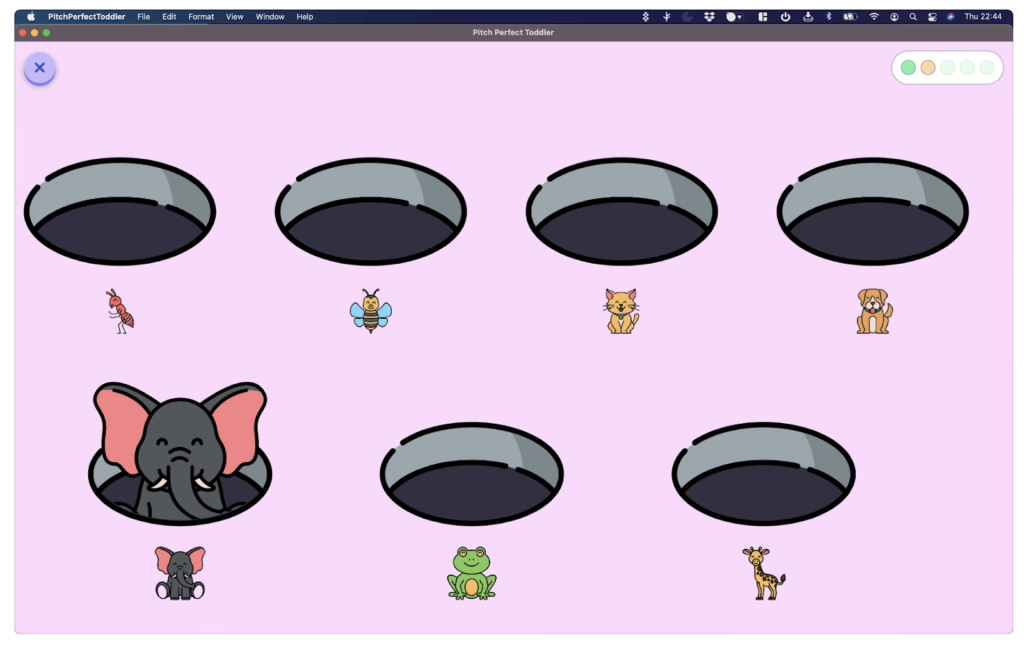
This collection of games was created for toddlers to train their musical ear. It’s a good example of how the UX takes into account cognitive development. Kids at the youngest age can’t read and memorize, so the game uses animals to represent notes and uses the simplest UI patterns that even the youngest children can understand.
My Teeth app
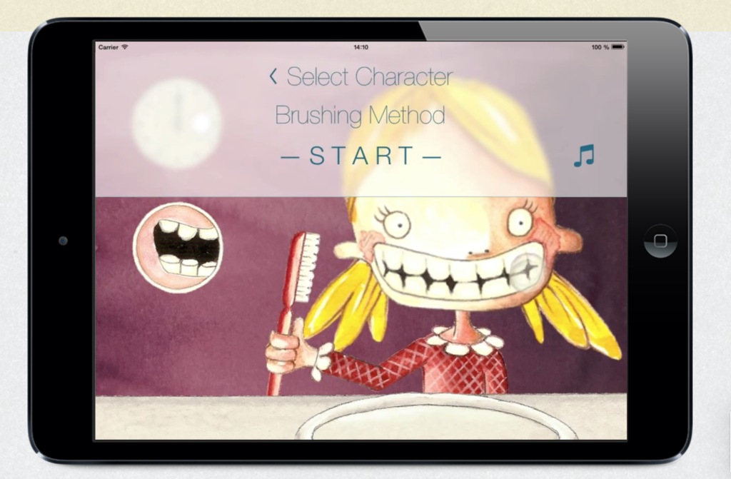
The app that teaches children how to brush their teeth properly uses the principles of UX for young users. Bright illustrations, funny guiding characters, and big-sized readable fonts are just what kids need to stay focused on the task and entertained at the same time.
BOOKR Class
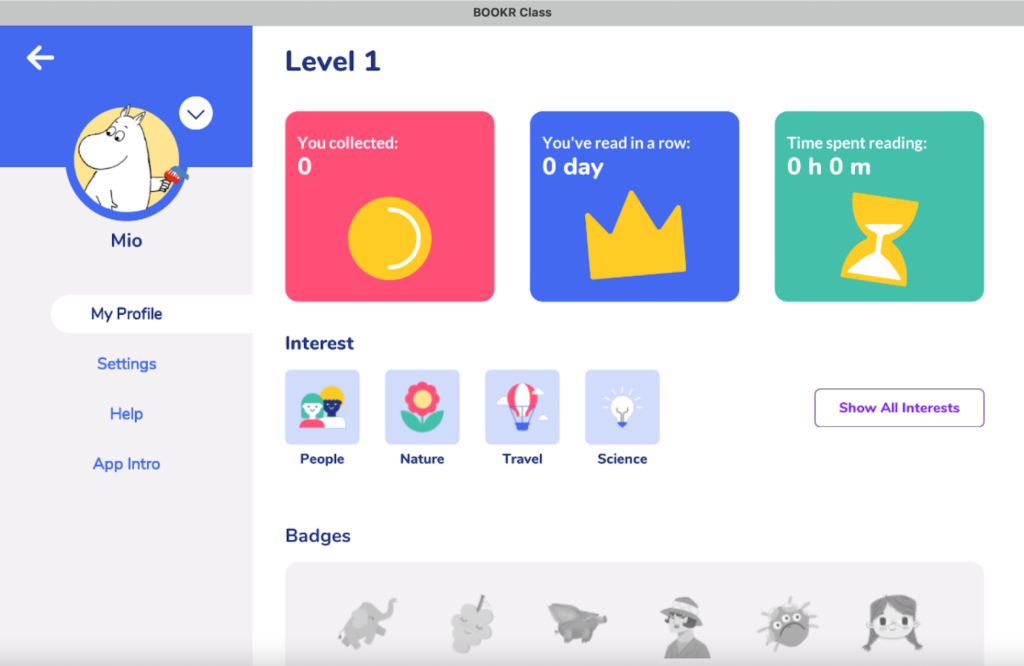
This web application encourages children to read books. Its creators have nailed the feedback and reward approach that is so important for a good user experience for children. There are badges for progress, statistics that keep users motivated, and also a clear menu that helps to navigate the application easily.
Youtube Kids
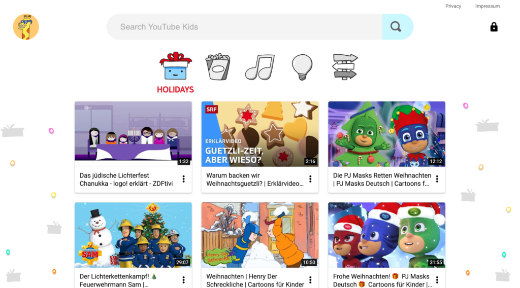
Youtube Kids is an example of how the product designed for kids differs from the one targeting adults. It’s much easier to navigate thanks to bigger buttons and fewer content boxes on the page. Plus the security settings on the platform make sure that younger users are safe and have access to appropriate content. Those all are parts of a thought-through design interface for children.
Wizarding World

Kids’ website design doesn’t always need to be all colorful. A famous Wizarding World website is a good example of how to target specifically your age audience, older kids and teenagers. Dark-themed UI combined with well-structured familiar website patterns and readable fonts provides a good UX experience.
To sum up
Nowadays children spend more time online than ever. Kids using gadgets confidently from an early age create a niche for digital products for children. This creates the demand for good kid-friendly design which is more than just bright colors and some illustrations. UX for kids should be based on children’s psychology in the first place and rely on strong user research. When designing children’s apps UX/UI, try to keep it simple, fun to interact with, and safe to use.
Originally published on eleken
- Children are a new, unique, and more demanding audience that present more difficulties for design.
- According to Mariia Kasymova, there are three main niches where child-friendly design is especially needed:
-
- Entertainment
- Online learning
- Fintech for children
- Mariia Kasymova presents us with 5 principles for better UX for children:
- Design for your target age group
- Choose the color palette and fonts carefully
- A friendly digital helper
- Constant feedback and reward.
- Make it as intuitive as possible


