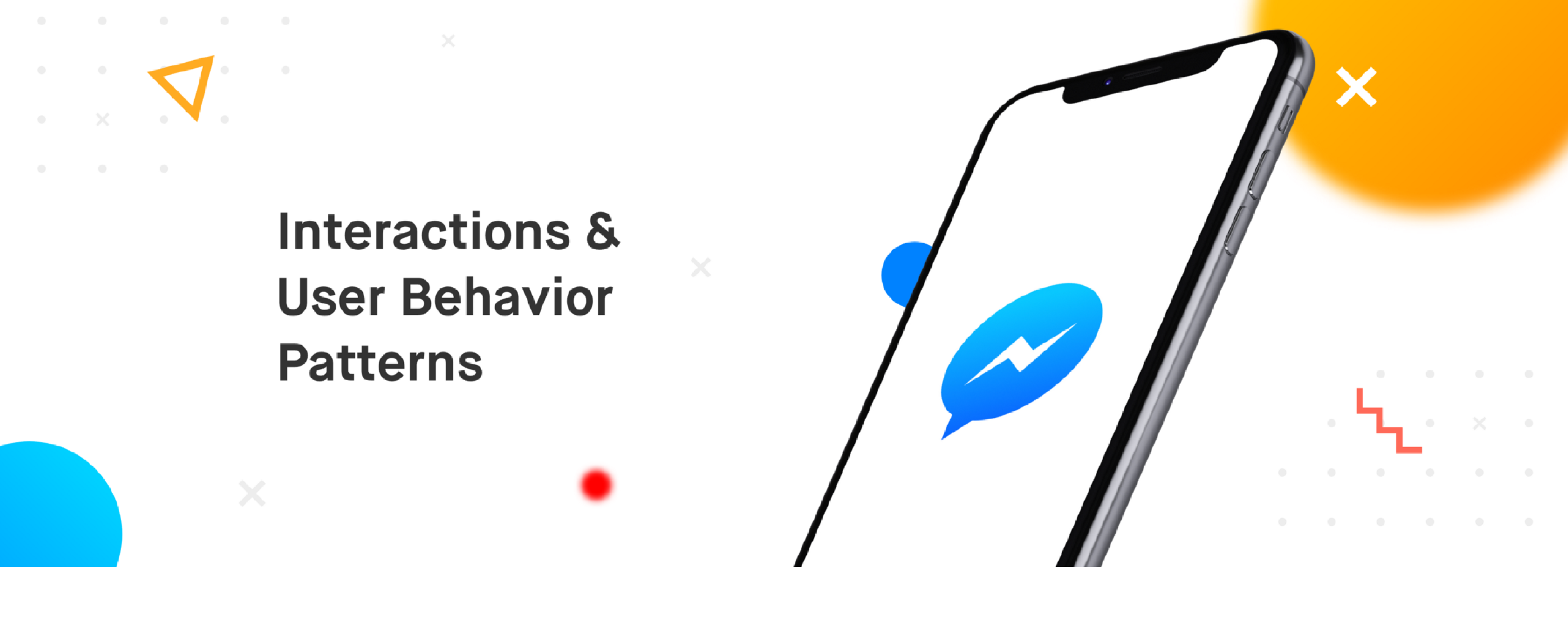
This article demonstrates the potential that interactions have in shaping behavior patterns. And in order to do that we’ll be looking at an interaction that Facebook Messenger rolled out a few months ago. It’s possible that you’ve already seen the interaction. If you haven’t, do a long press on any of your chats on Messenger. If you don’t want to go through the pain, here’s a video of it.
If you’re an Android user, you would expect the long press to reveal the actions you can take on the chat, and you’d be right to expect that. But you would see that these actions slide in from the right just like it would’ve if you did a swipe on the chat list item. Now, if you do a left swipe on it, and the same thing happens. In this piece, we’ll be breaking down interactions and talk about how Messenger has cleverly used it to shape their users’ behavior pattern.
But before we talk more about this, let’s see what interactions are made of.
Breaking down an interaction

Interaction Breakdown
An interaction can be considered to be made up of the following pieces
- User Action — The action that a user performs in order to interact with an element on an interface. In the case of smartphones, these actions are called gestures. Some examples are tap, long press, swipe, pinch, etc.
- Reaction — Reaction covers everything that happens on the interface as a result of the user action. This reaction could be limited to an element or could span over multiple elements of the interface. It could be around manipulating various properties such as shape, orientation, elevation, etc of one or multiple elements.
- Perception — The reaction of the interface builds a perception of how the elements on the interface behave against a certain action. This perception helps them make sense out of the interaction and understand how the product works building their mental models over time.
A lot of gibberish? Let me give you an example.
The video above shows the hamburger menu of Uber. The menu is accessed by a tap (user action) on the menu icon which slides the menu from the left edge of the screen (reaction), informing the user that the menu stays on the left of the screen (perception). That’s where the menu will come from every time we access it, and that’s where it will go back to when it’s dismissed. Interestingly, the way to dismiss this menu is with a left swipe, which most of us are used to subconsciously. But why is it that we do a left swipe on this to dismiss the menu, and not a right swipe, or any other action for that matter? You could easily blame habit here, but this habit was built over time where the reactions to our actions taught us how the hamburger menu functions.
Now, imagine if the hamburger menu came in from the left (just as it is today) but when dismissed, it slid out from the right of the screen. If that’s how hamburger menus behaved when they came out, we’d all be doing right swipes to dismiss it.
Every interaction creates a perception. These perceptions form mental models and the mental models shape behavior patterns.
It’s essential that we think about the perception when designing an interaction. Not just because it’s basic hygiene, but because being aware of these perceptions can help you break the barriers between your design and the user’s mental model.
Back to Messenger’s Long Press
Coming back to the topic, Messenger utilizes the reaction and perception of the interaction to shape their users’ behavior pattern in a really clever manner. On long press, the actions slide in from the right mimicking the reaction of the swipe gesture, building a perception that the actions are available just beside the chat item (outside the viewport). To anyone who is aware of the swipe interaction on smartphones, this reaction contributes to the learning that these actions can also be accessed via swipe.
While swipe has a very well defined reaction across apps, the long press doesn’t have a very standard reaction. In some apps, it would let you multi-select the items, whereas in some it would let you access actions on individual items via a bottom sheet or a dialog.
Tying long press to the reaction of the swipe interaction as a mean to educate the user about the existence of the swipe interaction serves as an incredible way to shape the user’s mental model. A huge round of applause to whoever in the team came up with this. It is undoubtedly one of the most clever interactions I’ve seen out there.
Why Swipe over Long Press?
Some of you might be wondering why Facebook is enforcing the swipe interaction over the long press. Well, according to the OS a user is used to, their behavior patterns differ. Long press is a fairly common interaction on Android, but it isn’t as common on iOS. The alternative to long press on iOS in a lot of cases is the swipe interaction.
Looking at it quantitatively, a swipe takes lesser time and effort than a long press, which qualitatively makes it feel a lot more fluid compared to long press. So maybe that’s why Messenger is pushing swipe over the long press. Maybe they plan to kill long press in the future and swipe remains the only way to access the actions. Well, let’s let the future educate us on that.
Conclusion
Behavior patterns are shaped by mental models, which are built on top of experiences. Though it’s not advisable to try and change a well-established mental model, every interaction the user has with your product is an opportunity to confirm or reshape it. Being aware of the perception our designs and interactions create is the key to crafting clever experiences which shape user behavior patterns in the desired manner.