
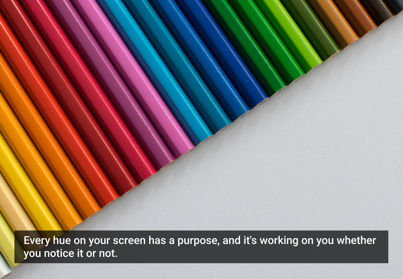
When I open an app or website, the first thing that catches my eye is usually the color, not the layout or typography.
Over time, I’ve realized that color isn’t just decoration. It’s psychology. It influences how users feel, think, and act inside a digital product. In my experience as a designer, I’ve seen how color can guide attention, build trust, and create lasting emotional connections that extend beyond the screen.
Why color psychology matters in design
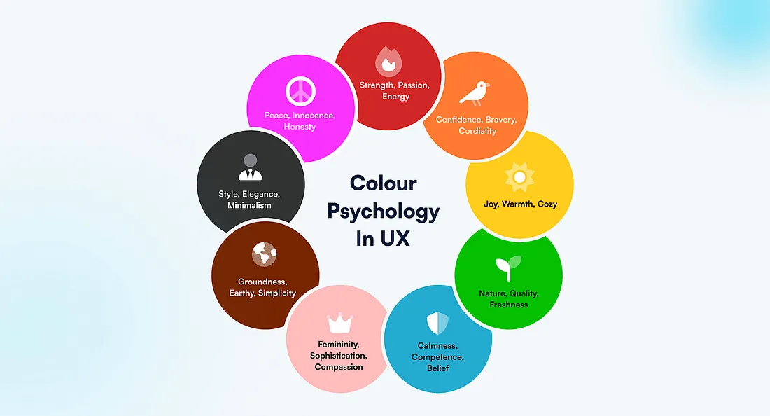
In UI/UX, every design choice should have a purpose, and color is no exception. Colors communicate meaning faster than words. They affect perception, mood, and even behavior.
From my perspective:
- Red creates urgency or excitement, great for call-to-action buttons.
- Blue builds trust and calmness, often used by financial or social media brands.
- Green represents success, growth, and safety.
- Yellow conveys warmth, optimism, and energy.
- Black communicates elegance and luxury.
- White provides clarity and simplicity.
When I choose colors thoughtfully, I notice users respond more naturally. The design feels easier to navigate and emotionally more engaging.
The emotional side of color
Each color triggers emotional and psychological responses, and these can vary by culture, context, and personal experience.
- A bright red might signal danger in one context but passion or celebration in another. In Chinese culture, red is regarded as a lucky color, symbolizing happiness, success, and good fortune.
- A soft blue might relax users in a meditation app, but feel too cold in a shopping app.
That’s why designers often validate their palettes through user research. Observing how people respond to colors ensures the interface feels natural and emotionally aligned with the product’s goals.
The role of color in branding
Another reason why color is so important in UX design is that colors communicate branding, which is the visual appearance and voice of a company. Colors play an important role in a company’s brand guidelines, just as typography does.
Color helps define a product’s visual identity, making it stand out among competitors. Think about some of the most globally recognized brands and the colors they feature in their products and logos:
- The yellow of McDonald’s arches feels cheerful and welcoming.
- The bold red of Coca-Cola feels energetic and exciting.
- Google uses four specific colors — blue, red, yellow, and green — consistently across its products, creating a distinct and instantly recognizable identity.
As a designer, I’ve realized that thoughtful use of brand colors helps users connect emotionally with a product, even before interacting with its features.
The 60–30–10 rule
A practical principle I often follow is the 60–30–10 rule — a timeless design guideline that helps create visual harmony and balance:
- 60%: Dominant color (usually background or primary interface area).
- 30%: Secondary color (supports and adds contrast).
- 10%: Accent color (for highlights, calls to action, or key elements).
This ratio ensures a cohesive look while keeping interfaces both engaging and visually calm. It’s an effective way to avoid color chaos and maintain hierarchy across screens.
Designing for color blindness and accessibility
Not all users perceive color the same way. Around 8% of men and 0.5% of women worldwide experience some form of color blindness. For these users, certain color combinations — like red and green, or blue and purple — can be difficult to distinguish.
As designers, it’s our responsibility to create interfaces that remain functional and inclusive for everyone.
Here’s how I approach it:
- Don’t rely on color alone to convey information; use text labels, icons, or patterns as secondary indicators.
- Check contrast ratios using accessibility tools to ensure readability.
- Test your designs with color-blind simulators to see how they appear under different vision conditions.
Inclusive color design not only improves accessibility but also makes products more professional and user-friendly.
Color is more than an aesthetic choice; it’s a psychological tool that shapes how users think, feel, and connect with digital products.
As a UI/UX designer, I’ve learned that mastering color psychology means understanding not only how colors look, but how they communicate emotion, culture, and brand. The next time you design an interface, think beyond the palette, think about the feeling.
I’m a UI/UX designer who believes every pixel has a purpose and that color is the heart of every great user experience.
The article originally appeared on Medium.
Featured image courtesy: Tanja Tepavac.


