Save
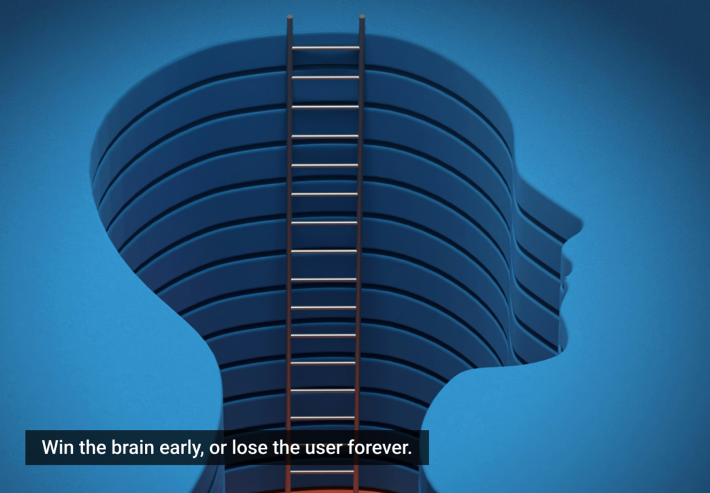
Introduction
Every tap, scroll, and click in a web app tells a story — not in words, but in intent. In the competitive digital ecosystem, businesses can no longer rely solely on surveys or assumptions about what users want. Instead, interaction data — the digital breadcrumbs left behind by real users — has become a vital lens for understanding audience behavior.
Consider how Netflix fine-tunes its recommendation interface. Every hover, pause, and scroll through a content row contributes to decisions about what shows to highlight or which thumbnails perform best. Similarly, Airbnb uses journey tracking to identify where users abandon booking flows, helping them streamline page layouts and increase conversion rates.
For marketers, these insights bridge two worlds: experience and persuasion. The same data that helps designers optimize a checkout button can help marketing teams understand which value propositions truly resonate. Tracking user interactions creates a continuous feedback loop — refining the user experience while amplifying marketing performance.
As we dig deeper, we’ll uncover how interaction tracking works, the tools that make it possible, and how businesses can turn analytics into smarter design and better engagement.
TL;DR: Tracking user interactions helps web app teams understand what users love, what frustrates them, and how to align UX with marketing goals. When done right, it transforms raw behavior data into design improvements, higher engagement, and measurable business growth.
Understanding user interactions: beyond clicks and scrolls
At first glance, user interactions seem simple — a click here, a scroll there, maybe a swipe on mobile. But each action represents a micro-decision, a tiny reflection of user intent. In modern web apps, these micro-decisions collectively shape the user journey and provide valuable data for both UX designers and digital marketers.
Take an e-commerce app like Amazon. Every interaction — from hovering over a product image to expanding a dropdown menu — reveals something about user curiosity or hesitation. Amazon’s recommendation engine uses these micro-interactions to predict buying intent and dynamically adjust product placements. What looks like a simple “You may also like” carousel is actually a product of billions of interaction signals, tuned to individual users.
In marketing terms, this is behavioral gold. Tracking interactions such as time on page, scroll depth, or repeat visits can uncover engagement patterns that reveal how effectively content or offers resonate. For example, HubSpot found that analyzing CTA click behavior helped them identify underperforming copy and redesign landing pages that improved conversion rates by over 20%.
From a UX perspective, understanding these patterns goes beyond aesthetic choices — it’s about empathy through data. A form that users partially fill and abandon tells you far more about frustration than a post-session survey ever could. Every friction point visible in analytics becomes an opportunity for optimization.
As web apps become more dynamic and personalized, user interactions now extend into areas like hover intent tracking, gesture recognition, and even voice interface commands. A product team tracking how long users hover over tooltips, for instance, can detect confusion or poor affordance in the interface.
In short, tracking interactions isn’t just about measurement — it’s about meaning. It transforms what might seem like noise into actionable insight. Once you start treating user behavior as data with a story to tell, you move from guessing what users need to knowing it.
The data pipeline: how modern web apps capture and process interaction logs
Tracking user interactions might sound like magic, but beneath the surface, it’s a blend of smart instrumentation, structured data, and analytical finesse. The goal is simple: capture every meaningful action without overwhelming your system or your team with noise.
Think of it like observing visitors in a store. You don’t just count how many walk in — you watch where they linger, what they touch, and which shelves they skip. In web apps, that observation happens through event tracking — tiny snippets of code that log user actions like clicks, page views, or form submissions.
Modern analytics tools make this process seamless. Google Analytics 4 (GA4), for instance, uses an event-based model that lets developers define custom events (like “product_viewed” or “add_to_cart”). This approach provides granular data beyond the traditional “page hit” metrics of older analytics versions. Similarly, Mixpanel and Amplitude specialize in event-driven insights, helping teams visualize user flows, retention patterns, and funnel drop-offs.
A practical case: Airbnb once used a mix of in-house logging and third-party analytics to track user drop-offs in its booking funnel. The data revealed that many users paused at the “guest details” page — a signal that the form design was too complex. A redesign based on this insight reduced abandonment by 15%, directly boosting bookings and revenue.
Another example lies with Canva, which uses FullStory to replay anonymized sessions. By visually seeing where users hesitate or backtrack, their design team identifies confusing UI elements faster than survey feedback ever could.
Behind the scenes, interaction data travels through a pipeline:
- Collection: Frontend scripts capture user actions as events.
- Processing: Events are structured, filtered, and sent to data warehouses like BigQuery or Snowflake.
- Visualization & Insight: BI tools and dashboards translate raw events into understandable metrics for designers and marketers.
For digital marketers, this pipeline bridges the gap between analytics and storytelling. Knowing how users behave inside your app helps tailor campaigns, test landing page hypotheses, and deliver content that meets actual intent.
The magic happens when UX and marketing data converge — when the “what” (user actions) aligns with the “why” (motivations). And that’s where the next step comes in: understanding how to map these behaviors into actionable insights that drive both design and growth.
Mapping the customer journey: turning behavior into insights
Tracking user interactions is valuable — but interpreting them as part of a customer journey is where the real intelligence lies. A single click means little in isolation. Yet when you connect that click to a sequence — discovery, engagement, conversion, and retention — you get a living map of how users experience your product.
Imagine an online fashion retailer like ASOS. They don’t just track purchases; they trace the entire narrative: users discovering items via social ads, browsing collections, adding to a wishlist, abandoning carts, and later returning through email reminders. This full-spectrum view, powered by interaction data, helps the company refine both UX and digital marketing. For instance, if many users drop off after viewing shipping details, it signals that cost transparency or layout might be a friction point.
Customer journey mapping begins by linking key interaction data points — page visits, button clicks, dwell time, search queries, or session reactivations. Modern analytics platforms like Hotjar, Mixpanel, and Amplitude visualize these behaviors through funnel analysis and journey flows. These visual maps show exactly where users succeed, stall, or leave.
A compelling real-world case is Spotify’s onboarding redesign. By tracking how new users navigated playlists and skipped tutorial prompts, Spotify identified a high drop-off rate in early sessions. They used these insights to simplify onboarding, reduce optional steps, and guide users faster toward personalized playlists — dramatically improving first-week retention.
For marketers, journey mapping translates behavioral insights into a targeted strategy. A user repeatedly hovering over a product image but never clicking “Buy” becomes a signal for remarketing or personalized recommendations. Similarly, tracking how users interact with pricing tables or blog CTAs helps content teams refine messaging to better align with user intent.
The beauty of this approach lies in pattern recognition. When thousands of user journeys overlap, you start seeing universal truths — what converts, what confuses, and what delights. This data-driven empathy forms the foundation of next-generation UX optimization.
Interaction tracking, therefore, isn’t just analytics; it’s narrative analysis. It’s about understanding the emotional rhythm behind user actions. Once a company starts thinking in terms of journeys rather than isolated metrics, product design and marketing strategy evolve from reactive to predictive.
Improving UX with data: from friction points to flow optimization
Once user interactions are tracked and journeys are mapped, the next step is turning that data into actionable design improvements. This is where behavioral insights meet creativity — transforming friction into flow.
Consider Netflix, which famously runs thousands of A/B tests every year. Each variation — whether it’s a thumbnail style, autoplay preview, or button position — is tested based on how users interact with it. Subtle changes driven by interaction data can increase viewing time by millions of hours collectively. What makes this powerful is that it’s not guesswork; it’s iteration guided by evidence.
In web apps, friction points are easy to miss but hard to ignore once revealed. Heatmap tools like Hotjar and Crazy Egg show where users click, scroll, or hesitate. For instance, Duolingo discovered through click heatmaps that users often tapped on locked lessons. Instead of ignoring that “mistake,” they redesigned the interface to better communicate progress and added teasers for upcoming lessons — boosting retention and motivation.
Even a small usability issue can have massive ripple effects. A form field mismatch (say, requiring phone numbers in a strict format) might frustrate users and cause a 5% drop in sign-ups — a loss that analytics alone won’t explain, but interaction tracking will. By recording rage clicks (rapid repeated clicks on the same spot) or abandoned forms, UX teams can identify and fix these silent pain points.
From a marketing perspective, improving UX through data enhances conversion efficiency — the ratio of visitors who take desired actions. A smoother experience means users move more naturally from awareness to purchase or engagement. For example, Shopify found that simplifying their onboarding forms, based on interaction analytics, led to a 12% rise in store creation completion rates.
Another key practice is journey-based optimization, where teams improve the user flow holistically. Instead of testing isolated buttons or colors, they refine entire segments — for example, the checkout process or content discovery loop. Interaction data tells them which sequence of actions converts best, and why.
Good UX design is empathetic; great UX design is empathy verified by data. The data doesn’t replace intuition — it validates it. It gives designers confidence to back creative choices with evidence, and marketers the precision to align campaigns with user behavior.
Every optimized click, hover, and scroll becomes a step closer to a product that feels effortless — a digital experience so intuitive that users hardly notice it’s been optimized for them at all.
Personalization power: using interaction data to tailor experiences
When web apps learn from user behavior, they stop being static products and start becoming living, adaptive ecosystems. Personalization — the ability to shape content, layout, and recommendations based on user interactions — is one of the most powerful outcomes of tracking behavioral data. It’s where data stops being passive and becomes predictive.
Take Amazon, for instance. Their recommendation system is a masterclass in behavioral personalization. Every click, search, and linger over a product image informs algorithms that suggest items you didn’t even know you wanted yet. Amazon’s personalization engine drives nearly 35% of its total sales, showing how finely tuned interaction tracking can become an engine for revenue.
Another example comes from Spotify. Every play, skip, and like feeds into models that personalize your “Discover Weekly” playlist. The service doesn’t just use your listening history; it observes how you interact — how long you linger on a song before skipping, or whether you replay it. That subtlety, powered by continuous interaction tracking, makes each user’s experience feel individually curated.
Web apps outside the entertainment space are also leveraging this. LinkedIn uses engagement data — which posts you comment on, which jobs you click — to tailor feed content and job recommendations. For marketers, this behavior-driven personalization improves targeting accuracy and ad relevance. Campaigns become smarter because they reflect what users actually do, not just what they say they want.
From a UX standpoint, personalization shortens the distance between user intent and fulfillment. Consider a SaaS platform like Notion. It tracks which templates users frequently duplicate or which tools they connect to (like Slack or Trello). This allows Notion to highlight relevant templates or integrations on the dashboard, creating a sense that the product anticipates the user’s next move.
The technical backbone here is event correlation — connecting multiple user actions to a single behavioral pattern. Tools like Segment, Mixpanel, and Amplitude can integrate with marketing automation systems to serve personalized content or feature suggestions in real time.
But personalization isn’t just about algorithms; it’s also about emotional relevance. When users feel understood, trust and loyalty follow. An interface that “remembers” a user’s preferences — preferred themes, saved filters, or last-viewed content — feels human. That subtle familiarity keeps users coming back.
Yet, this power must be handled responsibly. Hyper-personalization can quickly cross into the uncanny if users feel over-tracked or manipulated. That’s why transparency and ethical design principles are crucial — a topic we’ll explore next.
Privacy and trust: responsible tracking in the age of data regulation
Tracking user behavior comes with a paradox: the more you know about your users, the more you risk losing their trust. In the era of GDPR (General Data Protection Regulation) and CCPA (California Consumer Privacy Act), ethical data handling isn’t just a legal requirement — it’s a strategic advantage.
Users today are hyper-aware that their every click leaves a trace. While they appreciate personalization, they’re wary of being watched too closely. This tension means modern web apps must design tracking systems that are both insightful and respectful.
Let’s look at Apple, a company that has turned privacy into a brand differentiator. By allowing users to control app tracking transparency, Apple effectively repositioned privacy from a compliance issue to a feature. This approach won user loyalty while pressuring competitors to adopt clearer data policies.
Another instructive case is Spotify again — this time, in how it anonymizes behavioral data. The company uses aggregated trends, not personal identifiers, to improve UX. For instance, when optimizing playlist recommendations, Spotify tracks “session patterns” (how often people skip, pause, or replay), not individual user identities. This balance between personalization and privacy keeps the experience smart without crossing ethical lines.
From a marketing standpoint, transparent data usage can actually increase engagement. When users understand why data is being collected — say, to improve navigation or tailor recommendations — they’re more likely to consent. According to Deloitte, 79% of users are comfortable sharing data when they see a clear benefit and feel in control.
Technically, this balance is achieved through techniques like:
- Anonymization: Stripping personally identifiable information (PII) before storage.
- Event aggregation: Tracking behavior trends collectively rather than individually.
- Consent-based tracking: Giving users real choices about what’s logged, not hidden toggles.
- Privacy dashboards: Allowing users to view and manage their data footprint.
The future of UX analytics will be built on ethical transparency — designing for clarity, not concealment. When apps communicate openly (“We’re tracking your clicks to make navigation smoother”), it builds a loop of trust-driven engagement.
For digital marketers, this trust translates directly to brand value. A user who feels safe sharing data is a user who stays, converts, and advocates.
In short: ethical tracking isn’t a compliance checklist; it’s a user experience principle. Privacy by design is now a cornerstone of good UX — and the next section explores how teams can turn this ethical foundation into measurable business growth.
Closing the loop: turning insights into measurable growth
Collecting and analyzing interaction data is only half the story. The real impact comes when those insights are turned into measurable growth — higher retention, stronger engagement, and smarter marketing performance. This “closing the loop” is what separates data-rich companies from data-driven ones.
A prime example is Airbnb. The company’s design and growth teams work in unison, continuously feeding behavioral insights from their web app into product and marketing decisions. When data showed users were frequently pausing at the “Select Dates” step during booking, Airbnb redesigned the calendar interface for simplicity and faster load time. The result? A 12% increase in completed bookings. Each change was tested and validated through interaction tracking, creating a continuous improvement cycle.
Similarly, Shopify leverages event data from its merchant dashboards to identify where new users struggle during store setup. Their growth team found that merchants often stalled when asked to connect payment gateways. In response, Shopify introduced contextual guidance and tooltips — small UX changes that led to a 9% increase in store activation rates.
For marketers, this synergy is powerful. Every design improvement that enhances user flow also boosts conversion efficiency. If a checkout page becomes faster or a signup process becomes clearer, marketing campaigns immediately benefit from higher ROI without increasing ad spend. HubSpot exemplifies this approach by connecting UX data with CRM metrics — aligning user journey improvements directly with lead generation and retention.
To operationalize this, many modern teams adopt data-feedback loops:
- Track interactions through event logging tools (Mixpanel, GA4, Hotjar).
- Analyze pain points and run experiments (A/B tests, funnel analyses).
- Implement UX improvements and monitor the lift in conversions or engagement.
- Feed outcomes back into marketing and product strategy for continuous refinement.
Over time, this iterative cycle compounds results — the product becomes smoother, campaigns become more targeted, and the user base becomes more loyal.
In essence, interaction data creates a virtuous loop: Better data → better UX → better engagement → better business outcomes → better data again.
Notion’s steady growth offers a great example of this compounding effect. By tracking which features users frequently explore or abandon, Notion refined onboarding tutorials and content prompts. Engagement rose, feedback improved, and new product launches became more informed — each cycle reinforcing the next.
The lesson is clear: the bridge between user experience and business growth is built on behavioral understanding. Companies that learn from every click don’t just design better apps — they design better strategies.
Conclusion: the data-driven future of UX and marketing
User interaction data has quietly become the heartbeat of modern web apps. Every scroll, click, hover, and pause is a conversation between the user and the interface — and those conversations are rewriting how products evolve and how marketers connect with audiences.
The companies thriving in this era — Netflix, Airbnb, Spotify, Amazon, Notion, and Shopify — share one common philosophy: they listen to behavior, not assumptions. They treat every data point as feedback, every drop-off as an opportunity, and every successful flow as a validated hypothesis. The result is an ecosystem where UX design, digital marketing, and product strategy no longer operate in silos but in synchrony.
What makes interaction tracking transformative isn’t just the analytics — it’s the empathy embedded in it. When designers study heatmaps, marketers read engagement funnels, and developers refine event pipelines, they’re collectively asking, “What’s working for our users, and why?” That shared curiosity is what fuels long-term loyalty.
The future of UX and digital growth will be defined by adaptive intelligence — systems that learn in real time from user behavior while protecting privacy and autonomy. Ethical, anonymized, transparent data use will be the standard, not the exception. Apps that respect users’ trust while personalizing their journey will become the ones users return to, recommend, and champion.
In the end, tracking user interactions isn’t about surveillance — it’s about service. It’s the art and science of paying attention. When web apps learn from their users, they evolve into experiences that feel seamless, personal, and alive. That’s the true power of interacting data: it turns digital interfaces into living reflections of human intent.
References & further reading
- Spotify – How Spotify Uses Design to Make Personalization Features Delightful
- Spotify Engineering – How Spotify Uses ML to Create the Future of Personalization
- Amazon Science – The History of Amazon’s Recommendation Algorithm
- Baeldung – How Does the Amazon Recommendation System Work?
- Amplitude – Product Analytics Case Studies
- Mixpanel – Why Marketers Should Choose Mixpanel Over Google Analytics 4
- Flarelane – Choosing the Right Analytics Tool: Google Analytics, Amplitude, Mixpanel
- Google Analytics 4 – Official Documentation on Event Tracking
- Airbnb UX Case Study – Improving the Airbnb Experience with an Interactive Assistant
- Hotjar – Customer Case Studies: How Teams Use Hotjar to Improve UX
- Crazy Egg – Case Studies: How Crazy Egg Helps Improve Website Usability & Conversions
- Netflix Tech Blog – Learning a Personalized Homepage
- Netflix Tech Blog – Artwork Personalization at Netflix
- Netflix Tech Blog – Foundation Model for Personalized Recommendation
- Airbnb UX Case Study – Improving the Airbnb Experience with an Interactive Assistant
- UX Design Institute – Real-World UX Research Case Studies from Airbnb, Google & Spotify
- HubSpot UX Transformation Case Study – NeoInteraction
- VWO – How Netflix & Amazon Approach Personalization
- UXCam – User Behavior Analytics Examples and Case Studies
- Userpilot – Tracking User Activity in Web Applications
- Contentsquare – 5 Behavior Analytics Use Cases That Work
- WowMakers – What is Behavioral Analytics? How to Use it for a Better UX?
- Target Internet – A Marketer’s Guide to Good User Experience (UX)
- Microsoft Advertising – The Future of Digital Marketing (Whitepaper)
- UXMatters – Strategies to Improve User Retention Through Behavioral Analytics
- ResearchGate – User Activity Tracking for Website Usability Evaluation
- Chameleon – How to Leverage Behavioral Analytics to Optimize UX
The article originally appeared on LinkedIn.
Featured image courtesy: Deng Xiang.


Srikanth R
Srikanth is a Software Development Engineer at Six30labs, specializing in MERN stack development. An engineering graduate with an MBA in Human Resources and Marketing, he combines strong technical expertise with strategic business insight. His work focuses on building scalable, efficient web applications that align technology with organizational goals.
- The article explains how interaction data like clicks, scrolls, and session patterns reveals real user behavior beyond basic analytics.
- It shows how tools such as heatmaps and session replays turn this data into actionable insights that improve UX and product decisions.
- The piece emphasizes using behavioral insights responsibly, balancing optimization with user privacy and ethical data practices.