Save

To meet expanding needs, designers turn to design systems to streamline design with the hopes of providing value at lower cost and effort. In essence, a design system is a complete set of standards intended to handle design at scale using reusable components and patterns.
The components have been standardized through use over time and picked at the point when they became common knowledge.
Design systems are the rationalist approach to design where functional performance is the guiding principle. The sweet spot between what is viable, feasible and economically sound.
At the moment its seems that everyone (myself included) is pointing to the many benefits of the design system. Replicating with speed at scale. Reduced lead times. Creating a unified language across cross-functional teams. Visual consistency across products, channels and departments. Faster onboarding times and higher turnover. A blissful prophecy to answer all design problems.
But are there no dangers involved? Have design systems never been tried before? Why is everyone rushing to create their own design system if they aim to solve the same problems?
The idea of design systems might still be new to some but fairly established in Ui design for some years now. But the idea of design systems is much older. The idea of a systemized approach to design can be found throughout history.
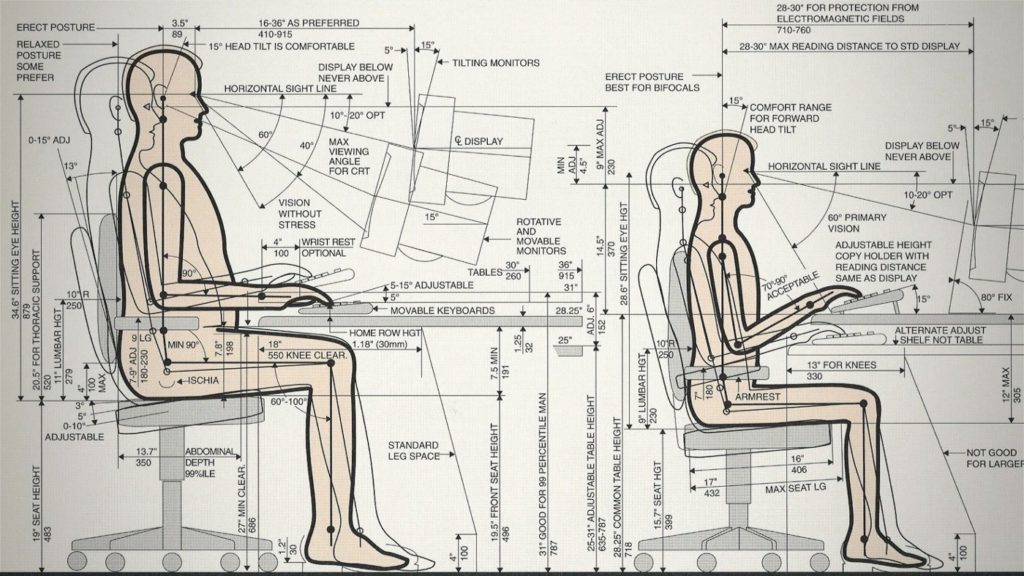
American industrial designer Henry Dreyfuss developed the handbook called “The measurement of man and woman”. A blueprint for the average American male and female was used as a standard guiding principle in his and others designs. While designing for the masses it’s impossible to consider each individual but we still need to consider the people when we design products for them. The most efficient way for Dreyfuss was to calculate the average body type and use this as a starting guiding point.
French/Swiss Architect Le Corbusier developed a similar system called Modulor as a tool for Architects. Based on his measurements of historical buildings, Fibonacci numbers and the golden ratio the Modolur system was an attempt to discover the mathematical proportions of the human body and use this knowledge to improve the function and aesthetics of buildings.
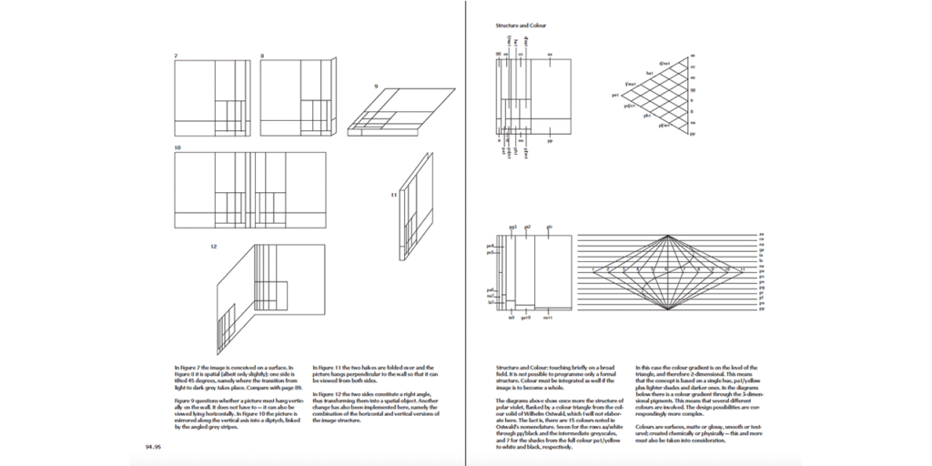
InDesigning Programmes, German visual designer Karl Gerstner depicts the mathematical system at play in visual design and how to utilize it to create ornamental designs that feel like they belong together.
All systematic principles for ensuring good design outcomes.
Design Principles that are based on mathematical insights and human knowledge have been around for centuries. Ui design seems to follow the same pattern when a domain of design reaches a certain level of maturity we try to apply a systematic approach to it.
Why?
The benefit of reproducing satisfactory results with low risk at higher speeds and volumes is hard to argue with. In the 1920s Henry Ford realized the same thing and the introduction of the moving assembly line into the automotive industry was the result. Automating aspects of production where possible. Creating a systematic 84 step process for assembling a model T car in one hour and 33 minutes. A car designed for “the great multitude”. However one of Fords most famous quotes about the Model T was,
“Any customer can have a car painted any colour that he wants, so long as it is black.”

Around the same time, Le Corbusier presented his concept of the radiant city. An urban design project in the city centre of Paris. This was a fully asymmetrical masterplan consisting of 24 cruciform skyscrapers. The buildings would stand 200m tall and would house businesses and hotels. The purpose was to improve the communication network and access to sunlight and green areas while reducing urban traffic. Le Corbusier was criticized for his vision and blamed for having extreme rationalists views.
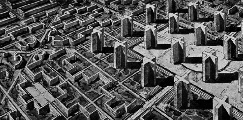
Besides the lack of consideration for people in his design, a controversial aspect of it was its construction would involve demolishing most of the city centre of Paris. Wiping out a large portion of the city’s architectural history.
Le Corbusier never got a chance to build a city but his ideas about a rational new order based on efficiency and mobility inspired others. Large parts of New York and Dallas were demolished during the 50s and 60s to make way for multilane highways and multistory housing projects.
In Sweden, the government granted loans to build housing for 100000 people per year during the period 1965–1975. The project became known as “Miljonpogrammet” (The million programme). The goals were to reduce the overcrowding and housing shortage at the time. But also to increase the standard of living. The solution to handle an artifactual challenge at this scale was to apply a rationalist approach enforcing auto mobilisation, hard city planning and functionalism. The house design was broken down into components and patterns so production could be systemized. Houses were not built anymore, they were assembled.
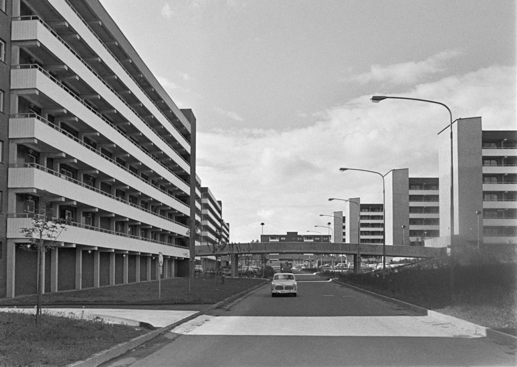
The city planning effort in New York, Dallas and Sweden was first considered successes. But then something strange happened, people would leave these places if they could afford to do so. Leaving people with less economical resources behind creating socio-economical segregation. In Sweden, the design was to blame. The use of concrete and modular building systems together with a functionalistic outdoor environment created a drab architecture that where consider unattractive to live in.
Traffic engineering for a long time was based on the same functionalistic and systematic paradigm. A social theory inspired by logic where the increased need for transportation networks was solved by motor highways. If the need increased, the solution was to add more lanes. Similar to how we address increased user needs in today’s design systems by designing and adding new components to address them.
In regards to solving increased traffic network needs, the german mathematician Dietrich Braess found that adding more roads does not solve the problem. On the contrary, he found it actually slows down traffic. The problem was that traffic engineers only measured cars, not drivers. They never accounted for independent human decisions.

The problem with any system is that it can only account for what is known, never the unknown. If a system has been introduced and a problem arises, we tend to look to the system for a solution. Based on the system we try to find the next logical step to improve and solve. But sometimes new problems fall outside of the capabilities of a system.
The problem with systems is that once introduced and proven successful it is hard to change them and even hard to get rid of.
Even if modern Ui design is user-centric the user is still treated as a quantifiable variable. The solution that covers the most ground is the one most likely to be implemented. But as history has shown us, this does run the risk of homogenising personal preferences. Or even worse, alienating large groups of people.
This is not a critique of design systems but a personal reflection where we have not yet seen the full consequences of its implementation in Ui design.
But maybe a note of caution might be fair. Users are still people, with individual needs, wishes and wants. As soon as we stop treating them as such, we run the risk of losing them.
Looking at the design system rhetoric surroundings, I can help to feel that the discourse starting to sound like a self-fulfilling prophecy. I believe in the many benefits that a design system can offer. But I have very little proof to support these expectations. The value outcome of the design is rarely measured by quantifiable means. As a designer, we can point to others holding the same belief (Industry standards) or perceived benefits by the users etc. There is a good reason for believing but they are not hard facts. It might be true that the use of a design system might increase the speed of development and time if you use an existing one. Developing your design system from scratch will do the opposite. But why would you want to develop your own system?
Why would anyone want a car in any other colour than black?
Because as designers of different products we cater to different users and customers which should be reflected in the system. But this puts us in a dangerous place where we defend the design systems and in attempts to ensure its position we might end up making choices that benefit the system and not the user.
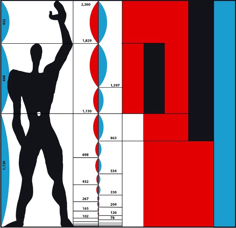
Le Corbusier disregarded the female body when he developed his Modulor as he believed the female body had less harmonious measurements. He later also change the standard height in his system from 175 cm (Based on the french male average height to the time) to 1.83 cm inspired by detective novels where the handsome main characters were often described in this height. The height also coincide with six feet which made for a more attractive number rather than 5’8.9 feet (175 cm) when translating the Modulor system into the imperial system.
Dreyfus did however include the female in his system and it stands as a comprehensive guide for considering a multitude of body shapes and sizes. Many of these principles have shaped the products used today e.g. everything in an office environment from desks, chairs, computers, keyboards and more to find the optimal seated working position. The problem is that working seated at a desk for prolonged periods is very bad for people.
The ideas behind design systems are based on system thinking which assumes that a whole can not be fully explained in terms of its parts and that the whole can not be understood without reference to its environment. This sounds good and in line with most notions of UX design. But when we apply system thinking to Ui and create design systems we have already reduced the world to problems that can be solved by Ui. This creates a state where it is easy to fall back into reductionistic thinking. Reductionist thinking tends to drive design towards a closed systems view of the context. As in the case of desk work and the human body, aspects are explained as individual and isolated events. The perfect position for the hands, optimal viewing angles for the eye, optimal chair angle for back support etc.
This shows that the system and the context are separate, deterministic and predictable. This treats the causal relationship between different elements as linear. The position of the hands affect our posture and our posture affects our view angle and so on. Such an approach tend to promote a process where results and performance is tracked on an operational level rather than on a broader system level. Thus making it easy to lose sight of “the bigger picture”.
Over-reliance on a design system can create an imaginary environment
in which individuals believe that prediction and control are the usable approaches to deal with complex design problems.
To implement the system we use a variety of tools and frameworks to ensure the success of the design. But if all such things fail they there is a tendency to fall back on reductionist explanations to explain the causes of system failure. Often in terms of personal failure, resistance to change etc. Rarely do we blame the design system. Having a design system enables one to exercise control over the design processes. But controlled environments and processes tend to act against innovation.
Here lies my dilemma with design systems. If done successfully, design systems solve a lot of design headaches. But I have this lingering fear that once implemented successfully, we change the perception of the value of design. The design system encourages fragmentation and isolation of design problems with clear answers, constraints, feedback loops in linear stages. This makes us smart at the micro-level but at the same time, it allows us to be stupid on the macro level.

If we have design systems that seem to provide good solutions to problems when presented, we tend to try to solve them within that domain. Past design systems were mainly developed to guide industrial design. Today’s design systems mainly focus on Ui design. We have become love drunk with screen-based technology as the solution for most problems. There is an app for all needs and it seems that we have also fallen in love with systems that ensure their optimal creation. So much in love that we are all rushing off to build our comprehensive model of what a design system should be.
But as Golden Krishna has pointed out when he coined the phrase “The best interface is no interface” just because you have a solution for a problem, it does not mean that it’s the right solution.
Just because there is a system for optimizing the creation of a Ui does not imply that a Ui is needed. In the same way, a system for designing the optimal seated working position does not imply that a seated working position is good.
So do I think design systems are wrong and bound to fail?
No, I still believe in their power to communicate and guide the intricate parts that form a complex whole that is the goal of certain types of design.
I just don’t believe it’s the one ring that should rule us all and a healthy dose of critical reflections should always be applied when dealing with design systems. Connected screen-based technologies have become communication highways. So let’s make sure that the systems we rely on makes room for and includes all individuals.
Because who knows, the best design system might be no system at all.
Tony Olsson
Designer of digital things and experiences
- The idea of design systems might still be new to some but fairly established in UI design for some years now while the idea of a systemized approach to design can be found throughout history.
- Tony Olsson, Lead Product Designer at Axis Communications, makes you question the capabilities of a system by recollecting past history events.
- The ideas behind design systems are based on system thinking which assumes that a whole can not be fully explained in terms of its parts and can not be understood without reference to its environment.
- The design system encourages fragmentation and isolation of design problems with clear answers, constraints, feedback loops in linear stages.


