The aesthetic-usability effect describes a phenomenon in which people perceive more-aesthetic designs as easier to use than less-aesthetic designs.
The effect has been observed in several experiments and has significant implications regarding the acceptance, use, and performance of a design.
Researchers Masaaki Kurosu and Kaori Kashimura from the Hitachi Design Center first studied this effect in 1995. They tested 26 variations of an ATM UI, asking the 252 study participants to rate each design on ease of use, as well as aesthetic appeal.
They found a stronger correlation between the participants’ ratings of aesthetic appeal and perceived ease of use than the correlation between their ratings of aesthetic appeal and actual ease of use.
It was concluded that users are strongly influenced by the aesthetics of any given interface, even when they try to evaluate the underlying functionality of the system. In his book Emotional Design, Don Norman explores this concept in-depth as it applies to everyday objects.
Aesthetic designs, in general, look easier to use and have a higher probability of being used, whether or not they actually are easier to use. Whereas, more usable but less-aesthetic designs may suffer a lack of acceptance that renders issues of usability debates.
Apart from having a great UX, it is equally important to have great UI and Visual Design.
These perceptions bias users’ subsequent interactions with the product and are usually resistant to change. Studies show that early impressions of a product influence long-term attitudes about their quality and use.
A similar phenomenon is well documented with regard to human attractiveness — first impressions of people influence attitude formation and measurably affect how people are perceived and treated.
There is a reason why dating apps work. No matter what people say, first impressions do make an impact. People do judge a book by its cover.
Aesthetics also play an important role in the way a design is used. Aesthetic designs are more effective at fostering positive attitudes than unaesthetic designs and make people more tolerant of design problems.
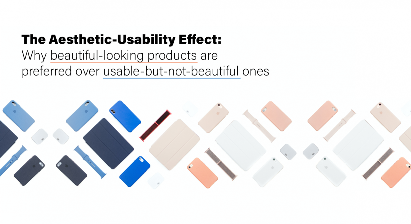
Consider Apple products. iTunes, iMovie, and even the iPhone aren’t devoid of usability flaws. But we are more tolerant towards them, considerably more than what we would be towards any other less well-designed piece of equipment.
Also, it is common for people to develop feelings toward designs that have fostered positive attitudes, and rare for people to do the same with designs that have fostered negative attitudes.
Moreover, such personal and positive relationships with a design evoke feelings of affection, loyalty, and patience — all significant factors in the long-term usability and overall success of a design.
For example, a lot of people have a strong affection for their cars. Some go as far as to name their cars and treat them like pets. They love their pets as their children, even if they have one or two flaws.
These positive relationships also have implications for how effectively people interact with designs. Positive relationships with a design result in an interaction that helps catalyze creative thinking and problem-solving. The product is treated like a friend or a companion.
On the contrary, negative relationships result in an interaction that narrows thinking and stifles creativity. This is especially important in stressful environments since stress increases fatigue and reduces cognitive performance.
If your cab booking app doesn’t look very cool in the first place and makes the blunder of mistakenly crashing at a crucial time when the user is in a hurry, it will surely face the full wrath of the user, compared to a sleek and polished app.
In such situations, there is a good chance that people might start hating the product for no apparent reason or fault of its own. Aesthetics play a very important role here. Good looks help prevent this to a great level.

Braun puts a lot of aesthetic value in their products
But, bear in mind that the aesthetic-usability effect has its limits as well. A pretty design can make users more forgiving of minor usability problems, but not of larger ones. (As the first law of e-commerce states, if the user can’t find the product, the user can’t buy the product. Even great-looking sites will have no revenue if they suffer from poor findability.)
Form and function should work together. When interfaces suffer from severe usability issues, or when usability is sacrificed for aesthetics, users tend to lose patience. On the web, people are very quick to leave. On the phone, they are quick to delete.
Aesthetically pleasing interfaces are worth the investment, especially when you already have a competitor in the market. Visual designs that appeal to users have the side effects of making your site appear orderly, well designed, and professional. Users are more likely to want to try a visually appealing product, and they’re more patient with minor issues.
However, this effect is at its strongest when the aesthetics serve to support and enhance the content and functionality of the product. Visual Design is always preceded by good UX and Product Design.

Aesthetic designs make people more tolerant of design problems