Save

Nearly all tech companies focus on generating active users and driving consumption. Constant interaction with an app (or another digital service) is seen as an indicator of success, rather than helping users to fulfill their goals according to their values. Our love-and-hate relationship with our digital devices shows clearly that we all know that things are wrong. While our well-being and freedom depend heavily on how autonomous we are in navigating a world full of options.
Many ways exist in which our ability to choose freely is being undermined in the digital, be it through automation, filter bubbles and recommendation engines, forced opt-ins for data collection and monitoring, habit promotion, paternalism with nudging, and unfavorable default settings – the list is long. All of these reduce our options and limit our freedom. And in most cases, the economic interests of providers are not in line with our personal goals and values. But there is another way.
Design for Human Autonomy puts people at the center
To solve these problems, we need to start at the app development stage. We should follow the principles of responsible, humane, and ethical design, with a special focus on what I call “Design for Human Autonomy”. This involves respecting human needs such as autonomy and individual values as well as our interconnectedness. Apps, services, and institutions (all called apps here for simplicity reasons) designed according to this approach meet three conditions:
1. The individual and the interaction between people over the interaction with the app
2. Users are empowered to largely manage without the app itself in the end
3. The values built into the app are transparent – and the values and goals of the users are respected
That can look as follows:
1. The individual and the human interaction
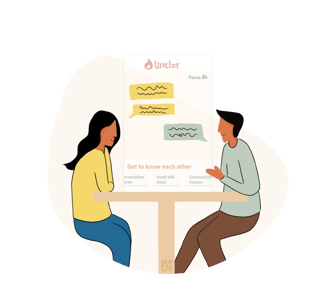
Social media and dating apps offer a good example of the first condition. Tinder and Bumble offer the possibility to get in touch with countless people in a quick and easy way. As a result, users quickly feel a sense of choice and are overwhelmed. Consequently, many users are caught in an endless loop, looking for better and better matches. There are many studies that prove that people tend not to make a choice when they have too many options. This phenomenon is not unknown to app makers, they use this insight to get us to buy subscriptions.
One suggestion for improvement: once you’ve received your first few matches, the app doesn’t offer more people to choose from the next time you launch it, but instead shows the chat option to get started. A small change from the default setting puts the focus on connecting and sharing, with a potentially big impact. In addition, these apps could offer tips and courses on topics such as small talk and communication – and thus expand their revenue streams. To do so, providers would need to broaden their focus – away from the goal of “connecting with countless people quickly and easily” to “deepening the quality of relationships.”
Facebook, too, could help us truly connect with people by not enticing us to scroll and consume when we feel alone, but then connecting us directly with our closest friends. This puts the individual and the connectedness – the interaction between people – first, and not the use of apps and technologies themselves. Many companies and software developers are already familiar with this principle, the agile manifesto’s first key value puts people over the tools—for good reasons.
2. Empower users to get by without the app
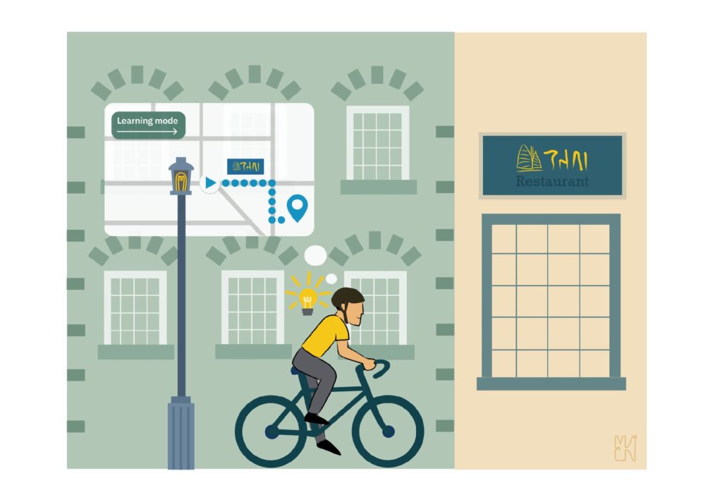
An example of the second point would be an alternative mode for navigation apps. For many people, Google and Apple Maps make it quicker and easier to find their destination. However, one (undesirable) side effect, in addition to data collection and monitoring, is that we still use the navigation app even on routes that we already know. Who doesn’t know this effect? After using an app several times, we now feel better and safer with its assistance and start to doubt ourselves when we don’t have digital guidance. Thus, the digital crutch becomes a part of ourselves.
How much better would a navigation app be that indirectly guides us to find the route better on our own? For example, by means of a learning mode in which we slowly get to know our surroundings and the route better – and the app and digital support slip further and further into the background during this process. This approach could also be applied to AI and chat systems like ChatGPT, which could empower users by providing them with access to educational materials or using a learning mode to help them become more self-sufficient. By empowering users in this way, these systems can promote autonomy and critical thinking, rather than undermining these qualities. This requires the courage of the providers to empower the users in such a way that they can ultimately do without the app and the device to a considerable extent.
3. Respecting the values of the users with their own transparent values
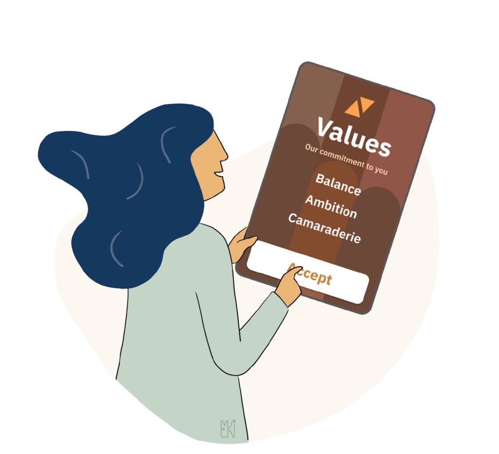
Not everyone pursues the same goals and values. What means autonomy for some may be a restriction for others. But how do we determine what suits us best? App providers must consider their own values and those of their users and then implement them consistently during development (concepts such as value-sensitive design or design for values offer a good start) and make these values transparent. In this way, users can see which values and behaviors an app promotes—what kind of person it makes of them.
Instead of just catering to short-term needs, app features could become evidence of the app maker’s values, norms, and principles that users can use to achieve their goals. For example, instead of using annoying banners to force users to agree to cookies and terms and conditions, a banner at the beginning could inform about the commitment of the values the company and its app hold towards the user. Active communication of these values promotes transparency and trust among users. Market research companies such as Gartner and Forrester see gaining and retaining the trust of consumers as an important strategy for companies today.
Conclusion: win-win-win
In this context, design for human autonomy would be a win-win-win for the individual, society, and the company because the individual better achieves his or her goals, the interactions strengthen society and the trust gained and new services bring in further revenue.
Alexander is a psychologist and technologist, product consultant at the international IT consultancy firm Thoughtworks, and editor of the “Responsible Tech Playbook". His pioneering work on humane tech was taken over by Google and Apple, highlighted by TIME, commented on DIE ZEIT, and exhibited in the Futurium.
- The majority of tech companies concentrate on attracting active users and increasing consumption. Additionally, their economic incentives conflict with our own values and aspirations as users.
- According to the author, we should adhere to the rules of responsible, ethical, and humane design referred to as Design for Human Autonomy.
- There are 3 conditions to design for human autonomy:
- The user and their interactions with others should be prioritized over their use of the digital service;
- In the end, consumers are encouraged to navigate mainly without the software itself;
- The app’s values are transparent, and it respects the users’ values and objectives.


