Flag

We stand with Ukraine and our team members from Ukraine. Here are ways you can help

Get exclusive access to thought-provoking articles, bonus podcast content, and cutting-edge whitepapers. Become a member of the UX Magazine community today!

Home ›› Design ›› Oversoaped in Los Angeles #wtfUX

Oversoaped in Los Angeles #wtfUX

by Josh Tyson
1 min read
Share this post on
Tweet
Share
Post
Share
Email
Print

Save

A confusing real-life interface at Los Angeles International Airport leaves an interaction designer with too much soap on his hands.

Bad design decisions don’t just effect our experiences with digital products. There are plenty of poorly conceived products in the world of flesh and blood and brick and mortar waiting to derail your flow.

A sink in the men’s restroom at Los Angeles International Airport (LAX) recently reminded Kane Albarron of this. The Interaction Design Lead at Fjord in New York City got more soap than he anticipated thanks to a confusing real-life interface.

“At first glance, it appears as if you have two options for dispensing water: by sensor or by push button, as indicated on the labels,” Albarron says. “What is actually happening here is that the push dispenses soap, and the sensor dispenses water. To further complicate things, soap pumps are also available above the sink.

LAX bathroom wtfUX

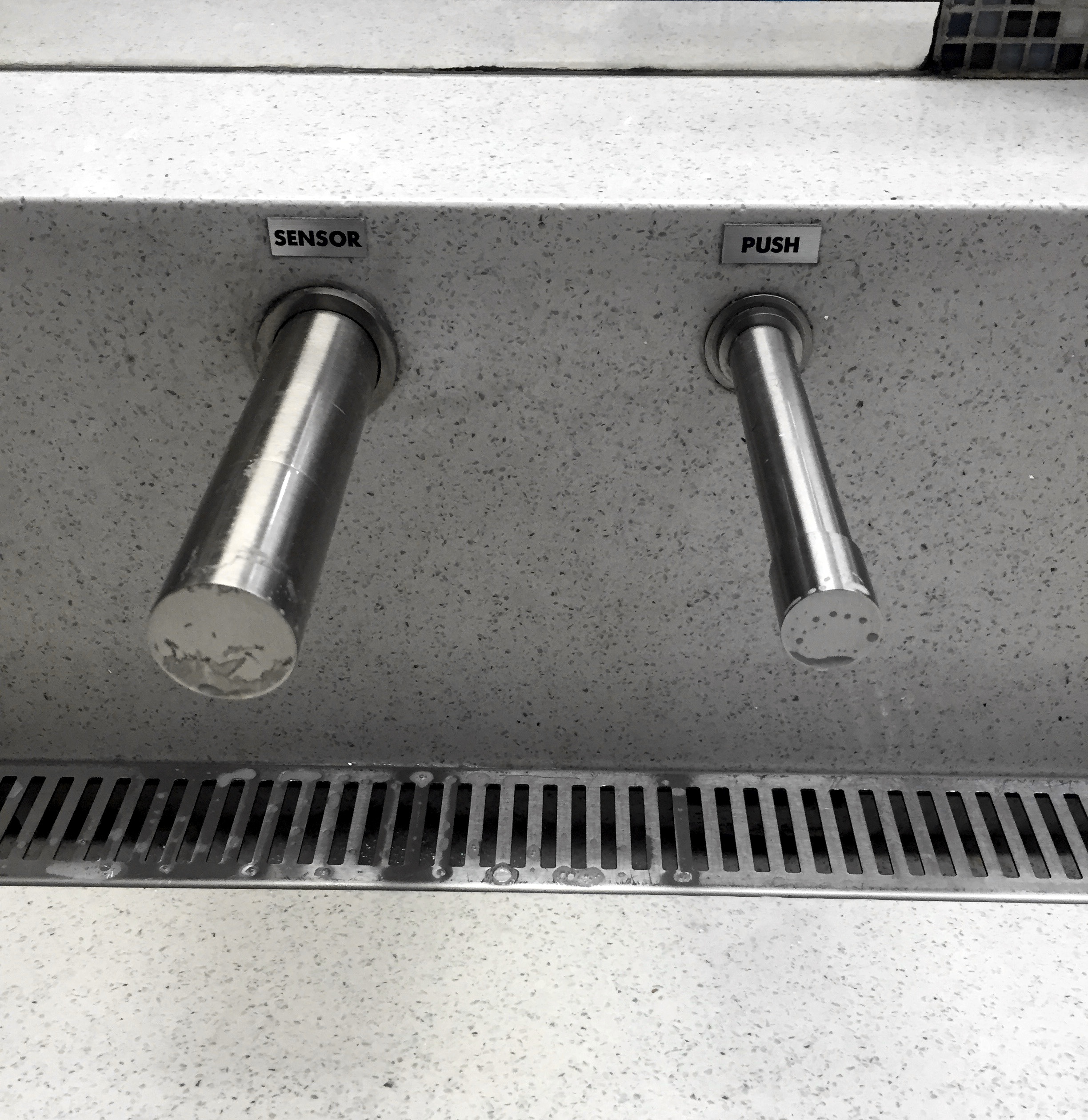
“I thought this was interesting, seeing as how someone actually spent time and money making little plaques that indicate the action instead of the contents. It was a real WTF moment for me when I went to rinse off my soap with more soap.”


Keep these coming. Send them to us via Twitter or Facebook using the hastag #wtfUX or email them to: [email protected] with “#wtfUX” in the subject line. Include as much context as you can, so we get a full understanding of what the f%*k went wrong.

post authorJosh Tyson

Josh Tyson
Josh Tyson is the co-author of the first bestselling book about conversational AI, Age of Invisible Machines. He is also the Director of Creative Content at OneReach.ai and co-host of both the Invisible Machines and N9K podcasts. His writing has appeared in numerous publications over the years, including Chicago Reader, Fast Company, FLAUNT, The New York Times, Observer, SLAP, Stop Smiling, Thrasher, and Westword. 

Tweet
Share
Post
Share
Email
Print

Related Articles

How can thoughtful workspace design transform collaboration and creativity? Discover how a human-centered approach reimagined 21,940 square feet into a flexible, inspiring environment that employees love.

Article by Aalap Doshi
Rethink Space: Designing a Human-Centered Workspace that Supports Flexibility, Collaboration, Privacy, Innovation, Creativity, and Transparency
  • The article explores how human-centered workspace design can improve collaboration, flexibility, and creativity by addressing employee needs.
  • It highlights solutions like open zones, quiet spaces, and pod-like configurations, showing how these changes boosted teamwork and morale.
  • The piece emphasizes the value of co-creation, adaptability, and clear communication in rethinking office spaces.
Share:Rethink Space: Designing a Human-Centered Workspace that Supports Flexibility, Collaboration, Privacy, Innovation, Creativity, and Transparency
7 min read

Why do designers grumble at the mere mention of PowerPoint? Discover smart strategies that turn frustration into creative solutions.

Article by Jim Gulsen
Why Designers Hate PowerPoint (and How to Fix It)
  • The article examines why PowerPoint often frustrates designers, from its limited design capabilities to inefficient workflows, and explores opportunities to bridge those gaps.
  • It highlights strategies like building systematic design elements, creating templates, and augmenting slides with other design tools.
  • The piece underscores the importance of collaboration, simplicity, and proactive planning to elevate design and streamline workflows.
  • It highlights practical methods to help designers balance quality and speed for presentations that are both functional and visually engaging.
Share:Why Designers Hate PowerPoint (and How to Fix It)
4 min read

Struggling with PowerPoint’s design limitations? This step-by-step guide shows you how to build systematic design solutions, from mastering slide layouts to using sticker sheets for patterns. Learn to create polished, professional presentations with smart workarounds and helpful tips.

Article by Jim Gulsen
A Step-by-Step Guide to Creating a “Design System” in PowerPoint
  • The article gives a step-by-step guide to building systematic patterns in PowerPoint. It talks about the program’s limitations and gives essential tips like mastering slide layouts and customizing text settings.
  • It suggests using PowerPoint’s automated features carefully and advocating for manual workarounds to elevate quality.
  • The piece introduces creating sticker sheets for reusable design components and highlights strategies for successful workflows.
Share:A Step-by-Step Guide to Creating a “Design System” in PowerPoint
5 min read

Join the UX Magazine community!

Stay informed with exclusive content on the intersection of UX, AI agents, and agentic automation—essential reading for future-focused professionals.

Hello!

You're officially a member of the UX Magazine Community.
We're excited to have you with us!

Thank you!

To begin viewing member content, please verify your email.

Tell us about you. Enroll in the course.

    This website uses cookies to ensure you get the best experience on our website. Check our privacy policy and