It should be no surprise to any contemporary UX Designer that a flat, minimalist design trend has emerged over the past few years. Companies such as Apple, Microsoft, and Twitter have all taken advantage of this emerging style in designing their digital products.
A flat design and a minimalist approach go hand in hand. Flat design eliminates the appearance of depth by avoiding gradient and shading (techniques used to create the appearance of realistic dimension) and favoring one-dimensional geometry. Minimalist design buoys this effect by eschewing unnecessary features and content in favor of a clean, sleek, monochromatic approach. Together, the two approaches advocate rejecting excess and ornamentation, instead honoring clarity and legibility.
Yet despite the effort of both practices to make a UI interface as simple as possible, the intersection of flat design with minimalist design has created usability issues for users. Oversimplifying features on a page has ironically made it more difficult for users to ascertain where they can click and why they are clicking there.
In an article published by Nielsen Norman Group entitled “Long-Term Exposure to Flat Design: How the Trend Slowly Decreases User Efficiency,” author Kate Meyer outlines how, prior to flat design, strong signifiers for “clickability” such as shadows or raised buttons helped indicate to users the function of features on a page. But with flat design, these traditional signifiers have disappeared, making it increasingly complicated to identify what is a background skin and what is a button. While flat design attempts to make an interaction more seamless, the elimination of depth to integral page features has obfuscated the function of these features as well.
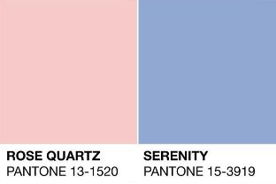
Thankfully, a third trend has emerged amongst the minimalist and flat design trends: muted colors. Muted, subdued colors have seen some celebrity in recent years. Look no further than Pantone’s colors of the year (Serenity and Rose Quartz) for evidence of the growing popularity of colors that are less harsh and more calming.

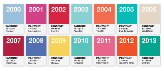
In fact, if we observe Pantone’s chosen colors from the year 2000 onward, we see an exponential increase towards a more muted tone.
The reason for this shift is as obvious as the conflict with flat design – muted colors allow designers to create depth within a page without breaking the rules of minimalist flat design. A muted blue on top of a deeper muted blue is easy on a user’s eye and can evoke a kind of hierarchy that indicates page depth without relying on shading
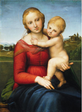
For cues as to how this trick of the eye works, we can look to paintings of the early Renaissance. The folds of the Madonna’s dress in Raphael’s “The Small Cowper Madonna,” for example, demonstrate how with color alone depth and texture can be created.
In contrast to this technique is chiaroscuro, a technique that used light and dark to create form and which can be seen in later Renaissance paintings such as Leonardo da Vinci’s “Mona Lisa.” These later paintings are more similar to skeuomorphism, flat design’s predecessor that relies upon gradient and shading. As with most trends in life, history repeats itself, and the evolution of color in user experience design is no different.
The re-popularizaiton of muted colors in web design has had an undeniable influence on various aspects of society such as advertising, fashion, and music. We can use the recent branding campaigns by companies such as Casper and Thinx as examples.
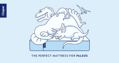
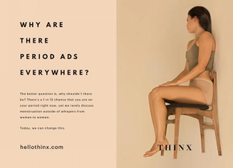
Both companies have utilized muted colors in their print advertising. But in a print campaign, there is no need for a flat effect or minimalist design, as the user is not interacting with a piece of paper. They are not clicking or scrolling through a paper image. There is only one action, which is to look. Nevertheless, the two campaigns have taken advantage of muted colors, indicating that muted colors have taken on a new role aside from a functional UX practice.
Muted colors have come to represent modernity, the contemporary, progressiveness, and efficiency. They represent what is new, and convey to viewers that the substance upon which they are looking has relevancy and isn’t out of date. The muted colors in that very famous music video by the artist Drake entitled “Hotline Bling”? We can bet that those colors were not unintentional. Muted colors speak to modern day culture and therefore the masses. They have an emotional effect on the user experience as they signify something of the moment. They are not only easier to look at than harsh colors—they are conceptually fashionable as well.
Today, UXers need to be as conscious of their color choices as they are their design choices. Color can indicate as much to a user as content, flow, usability, and function. A simple color choice between a vibrant green or a muted green can sway a user instantly against a site, as the color choice indicates something archaic and thus something not useful. Much like how how a clunky UI can seem analog, bright and intense colors can seem like a blast from the past.
Therefore, take heed when choosing color. Not only does a muted color scheme help improve some of the functionality issues with flat design, but it also has an emotional effect, communicating modernity and relevancy. It may not be the decision foremost on your mind, but if you cannot imagine “Hotline Bling” without those groovy color choices, you shouldn’t imagine your site without an equally impactful palette.