Save

By now, we’ve all heard the prediction that a post-COVID-19 world will bring more remote work flexibility and less business travel. I believe that, with these changes, will also come a huge mindset shift, both for companies and many creative professionals. It’s going to change how we work and the products we create – in many ways, for the better.
As designers, we’re trained to solve problems. Look around and you’ll see that COVID-19 has illuminated countless opportunities for problem-solving. These opportunities have little to do with selling more products and a lot to do with empowering individuals to stay safe, healthy, and happy. This is the root of this coming mindset change.
Personally, I’ve felt a strong pull recently to do more work that empowers humanity instead of just advancing consumerism – and I’m far from the only one. Designers are innovating in the fields of primary healthcare, contactless interactions, food shopping, and much more. We’re seeing this on a small business level as well. Maria V. Troconis of Grafikisto, a branding and design Studio based in Los Angeles, says in an Instagram post, “Now more than ever we’ve been in conversation with people doing work that matters…whether it’s on a micro or a macro level. Before we sign up to work with you as our client, we ask ourselves if our creative partnership will bring about the change needed to make a difference and bring value — for your brand and business, your customers, and even on a grander scale, your field and community.”
Designing to sell
I started my UX career working in e-commerce, designing for a variety of fashion brands as well as wholesale retailers. So while I was learning usability best practices, I was also learning psychological design tactics for increasing conversions on mobile commerce sites and apps.
Below are five examples of e-commerce design best practices that I learned and utilized in every single experience I had my hand in:
- Place the value proposition and CTA above the “fold” on the home page.
- Display minimal navigation options to decrease overwhelm.
- Use incentives, offers, and tone to create a sense of urgency.
- Categorize products accurately according to users’ expectations.
- Keep check-out linear to decrease cart abandonment.
It’s pretty obvious that all of these best practices are aimed at selling more. Since I was only practicing UX from that single perspective, I didn’t realize that there is so much more to it than just conversion optimization.
Designing to empower
Fast forward to now, I’m spending my year as an Adobe Creative Resident focusing on mindful UX design. I want to use UX to innovate and create helpful applications for end-users. Even though I may partner with brands, the goal is to introduce something that empowers the brand’s target consumer. Essentially, my aim is to help a company by focusing on helping its audience.
So am I actively unlearning everything I learned about e-commerce? Not at all! I believe we can take the skill-set behind designing to sell and repurpose it into an ability to use design to empower users.
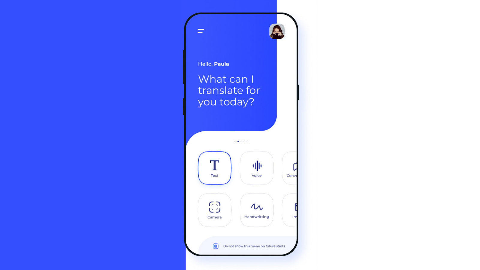
Fábio Santos & Orizonart Art Studios on Behance.
1. Place the value proposition and CTA above the “fold” on the home page = Guide your users from the start
Just like a potential customer on an e-commerce platform should come face-to-face with the value of what’s being sold, a user should get a good grasp of an application’s purpose and opportunity from the initial entry point. As a UX designer, it’s your job to guide them in understanding what they can do with it and how to begin.
With UX, the platform being designed is the product that will be used. If it’s a paid product, the sale has already been made! So instead of trying to entice someone with a “value proposition,” it’s more about helping them squeeze the most value out of the product they’ve already got in their hands.
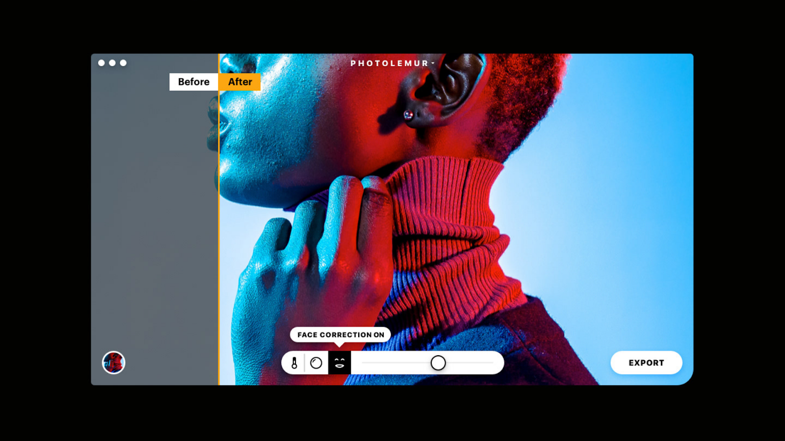
Vladimir Kudinov on Behance.
2. Display minimal navigation options = Display only meaningful features to reduce overwhelm
In e-commerce design, the point of decreasing overwhelm is to remove distractions so that a shopper is more likely to convert. When there are too many options, our brains have a harder time making decisions and will often give up and walk away. Looking at this from a more holistic UX perspective, decreasing overwhelm is still extremely important if we want our users to have productive and enjoyable experiences with our product. In general, great applications don’t let you do 50 different things. They focus on one or two things and help you do them really well.
Of course, there are exceptions to this. Photo editing software, for example, lets you do hundreds of things. But a good photo editing software is one that also focuses on helping you learn to use it effectively instead of overwhelming you with features you don’t know how to use.
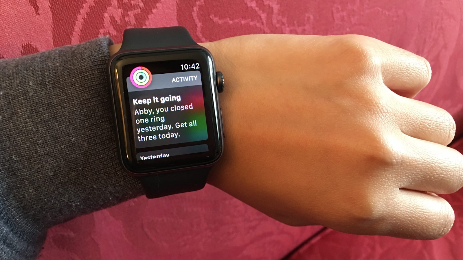
Abigail Abesamis from Business Insider.
3. Use incentives, offers, and tone to create a sense of urgency = Use incentives, offers, and tone to help users reach their goals
This is one lesson from e-commerce that UX designers should implement cautiously and thoughtfully, if at all. Manufacturing a sense of urgency can be unethical and should be done sparingly.
As UX designers, we have to determine if a sense of urgency is important in helping a user achieve their goal. For example, an app designed to encourage exercise might use incentives and tone to urge the user to get out and take 150 more steps in order to reach their daily exercise goal. This is a common and totally valid use of urgency in design. However, a travel booking app that shouts “Only 1 room left!” when there are actually plenty of rooms left, is an unethical practice and tactics like this should be avoided.

Mary Wilson on Behance.
4. Categorize products according to users’ expectations = Categorize information, tools, and features according to users’ expectations
Much like organizing inventory on an e-commerce platform, organizing information and tools thoughtfully in an interface is crucial. In a video conferencing app, for example, a user would expect the “mute”’ and “change audio input” functions to be grouped near each other. If they were not, that would make for a very confusing experience.
E-commerce designers and UX designers alike need to understand the schemas involved in a digital experience as well as the expectations set by preceding interfaces. Just as we would look to the “accessories” category to find jewelry, hats, and bags, we would also look to the microphone icon in order to control any of our audio preferences.
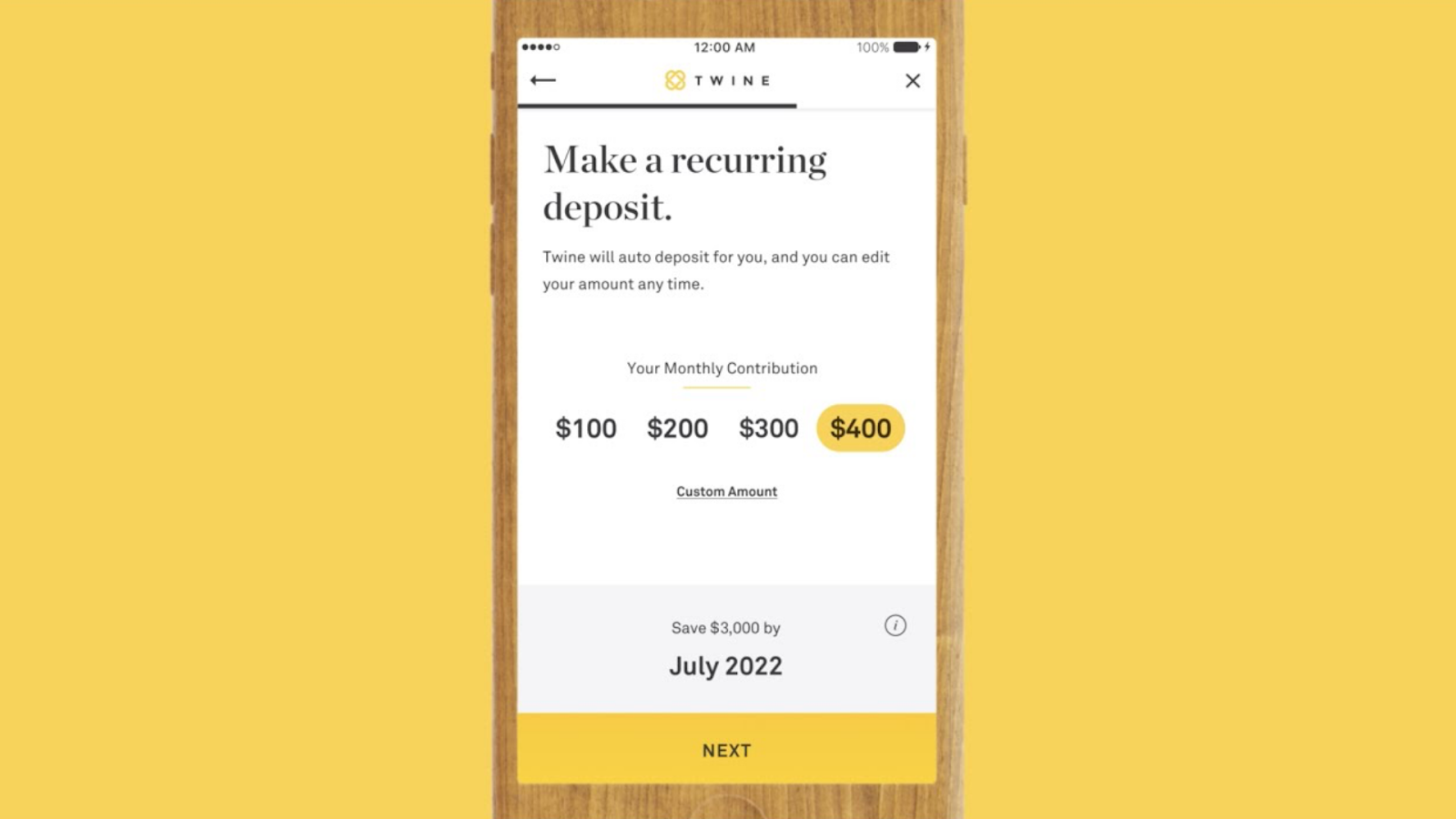
5. Keep check-out linear to decrease cart abandonment = Set users up for success with straightforward steps
In e-commerce, this refers to the different steps within a checkout flow. The best practice is to show the steps all at once and place check marks on steps that have been completed. This gives users a clear picture of what they have left to do. The same goes for any other critical flow in a digital experience. When it comes to important or challenging tasks, it’s our job as designers to make them as simple and straightforward as possible for our users so that they don’t abandon ship.
Let’s say we’re designing a personal finance app aimed to help users reach their savings goals. A critical flow, in this case, might be setting up an auto-transfer of funds from one account to another. This has the potential to be overwhelming for a user if the steps are not clear. Just like in a checkout flow, if a user reaches a point of confusion, they will likely give up because of the risk involved in moving forward without clarity: the risk of losing money. By keeping steps linear and straight-forward, we can keep our users on track towards their goals.
Designing for humans first
All of this isn’t to say that selling is bad, or that working as a designer for a company trying to sell their product or service is bad. In fact, it’s almost unavoidable! But in this new economy, companies are going to be successful by continuing to embrace innovation for positive change, problem-solving, collaboration, and creativity, just like they were forced to do during the height of COVID-19. Designers have the opportunity to lead that charge!
Maddy Beard
Maddy Beard is a strategic designer with a focus on UI/UX design in the wellness space. Empathy, cognitive psychology, and digital wellbeing are all driving forces behind her work. This year as an Adobe Creative Resident, Maddy is exploring ways to help people achieve their wellness goals using tech, while intentionally designing these products to promote more mindful tech use. She loves sharing her process and learnings with the creative community on Instagram and via her YouTube channel.


