Save
Chapter 6: Architecture
In 1936, Herbert “Hib” Johnson — head of the S.C. Johnson company and grandson of its founder — hired the architect Frank Lloyd Wright to design a new headquarters for his company. Johnson wanted to “make our chosen life’s work fine, and more enjoyable,” and to “eliminate the drabness and dullness we so often find in office buildings.” In other words, he wanted a better work environment for himself and his employees.
The building Wright designed for the Johnson company is considered to be one of his best. Its centerpiecea — a huge, soaring space called the Great Workroom — is one of the first open plan office environments. Writing about the Great Workroom many years later, architecture critic Paul Goldberger called it a triumph of engineering and esthetics, a space “created to give the company’s clerical workers a sense of community and nobility.”
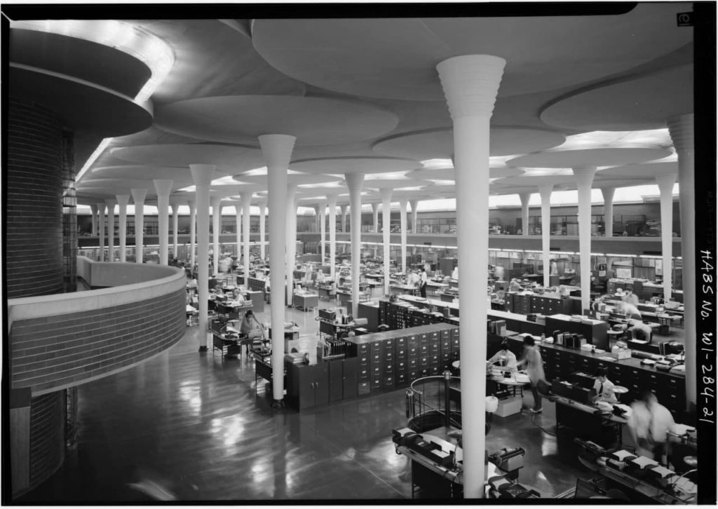
The Great Workroom in the Johnson Wax headquarters
I do much of my work with collaborators I seldom see in person. We, too, share a sense of community, but ours doesn’t congregate in physical space; our gathering place is a software application called Slack. Alas, Slack doesn’t do much to reinforce our sense of community — and there is much less nobility.
In Silicon Valley, as well as many enterprises, the default framing for thinking about customer-facing digital things is that they are either products or services. I often meet peers who describe themselves as product designers or (less frequently) service designers. It’s not unusual to hear of teams working toward a minimum viable product. The things they’re working on have product features that are defined by a product manager. When they launch, these systems are said to be “in production.”
Product is an appropriate framing for some classes of digital things – but not all. Slack is not just a product. Android is not just a product. iTunes is not just a product. Facebook is not just a product. Salesforce is not just a product. Weibo is not just a product. These things are also information environments; through their language and structures, they create contexts that change how people understand the world, think, and act. They also serve as platforms where first-, second-, and third-parties can build and host products of their own. The list of their stakeholders is long and extends well beyond the confines of the organizations that “manage” them.
To think of these things as merely products or services is to grossly underestimate the impact they have on the people who use them. We don’t experience products or services in a void; we experience them in contexts, and these systems create those contexts. While there’s no doubt that you’re interacting with a service when you log into your insurance company’s website to see details about your policy, that service is being provided to you within a particular context that is created by the website itself. To design the service in isolation from its context is to do neither justice.
As with physical environments, such as buildings and towns, information environments must be designed to address particular needs. Although the design of software is relatively new, the design of environments is not. People have been creating buildings and towns for centuries. The field of design that has focused on designing environments is architecture. In this chapter, we will examine the design of information environments as a form of architecture. Let’s start by unpacking what we mean by design.
Design
When many people think of design, they think of aesthetics: how something “looks and feels.” They may sense something has “good design” because it stands out from among similar products because of the way it looks. This is a misunderstanding. Design is not a characteristic of things; it’s a process by which things are made. It’s more of a verb than a noun.
When we’re creating something new, design allows us to simulate possible solutions so that we can experience them without incurring the costs of building the final product. We do this by understanding the context the thing we’re designing will address (including the needs and expectations of the people who will use it) and producing models of varying fidelity that allow us to envision and test alternatives. For any one challenge, there are many possible ways forward. Design allows us to explore and refine the ones that best serve the needs of the project. Design is how we make possibilities tangible.
These needs are expressed as requirements, which can be overt or tacit. Often, these requirements are at odds with each other, and it is up to the designer to suggest a particular balance between them. I’ll illustrate with a case I saw firsthand. Many years ago, I witnessed the design process of an architectural project for a housing subdivision. The subdivision was going to have many houses laid out in long, narrow lots that were perpendicular to the street. An architect had been hired to design the house model that would be built on these lots. He came up with a design that had the roofline of the house set perpendicular to the direction of the lot, so the roof was lower at the front and back of the house and taller in the middle. The architect liked how this looked.
However, these houses were meant to appeal to low-income buyers. This meant that the houses needed to be expandable over time, and the only place for the houses to grow was into the backyard. Having the roofline perpendicular to the lot made that much more difficult than ifit were parallel to the lot.
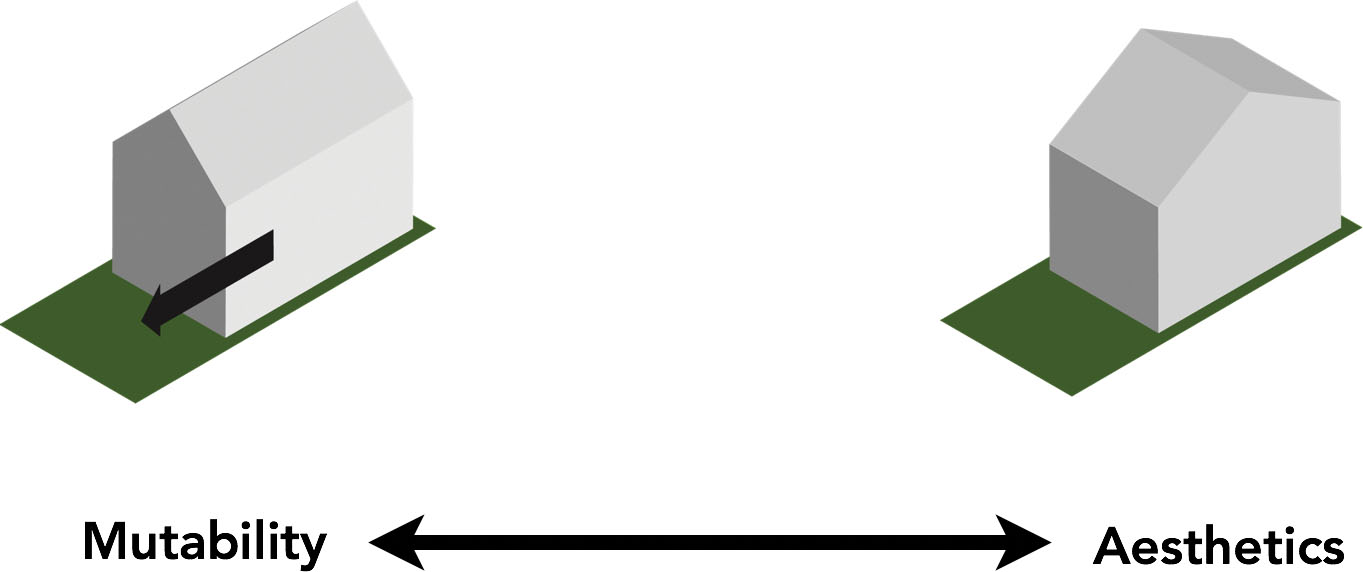
You could say that in this case, two forces were pulling the design in opposite directions. One approach was optimized for resilience and mutability – the ability to change over time– while the other was optimized for the architect’s aesthetic preferences.
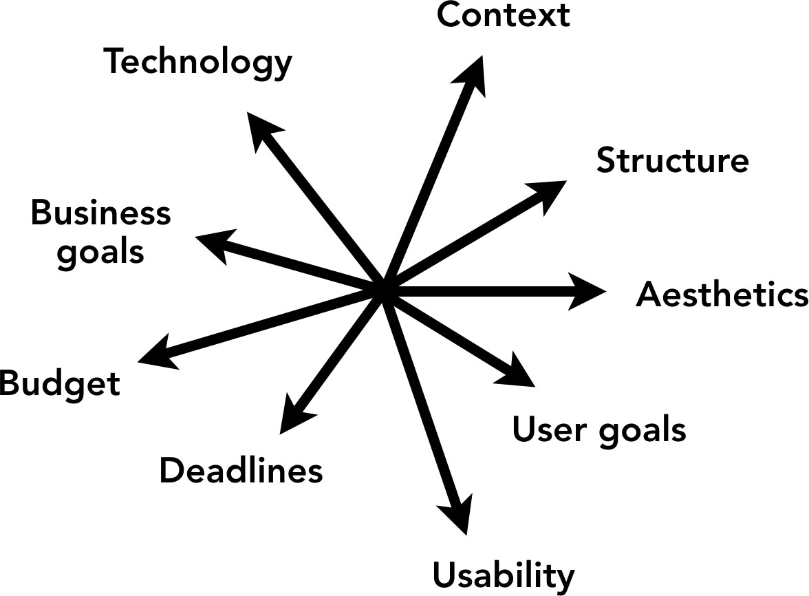
All design projects have forces such as these pulling them in different directions. The design process consists of defining hypotheses of what the balance between these forces ought to be and articulating them to stakeholders – the people who are commissioning it and those who will be using it – and the people who will build it. Designers use models to communicate the intended balance to these audiences. These models can take many forms: sketches, comps, prototypes, etc. As the project proceeds, the models go from more abstract to more concrete, but by definition they always stop short of being of identical fidelity to the final product. Feedback from stakeholders and developers help designers refine the models as the project progresses.
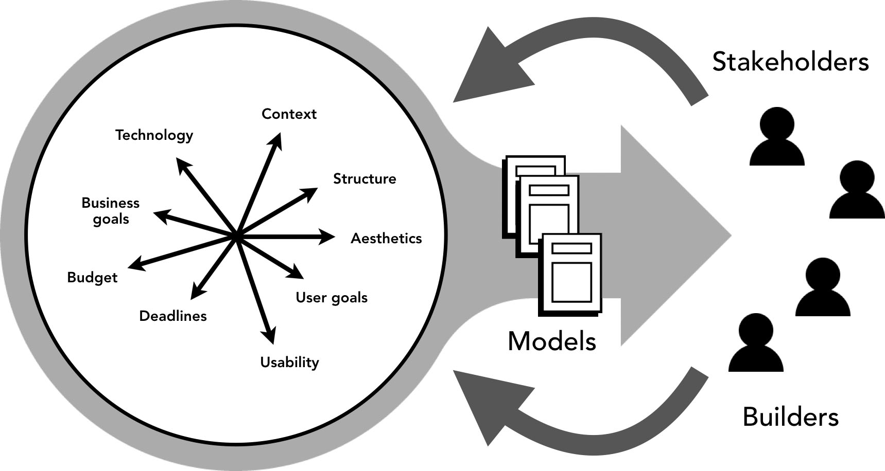
People have used this approach to problem-solving for a long time in a variety of different fields and problem spaces. Particular disciplines have emerged to focus on particular sets of problems. For example, graphic design is the design discipline that focuses on creating visual signs that move us to action. Industrial design focuses instead on creating practical mass-produced objects. Architecture is the design discipline focused on the creation of physical environments, such as buildings and towns. Because of this, it is of particular interest to us a we evolve the design of information environments.
The Design of Environments
The first designed environments were very simple; they came about as our forebears experimented with various ways of sheltering themselves, their families, and their goods from the elements. This process of trial-and-error produced a set of best practices, leading to the establishment of a vernacular craft tradition of building that is still alive in many rural areas. But eventually, building design moved beyond the functional basics demanded by shelter to serve other goals, including the creation of a tribal identity and mediation of the group’s relationship with the supernatural. Architecture developed a formal language that allowed it to serve these roles above and beyond the mere provision of shelter.
Architecture informs our self-identity and culture more than any other design discipline. This is because the output of architecture revolves around the contexts in which much of our lives play out. Think about the place where you live. Perhaps you live in a house or an apartment. What does this structure say about you? How does it inform your self-image? What do others think about it (and hence, about you)? How intentionally does it reflect who you are? Does it serve merely utilitarian ends, or are there aspects of it that transcend shelter to express something about your individuality or your place in the pecking order of society?
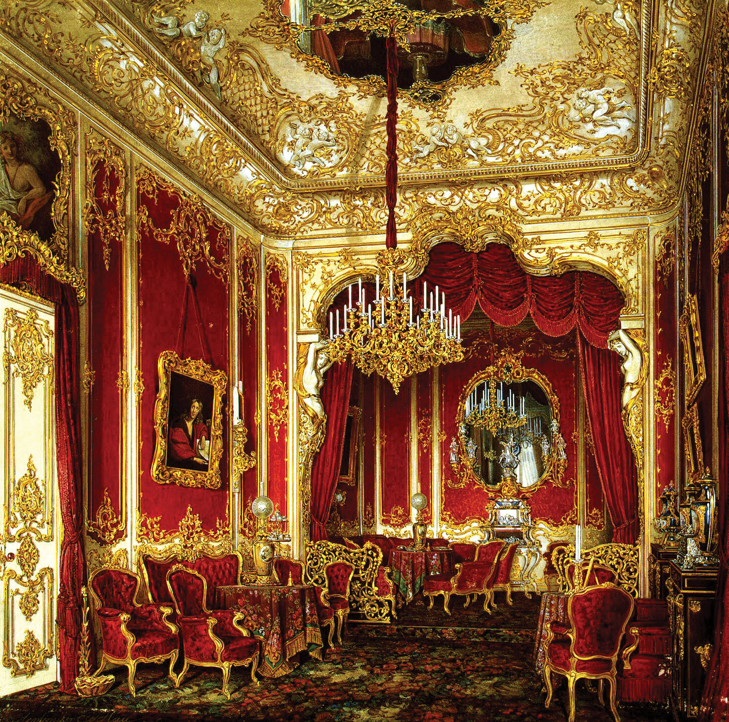
Of course, environments don’t just affect us at a personal level; they also influence our ability to function socially. For generations, the well or fountain in the town square served as the meeting place where citizens found out what their neighbors were thinking, the guildhall enabled colleagues to work out differences and embark on joint endeavors, and the assembly hall hosted lawmakers as they discussed and developed laws. As we move more of these and other social and civic activities to information environments, it behooves us to vie for their integrity and usefulness. Over the centuries, architects have developed various design principles that can guide us in the pursuit of these goals. Let’s examine a few of them.
Function
Architecture is eminently practical. Above all else, buildings provide utility: they keep us warm and dry and give us safe places to sleep, eat, learn, transact, and more. The relationship between form and function has been a central concern of architecture for a long time. In the late 19th century, the architect Louis Sullivan coined the famous phrase “form follows function,” which succinctly expresses a focus on efficiency and expression in service to functionality.
Ergonomics
Human bodies have particular characteristics that inform how they interact with the environment. For example, doors must have an appropriate height and width if people are to use them to move from one room to the next; door handles must be located at a specific height if they are to be turned by human hands; and so on. Architects are concerned about designing environments that can be used by people, so they carefully consider their work in relation to the dimensions and capabilities of the human body.
Understandability
Elements in the environment must not only be usable by people, but they must also be understood to be usable. The door “reads” as an opening in the wall; it says, “passage here!” Architects have long played with the configuration of elements to communicate particular messages and influence behavior. For example, urban designers will often place prominent vertical elements at junctures to call attention to key nodes in the city’s fabric. Successful public environments must be understandable by people from a variety of backgrounds and levels of education.

Quality
People experience a beautiful form crafted from fine materials very differently than the same form sloppily thrown together using inadequate materials. Joints between disparate elements and materials can be elegant, inventive, and delightful, or they can be clumsy and thoughtless. Architects strive to infuse their work with a tangible sense of quality from the largest to the most granular scale.
Coherence
The most successful environments have their elements arranged into a particular order that people understand as being more than just a sum of parts. This means that every part of the composition contributes to the coherence of the whole. Most architects strive for gestalt: ensuring elements “carry their weight” conceptually toward a sense of wholeness in the place.
Fit
The form of a designed environment is a response to a set of conditions in the world. The success of the environment depends on how well it addresses the contextual conditions that brought it forth. Architects strive for what Christopher Alexander called “good fit”: a tight relationship between the form, or product, we have created, and the context it was created for, with the understanding that the context the project exists in is constantly changing.[1]
Resilience
Environments are constantly adapting to changing conditions outside and inside the environment. Change can come from the external forces, such as winds buffeting the surface of a building, or from internal forces, such as the need to reconfigure a space to accommodate a new use. Architects are concerned with the adaptability and resilience of the environment; they design environments that can change without compromising the integrity of the whole.
Mental Models
These principles are as applicable to the design of information environments as they are to the design of physical places.[2] Both types of environments have something important in common: people experience them by taking in various parts of the environment one at a time. Eventually, newcomers to a place understand how it’s organized and how they can move around in it.
Think back to a time in your life when you were in a new location – perhaps you’d started a job in a new office. Your first days in the new office would be a little disorienting. You’d need help knowing where things were; you probably felt clumsy and got lost often. Eventually, you figured out the “lay of the land” and could move around with ease, without having to think about it. How did you do this?
You did it by developing a mental model of the environment. You built this model by moving around the environment and taking in its features through your perceptual systems. Your memory kept track of where you’d been and created relationships between spaces in your mind. In a physical environment, such as your office, this happens as you walk around. In information environments, you “move” by clicking or tapping on elements such as links and buttons that show you different parts of the environment. In both cases, you are creating an internal model of how elements relate to each other. The more nuanced this model is, the better you understand the environment, and the easier it will be for you to function there.
Most architects strive to make environments understandable; this entails laying out the place and detailing it so that its users can build mental models of the place easily. Architects do this by carefully arranging relationships between physical forms and elements. Designers of information environments strive for the same objective, but do so by arranging semantic elements such as icons, labels, buttons, and links. These are obviously very different things. Words and pictures on a computer display, or sentences spoken by a “smart agent” in a cylinder on your mantelpiece, have entirely different characteristics than walls and passages in a building. There is an emergent design discipline that does for information environments what architecture does for physical environments. It’s called information architecture.
The Architecture of Information
Information architecture (IA) is the area of practice and field of study that concerns itself with the design of information environments. IA aims to make information easier for people to find and understand. As with (physical) architecture, this calls for bringing a particular order to the elements that comprise the environment.
Although the structuring of information for ease of retrieval has been around for centuries (think of the invention of page numbers and tables of contents in books), it was with the arrival of digital information technologies such as computers that the discipline of IA came into its own. These two objectives – making information findable and making it understandable – have been part of the discipline since its early days. The emphasis on one or the other has varied over time, but the two have always complemented and supported each other.
As with so many other important contributions to the field of human-computer interaction (HCI), the modern conception of IA traces its roots to groups working at IBM and Xerox’s Palo Alto Research Center (PARC) in the late 1960s and early 1970s. Researchers and inventors at these companies were among the first to meet the informational challenges posed by new digital technologies, which made it possible for people to interact with data in scales previously unimagined.
The term information architecture itself was popularized by the architect Richard Saul Wurman in the mid-1970s. Wurman’s approach was to make things more understandable by presenting information in a particular context that made it relatable on a gut level. At first, Wurman’s attention was focused on urban environments. For example, an early book, Cities: Comparison of Form and Scale, consisted of photographs of 1:14,000 scale clay models of cities around the world; the first to-scale comparison of cities. Subsequent books (over 80 of them) have clarified a wide range of different subjects, from the work of his mentor Louis Kahn to personal investing to dog care.
Many of Wurman’s most well-known projects are either books (Information Anxiety, Information Architects, the Access series, etc.) or maps (e.g., the Tokyo transit map). However, there is more to his work than graphic design. Among the general public, he is better known as the founder of the TED conferences. As with his books and visual design, TED originated with an impulse to clarify by subtraction and reconfiguration; in this case subtracting all the things Wurman hated about conferences and carefully curating speakers from a wide variety of different fields.
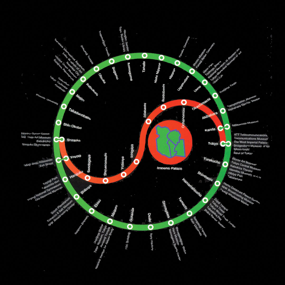
The common thread that underlies all of these projects is the idea that the relationships between elements creates a particular context that affects how we understand the whole. In the case of the Tokyo subway map, the elements are the names of individual stations in the system. At TED, they are presentations by speakers from widely different backgrounds that have been carefully curated. As Wurman put it, “You only understand information relative to what you already understand.”[3]
Contemporary information architecture also has roots in Information Sciences, mostly through the work of Peter Morville and Louis Rosenfeld. Their 1998 book Information Architecture for the World Wide Web, affectionately known as the polar bear book because of the illustration on its cover, brought traditional principles of information organization to the design of websites at a time when many designers were first starting to grapple with the challenges of large-scale digital information environments. It was the right message at the right time, and the polar bear book was very successful.
Architecture was often used metaphorically by practitioners, who understood wayfinding as a goal in both physical and information environments. Christina Wodtke’s Information Architecture: Blueprints for the Web (2002) made the connection between architecture and web design explicit. The explosion of information that resulted from the popularization of the World Wide Web ushered in a decade in which the IA community focused on finding their way to information. However, when smartphones started to take over as the primary means with which people accessed information environments, information architects shifted their attention to context-making. Andrea Resmini and Luca Rosati’s landmark Pervasive Information Architecture (2011) was a call for a more systemic approach to design, with the aim of creating coherent experiences that span multiple touchpoints across physical and digital space. Andrew Hinton’s Understanding Context (2014) tackled the subject of placemaking with language head-on, and is required reading on the subject. Both books provide solid foundations for an approach to architecture that aims to make information not just findable, but understandable. In 2015, the fourth edition of the pola bear book (now titled Information Architecture: For the Web and Beyond, and of which I’m a co-author) introduced new material on contextmaking with information to the classic IA text.[4]
These advances acknowledge that information is only understood in particular contexts, and that the way we organize the semantic structures of our information products and services alters those contexts. It’s a perspective that acknowledges information environments as places that should serve the needs of the people who will use them. Unfortunately, it’s the opposite of today’s deeply cynical and pervasive focus on engagement, which, in practice, seeks to apply our new information superpowers to manipulating and addicting people.
Community and Nobility
The largest information technology companies in Silicon Valley – Google, Facebook, Apple – understand the importance of designing environments that enable their people to do their best work. All three have hired world-class architects to design their corporate headquarters: Bjarke Ingels and Thomas Heatherwick (Google), Frank Gehry Facebook), and Norman Foster (Apple). Like Hib Johnson before them, the leaders of these companies seek to create places that give their workers a sense of community and nobility (And perhaps also signal to the world that they have the wherewithal to change the environment in powerful ways). Unfortunately, this perspective hasn’t yet extended to the people who will be using the companies’ products and services, perhaps because designers and managers in these companies understand them primarily as products and services.
Shortly before I moved to the San Francisco Bay Area in 2013, a friend warned me: information architecture is barely a thing here anymore. To my dismay, I’ve found that to be true. Design here has focused on a product-oriented (and less frequently, service-oriented) approach that seeks to “move fast and break things,” a mantra that until recently decorated the walls at Facebook’s headquarters. But when your “product” is used for hours on end by billions of people every month, the thing you risk breaking is society itself. It’s time we recognize that these digital things we’re making are the places where many of our most important social interactions are happening, and start designing them accordingly. These things need architecture.
Over the course of the next three chapters, we will look more closely at how information architects tackle the challenge of designing information environments that serve people’s needs. We will start by lookingmore closely at the role of structure in creating coherent contexts.
[1] Christopher Alexander, Notes on the Synthesis of Form (Cambridge: Harvard University. Press, 1964). [2] For more heuristics for designing of information environments, see Andrea Resmini and Luca Rosati, Pervasive Information Architecture: Designing Cross-Channel User Experiences (Burlington: Morgan Kaufmann, 2011) [3] Richard Saul Wurman, Information Anxiety 2 (Indianapolis: Que, 2000). [4] For a more comprehensive look at the history of information architecture, see “A Brief History of Information Architecture” by Andrea Resmini, The Journal of Information Architecture issue 3, no. 2 (2011): 33–46,
If you want to read the whole book, you may find it at Rosenfeld.
Jorge Arango
This user does not have bio yet.


