Originally published on Liquid Light’s blog.
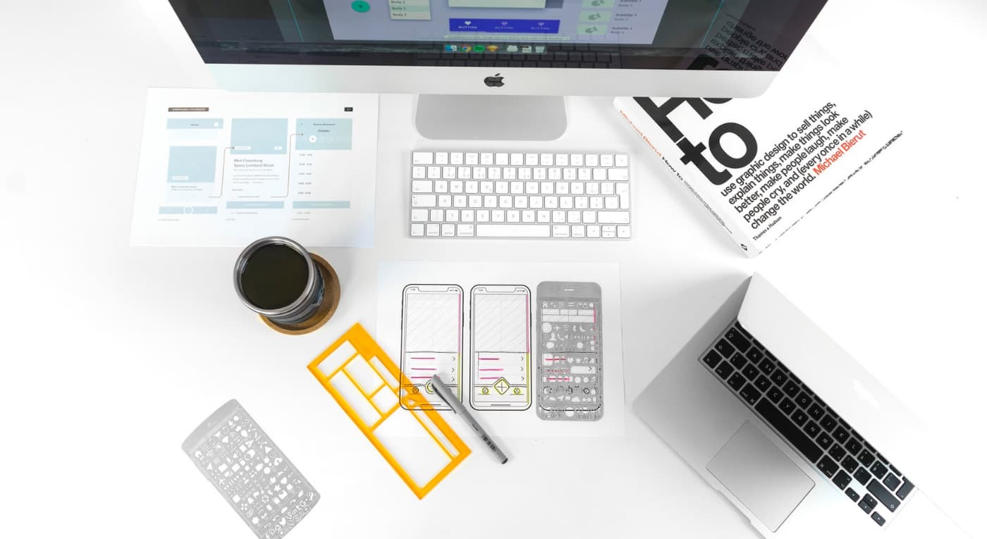
A vital stage of any project is wireframing and prototyping. We use this stage of a project to quickly explore different user journeys, define a content hierarchy, and rapidly explore how different layouts change the overall browsing experience for users.
As a small design team, we have previously never felt the need to create a framework for our wireframing process. Instead, we have opted to create bespoke wireframes per project, allowing designers total freedom to explore the wireframing approach based specifically on the needs of an individual projects’ brief.

A selection of our inconsistent historic wireframes from various project
Growing pains
As our design team has grown, this approach has created a few issues:
- Inconsistent visual appearance between designers — Whilst appearance is not a key element of wireframes, each designer had their own workflows and personality which would create unnecessary variations. We felt a more consistent visual approach was more professional and provided clients with familiar documents throughout our time working with them.
- Difficult handover process — A common part of our workflow is for designers to pick up each others work and offer a new perspective on a given UX challenge. With no universal approach to wireframes, it can slow us down whilst familiarising ourselves with another designer’s style and approach.
- Repetitive components slow us down — Whilst our vision to create bespoke wireframes was based around not wanting to rely on the same cookie cutter components for every project, realistically, we found that some components were being used over and over again and starting from scratch was time consuming with no real benefit.
In light of these issues, we decided that creating a wireframe toolkit could help us to be more consistent and faster with our wireframing and prototyping project phases.
Considerations before we begin
Once we’d decided to build a toolkit we needed to define a few goals and expectations for why and how we would use the toolkit. I set up a few meetings with the design team and we came up with the following considerations
Sketch-based
At Liquid Light we use Sketch for all of our wireframing and design, so this was an obvious requirement. The tool will be made within Sketch allowing us to make use of symbols, text styles, and potentially the team library feature (although we need to fully understand this!).
Consistency
This is where things started to get a bit tricky as we currently have four designers and we all work slightly differently. In order to create a consistent approach we need to decide on the “best” approach for artboard sizing, typography, method of presentation, guides and column layouts, annotations and gestures, and that’s to name just a few! My suggested approach of “my way or the highway” didn’t quite fly with the team.
It took quite a few conversations to make decisions on this, compromises needed to be reached which would ultimately change our individual workflows. As with almost everything web design related, change is a constant so what seems to work “best” for us today may well change over time.
Flexibility
It was really important for us to create a toolkit that does not “get in the way” of a designer’s workflow or the explorative process of wireframing.
Key Decisions
Meeting with the design team allowed us to come up with a few ground rules for the toolkit.
Typeface
We knew we wanted a neutral typeface for wireframes, nothing that would detract from the information on the page. We’ve used Helvetica a lot in the past but recently had been exploring other options, as Helvetica has become so common that instead of being neutral as it once was has now developed a character of its own. We settled on Apple’s system font San Francisco Pro, due to its great legibility and neutral feel.

Artboard and grid size
This decision came about mainly for practical reasons because to create a set of components that can be easily used in wireframes, they need to be sized consistently with each other. This required us to set a document width to work with, however, in the interest of flexibility, we consider this a starting point rather than a rigid rule.

Some basic typography and our 12 column grid
Making the toolkit
Now we’d decided what it was we were making it was time to dive in. I began by looking back at some recent sets of wireframes we’d made and extracted some common elements I knew I would need. This provided nearly every element the kit would need, but all with inconsistent appearances.
I set up a new artboard at our agreed-upon dimensions and started by defining basic typography styles much like I would for a design process. Once I was happy I created color variants for links as well as light text to be used on dark backgrounds and dark text for use on light backgrounds. These were then saved as text styles for easy future usage.

Examples of heading variants
Following this, I began converting, rationalizing, and neutralizing all the elements I’d collated. Changing type was easy enough, the main challenge was bringing everything into the new grid and widths we were now using.
Colors
Whilst colors are not a prominent feature in wireframes generally I still created a palette to help ensure consistency and contrast. This consists of a range of greys for different scenarios and a blue for showing links, actions, and buttons.

Icons
We often use icons to help demonstrate functionality within our wireframes and purchased a very large and comprehensive set which we have been using for a few years. To save us time I imported the complete set into the toolkit on a separate page so they are always easily accessible.

A small selection of the icons from the Icomoon set
To symbol or not to symbol?
One of the biggest questions I’ve come up against during creating the toolkit is when to use Sketch symbols. Sketch symbols are a powerful tool within the software’s arsenal and one we use heavily during our design stages. When wireframing, however, there is something more fluid and flexible to the process that meant using symbols often felt like an over-complication to manage as the document grows. For this reason, I kept it simple, only using symbols for a default header and footer that can be modified for each project.
The thinking behind this was that a component can be taken from the toolkit and incorporated into a project-specific wireframe, at this point it is likely some changes will be needed either to layout or content to make it work for the specific project. Once this is done the designer can make the decision on a project-by-project basis. Is this element going to be a recurring element throughout my set of wireframes? If the answer is yes then a symbol can be created for that project.

A range of components from the finished toolkit
An advantage to this approach is a much less cluttered symbol page which only features symbols used specifically in the project, rather than the entire toolkit with the possibility of many unused elements being present.
I’m sure that over time this approach may develop and once we have used the kit for a few more projects the use cases for symbols will become more obvious. From there, the kit can grow organically rather than trying to do everything in this first iteration.

Example of how the toolkit has already been used to create consistent wireframes with infinite possible use cases
Future plans
A toolkit like this is never really finished, it’s a living breathing document that I am sure will grow and change overtime. Already I am considering if we could use Sketch’s powerful resizing features to create components that can be scaled to work in a broader range of circumstances. We’d also like to plug in dynamic data, so that we’re using real content, though at the moment, this doesn’t work how we’d like.
We’d also like to plug in dynamic data, so that we’re using real content, though at the moment, this doesn’t work how we’d like.

With this approach also comes the question of how granular should the toolkit become and would a more granular approach start to limit our designers’ problem-solving freedom? I don’t have an answer to this at the moment. But it is certainly something I am keen to monitor and get feedback from the team about as time and projects pass.
Conclusion
It’s taken a relatively large amount of time to create this toolkit but already after using it for only a few projects it’s clear to see that this upfront time commitment is likely to pay us back in efficiency many times over.
It has also been an incredibly valuable experience to really analyze the wireframes we are creating and better understand the UX conventions we as a team find ourselves relying on upon again and again. It raises the question of if we can now use this knowledge to further streamline our site build process by developing these popular conventions into reusable components, that can be quickly deployed whilst still allowing the flexibility for project-specific adjustments. Something which we are already doing but could be refined further.
Only time will tell if the toolkit will work as well for our entire design team as it has for me personally or if workflows from different designers will throw up new challenges that I have yet to consider.
Have you created any tools like this for your creative team? I’d love to hear what challenges you have come across and how you went about solving them? Has this article motivated you to have a go at implementing something similar? Feel free to drop us a comment with any questions you have.