Flag

We stand with Ukraine and our team members from Ukraine. Here are ways you can help

Get exclusive access to thought-provoking articles, bonus podcast content, and cutting-edge whitepapers. Become a member of the UX Magazine community today!

Home ›› Behavioral Science ›› How To Gain Actionable User Insights Through Simple Observation: A Case Study

How To Gain Actionable User Insights Through Simple Observation: A Case Study

by Lia D. McCabe
3 min read
Share this post on
Tweet
Share
Post
Share
Email
Print

Save

UserInsights_Slider

How do you find actionable insights in this fast-paced environment, where we don’t always have time to recruit, schedule, and moderate testing sessions?

Presented at DCUX 2019 as “Fly On The Wall” talk by Lia D. McCabe
Just-complex-enough concept

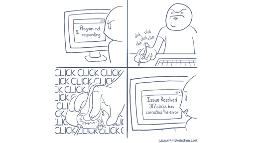
If only this worked!

 
I’m sure you’ve all been there. You’ve got a great website but you’re not sure why users are getting frustrated and not engaging with your product. Or perhaps in some instances, your users may be over-engaging; Nonetheless, to create a successful, user-friendly website, we need to take a closer look and focus on actual user behavior. In this fast-paced environment, we don’t always have time to recruit, schedule, and moderate testing sessions. But that’s okay because you can still gain actionable insights by using what I call the Fly-on-the-Wall method. Here are a few tips to get you started.

Tip 1: Use a naturalistic approach
By using a naturalistic approach or ‘in-the-wild’ observation, we can gain qualitative and even quantitative outputs that are more reliable and more likely to encounter true-to-life user frustrations than in a structured setting.

A great approach is using session-replay and heatmaps as a tool for unmoderated remote testing. For instance, at my company, we wanted to know how we could improve our medical Guidelines page to make documents and related materials easier to find. To accomplish this, we utilized a naturalistic approach through observation of recorded user sessions and heat mapping on the Guidelines page. Now there are a lot of great tools out there but there’s one, in particular, I’d recommend, which leads me to tip #2.

Tip 2: Utilize the right tools
It’s important to have tools that work with us…not against us, and in my experience Mouseflow is that tool.

Mouseflow allows us to record-and-replay or live-watch user behavior to identify problems they may encounter. Because it’s just a line of code that’s placed on any website, there is no recruitment or scheduling necessary. You can turn this code on and off at any time and can adjust your sample size at any point. This makes usability testing quick, easy, and flexible. Session-replays let you see exactly what users are doing on the screen while the heatmaps track clicks, mouse movements, scrolling, and other data points to get to the bottom of your research questions. This tool allowed us to gain many actionable insights for our redesign.

Heat Mapping

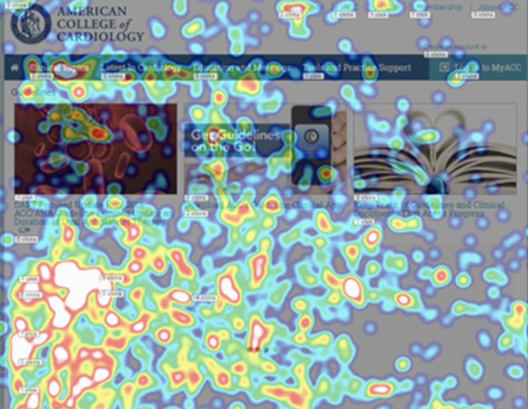
Heatmapping session utilizing Mouseflow tool (www.mouseflow.com). The white/orange indicates high-level of user activity in the form of clicks.

For instance, when reviewing the video replays on our Guidelines page, we observed that users were struggling to find what they were looking for. This was indicated by users continuously scrolling and clicking the ‘more’ button until ultimately abandoning the page. We also observed users typing in various versions of similar text when seeking related content, which the search was not returning. Some of these sessions lasted as long as 20 minutes. We were able to infer that it was not clear to users what text was a clickable link vs. a title or header, which led to frustration in the form of ‘rage-clicks’.

We also noted that users typically were not interested in or did not notice the triptychs at the top of the page as indicated by the low level of heatmap activity in scrolling, attention, and click categories. This informed our research question and led us to ask follow up questions such as: how can we make the search and browse functionality more efficient? Is the triptychs valuable to users or should we consider removing it? And so this leads to my third and final tip.

Tip 3: Hypothesize & Validate
Considering this data, we formed a new design hypothesis: If we remove the triptychs and pull the content of the guidelines to a landing page in a more easily digestible format, then users would be more likely to find what they need and become less frustrated.

With the knowledge gained through the naturalistic approach, we redesigned the Guidelines page and ran a second Mouseflow test. This time, heatmaps indicated users were often finding what they were looking for right away, typically clicking on pdfs or the latest Guidelines. Sessions were shorter and there were no rage clicks.

In summary, qualitative research can generate lots of ideas for product improvement as it reveals possibilities that aren’t found in quantitative research. So, if you’re short on time and resources, give the Fly-on-the-wall method a chance.

post authorLia D. McCabe

Lia D. McCabe

Lia is a User Experience Researcher at the American College of Cardiology, where she leads the creation of effective user experiences for cardiologists and patients worldwide. She values community volunteerism and has previously served as a board member for UXDC. Tweet her @LiaDMcCabe.

Tweet
Share
Post
Share
Email
Print

Related Articles

Struggling with PowerPoint’s design limitations? This step-by-step guide shows you how to build systematic design solutions, from mastering slide layouts to using sticker sheets for patterns. Learn to create polished, professional presentations with smart workarounds and helpful tips.

Article by Jim Gulsen
A Step-by-Step Guide to Creating a “Design System” in PowerPoint
  • The article gives a step-by-step guide to building systematic patterns in PowerPoint. It talks about the program’s limitations and gives essential tips like mastering slide layouts and customizing text settings.
  • It suggests using PowerPoint’s automated features carefully and advocating for manual workarounds to elevate quality.
  • The piece introduces creating sticker sheets for reusable design components and highlights strategies for successful workflows.
Share:A Step-by-Step Guide to Creating a “Design System” in PowerPoint
5 min read

Publishing in HCI and design research can feel overwhelming, especially for newcomers. This guide breaks down the process — from choosing the right venue to writing, submitting, and handling revisions. Whether you’re aiming for conferences or journals, learn key strategies to navigate academic publishing with confidence.

Article by Malak Sadek
A Guide to Publishing Human-Computer Interaction (HCI) and Design Research Papers
  • The article provides a guide to publishing in Human-Computer Interaction (HCI) and design research, sharing insights from the author’s PhD experience.
  • It explains the significance of publishing in academia and industry, offering an overview of peer-reviewed journals and conferences.
  • It breaks down the two main types of papers — review and empirical — detailing their structures and acceptance criteria.
  • The piece emphasizes strategic research planning, collaboration, and selecting the right venue for submission.
  • The piece also outlines practical steps for writing, revising, and handling rejections, encouraging persistence and learning from reviewer feedback to improve publication success.
Share:A Guide to Publishing Human-Computer Interaction (HCI) and Design Research Papers
8 min read

Accessibility isn’t just about compliance — it’s about inclusion. A deaf developer shares what UX designers need to know to create better experiences.

Article by Tamara Sredojevic
Designing for Deaf Users
  • The article talks about a deaf developer who shares insights on digital barriers, assistive tech, and inclusive design.
  • It presents a candid conversation on UX challenges, assistive technology, and advocating for better accessibility.
  • The piece dives into the challenges and solutions for creating truly accessible experiences.
Share:Designing for Deaf Users
11 min read

Join the UX Magazine community!

Stay informed with exclusive content on the intersection of UX, AI agents, and agentic automation—essential reading for future-focused professionals.

Hello!

You're officially a member of the UX Magazine Community.
We're excited to have you with us!

Thank you!

To begin viewing member content, please verify your email.

Tell us about you. Enroll in the course.

    This website uses cookies to ensure you get the best experience on our website. Check our privacy policy and