Save

Imagine you are 75 years old. Your body and perception have shifted, and you’re likely to experience products and services differently. Most digital devices — largely designed by and for younger people — aren’t optimized for your needs.
Who does this affect, really? The truth is that, in later life, it’s something that will affect us all.
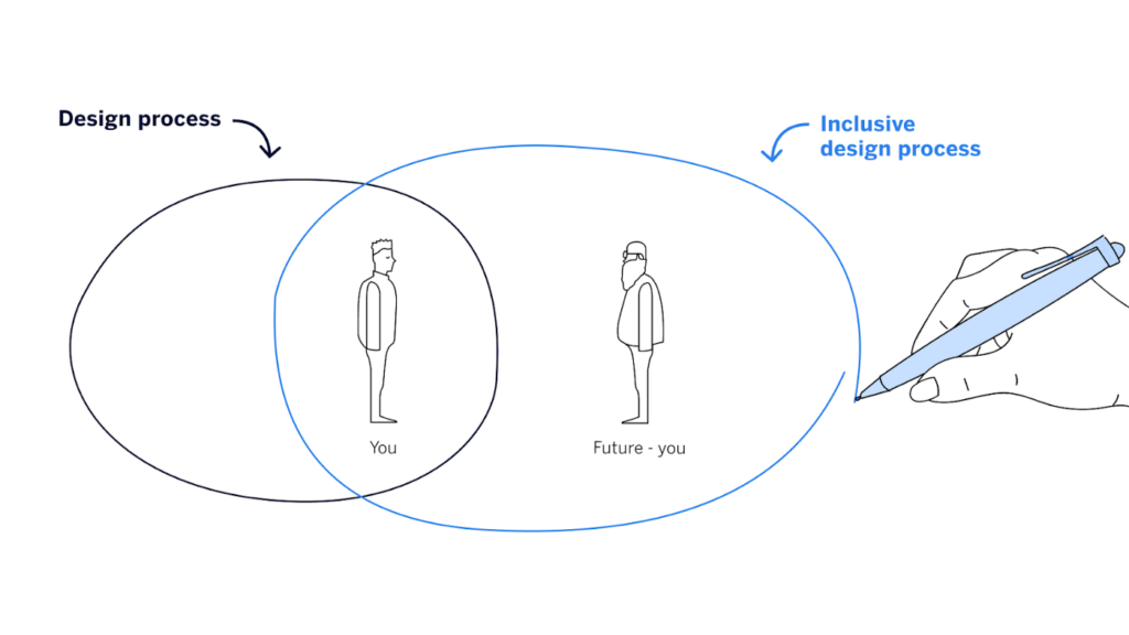
Adoption of digital technologies is still on the rise among older users, so increasingly designers will need to consider the kind of age-related use limitations a 75-year-old may encounter. And, as I’ll go on to explain, we all benefit from the implementation of inclusive design. So how can we avoid ageism and design without bias?
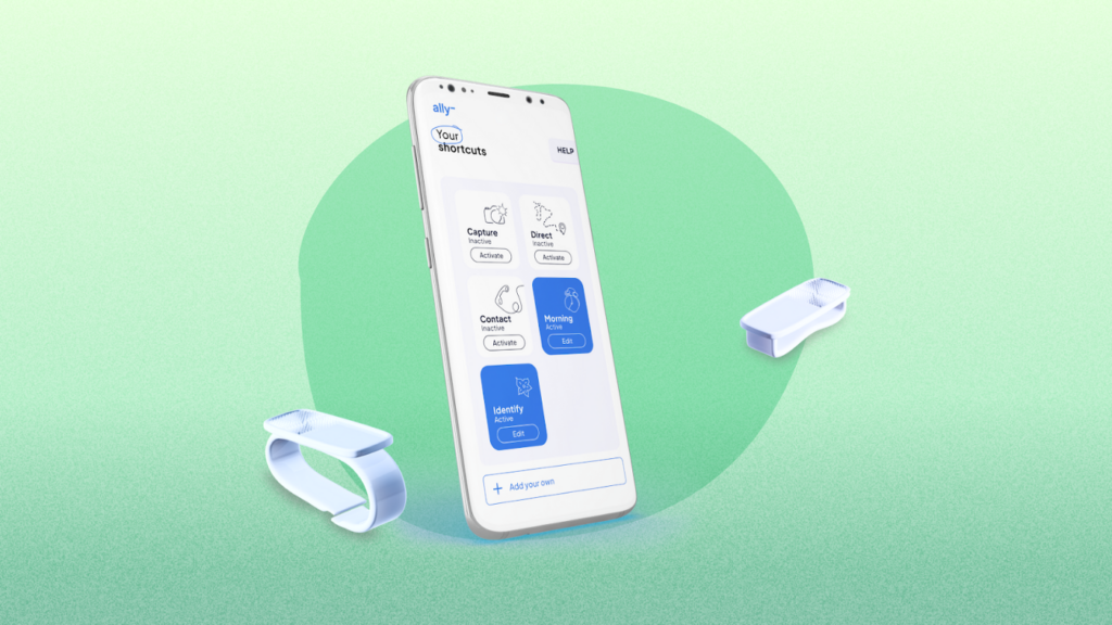
Earlier this year I carried out qualitative research within the German market—and insights from my interviews with 12 participants (all aged 75 and over) form the basis of the methods that I recommend in this article. In addition to my research, I developed a digital product called ally—an app enabling seniors to store actions they frequently use on physical NFC tags, supporting them to solve age-related difficulties in their daily lives independently.
I believe that to reach age-inclusive solutions, designers must adopt an inclusive mindset, make empathetic decisions and apply practical methods. Read on for five ways to transform intention into action, and learn how to widen accessible products to inclusive ecosystems.
#1: Inclusive, in-person research and testing
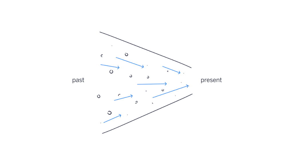
In interviews, older adults often said:
“That’s just me though… it’s due to age.” Participant 02
If people don’t consider their difficulties as relevant, they don’t mention them. That affects research insights. An easy fix for this is to conduct interviews and testing in person. People often feel more comfortable when in conversation — and it’s possible to observe interactions with devices first-hand.
It’s valuable to include seniors in research and testing, even if they aren’t the main user group. Why? A whole demographic isn’t an edge case — plus insights from people with more life experience can radically improve our designs. Older adults draw from a broader set of experiences and bring in a different perspective because they’ve lived through various technological ages and have adapted to distinct technology.
Applying my understanding of inclusive design for the elderly, I developed a digital product and tested it with my research group. Despite following accessibility guidelines, during testing with older people I discovered that interaction elements, such as buttons and input fields, were still too small for my participants to operate. Testing with an older user group was a crucial part of developing a design that could be used by them.
#2: Focus on behavior instead of demographics
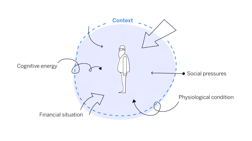
“It’s not about people being old and therefore behaving in a certain way, it’s about forces influencing them and how these are affected by age.”Matt Wallaert, Head of Behavioral Science, frog
Seniors aren’t just seniors. As with any other demographic, they’re a highly diverse group with varying characteristics — and there are many reasons people in later life might experience difficulties with digital products.
Behavioral science (BeSci) can be a helpful tool to understand seniors’ relationships with digital products. If an individual has never used a product — or has stopped using it — the BeSci approach looks at what pressures might be influencing their behavior and relationship with the product.
Age is just part of the picture, and many other factors need to be taken into consideration when designing for older people. Promoting and inhibiting pressures can be social circumstances, financial possibilities, physiological conditions and cognitive energy. Pressures have different strengths and depend on the context, but they don’t change. Archetypes experience forces in different intensities. An influence on the strength of inhibiting pressures is aging—cognitive energy, for instance, might be less due to age or depending on the time of the day.
Narrowing the age range for interview participants can help support a research objective. The youngest participant in my study was 75: this is because age-related changes tend to intensify after crossing this age. Based on my qualitative research, I then created three behavioral archetypes, differing in lifestyle, needs, attitudes, motivation, values, and behavior towards digital products.
#3: Tailor accessibility guidelines
According to the Web Content Accessibility Guidelines (WCAG), an accessible website is perceivable, operable and understandable. To make a digital product that’s inclusive for older users, standard guidelines for web content accessibility need to be tailored to aging factors.
Dexterity, vision and cognition: these senses are age-related pressures particularly relevant for digital product design. If they decrease, the experience is impacted. Lower precision complicates clicking on elements, less cognitive energy creates difficulties to focus on tasks and low vision affects readability and color contrast.
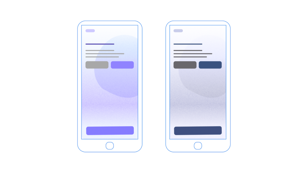
A good example of how senses shift in later life is the age-related color blindness: tritanomaly vision. With this blue-yellow color blindness, purples appear grayish, which can affect the usability and emotional impression of a design. This means a person with tritanopia wouldn’t be able to engage fully with an interface using purples and grays as indicators for distinctive interactive elements. Therefore, we should use additional elements to clarify functionality, such as text.
Color perception is just one example that affects how designs are perceived. Motion design can affect how seniors operate with digital products. Less cognitive energy might prevent users from interacting with dialog modals, if they disappear too quickly. Terminology that doesn’t require knowledge about cutting-edge technology makes content understandable.
#4: Map product demands with capabilities
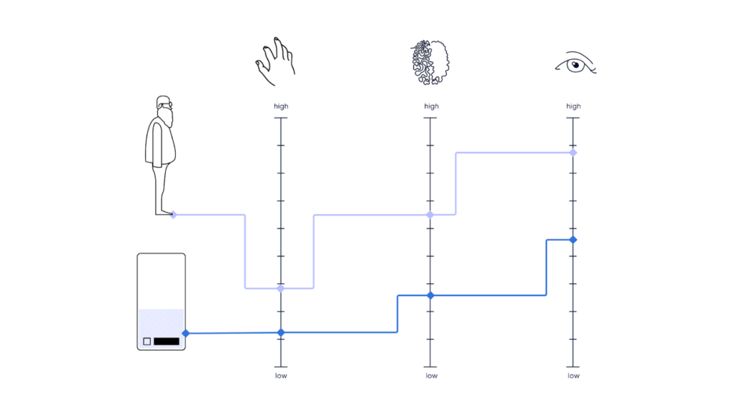
Every design decision has the potential to be inclusive or exclusive. Design criteria need to be guided by age-related changes. That means the requirements of digital products shouldn’t go beyond the abilities of seniors.
A product interaction map, originally for physical products, supports alignment of features with the capabilities of the users. It can be used to display senses involved in every stage of the journey and the level of ability required to use each feature. We can include this map as a separate layer in the user journey. So, it’s easy drawing inspiration from existing capabilities. We can focus on the higher points and draw inspiration from capabilities, rather than focusing on limitations, because this could hold great ideas back, instead of opening up new opportunities.
This mapping method can support inclusive design decisions, helping designers to adjust features according to capabilities of users affected by age-related limitations.
#5: Question interface conventions
Following heuristics — mental shortcuts that can facilitate problem-solving and probability judgments — is crucial when designing for aging users, especially when it comes to consistency. Designs should stay close enough to other products so new patterns don’t have to be learned.
At the same time, it’s important to bear in mind that conventions aren’t familiar to everyone. We shouldn’t take too much prior knowledge for granted. We should rather explore the interplay between familiar conventions and alternative adaptations to individual needs.
“What do the dots mean? And what is this? Ah photos, yes that’s what it looks like.” Participant 12
During my qualitative study, I found that icons, for instance, aren’t familiar to many older adults. The indication of the functionality of three dots isn’t understandable at all, whereas a figurative icon like a camera represents clearer that this must be the way to take pictures. The more abstract, the more difficult to understand…and the more figurative, the easier. For instance, other elements can convey the same information — text or illustrations. Whether designing onboarding, orientation within apps, terminology, and motion design, it’s worth questioning conventions on every level.
Conclusion
In designing a product, it’s likely you’ll always exclude some people. Using the example of colors: bright contrasting colors are easiest to perceive for seniors, whereas it’s recommended to use calming, less contrasting colors for people with autism. Adopting an inclusive mindset, including research and reflections about which user group might benefit from which design changes, and carrying out proper testing already helps a lot. Products should always intend to be inclusive and follow basic accessibility guidelines — and then it depends on the product how we prioritize, e.g., on colors.
Designing to be accessible for older people goes far beyond creating large enough buttons. Age-related changes affect every stage of an older person’s journey through a digital experience. People in later life should be considered throughout the whole process, in the design of virtual and physical products, as well as the transition between touchpoints. To ensure accessibility at every touchpoint, we need to design inclusive ecosystems.
You could scale these methods to products and services for industries, such as healthcare, finance, and enterprise tools. An inclusive process leads to experiences that improve lives and develop their full potential on the market. That’s beneficial for business and people.
Originally published on frog Voices by frog, part of Capgemini Invent

Alina Karl is an Experience Designer based in Munich. For her bachelor thesis, she worked together with frog to transform this research into an app that enables people in later life to store actions they frequently use on physical NFC tags. This convergent product supports seniors to solve difficulties in their daily lives independently by assessing the tags in situations they experience age-related limitations.
- In order to reach age-inclusive solutions, designers need to adopt an inclusive mindset, make empathetic decisions and apply practical methods.
- 5 methods for inclusive digital experiences:
-
- Inclusive, in-person research and testing
- Focus on behavior instead of demographics
- Tailor accessibility guidelines
- Map product demands with capabilities
- Question interface conventions
- An inclusive process leads to experiences that improve lives and develop their full potential on the market which is beneficial for both business and people.


