User Experience (UX) principles and practices play a crucial role in keeping the design process on track while building great UX designs that users will fall in love with. The principles of user experience are like the directions for a recipe but for great design. However, occasionally breaking these UX principles is a good idea.
All of the websites and apps that came along in the early days of the internet had terrible experiences. They had cluttered home pages and distracting color palettes.
But over time, certain UX principles were used to enhance the user experience.
Breaking Design Principles on Purpose
I think it’s important to state that I have never found a case where creating a site against all the principles of good design has turned out to be a remotely good idea. Some of the most successful companies have dared to defy common UX principles!
Let’s have a look at how Snapchat and Netflix purposefully break UX guidelines to achieve specific goals.
Snapchat breaks all the rules
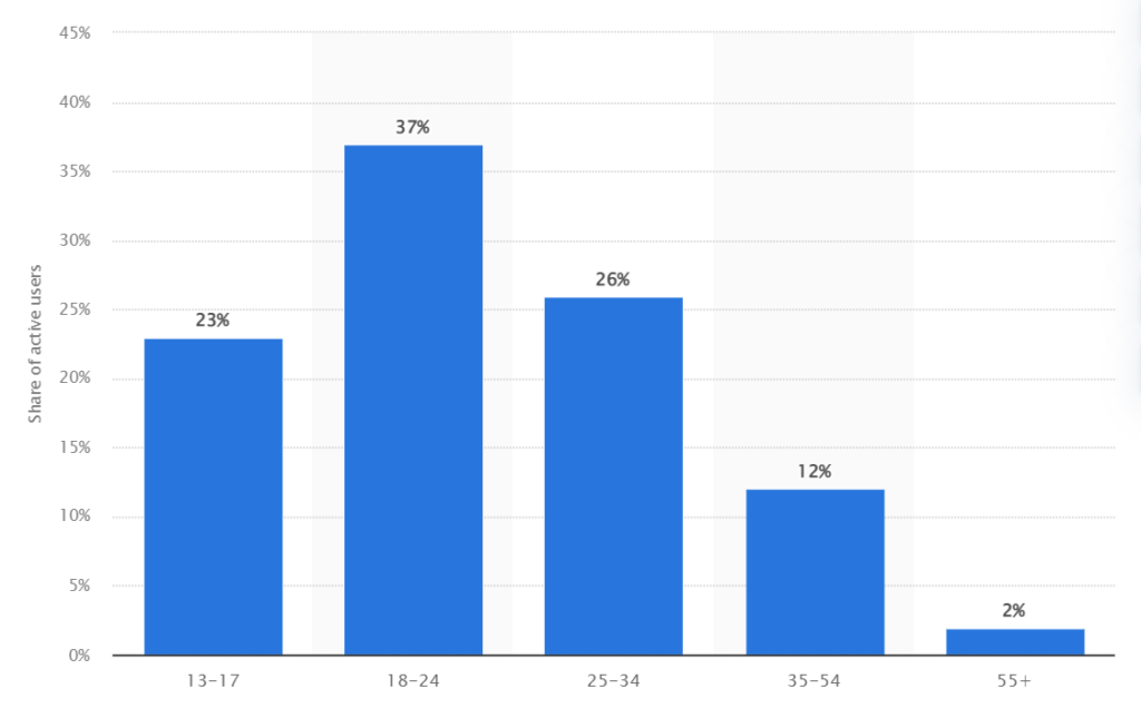
With more than 500+ million downloads on the Google Play Store alone and over 160 million active users each day, Snapchat has caught the attention of its users with its complicated user experience. Snapchat’s iconography is confusing, its labels are non-existent, the app’s functionalities are hidden or obscured, and navigation without Snapchat’s guidance is extremely complicated.
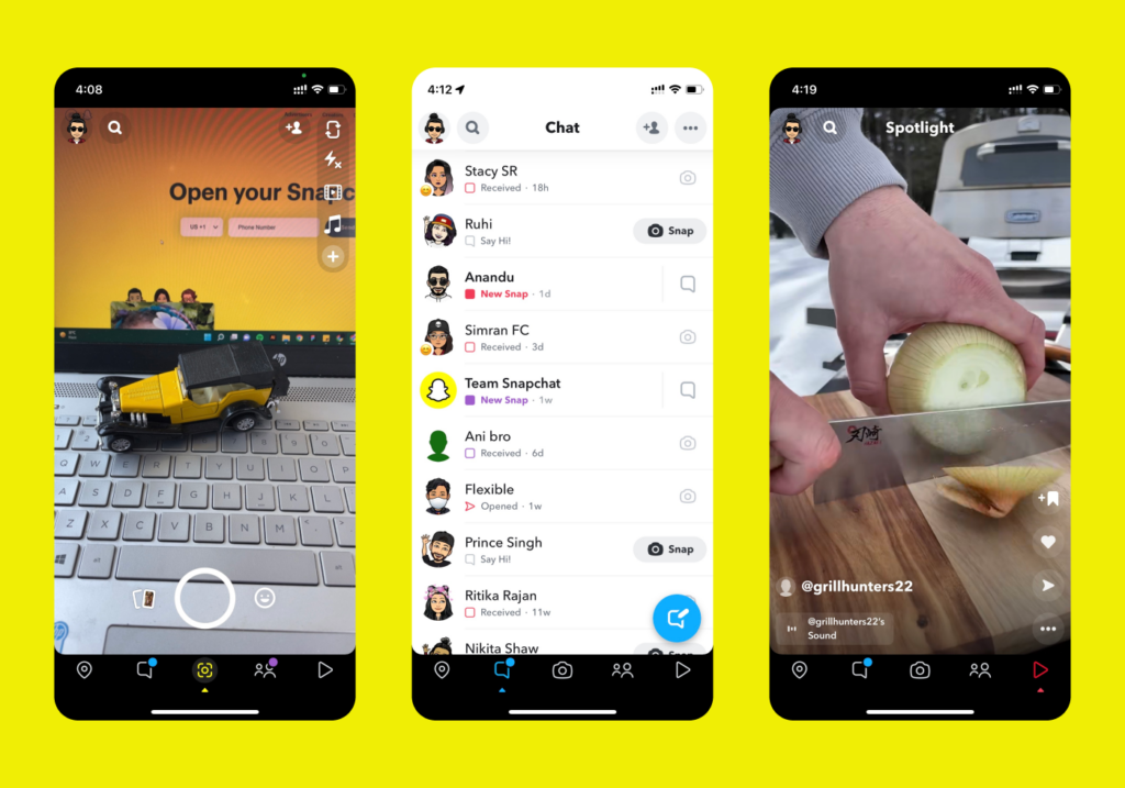
However, Snapchat’s user experience is not bad. It’s actually an incredibly smart design. Their challenging user experience is what keeps them relevant to their primary target audience: teenagers and millennials.
While Snapchat’s user interface isn’t the most intuitive (at least for adults), it does serve a few critical functions:
It keeps the adults out
Snapchat is a safe place for teens. They intentionally made the user interface challenging to grasp in order to make it difficult for adults to use. Most adults would not bother putting up the effort to learn how to use the app, leading to its abandonment. All content is ephemeral with strict limitations on editing. Most content is sent privately, and no content can be publicly rated or compared. Adults would not bother putting up the effort to learn how to use the app, leading to its abandonment. This limits Snapchat’s user base to teenagers.
It makes people talk about Snapchat
Even teenagers find Snapchat’s user interface challenging, but it becomes a game for them as a means of being cool and fitting in with their peers. Every time a new feature is added to Snapchat, thousands of people ask each other how it works. Each time, that chit-chat raises awareness of Snapchat.
There is a Gamification Component to It
Snapchat understood its users’ psychology and made certain features challenging to access intuitively. Users will only find these features if they spend more time on the platform exploring, which will make them feel rewarded. For example, When a user visits their Snapchat profile, the score appears under their name. It essentially displays how active they are within the app (sending and receiving snaps) as well as how much time they spend on it. This wonderful gamification strategy has been working successfully for Snapchat.
Netflix Does Not Care if You Hate the Auto-Play Trailer Feature
When it comes to user experience, Netflix does most things right, but not too long ago, Netflix decided to auto-play the previews when a user hovers over the thumbnail. This feature annoyed many users, and countless articles, tweets, and blog posts were written about it, where users complained about how annoying the auto-play feature was. To be fair, I can imagine the hypothesis. People who are stopped on a show thumbnail and read the description are interested in the show. So why wouldn’t you help them out by just playing the trailer automatically?
Netflix Auto Preview Feature
There was another aspect that caught my attention. With the preview sound, there was also additional music playing while the trailers were playing. The music was in tune with the same essence as what the preview trailers displayed. For a scary movie, there were scary screeching sounds, for a comedy, there was upbeat music; and for dramas, slow violins were playing. Now, this might sound trivial, but it is an extremely important feature from a UX perspective and makes a huge difference!
So, what these trailers were ultimately doing was conveying an experience to the user. You were able to know what experience you were about to get just within a few seconds of viewing the preview and without even reading the description! By combining both visual and audio cues, a feeling was successfully communicated to the user.
But after listening to its users, Netflix finally lets users disable auto-play for trailers.
So that’s a wrap-up for now.
And that’s the wrap-up for now!
These companies challenged UX rules for a reason: they researched their target audience’s preferences. That is what user experience is all about! Understanding your customer’s needs and implementing solutions that meet their expectations.