Save

Julie Mehretu at LACMA
When I first moved to California at 23 years old, I was young, broke and living off beans & rice, but one indulgence I allowed myself was a membership to the SFMOMA. I could barely make rent and was struggling to find work, so my roommate called into question my $75 membership, but seeing the Chagall exhibit five times made it all worthwhile. I have always fantasized being included in the pantheon of fine artists with my own work hanging on the walls of these revered institutions, so being in proximity to these iconic pieces was the next best thing. I knew intuitively that the firsthand examination of influential artwork shaped me in unique ways, and I should do whatever I could to spend as much time there.
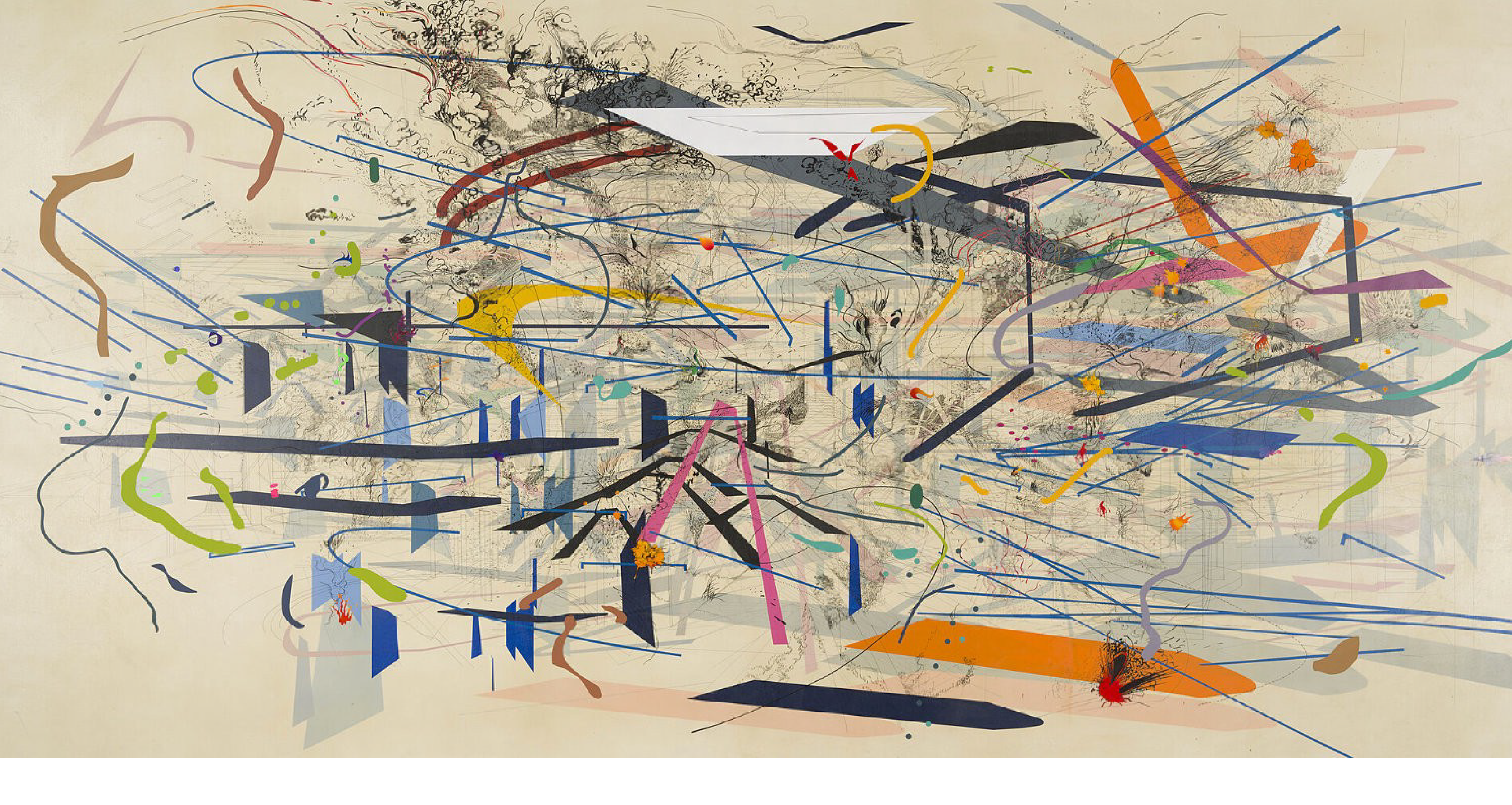
Twenty years later I live in Los Angeles with a membership to the LACMA, and recently was floored by the immense abstract works of Julie Mehretu. Her massive and meticulous exhibition reminded me how much of a profound effect the art world has on shaping how I design. I could never really put into words why I loved museum experience and what effect it had on my own artistic taste when I was an impressionable young designer, but I can now. If you are a designer of any kind, I think it’s important to take time to immerse yourself in fine art, and you’re doing yourself a disservice if you don’t at least familiarize yourself with various narratives around some of the more contemporary movements. There are so many unique ways that a trip to the gallery can shape your idea of fundamental art concepts that really have no shortcut or substitute.
Helps us Elevate
The most famous works of art you know today have a ubiquity to them — you’ve seen them on posters and postcards, used in ads or even as satire, so their meaning will inevitably become muddied in our minds. Even a quick scan of the writeup on the gallery wall or a cursory flip to Wikipedia can give you the context of work you may recognize, but not understand its importance outside of a meme on your timeline. Because at one point in their existence these artworks were new and revolutionary and achieved a type of transcendence from what came before them, and it’s up to us to understand their social importance.
The Impressionist movement arose because artists like Claude Monet and Mary Cassatt created work that was a response to the advent of the photograph. Prior to photography, artists were responsible for capturing moments in time through portraits and landscapes, but a new technology pushed artists to question the utility of paint on canvas as true-to life representation. As the photographic medium became faster at capturing reality, it allowed painters like Monet to move onto more conceptual ideas of light and form. Not only could painting depict reality, it moved into a more experimental phase, creating the context that elevated the craft further. You may not have realized this context of Impressionism because we were born into a world where both photographs and impressionist paintings already existed, so this void of how painting evolved is lost on us, save academic study.
Think about your own context at this point in your life: what technology is changing design? How are colors and type trends evolving? And what socio-political events are happening around us right now influencing how design looks & feels? Art has a way of tackling a wide variety of issues head on, forever unafraid to shake up our perceptions of society and tackle how technology is affecting us, and I think design can achieve similar goals. Most design is beholden to commercial requirements and external criteria that limit the scope of a work’s narrative, but why not aspire to include some small elements in our work — icons, patterns, or illustrations– attempt to transcend the basic requirements of commercial art? I believe elevating our work should be the goal of everything we make, even in small ways where we can, and pushing our own story forward will help give our design much more vibrancy.
Pattern Recognition
Abstract art is a great thing to expose yourself to as a designer, because for almost 99% of the design we do, it cannot function as abstraction. The design has to have some meaning and help communicate a certain problem, even the most shape heavy poster still has to convey some information to its viewer. So, abstract art is the perfect opposite analog to design, you have to infer meaning from it. The best abstract art helps you construct emotion around shape, line, & color eliciting a memory of something you can’t quite put your finger on. Studying a wide range of abstract art can show you how to convey a whole range of feelings using only color, texture and shape. Nothing representational means you have no choice but to leave any literal meaning behind, and this can help add to your visual language in your own work.
Many abstract artists like Mehretu spend years in a sort of obsessive pursuit of transcendent shapes and arrangements that lead them down a path of perfecting their patterns until we deem them worthy to display in a museum. The study of these patterns help us decode a universal language not rooted in the literal; we can piggyback on the glyphs they’ve discovered for our own work. Emotions come through in color, anxiety develops as a result of diagonal lines, a soothing sensation from repetition, you learn to communicate in non-verbal ways by attaching your own emotions to the shapes you see in front of you. You learn to speak your experience without saying a word by way of transference.

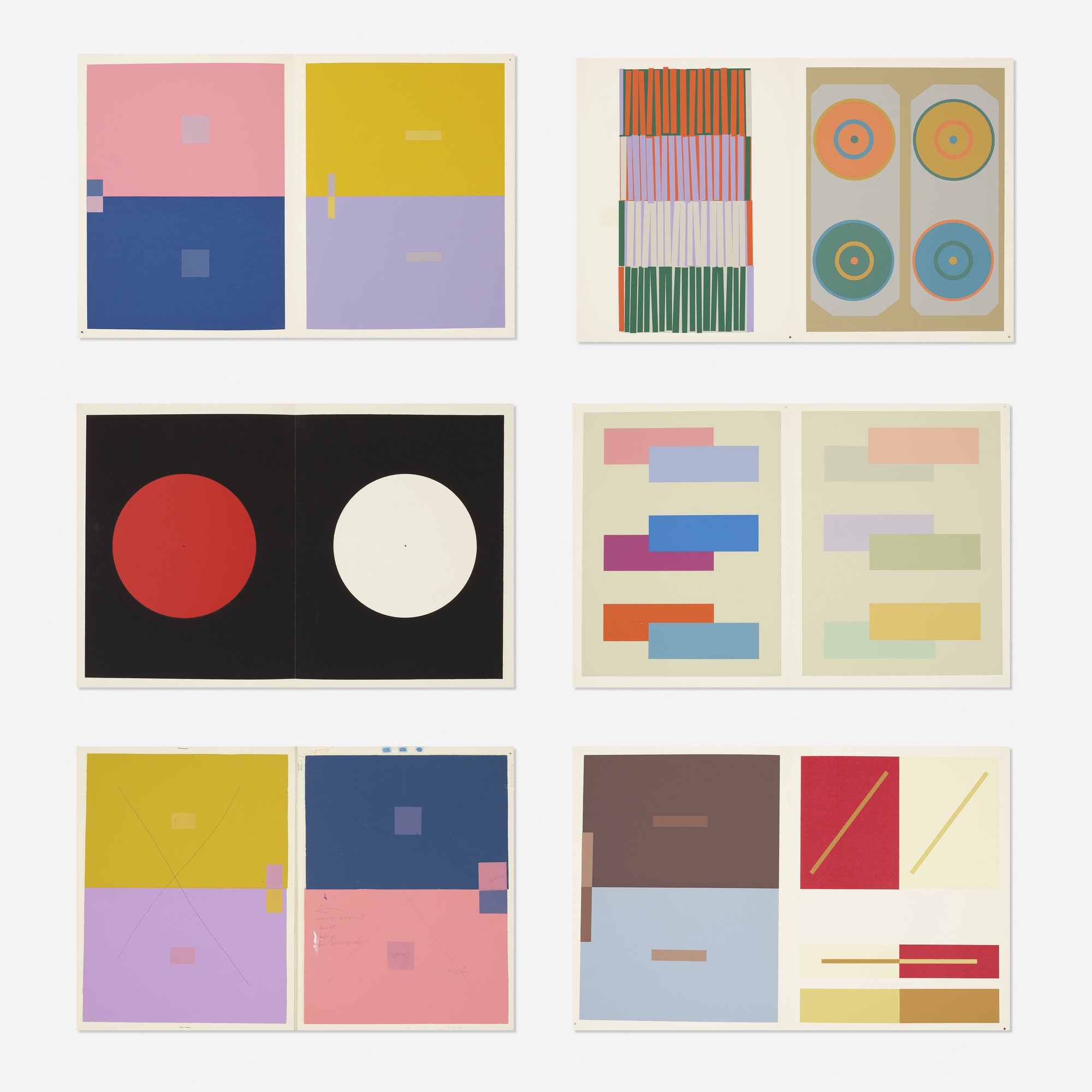
Pages from Albers’ numerous color studies.
The Bauhaus School in Weimar, Germany dedicated years and entire curriculum to discovering these patterns and enhanced our thinking around these ideas. Under instructors like László Moholy-Nagy and Josef Albers, breaking down geometric elements using scientific processes and overlapping colors and shapes was a more focused study on abstraction. Artists like Paul Klee and Wassily Kandinsky expanded on the processes by spraying and stamping colors, or by creating shapes they saw while listening to music. These studies helped push the idea of design and art being interchangeable, both utilizing the same building blocks and both held to equal importance. Theirs was a bridge with a foundation in science.
Physicality
Design has a fair amount of physicality to it through the resurgence of zines and handcrafted books, to the craft Kombucha can we drink, to the lustrous Apple style packaging to all of our goods, but it’s manageable in scale. Arguably, most design we experience now is on the screen of a device, so any physical aspect to our work is facsimile, a simulacrum spit out of a small computer. So gaining an appreciation for the physical construction of any given piece of art will help you better assess when you choose to incorporate texture, or tactile imagery to your work. Understanding physical properties and how they react to light or tension points can help you imitate those things through design as you pinch and zoom.

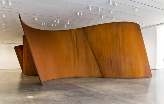
Richard Serra’s giant steel sculpture from 2006 that you cannot ignore.
Other than the occasional billboard or trade show booth, our designs tend to exist in dimensions that fit on a 8.5″x11″ sheet of paper. So seeing work at an enormous level pushes us to expand our own limits in design, such as making type fill the page or zooming way in on just an eye in a photo. An artist working in large scale forces you to walk around their work, changing your physical space to absorb all its elements. This an incredible decision for an artist to make, making you change your perspective, possibly multiple times, to absorb the intent. Designers, on the other hand, can direct your eye with strong diagonals or focal points, but rarely do we have the ability to adjust the viewer physically, so immense size is a powerful idea that art can achieve in unique and stunning ways.
Designers can be a bit myopic in our work as we repeatedly stare at our workstation screens day in and day out, so proximity to an imposing physical work of art can help shift our vantage point in a dramatic way. I would even add that physical spaces have become Instagram darlings that people love to experience and share with their friends. This type of physicality, like Yayoi’s Infinity Rooms at The Broad, serve as an infinite feedback loop (so meta) of design showcasing physical space that influences more design. As design continues to document our physical world, these types of physical spaces are curated to be social media ready, a never ending loop of content.
Quietly Absorb Discordant Ideas
Museums are fairly solemn places, nobody tends to shout or act recklessly in a museum – it has a wonderful, serene quality. Tranquility of an architectural space forces us to pay attention in a focused, almost spiritual level, it’s no wonder so many of us act in museums the same way we would act in a church or mosque, careful with our footfalls, speaking in whispers. As our attention feels more and more distorted from our endless scrolling or binging, museums are the perfect place to reset our attention – we have no choice but to fixate on the art and let our mind wander around its meaning. Good art rarely makes immediate sense, so our brain is coerced into making connections, resulting in the overall idea coalescing in our mind. So much of design is connecting dots for the viewer, so what better way to build this muscle but in a space designed specifically to do just that?

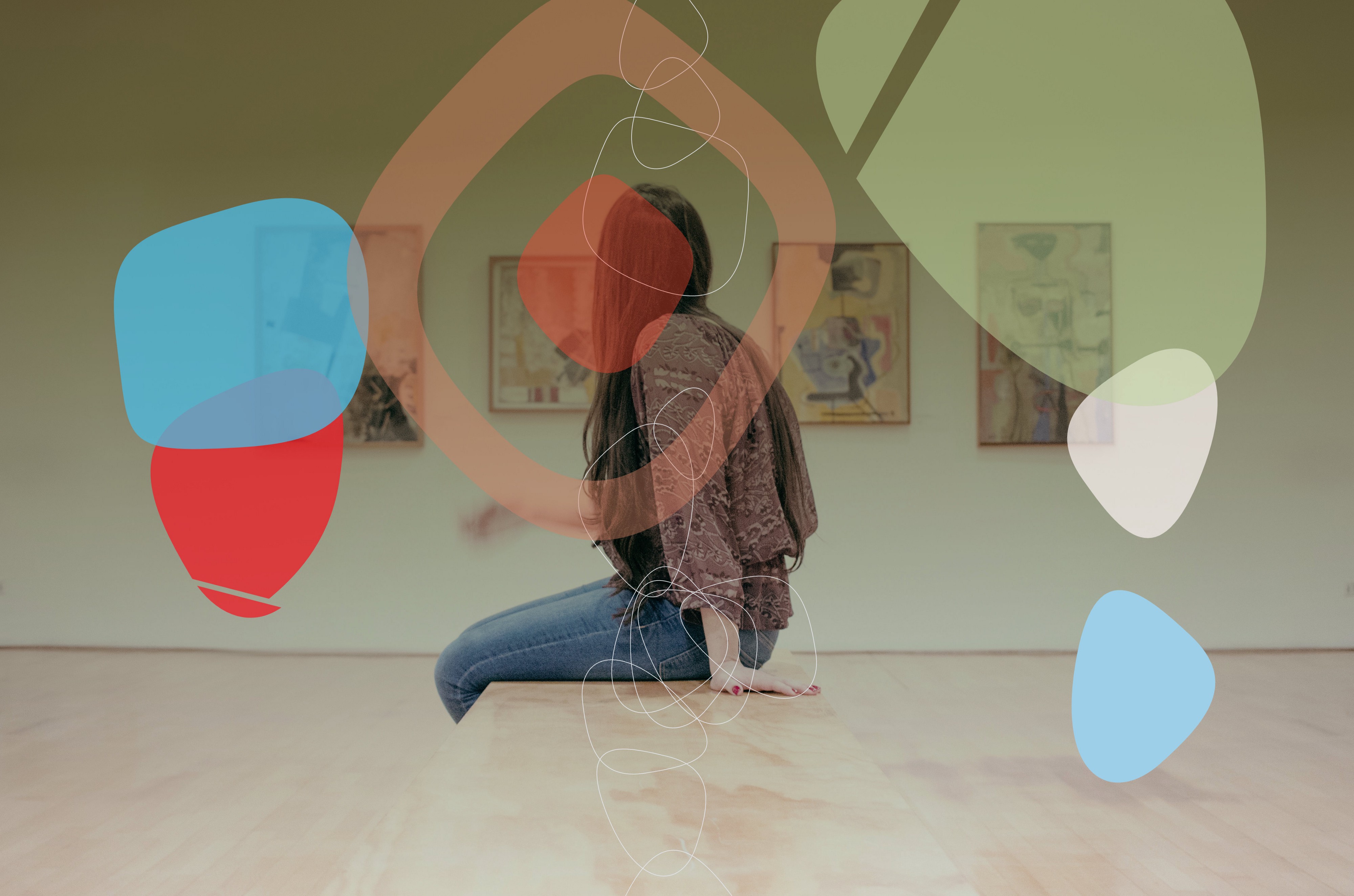
Put away your phone and let your brain run away with you. Photo by gilber franco on Unsplash
Often times the discordant ideas in art are a lot farther reaching than those of design, due in large part to a lack of a direct commercial objective tied to it. So in a way your flexing this muscle in stranger and more extreme ways than if you were putting together creative to solve a client brief. Larger ideas are at play: art often questions our normal assumptions of politics, gender, race, sexuality – a lot of topics you’re not solving problems for on a regular basis at your job. Art allows us to examine the push and pull of all sorts of boundaries and assumptions that would be incredibly off-limits in most offices. Quirkier ideas such as irony and playfulness also exist readily in these spaces, which also can be integrated into your work but are likely less apt to make your HR department sweat. Every subject is up for grabs and exploration in the art world, which can make museums and galleries more stimulating than your design 9–5. You get to walk out the door with all sorts of new and exciting ideas to bring to your own work to make it brighter and more robust
The art world is a strategic partner of mine in design, I find its depth and openness to our own interpretations fascinating. When I was a designer at Yelp, the SFMOMA was right around the corner, so I required many of my inspiration sessions and meetings on my coworkers in its spaces. To be fair, I think they enjoyed getting out of a conference room as much as I did. If you have museums and galleries near you, take full advantage of the lessons they can teach you, even if you know very little about art from an academic sense. Maybe after a visit or two, you’ll want to discover more. A membership or donation to these places goes a long way, I can’t recommend immersing yourself in the abstract enough.
Michael Ernst is a visual designer living in Los Angeles. Former tech product designer, he is currently working on his illustration portfolio after returning to art school.


