Save

According to a recent Forrester survey, 77% of customers prioritize companies that provide a personalized user experience or service. And the fact that more and more businesses strive to enhance personalized UX isn’t surprising at all.
Personalization and customization are efficient UX techniques that help users avoid generic and unnecessary content. Instead, they provide people with more relevant, up-to-date, and individualized experiences. At least, that’s what they say.
In many cases, however, personalization causes additional challenges for end-users, making people feel frustrated about their experiences as they find the content irrelevant, redundant, or unhelpful. Moreover, too much personalization can make users think that a service compromises their privacy, making them leave as fast as possible.
We at Eleken constantly provide effective UX solutions that address users’ needs. And we know exactly how to keep the right balance when applying customization and personalization in product design. In this article, we are going to share these insights with you. But let’s define the basics first.
What is personalization in UX design?
Personalization allows UX designers to create user journeys that meet customers’ unique requirements and deliver experiences based on their individual needs. If we say that the product or service is personalized, we mean that it predicts users’ expectations and is tailored to their goals. This makes design solutions more helpful, engaging, and easier to perceive.
Many confuse personalization and customization, believing that these terms have the same meaning. However, there is a significant difference between them.
- Personalization is when UX elements based on customer data address the individual needs of each user.
- Customization allows users to adjust UX elements to their individual needs on their own.
Learn more about personalization and customization in UX design in our blog post.
Now, let’s explore how different types of digital products personalize and customize user experiences.
Who takes advantage of UX personalization and customization?
Most commonly, UX personalization is used in e-commerce apps, streaming services, and social media platforms. Here are three typical examples of a personalized user experience in these types of digital products.
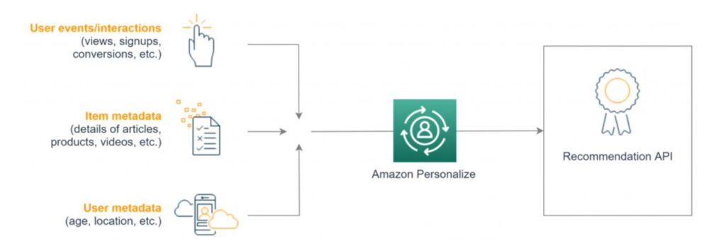
- E-commerce apps. For example, Amazon uses a machine learning service, Amazon Personalize, to help e-commerce stores create individual recommendations for their customers. It combines and analyzes user interactions, user metadata, and item metadata to generate the most relevant offers for online shoppers.
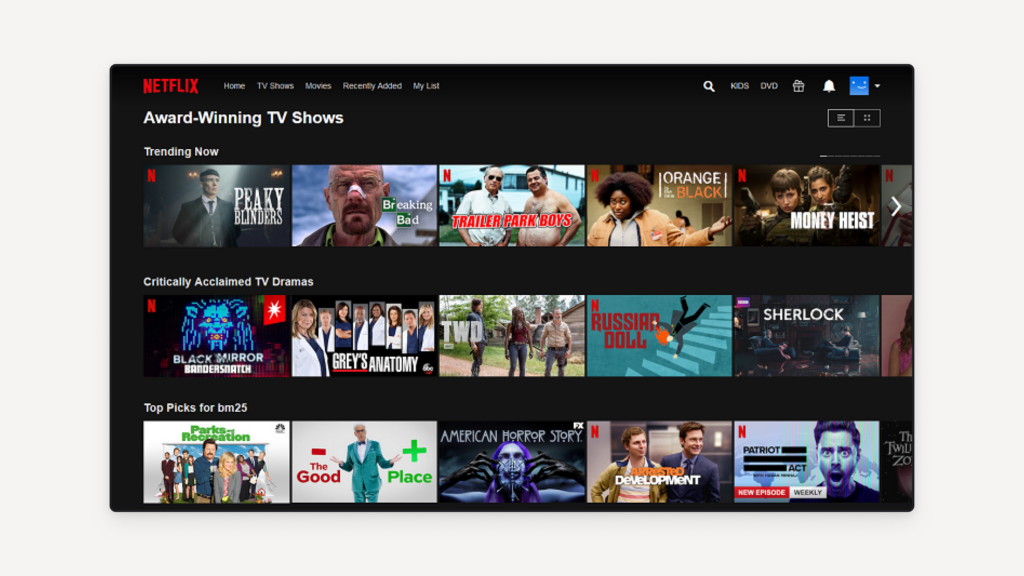
- Streaming services. The entire user interface of such platforms is built around individual user preferences. For example, Netflix has adopted a personalized movie recommendation system that predicts how much a person would like to watch a movie depending on a member’s previous activity.
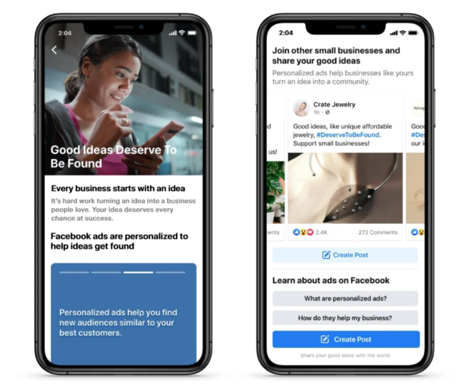
- Social media. Have you ever noticed that Facebook (or Meta, as they call it today) delivers only specific content to your feed, something you were recently looking for? That’s because the platform collects data about each user to create customized experiences, including ads, news, and so on.
These are just a few personalization UX examples in modern digital solutions. More and more products turn to personalization and customization. Individual recommendations and helpful notifications are great when it comes to making digital products engaging.
At this point, it may seem that the more personalized UX is, the more users will convert into loyal customers. However, this is not always the case. Too much personalization may have the opposite effect and here’s why.
When does personalization turn into overpersonalization?
It’s pretty obvious why personalization matters in UX user experience. It allows products to deliver more relevant, and valuable content. Customization provides users with freedom and enables them to adjust interfaces to their own requirements. But will these benefits become even more significant if you increase personalization and customization in your product’s UX design?
Well… not really. In fact, the line between enough and too much is quite thin here. At some point, a customer will likely find this “extra personalization” boring, overwhelming, or even creepy.
According to comprehensive research conducted by Nielsen Norman Group, too much personalization in UX leads to a lack of diversity, content fatigue, and homogeneous user experiences. As a result, a product fails to deliver the content users actually strive to receive.
That is why UX designers should be careful when implementing personalization and customization. Here are the most significant pitfalls we always keep in mind when turning to these solutions in our designs.
Main issues caused by too much personalization and customization
Let’s take a closer look at the most common personalization and customization challenges and consider their negative impact on user experiences.
Lack of diversity
When trying to provide users with as relevant content as possible, a product may feel strictly limited to users’ core interests. As a result, it lacks diversity because of missing out on a broader range of content that could potentially interest users. In this case, focusing on a single preference of an individual user prevents an organization from learning more about its target audience and delivering more diverse content that would still be based on their needs.
For example, imagine an app allowing users to browse images. If a person is interested in funny cat pictures, overpersonalized recommendations will provide them with hundreds of those. However, this approach also limits their access to other types of content. But what if this person would also love to see dogs and bunnies in their feed? That is where overpersonalization becomes a problem both for the organization and end-users:
- Organizations lack an understanding of individual user needs
- End-users will eventually get tired of the same-looking content

Homogenous experience
In the same research we mentioned above, NN Group describes one of the most critical impacts of overpersonalization as a homogenous experience. This survey showed that the participants quickly get bored when viewing the same content on Facebook, Instagram, and TikTok. Besides, they experienced the same feelings when receiving similar product offerings on Amazon. In particular, users complained about outdated recommendations based on their previous purchases.
The outcome of this issue is quite frustrating. According to NN Group’s report, “In some cases, this level of overpersonalization has caused users to lose interest in these platforms or abandon them altogether.”
Placing users into a narrow audience group limits their freedom. So instead of pleasing people with attention to their individual interests, personalization becomes annoying if not implemented wisely.
Content redundancy
Content homogeneity is also related to another common personalization issue. Users may find the targeted content not just boring, but redundant if it is duplicated, especially in cases when the person bumps into identical (or very similar) posts, ads, or recommended goods lots of times.
This effect is also caused by overpersonalization that occurs when a system considers a particular type of content a user’s primary interest. However, many people prefer avoiding such duplicates and having unique online experiences.
One of the most common examples of content redundancy is the Instagram feed. People, when following certain trends, make tons of similar pictures. There’s even an @insta_repeat account that points out this phenomenon. It shows multiple similar posts made by different users at different times, and they are just identical.
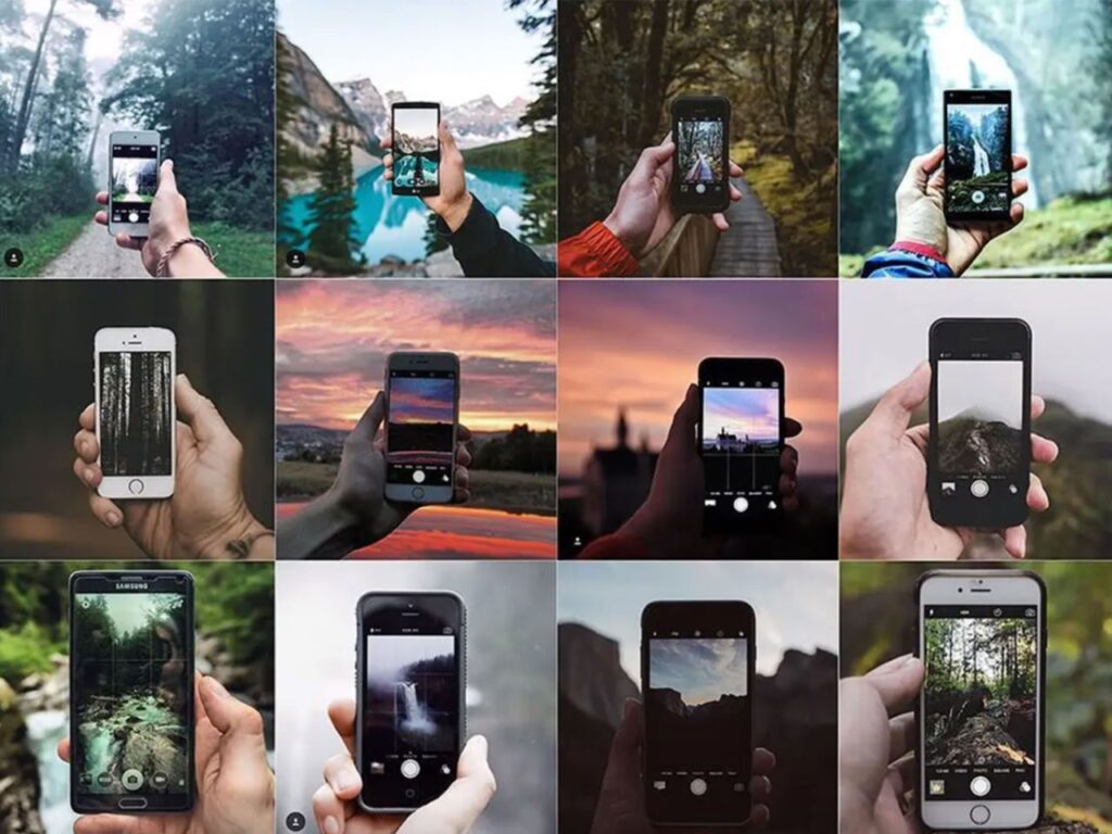
While being a bit annoying on social media channels, redundant content is a main deal-breaker when it comes to ads. MarketingWeek reports that nearly half (45%) of customers abandon brands that repeatedly show the same advertisement or creative messaging. As you can see, personalization doesn’t help here.
“Creepy effect” of personalization
It’s not a secret that personalization and customization are based on data that organizations collect about users. However, people don’t tend to think about that when these methods work properly, providing them with helpful and relevant experiences. In contrast, if overpersonalization occurs, users may find it not just excessive, but creepy.
In other words, if a user takes a single action that snowballs into receiving tons of related content, they will likely get worried about their privacy.
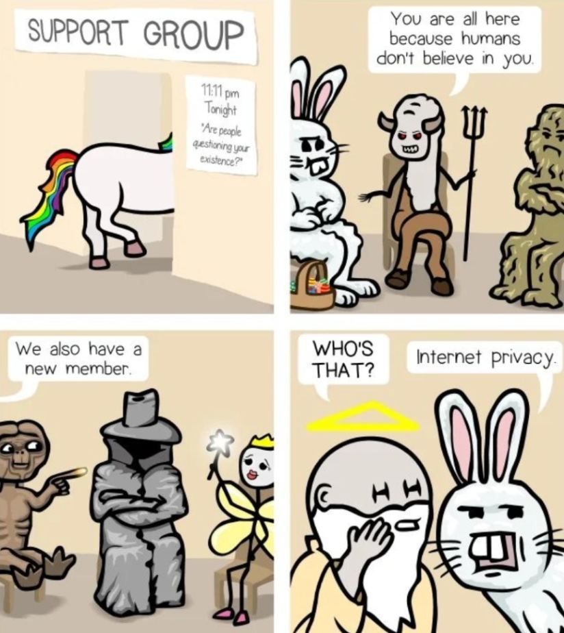
In particular, many users consider personalization creepy if they don’t understand how certain information was gathered. For instance, let’s say a person searched for cosmetics from their phone on a specific website and then started to receive related recommendations on another website when using a laptop. In this case, a user won’t understand how their data was processed and used, which leads to anxiety and mistrust.
Besides, it’s a good idea to keep in mind that certain information is sensitive. Personalized content based on such data should not come to a user out of blue. Good UX should consider this factor when applying personalization and avoid misusing private information (from pregnancy and medical issues to the need for psychological help or addiction treatment, and so on).
Cognitive overload caused by overcustomization
All cases described above definitely prove that too much personalization causes many challenges for end-users. But what about customization? Could it be too much?
Well, too much of something is never a good thing. Customization provides users with more freedom and control over interfaces. However, at some point, this freedom causes so-called cognitive overload.
According to numerous studies, users don’t want to think too much and develop their expertise sky-high when interacting with digital products. Instead, they want to get a design that is simple, intuitive, and result-driven. So while customizing certain features to users’ individual needs sounds cool, asking users to set every single aspect of a digital solution on their own is not a good idea. In fact, overсustomization causes friction, requires too much learning, and may even question the value of the product.
Now that you know all the potential pitfalls and misuses of personalization and customization, let’s explore how to make these solutions work as intended. Here are the most effective ways to avoid overpersonalization and overcustomization in user experience.
How to prevent overpersonalization and overcustomization
When designing an app or platform, a product team should find the right approach to implementing personalization and customization. Of course, the need for these UX techniques entirely depends on the product’s specifics, such as its type and the target audience it’s supposed to serve.
However, there are several best practices we at Eleken recommend following to avoid unwanted friction. Let’s look at them in more detail.
- Find the right balance. To avoid the lack of content diversity caused by overpersonalization, find a way to consider users’ individual needs while still delivering various content. For example, Pinterest allows users to add more categories to their primary interests, this way expanding their feed if they like.
- Combine targeted and general content. Users who can access only personalized content may quickly feel bored with a product. It’s better to mix different types of content and allow users to discover new information or goods, even if it’s not based on their initial interests or previous purchases.
- Be careful with potentially sensitive information. Users value their privacy, especially when it comes to sensitive data. Providing personalized recommendations based on such information should not be out of a relevant context. Otherwise, personalization may seem creepy or even hurt users’ feelings.
- Provide users with control. Users should be able to control and manage personalization applied by the products they use. Such an approach builds trust because it allows people to establish the level of their privacy on their own. Moreover, users will not be scared away if they understand how the personalization algorithm works.
- Take advantage of user feedback. If users face any kind of issues related to personalization or customization within a product, they should be able to report those problems. This will allow you to improve the user experience and prevent potential churn.
- Don’t let users’ freedom affect their comfort. The level of customization should be limited to people’s actual needs. Provide users with control over the interface only when it’s relevant and helpful. Avoid abusing custom features, as they may overwhelm users and make your platform less intuitive.
When personalization and customization work properly
As with any other aspect of UX, personalization and customization are effective only if applied wisely. If used too much, they may damage user experience and cause problems instead of solving them. These issues lead to higher churn rates which are critical for a SaaS customer journey. That is why we at Eleken always pay extra attention to the level of personalization and customization in our designs.
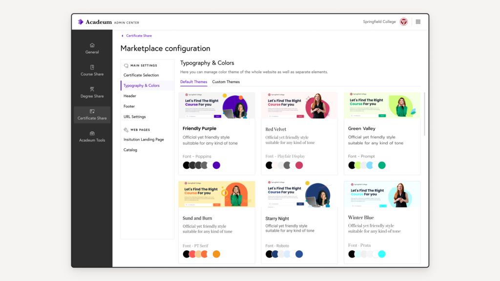
For example, when working on the Acadeum, a platform selling courses for universities. We got the right balance in terms of customization and personalization in our UX strategy. Check out how we implemented it here:
Personalized content based on the user’s individual choices. During the onboarding process, newcomers go through a brief interview that allows the system to determine which courses fit their needs best. As a result, users get the most relevant recommendations later on.
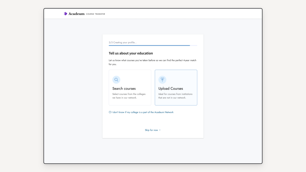
Personalization based on user roles. Personalized content depends on the roles that users select on their own. Every role accesses information that fits its needs most.

Well-balanced customization. Users can customize certain interface elements, including the background color and typography. However, the customization level doesn’t go too far. The app remains simple, intuitive, and easy to navigate.
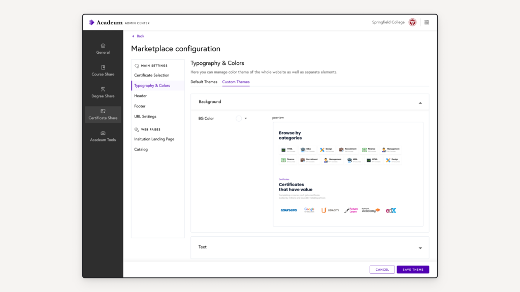
Moreover, if users don’t need to customize the interface, they can turn to the default themes and quickly pick the most suitable one.
Final thoughts
Personalization and customization work great only when carefully thought through. Product teams have to find the right balance when implementing these solutions in their designs. Overpersonalization may seem stereotypical, making content boring and generic and in some cases, it also makes users feel they’re being stalked. Too much customization, in turn, overwhelms users. Instead of creating a sense of freedom and control, it limits their interactions with the product and doesn’t meet the principles of accessibility in UX.
This article was originally published on Eleken.
As a Content Specialist at Eleken, a design agency for SaaS businesses, Maria writes articles covering UX/UI design topics. Besides work, Maria enjoys art museums, good books, and traveling with her dog.
- Personalization and customization are effective UX approaches that aid users in avoiding undesired content, but they can also cause new challenges.
- The author covers the main drawbacks of excessive personalization and customization:
- Lack of diversity;
- Content redundancy;
- “Creepy effect” of personalization;
- Cognitive overload caused by overcustomization.
- There are several practices, recommended by the author, that prevent overpersonalization and overcustomization:
- Finding the right balance to maintain content diversity;
- Using caution when handling potentially sensitive information;
- Providing users with control when it is relevant;
- Taking advantage of user feedback.


