Back in July 2019, Pinpoint asked our team at Taylor Thomas to help re-design the UI of their digital product. Having completed an overhaul of their brand and visual identity, Pinpoint wanted to inject their new visual look and feel into the app, as well as improve the overall user experience.
How can we add the most value?
As Marcus, Director at Taylor Thomas will often say, while we take pride in our final delivered designs, we place equal if not more emphasis on the questioning and thinking that gets us there. That’s where we feel, as design partners, we can add the most value to a product or business.
A UX audit
To begin, we spent a good amount of time analysing and thinking about the product’s UX. It’s always important to gain a solid understanding of the problems before attempting to solve them through design.
We looked at the product with a fresh pair of eyes, spoke to the Pinpoint team, evaluated the competition, and discovered some key pain points that needed addressing. We felt we needed to streamline some of the core user journeys and make the experience more intuitive as a whole.

Part of our initial UX audit for Pinpoint
Component based approach
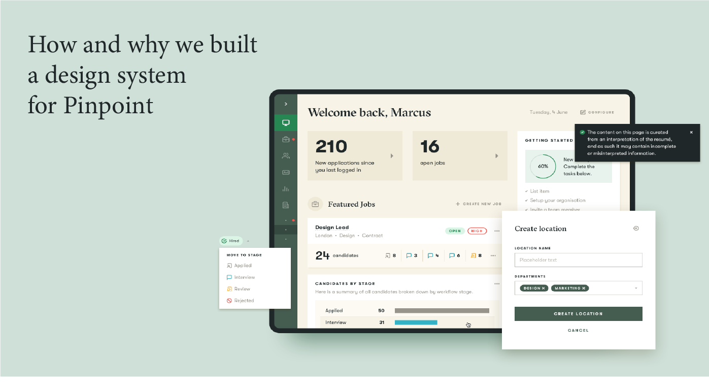
Pretty quickly, we identified the need for a dashboard that would act as the starting point for users, and aggregate all the important information in a single view. We used the dashboard to test some early variations in components and layout as well as establish some core principles for typography and colour. The dashboard laid the groundwork for a component based approach, and our decision to create a design system for Pinpoint.

Some early layout variations for a to-do list / notifications card
Pinpoint’s success, like many startups and growing technology businesses, hinges on their ability to scale and grow rapidly. Because of this, rather than merely delivering component and layout designs via Sketch or Zeplin, we felt that documenting a design system was important in helping them achieve that goal.
Additionally, Pinpoint didn’t have full-time design resources in-house, so providing a formal piece of documentation would allow the team to make quick design decisions and guide the design of new features. We love working with Pinpoint as they understand the value of design, are always eager to look at things from a design perspective, and unsurprisingly saw the benefit of this approach straight away.
What is a design system?
It seems like there’s an endless array of articles and blog posts on design systems that probably explain what they are and why you need one much better than I. Speaking from my own experience, with a varied design background, I was relatively late to the design system train. I remember thinking to myself, what’s the big deal? Isn’t it just a digital version of a brand guidelines document? (If you have experience working in branding you’ll know how often these get ignored).
Many top tech companies evangelise and publish their design systems online (Google’s Material Design and IBM’s Carbon Design System are two constant points of reference). After shifting to a more product design focus, I began to see why. Looking at the complexities involved in any growing digital product you start to see how quickly inconsistency, inefficiency and design debt can creep in, especially in larger organisations or where lots of people are working on the same product.

Some popular design systems – Material (Google), Carbon (IBM), Lightning (Salesforce), Polaris (Shopify)
A design system is the framework that glues design and code together. It acts as a single source of truth, ensuring that everyone is drawing from the same set of components, guidelines and principles. A design system makes it easier to build new features without time-wasting solving old problems over and over again. It’s a toolbox for designers, developers and product managers to deliver consistent user experiences as quickly as possible.
What are the advantages?
From a business perspective, the advantages are myriad – a properly implemented design system will improve:
- design consistency across your product,
- efficiency in your teams, and
- speed at which you can scale.
There is an economic saving, a shared sense of ownership and a consistent set of brand building blocks. As each new software feature or product is scoped, there is reduced overhead in creating them as the design team doesn’t need to be involved. And your customer is already familiar with your UI patterns because they have seen it all before.
In Pinpoint’s case, starting a re-design with a relatively small team, it felt like the perfect opportunity to implement a design system before any of the typical design debt has had a chance to accrue.
A systems view of the product
We started with a list of components that grew as the design progressed — a militant use of Sketch styles and symbols, and an 8px base grid system helped ensure consistency from the outset. A set of rules for usage and layout began to emerge across components of different complexities.
However small, every design decision took into account its potential impact elsewhere. For example, introducing a new button style prompts questions such as:
- ‘can we use an existing one?’,
- ‘is this specific variation justified?’, and
- ‘should this replace another one everywhere else?’.
The goal during the design process was to allow for the highest degree of flexibility with as few components as possible.
As the sole design team working on the project, we decided to approach the work in stages. First, we focussed on developing the UI of the key screens and user journeys identified in our research, ensuring styles and symbols were being created along the way. Then we moved on to documenting the design system in full.
We knew that complexity would only increase over time and previously established rules would need tweaking. Knowing how much work would be in the documentation process itself, we wanted everything to be as nailed down as possible from the get-go.
What tools did we use?
Knowing that the design system would evolve and change over time, we worked fluidly with the development team at Pinpoint, utilising Notion as our primary tool for collecting feedback. As the other critical users of the design system, we wanted to build consensus with the development team and ensure engagement at every step.
A component doesn’t really exist until it has been built.
Ultimately, if a component hasn’t been implemented as per the documentation, either it needs updating, or the documentation does. Otherwise, it isn’t doing its job. Its no longer the source of truth its supposed to be. Equally, regardless of design, a component doesn’t really exist until it has been built. Users don’t see designs in Sketch, they see and interact with components in their browser.
Utilising technology
Our vision was to use technology to help achieve this — we chose Zeroheight as the tool to house the documentation. Zeroheight integrates with Sketch to allow designers to import and update symbols easily, and also enables developers to embed live components from Storybook, a UI component library. In this way, we would be able to see designed and built components side by side and maintain parity between the two. We also implemented a versioning system for each component to track changes and make the documentation as transparent as possible.

Our proposed workflow process and tools
We used Abstract to house all our design files. Abstract is an incredibly powerful tool for Sketch which helps to simplify design collaboration, track changes and centralise design processes in an organised way. We created a component library in Sketch, deployed via Abstract, for designers to use when building new layouts and features. Gone are the days of asking your colleague for the latest version of a file, or saving files with names like ‘Dashboard V2 Final Final Final’.
So what does the design system actually look like?
Our design system consists of two main sections — a style guide which sets out fundamental elements such as colour, typography, and spacing, and a component library which documents anatomy, structure, behaviour and usage. Components are the building blocks of the product but need a set of accompanying instructions to make sure they are assembled logically and consistently. (Imagine trying to put together an IKEA wardrobe without the instruction manual.)
We included as much guidance as possible for each, to not only facilitate future decision making but also provide context for past decisions.

We opted for a categorised approach to component organisation, rather than a long flat list. Starting with just a handful of 12 or so potential components, the design system today consists of over 50 (and counting!), along with numerous subtypes, variations and states.
Each component begins with a short and concise description explaining what it is and what it does. The documentation is then split by type, size and style. A breakdown of the component’s anatomy establishes key terminology, specifications for size and spacing, followed by a set of ‘dos’ and ‘don’ts’. Additional guidance might help explain what size button to use and when, or how an input field should behave when more than one item has been selected.

Extensive guidelines for buttons – not as simple as you might think!
Where are Pinpoint now?
After ‘delivery’ of the design system as both a piece of documentation in Zeroheight, and UI kit in Abstract/Sketch at the end of 2019, we have continued to partner with Pinpoint on other projects such as their marketing site as well as some new product features.
For the latter, having the component library in place has already proved extremely valuable. It’s allowed us to create and iterate designs very quickly. It’s also demonstrated the evolving nature of the design system, with new elements added and tweaks being made, all of which will eventually feed through into the documentation and the app.
What did we learn?
Building a design system is not an easy task, and requires a lot of time and commitment from all involved. Being a continually changing deliverable, one of the biggest challenges is governance — larger organisations typically have teams dedicated to maintaining and policing their design system, especially as the number of users and contributors grow.
For a smaller team like Pinpoint, where there are only a handful of designers and developers involved, this is much more manageable using the tools we mentioned. We do think it’s still important to define each individual’s role and identify ownership; the design system is a product in itself and should be managed as such.
We’re excited to see how Pinpoint utilise the work we have done (and continue to do), and will undoubtedly be maintaining our partnership with them as they look to grow and expand their offering in the future.