Flag

We stand with Ukraine and our team members from Ukraine. Here are ways you can help

Get exclusive access to thought-provoking articles, bonus podcast content, and cutting-edge whitepapers. Become a member of the UX Magazine community today!

Home ›› Accessibility ›› Design Guide: Breadcrumbs

Design Guide: Breadcrumbs

by Alex Zlatkus
3 min read
Share this post on
Tweet
Share
Post
Share
Email
Print

Save

Breadcrumbs_Slider

You may or may not need to incorporate breadcrumbs into your web design, but here are some things to keep in mind if you do.

NOTE: The majority of my inspiration came from 

Let’s get right into it!

Anatomy

Because one cannot design before they define.
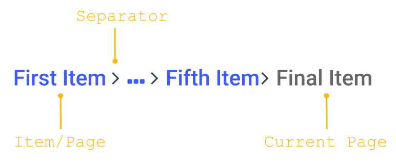
Breadcrumb

Please note, this is the terminology I will be using, although I know there are different definitions out there.

Utilization

Not every app needs breadcrumbs. At the same time, you should not avoid them due to the common misconception that they are outdated. You should leverage breadcrumbs if your app has a large hierarchical structure. Think .

Design best practices

1. Breadcrumb width should not exceed half of the page

This is for the sake of readability.  says it best:

Breadcrumb

If breadcrumb text wasn’t so readable to begin with I’d probably make the width 1/3 of the page.

This should be true whether the breadcrumbs are collapsed or expanded.
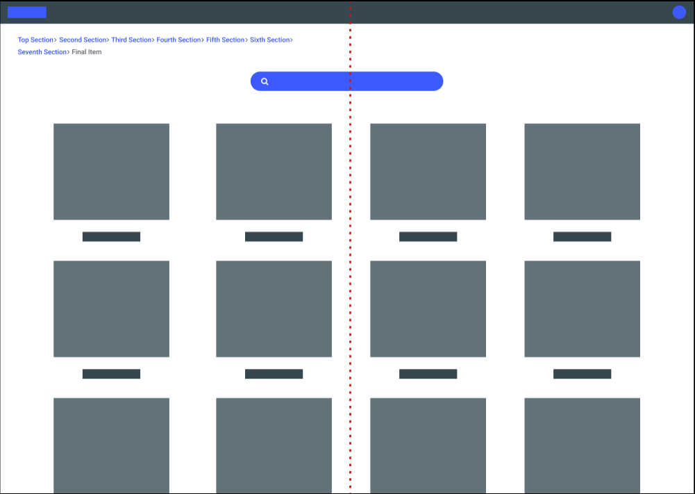
Overflow

Breadcrumbs overflow to next line in this example.

The only instance where you should not follow this rule is for mobile apps. In this case, use the entire screen width.
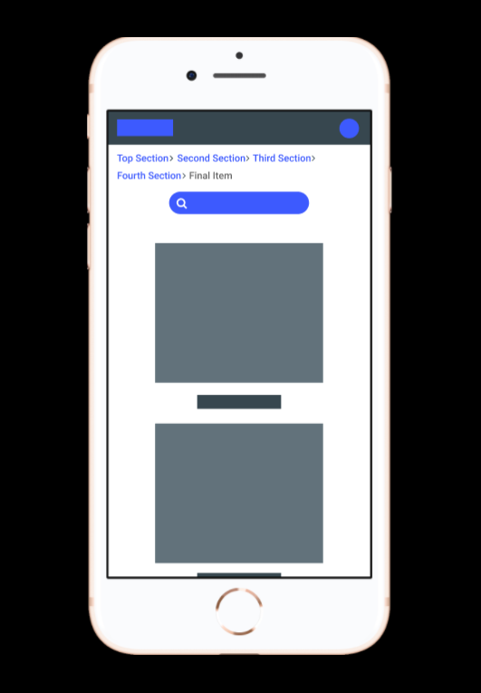
Mobile

Breadcrumbs overflow to next line in this example.

2. Collapse breadcrumbs by default if they have 4+ items

Why 4+ items? I’ll be honest, I picked this limit as it just “feels” right. 

If the user wants to see the entire trail of breadcrumbs, they should have the option to do so. As you can see from the design below, adding clickable ellipses is a great way of implementing this.

Mobile

Additional small things to consider:

Put the ellipses as close to the first item as possible — Items that are closer to the final item (current page) hold more weight to the user so you want to make those items visible.

NYC Subway

NYC Subway has a different context but leverages ellipses in multiple places 

Do not make the ellipses the actual first item — It is beneficial for users to know the origin of the current page they are on, especially if they are taken directly to the page they are on via a link.

Upon refreshing / re-navigating to the page, breadcrumbs should be collapsed again — There is no clean way to manually collapse breadcrumbs (nor do I think it is worth the effort) so make sure it is collapsed by default, even if they were expanded before.

3. Items with long name should leverage ellipses

There is no reason a really long page name should ruin the readability of your breadcrumbs. Use ellipses inside the item name if it gets too large.

Elipses

The ellipses in the item itself should still be clickable.

And (of course) all ellipses that replace text should have a hover over.

Hover

Probably should have added a more realistic name…

4. Separator icon should mimic movement

Users travel from page to page, so we should show that journey in our breadcrumbs. It’s a subtle design, but also requires minimal effort.

icon

Some of these icons are better than others, but at least they all show movement.

5. Last Item should not be clickable

The last item in the breadcrumbs should be the current page the user is on. This gives users quick confirmation of where they are in the app (even though this should be made clear elsewhere). It also provides consistency as the first page is also shown.

With that being said, the item should not be made clickable. Clicking this will only reload the page (which can be done using the refresh button) and could possibly confuse users in thinking they are on a new page.

As with all non-clickable elements, add signifiers (color, cursor type) to ensure users know this item cannot be clicked.

That should do it! Let me know if there are any other sure-fire best practices for Breadcrumbs! 

post authorAlex Zlatkus

Alex Zlatkus

Alex is a product designer from Boston, MA. With a history in customer support and quality assurance, he focuses on creating empathetic solutions, that work for all use cases.

Alex has extensive experience bringing UX best practices to startups and relish's every opportunity to advocate for design. Alex works at LogicManager, designing SaaS solutions in the risk management industry, and works part time at Connective, a social app for creatives. 

Tweet
Share
Post
Share
Email
Print

Related Articles

Discover how breaking down silos and embracing cross-functional collaboration can lead to smarter, more user-centered design — and better products for everyone.

Article by Rodolpho Henrique
Beyond the Design Silo: How Collaboration Elevates UX
  • The article explores how siloed UX design practices can hinder product success and argues for cross-functional collaboration as essential to creating meaningful user experiences.
  • It outlines the benefits of working closely with product managers, engineers, and stakeholders to align user needs with technical feasibility and business goals.
  • The piece provides real-world collaboration examples across research, prototyping, design systems, and accessibility to show how teamwork leads to more innovative and effective UX outcomes.
Share:Beyond the Design Silo: How Collaboration Elevates UX
4 min read

Designing for AI? Know what your agent can actually do. This guide breaks down the four core capabilities every UX designer must understand to build smarter, safer, and more user-centered AI experiences.

Article by Greg Nudelman
Secrets of Agentic UX: Emerging Design Patterns for Human Interaction with AI Agents
  • The article examines how UX designers can effectively work with AI agents by understanding the four key capability types that shape agent behavior and user interaction.
  • It emphasizes the importance of evaluating an AI agent’s perception, reasoning, action, and learning abilities early in the design process to create experiences that are realistic, ethical, and user-centered.
  • The piece provides practical frameworks and examples — from smart home devices to healthcare bots — to help designers ask the right questions, collaborate cross-functionally, and scope AI use responsibly.
Share:Secrets of Agentic UX: Emerging Design Patterns for Human Interaction with AI Agents
10 min read

Design systems were meant to streamline design and boost creativity — so why do they often do the opposite?

Article by Itai Vonshak
The Broken Promises of Design Systems: Why Following the Rules Won’t Get You to Great Products
  • The article questions whether design systems really help create better products.
  • It explains how they often limit creativity, are hard to maintain, and don’t scale well.
  • It suggests we need more flexible, AI-powered tools to support great design.
Share:The Broken Promises of Design Systems: Why Following the Rules Won’t Get You to Great Products
3 min read

Join the UX Magazine community!

Stay informed with exclusive content on the intersection of UX, AI agents, and agentic automation—essential reading for future-focused professionals.

Hello!

You're officially a member of the UX Magazine Community.
We're excited to have you with us!

Thank you!

To begin viewing member content, please verify your email.

Tell us about you. Enroll in the course.

    This website uses cookies to ensure you get the best experience on our website. Check our privacy policy and