NOTE: The majority of my inspiration came from Atlassian’s Design System
Let’s get right into it!
Anatomy
Because one cannot design before they define.

Please note, this is the terminology I will be using, although I know there are different definitions out there.
Utilization
Not every app needs breadcrumbs. At the same time, you should not avoid them due to the common misconception that they are outdated. You should leverage breadcrumbs if your app has a large hierarchical structure. Think Amazon.
Design best practices
1. Breadcrumb width should not exceed half of the page
This is for the sake of readability. Christian Holst says it best:

If breadcrumb text wasn’t so readable to begin with I’d probably make the width 1/3 of the page.
This should be true whether the breadcrumbs are collapsed or expanded.

Breadcrumbs overflow to next line in this example.
The only instance where you should not follow this rule is for mobile apps. In this case, use the entire screen width.

Breadcrumbs overflow to next line in this example.
2. Collapse breadcrumbs by default if they have 4+ items
Why 4+ items? I’ll be honest, I picked this limit as it just “feels” right.
If the user wants to see the entire trail of breadcrumbs, they should have the option to do so. As you can see from the design below, adding clickable ellipses is a great way of implementing this.

Additional small things to consider:
Put the ellipses as close to the first item as possible — Items that are closer to the final item (current page) hold more weight to the user so you want to make those items visible.

NYC Subway has a different context but leverages ellipses in multiple places
Do not make the ellipses the actual first item — It is beneficial for users to know the origin of the current page they are on, especially if they are taken directly to the page they are on via a link.
Upon refreshing / re-navigating to the page, breadcrumbs should be collapsed again — There is no clean way to manually collapse breadcrumbs (nor do I think it is worth the effort) so make sure it is collapsed by default, even if they were expanded before.
3. Items with long name should leverage ellipses
There is no reason a really long page name should ruin the readability of your breadcrumbs. Use ellipses inside the item name if it gets too large.

The ellipses in the item itself should still be clickable.
And (of course) all ellipses that replace text should have a hover over.

Probably should have added a more realistic name…
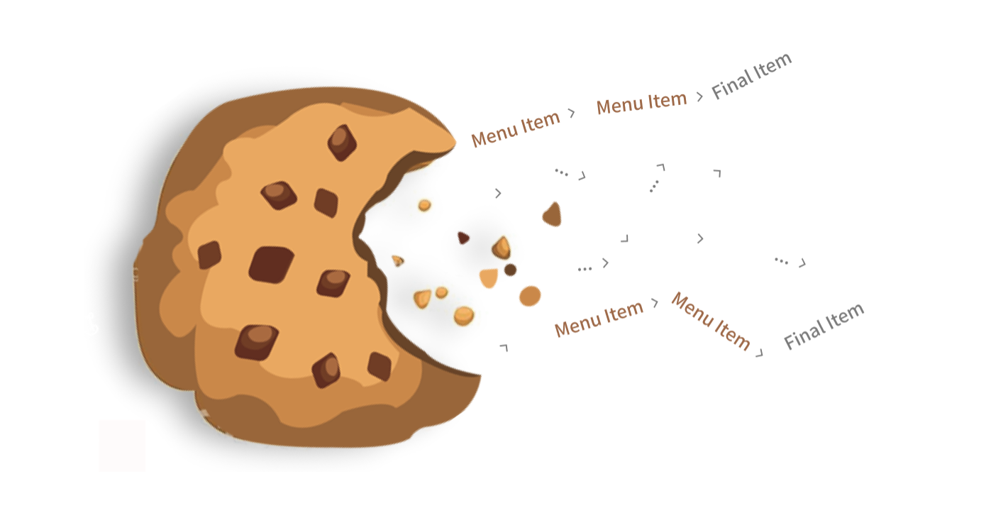
4. Separator icon should mimic movement
Users travel from page to page, so we should show that journey in our breadcrumbs. It’s a subtle design, but also requires minimal effort.
Some of these icons are better than others, but at least they all show movement.
5. Last Item should not be clickable
The last item in the breadcrumbs should be the current page the user is on. This gives users quick confirmation of where they are in the app (even though this should be made clear elsewhere). It also provides consistency as the first page is also shown.
With that being said, the item should not be made clickable. Clicking this will only reload the page (which can be done using the refresh button) and could possibly confuse users in thinking they are on a new page.
As with all non-clickable elements, add signifiers (color, cursor type) to ensure users know this item cannot be clicked.
That should do it! Let me know if there are any other sure-fire best practices for Breadcrumbs!