Save
The year is 2020, and the COVID-19 pandemic has changed every aspect of modern life. We have become an isolated society, more dependent on technology now than ever before. Video chatting with our family and friends is the new normal.
Now Imagine relocating to a new city during this time or starting a new job or perhaps, going through a breakup. Starting fresh has always been challenging, but now, impossible.
Enter Bumble BFF, once solely a dating app (Bumble) turned friendship incubator. A location-based social site that matches users based on preferences. It’s a digital way to meet new friends, existing before the pandemic but now, during a time of social isolation, it has the potential to be more useful than ever.
My research began with a question:
How has Bumble BFF helped people deal with social isolation during stay at home orders?
To help me understand and answer this question, I conducted preliminary research and discovery on Bumble BFF. I recruited and interviewed participants as a part of a research class in the Maryland Institute College of Arts’ Master of Professional Studies in UX Design program. From this research, I was able to identify key pain points within the user’s experience with the app and to make friends during the pandemic. I was able to create a tangible solution in the form of a prototype that I brought back to users to validate. Below are my findings.
Defining the Problem
I defined my user types into two groups:
Power User: They have made multiple connections and friendships through the app and return to build their social circle or maintain connections. They use Bumble BFF as a main source of networking and building their social circle, they have made 1 or more meaningful connections* through the app.
Novice User: They may have just moved to a new location and are trying the app to make new connections/friendships, they have not yet made a meaningful connection* through the app. They may use other social apps as their main source of networking.
*For the purpose of this research, “meaningful connection” was defined as someone the user has met up with more than 1 time.
The problem began with the user’s answer to my question.
While all interviewees reported their app usage has increased since the pandemic began back in March, there was no evidence that they had an increase in new connections through Bumble BFF since then.
Both User Types reported feeling awkward towards talking with their matches about COVID-19 guidelines and an overall feeling of disengagement with the app.
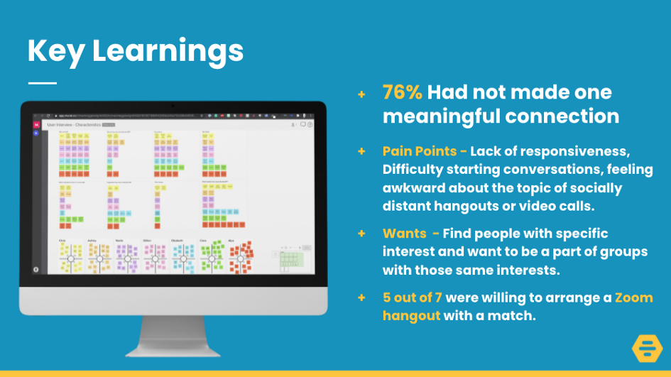
Key Learnings from User Research
Problem Statement
How might we make users feel comfortable with making plans with matches around COVID-19 guidelines?
Bumble BFF is built on social interaction with the goal of creating long-lasting friendships. That includes meeting up with people in the same local area. But what happens when it’s not safe to do so? Or if someone is unsure whether the other person would be open for a zoom happy hour or a socially distant walk?
From talking to users, it was made clear that the new world we are living in is a little awkward to navigate, especially with new connections.
What if Bumble BFF was smart enough to provide safe hangout ideas for its users?
This could take some of the awkwardness out of the decision to meet someone for the first time AND ensure that both users are ON THE SAME PAGE.
My idea, why not take the guesswork out of it and include what the user would be comfortable doing right there on their profile? The status field would be something like:
“I am willing to do a zoom hangout”
“I am willing to do a socially distant hangout”
I took a look at the current process flow and designed a sprint map that included the status idea, highlighting the area of opportunity.

Sprint map — created in Miro
Users and Audience
From my research, I was able to create two personas that represented my two user types. While the Power User is most likely the type to be less burdened by making plans during the pandemic, they still reported a lack of responsiveness as a major pain point. I made an effort to keep both user types in mind for my solution as improvements that would promote overall engagement would, in turn, help with responsiveness.
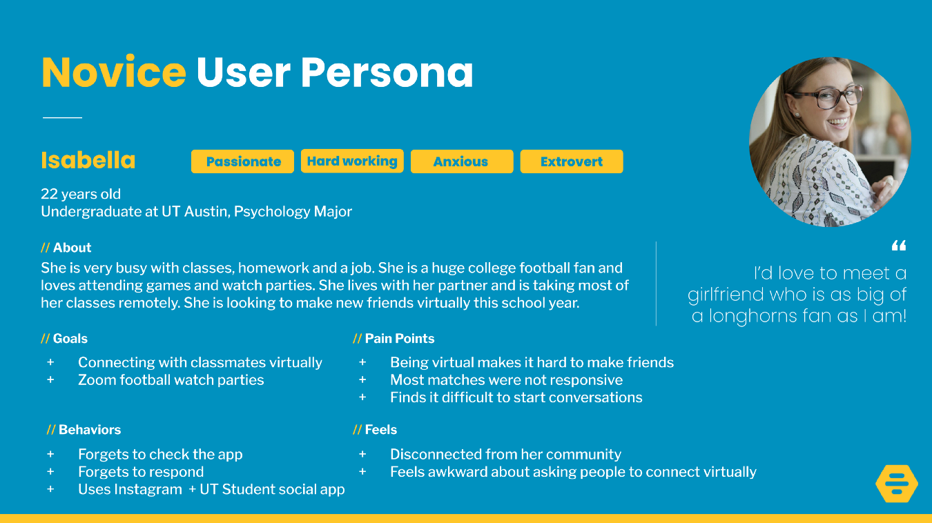
Novice user persona
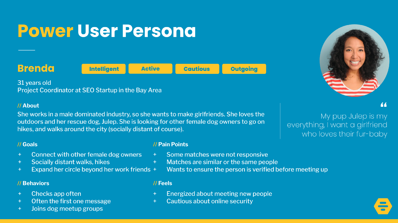
Power user persona
Key demographics of the users I interviewed:
- Ages 18–41
- 82% identified as female and 18% identified as male
- Users were sampled across the US
- 70% Students or recent graduates
Roles and Responsibilities
My roles in this project included UX Researcher, Interviewer, UX Writer, UX Designer, UI Designer.
Scope and Constraints
This was a solo project spanning across two 8-week courses, one focused on UX Research and the next focused on UX Design. Since I was working alone on this project within a time constraint, my research was limited. I did not have access to Bumble’s development team, so I could not verify if some of the features I suggest below would be realistic. I did, however, do research on contact tracing capabilities and I think that an app pulling in data from local authorities to alert its users is a real possibility. Find out more about Apple and Google’s contact tracing notifications here.
Process
With my research and problem in hand, it was time to begin to tackle the design.
Step 1: Lightning Demos & Crazy Eights
From the lightning demos, I thought about using features from 3 competitors to create COVID-19 hangout preferences.
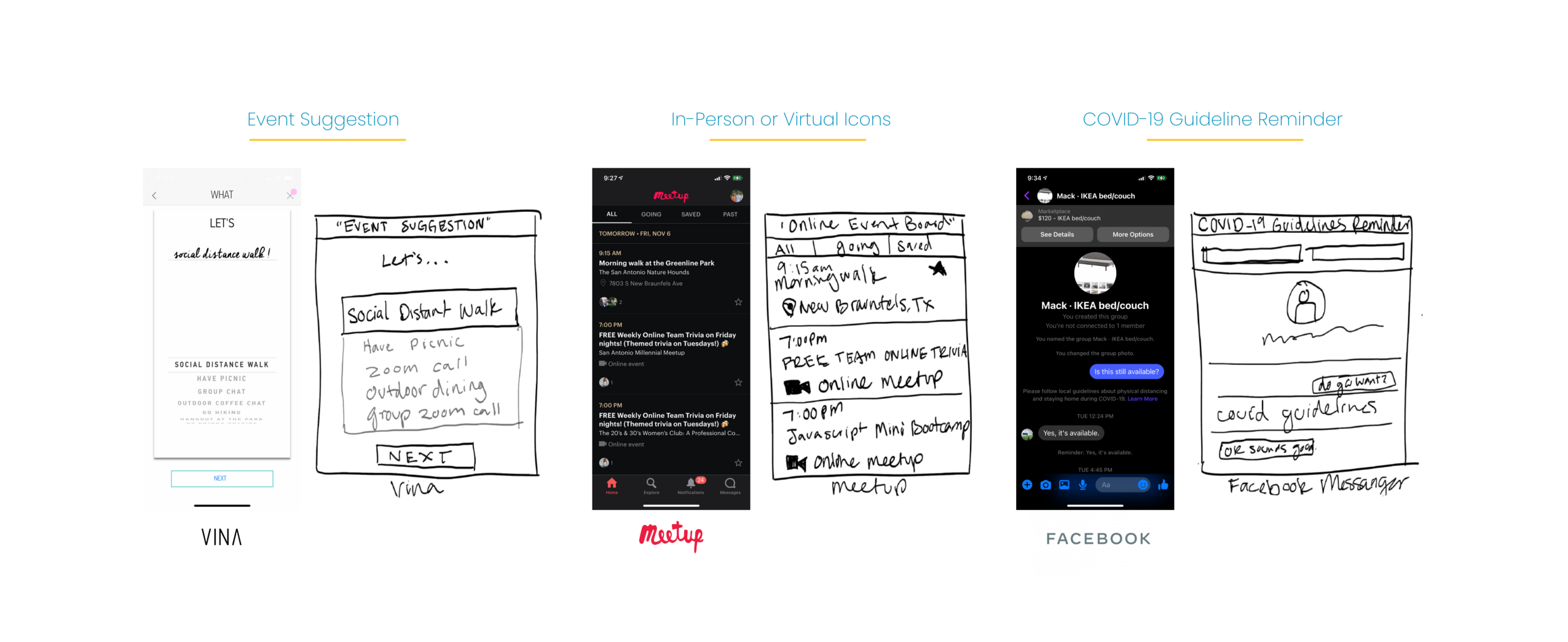
Lightning demos
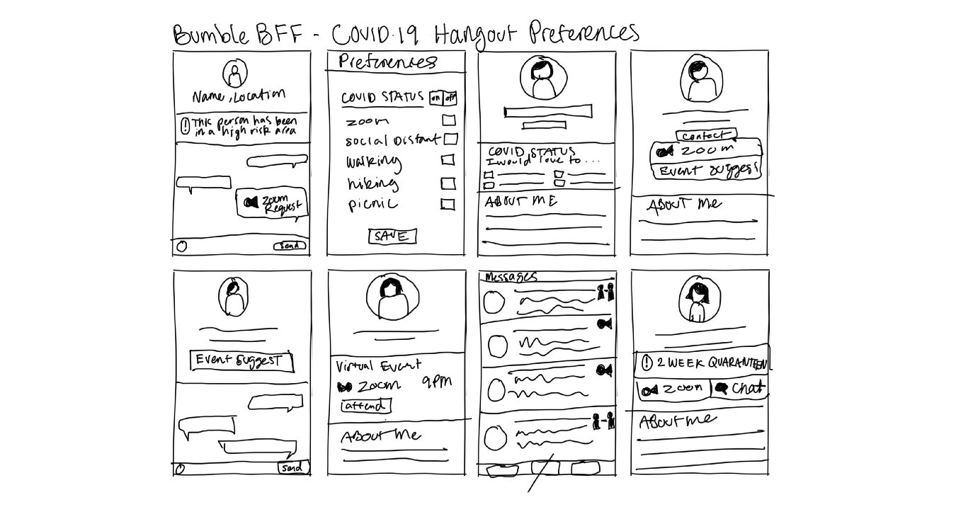
Crazy 8’s on the COVID-19 hangout preferences idea
Step 2: Wireframes
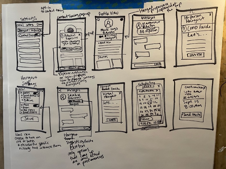
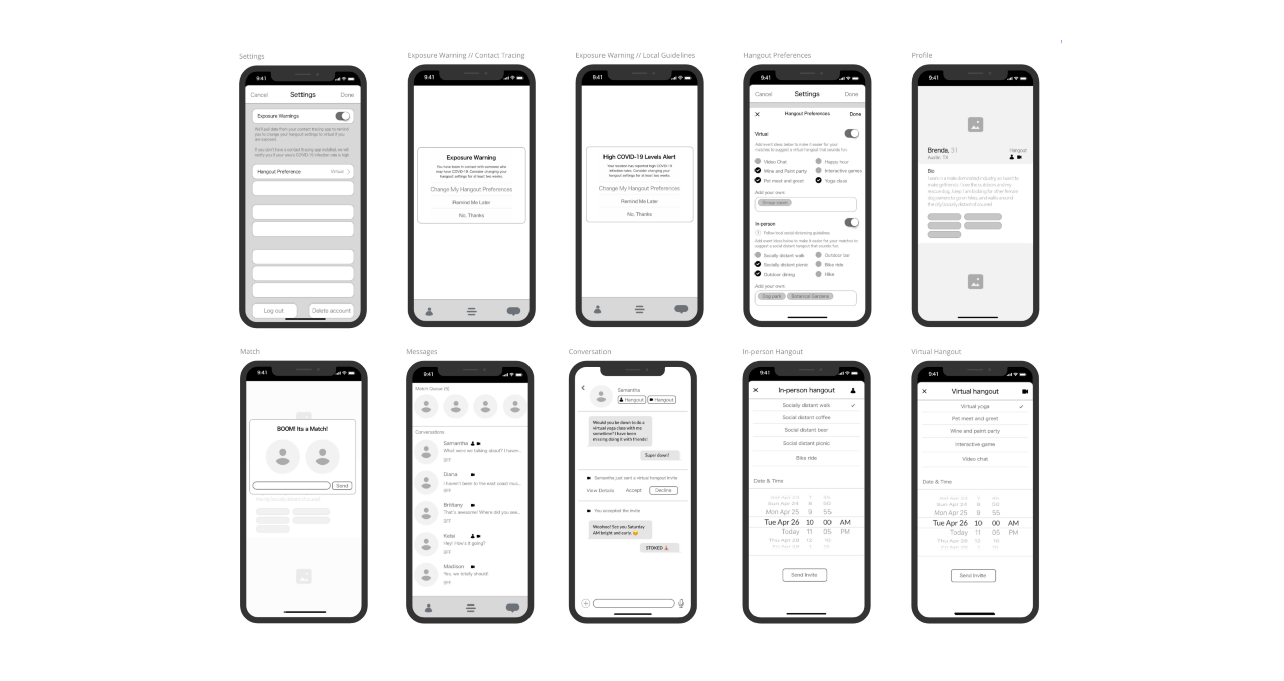
From my crazy 8’s I was able to start formulating ideas for what wireframes would look like.
- I built out a hangout invite experience that would live in the conversation screen and be opted-in through the settings screen.
- Through the settings screen, users could turn on exposure notifications. Bumble would pull data from contact tracing apps and could alert the user to high COVID-19 levels in their area and prompt them to change their hangout preference from in-person to virtual. This would reinforce using their safe, virtual hangout ideas.
- The hangout settings would list options for fun and exciting ideas for both in-person and virtual hangouts. The user could also add their own ideas.
- Users would be matched with other users based on their hangout settings.
- Users can use the hangout buttons inside the conversation screen to invite their BFF to their desired hangout. Taking the conversation to the next level without having to discuss whether they are comfortable with an in-person or virtual hangout. The suggestions also take the pressure off of one person to come up with the hangout idea. I think this feature would be useful after a pandemic as well.
- Icons would be very important to signify whether the person was willing to do in-person or virtual.
Step 3: Prototype
I used the current branding and preferences to make the experience feel familiar to the user and added the exposure notifications and hangout preference experience.
Current and proposed solutions
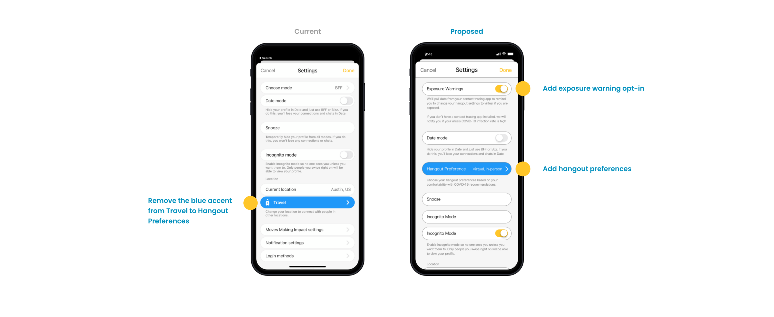
Current and proposed settings screen solution
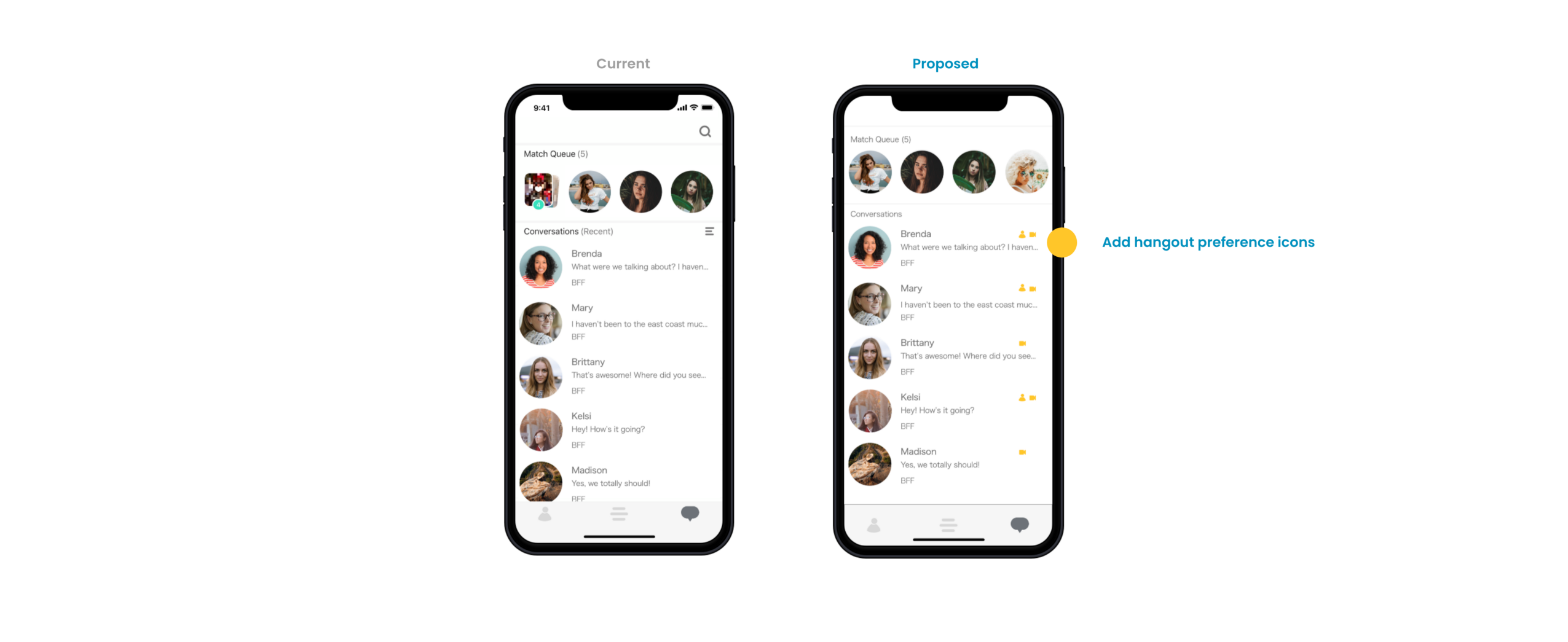
Current and proposed settings screen solution
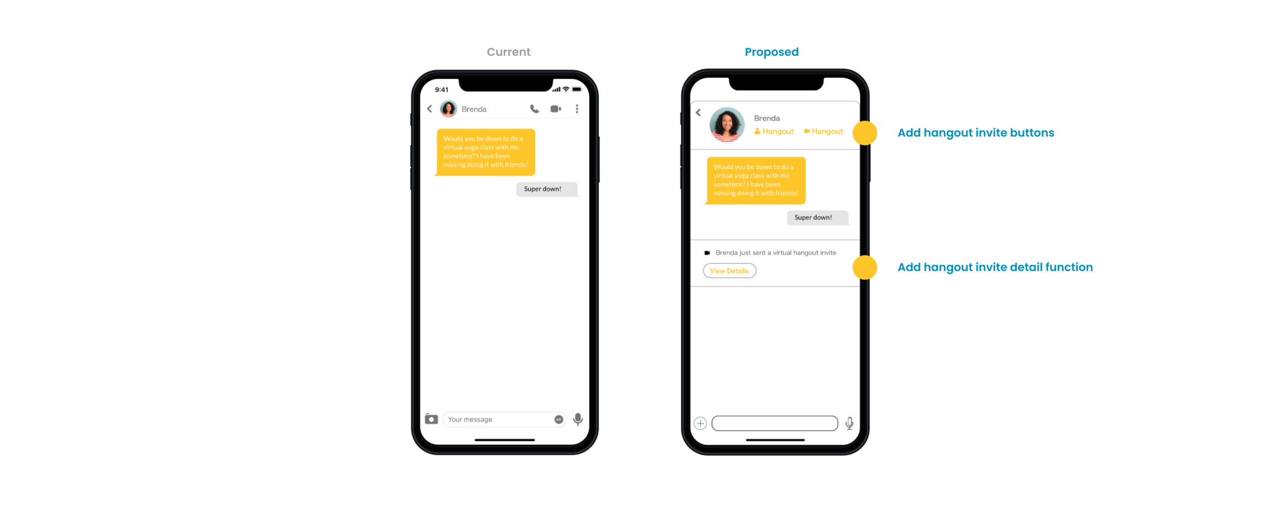
Current and proposed settings screen solution
First full prototype iteration
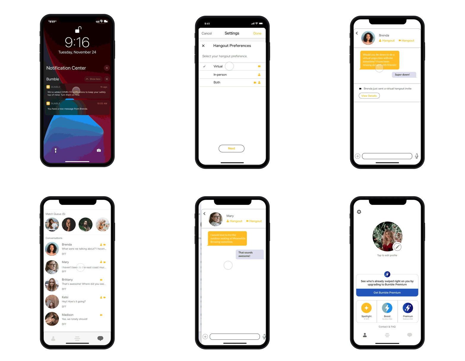
First prototype iteration — created in Sketch & Invision
Step 4: Usability Testing
For my usability test, I recruited 6 participants. I gave each participant’s two tasks to complete. Depending on their responses they would have additional tasks.
Task 1: Respond to push notification
(If user response is to turn on exposure warnings)
Task 1.2: Change your hangout preferences(If user response is to respond to Brenda’s message)
Task 1.3: Respond to Brenda’s hangout inviteTask 1.4: Turn on your exposure warnings
Task 2: Invite Mary to have a beer via in-person hangout or message
I ended each session with a few follow up questions to gauge the response to the experience and the user’s overall feelings about the app.
Results
I set the course of this research to answer two questions:
If given the opportunity to set up hangout preferences, would the user do so?
Yes, but this needs to be better highlighted in the app so it’s the first thing the user wants to do before anything else (like responding to Brenda) because this step is critical to understanding how the hangout Invites work.
Would the user be more interested in using the hangout invite button in the messaging to suggest a hangout or just coordinate a hangout via messaging?
4/6 used the hangout button but all agreed there would need to be a conversation about loose plans before using the tool. They saw it as a formal event invite. If I wanted the user to explore the options, I need to include an onboarding experience that shows them what is available to them and how to use the invites so they would feel comfortable.
The Good
- Overall, users loved that Bumble BFF cares about the health and safety of its users.
- The overall sentiment was that the added hangout features would entice the matches to go to the next step
The Bad
- Users often frustrated with where to go, what to do next In the conversation.
- Above frustration is amplified now because of stay at home orders — so making the virtual hangout options enticing is critical
- Feels too much like the dating side of Bumble BFF
The Solution
- Entice the user to actually USE the Hangout Invites
- Show the user where everything is when they login into the app
- Indicate that there is something new with Bumble BFF
Step 5: Branding
I created a mood board and persona that reflects the Bumble BFF brand as a whole.
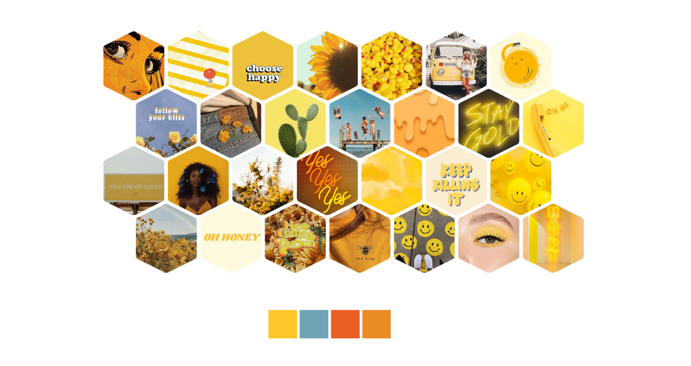
Mood board
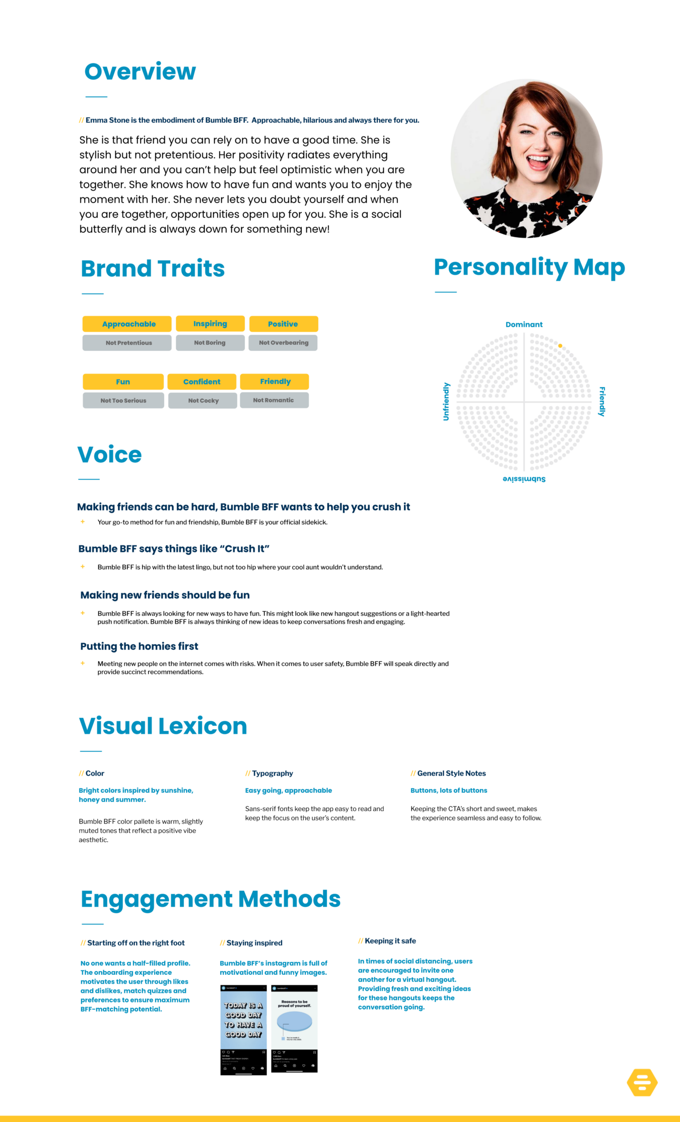
Brand persona
Step 6: Reassessment
From the user feedback, I was able to update the prototype to include my proposed solutions.
Settings Screen
- Move hangout preferences up in the hierarchy
Hangout preferences needed to be at the top, grouped with Exposure warnings so that the user sees the functions as related and the most important features. - Remove “date mode” function
Since users reported that the experience felt too similar to Bumble, I felt it was important to keep Bumble BFF separate.
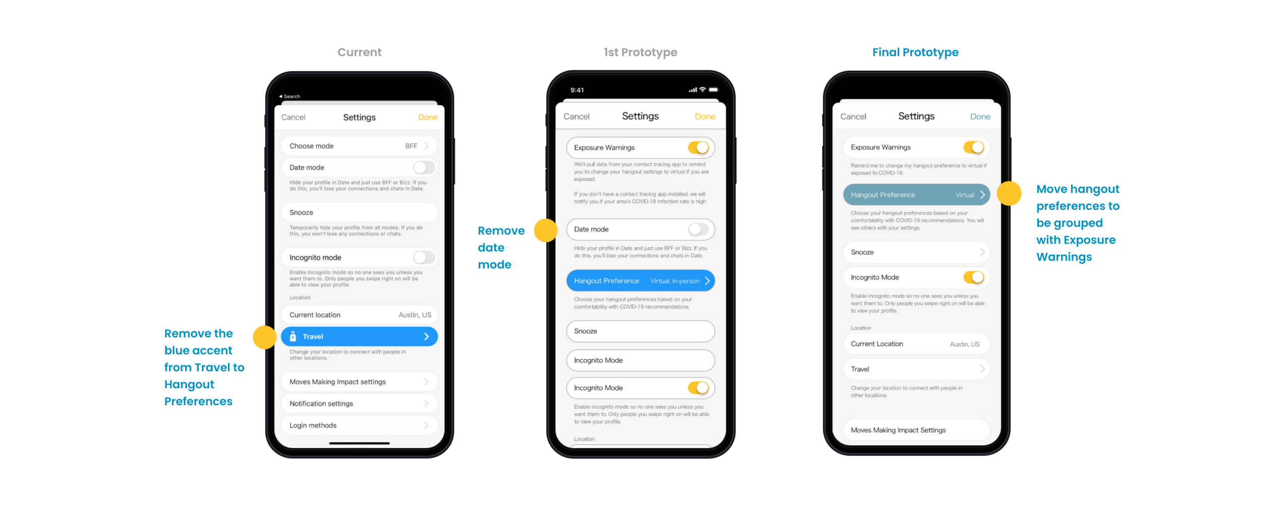
Final changes made to the settings screen
Messages Screen
- Add new feature onboarding tiles
In testing, users didn’t always go to their settings right away, even when prompted by a push notification. I created an onboarding experience that notifies the user in-app about the new settings and how it works.
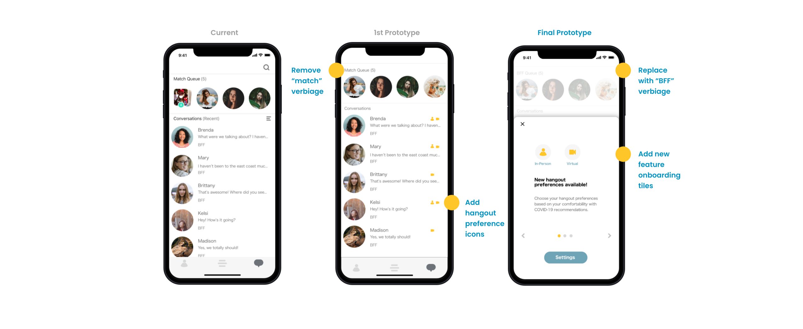
Final changes made to Messages screen
Conversation Screen
- Add to the calendar function
This was a common feature request from users to help them remember their new exciting plans!
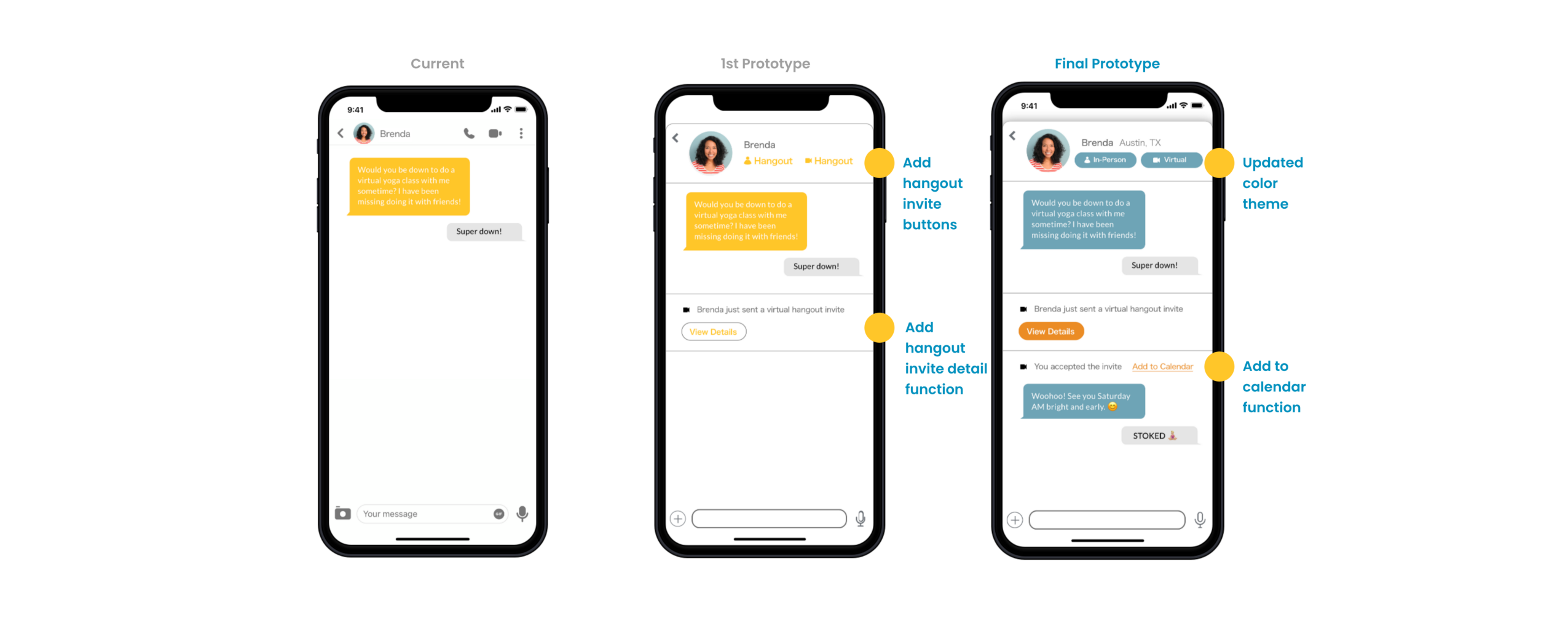
Final changes made to the chat screen
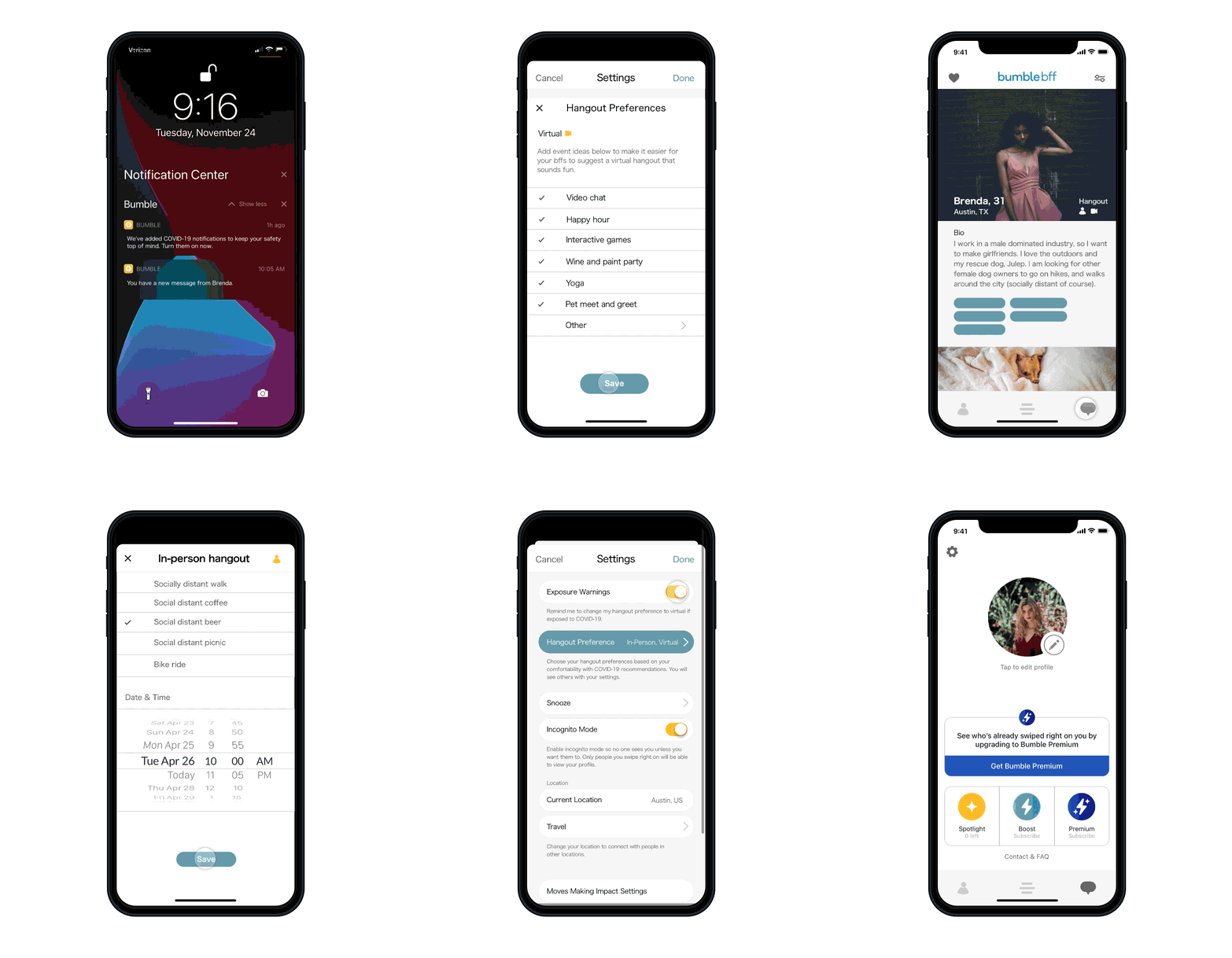
Final Prototype — created in Sketch and Invision
View the final prototype here.
Outcome and Lessons
- COVID-19 level alerts
Currently, in Dec. 2020, COVID-19 levels are high everywhere. So, I think the COVID-19 alerts would be more effective in the future where we could see cases spike in certain areas that have yet to receive enough vaccines. - Current accessibility issues
The white on yellow treatment to the buttons and conversation failed a color contrast check. Since that treatment was not on par with accessibility standards, I pulled a new blue from the mood board I created. A refreshed look that features the Bumble BFF blue as the new primary color and signals to the user that there have been some updates in the app. - The feeling of a dating app
A pain point for many users was the app feeling too much like a dating app.Attempted to remedy this by removing mention of the “match” language but I think more could be done here. I wonder if the experience would feel more “friendly” if the swipe interaction was changed to something like a high five for “yes” and a peace sign for “skip”. I would love to test and prototype this idea further. - Recruiting a larger group of participants.
If I went further with this prototype, I would like to expand my sample size to include more people from a wider variety of backgrounds, social status, ethnicity, sexual orientation, and ability.
Next steps
Given my time restraints, there were some avenues that I left unexplored. If I were to take this prototype further I would:
- Additional testing — I would love to go back to users with this 2nd prototype to see if I could get 100% use of the hangout buttons.
- Explore an in-app gaming feature where users compete with one another
- Add group hangouts, where multiple BFF’s can meet up virtually or in-person (with limitations).
Overall, I believe Bumble BFF is in a great position to be impactful during this time. With a few feature ads, it could position itself to make a difference in its user’s lives.
MacKenzie Legg
Mack is a ux designer and painter with a habit of poking holes in things. She is driven to use creative problem solving to build better products. Currently pursuing an MPS in UX Design at Maryland Institute College of Art.


