Save
In the last year, the iPad has continued its rise as the leading tablet device. We continue to see a rush of popular games and media well suited to the tablet—games like Angry Birds, tools like Skype, and applications like Facebook, Pandora, Netflix, and Google Earth. These applications entertain, display media, and allow us to communicate with each other. However, can the iPad also be used to create content?.
Content creation seems to require, at minimum, a keyboard and a mouse. But the iPad has neither. Furthermore, it has a smaller resolution screen than most laptops. The iPad has a powerful chip for a mobile device, but it is still underpowered compared to the average notebook.
Despite this, a number of iPad applications currently on the market have overcome these technical challenges to deliver experiences focused on content creation.
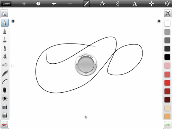
For painters and artists, SketchBook Pro is a richly featured drawing and painting tool.
Sketchbook pro
The Apple iWork apps (Pages, Numbers, and Keynote) allow basic editing of word processing documents, spreadsheets, and slide presentations. iMovie is now present on the iPad (or, at least, on the iPad 2). The OmniGoup released OmniGraffle for the iPad.
The Demibooks team and I had previously taken on the challenge of creating world-class interactive books for the iPad. We wanted to take it a step further to give authors a way to create rich interactive experiences without having to program the applications themselves.
Essentially, we wanted authors, illustrators, and budding storytellers to focus as much as possible on the story and the interactions, not on technical details like code. Although the iPad presents an uncomplicated UI to the user, its integrated development environment, Xcode, is too complicated for users without a development background. However, we also knew that the fuller power of the iPad is unleashed when the application creator can access deeper-level languages such as Objective-C. Learning the intricacies of device programming is not a trivial undertaking, especially for an artist or author focused on his art or story.
We received extensive feedback that artists and authors felt trapped between their desire to create their story on the new tablet medium and their inability to carry out extensive development efforts.
To address this issue, we proposed a new challenge for ourselves: could we create an application that allows authors and artists to focus on their art and story in creating an interactive book, rather then worry about the deep programming of the device?
Feedback from authors and illustrators suggested the idea had promise, so we set out to build Demibooks Composer, the world’s first iPad-based interactive book building tool.
We wanted something that worked effectively for the user, so we collaborated closely with several authors as user champions. Our user champions described their workflows, helped us understand their space, described the art assets required, and gave us a vision for what sort of interactive books they wanted to produce.
Via user feedback and iteration, we identified and solved several key design challenges, specifically:
- How do we manage a multi-stage content workflow?
- How do we manage the complexity of creating rich interactive experiences?
Challenge: Content Workflow
Workflow is a fundamental aspect of any creative project. Although creativity by nature can be exciting and chaotic, there is always an element of workflow that allows ideas to be translated into assets, and assets assembled into a final product. In discussions with authors and content creators, the first key challenge was to understand their natural creation workflow and how an application could fit into it.
A review of several existing applications suggested that there is already a rich ecosystem of applications that authors and artists use to construct their stories. It seemed interactive books were going to be designed using many of the same creative processes and techniques used to create a physical book. In many cases, artists wanted to create their assets by hand on physical media (e.g., painting or sketching) and then scan these physical assets into the computer. In other cases, the art was created digitally as part of a digital painting or drawing process using robust tools such as Photoshop and Illustrator.
The text for visual interactive stories is handwritten, chalked, inked, drawn, or digitally painted with specialized script and unique fonts and then digitized for use in an interactive book. All the artists or content creators we observed had very intricate or prescribed workflows.
It was impossible to create a tool that could subsume the entire creative process. Popular tools such as Photoshop represent years of embedded IP and learned behaviors that are not easily replicated or extended.
Instead, we focused on the part of the process where static assets would be transformed into interactive experiences. Whereas a traditionally printed book is be typeset for printing or proofing, the static assets of an interactive book are enhanced with interaction, animation, and audio to make an interactive experience.
We initially explored creating a tool that would run from a desktop and then share content to the iPad for viewing and interaction. An interactive book designed for a touchscreen must obviously be tested on a touchscreen. Swipes, taps, gravity and other touchscreen tablet specific interactions are not easy to simulate on a desktop.
If we were to build a desktop app, we knew the link between the desktop tool and the iPad would have to be extremely smooth and fast, so changes on the desktop would be updated instantly for testing on the iPad. This “build-time” lag is a critical factor in the overall experience of creating an interactive story or any interactive application. The shorter the gap between the implementation and preview of an interactive effect, the faster an author can iterate on the design. If there is a large lag between design and preview, the whole process becomes laborious. Development tools are often promoted for their ability to compile in real-time.
There are a number of methods to link a desktop development environment to an iPad, but they are all surprisingly slow (from seconds to minutes to sync). Over the course of a long project, a slow translation between the design mode and preview mode would be frustrating, and there’s a risk that the link between the desktop and the iPad is unreliable or hard to set up.
This led us to the conclusion we were working on the wrong platform. The most obvious way to have a minimal time delay between a design mode and a testing mode was to create books on the iPad itself. By building the book and testing it directly on the iPad itself, we could let authors and illustrators use enjoyable and natural touch interaction to move content around on a page, but we also radically cut the conversion lag every time an author wanted to test their interactive book.
Authors could continue to create artistic content by hand or digitally using their preferred tools, and then the finished art assets could be transferred to the iPad for assembly into an interactive book. By creating interactivity directly on the iPad, the author or artist could instantly preview the interactive book, getting instant feedback.
Challenge: Managing Complexity
Our major challenge was to manage the several layers of complexity inherent to building interactive content on an iPad.
Interactive books, by definition, are intended to showcase audio, movement, animation, physics interactions and many other effects. The challenge was to find a method to manage these effects that provided a balance between freedom (with increased complexity) and constraint (potentially with less complexity).
Most of these interactions and effects are fundamentally event-driven. Event-driven interactions can be simply described by if-then statements. If-then statements can describe many of the interactions we have in everyday life. For example, “IF you break the toy, THEN you won’t be able to play with it anymore;” “IF I turn this knob, THEN the stove will turn on.’
In an interactive book, these same statements can describe any of the effects that occur. For example, “If a user touches an image, then the image rotates.” Although these statements provide a memorable formula for constructing interactive effects, it was less clear how the could be communicated via the authoring UI.
Although we explored a number of techniques to communicate the if-then framework via the UI, we focused on Flowcharts, Timelines, and Lists as three common visual paradigms.
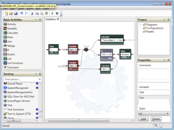
Flowcharts are a popular method of visually orchestrating interactive events in programming. They seem easy to draw, and can control the flow of execution in a program. Flowcharts are full of if-then statements (and more).
Microsoft flowchart based visual programming language.
However, flowcharts used in visual programming grow quite large and users are likely to spend more time managing the arrangement of charting shapes than creating the effects. It is also challenging to display large flowcharts on the small screen of the iPad.
It is possible that users would also struggle to see the connection between the abstract flowchart shapes and the resulting behavior within the interactive book. In essence, we would be distracting the creator from the creation process.
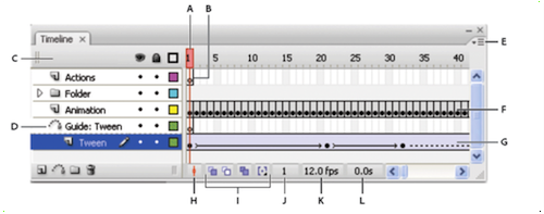
Timelines are extremely popular in animation and game design applications.
Adobe flash animation editor
Initial user feedback suggested that many of the animators we spoke with were very familiar with a timeline-based conceptual model for organizing specific motion effects and animation. Many of the effects within an interactive book involve motion and animation so it initially seemed like a timeline would be a good fit as an overall conceptual model to organize behaviors.
We tried several experiments using a timeline to organize the effects and interactions on a single page with several user-triggered effects (like rotating and moving objects) and looping animations. These experiments revealed a number of findings:
- Timelines can grow very large, both vertically and horizontally, with each object/interaction showing up as a new line. On a desktop, this may be manageable. However, on an iPad it is a challenge to show a large timeline while still providing the workbench or editing space as context.
- There were many event-driven effects that do not occur according to a specific timeline. For example, suppose that a user touches a shape in the book and the shape rotates. Although the rotation occurs over a specific span of time, the effect itself is not triggered by a specific point in time. Instead, the effect triggers each time the user touches the shape. If a page is made up of many of these event-driven effects, the timeline starts to look like a long list of effects all starting at time = 0.
- It is difficult to manage elements of a timeline using fingers. Unlike a mouse cursor, they do not provide a precise selection point.
- From an implementation perspective, it is costly to develop a smooth timeline interface using drag-and-drop or natural interaction. A badly implemented timeline actually makes it harder for a user to construct effects.
With all these outcomes considered, we made a decision to abandon the timeline concept. We needed something that still was clear to use, but possible to implement with finite budget and implementation resources.
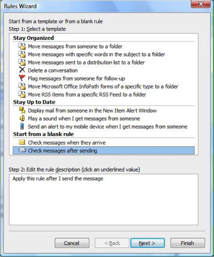
Lastly, we considered lists. A list is literally a set of items arranged vertically in rows. This option is the least visual, but the most space-efficient for use on an iPad. Lists can be sorted, filtered, nested and grouped. They can also be used to contain relevant pieces of if-then recipe for interaction. List based visual programming tools are surprisingly common. One very common example is the mail management tool within Microsoft Outlook.
Microsoft Outlook mail rules wizard
From an implementation perspective, lists are also included by default in the iOS-programming framework, which makes it most cost effective to produce.
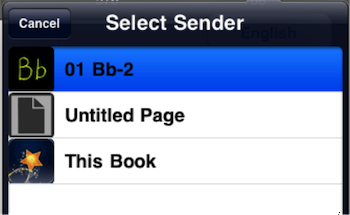
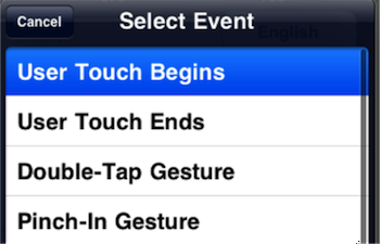
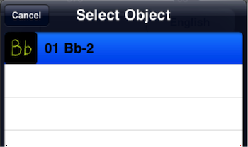
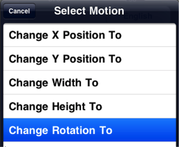
To implement lists, we took the if-then framework and placed it inside a list-based UI where an author can make selections to populate each aspect in the formula:
- IF (Object + Event) THEN (Object + Effect)
- IF (Image1 + Touch) THEN (Image1 + Rotate)
IF the Object (The image)
…Triggers an Event (User Touches Screen)
THEN the Object (The image)
…carries out the effect (Rotation)
That is all it takes. An author makes four quick selections from four lists, populating an if-then formula to generate an interactive effect.
List-based navigation is a common pattern throughout mobile design and does not require extensive learning. The lists are space efficient on screen, allowing a canvas to still be present to give crucial context.
Thus, the list based UI has so far provided the best balance between freedom and complexity within a finite implementation budget. Over time we will be exploring how to extend or supersede this initial design approach to implementing interactive effects within interactive books.
Conclusion
By placing the whole editing environment onto the iPad, we minimized the transition between laying out an interactive book and testing it. This does not supplant an author’s unique content creation workflow, but provides a central point to transfer all content and do the work of building the interactive book.
And by using efficient list based selections to add interactive effects, we balanced a finite implementation budget, available screen real estate, complexity, and clarity.
Christopher Roosen
I am a Principal UX, Usability Consultant and Axure trainer with 10 years experience in exploring complex UX problems, engaging users, developing strategy and designing multi-channel solutions.
I specialise in mobile, apps and transactional systems. I focus on delivering measurable and radical improvements to usability, user experience and engagement by:
- Focusing on both needs and delights
- Simplifying complex business processes and technology
- Identifying influential (and often latent) requirements
- Prototyping Axure based interactive wireframes early
- Testing with end users often
- Delivering concepts via an Agile UX framework
I have consulted with some of the largest and most innovative companies in Oceania, including Westpac, Optus, Telstra and News Digital Media. Recent projects include:
- UX design for www.therocks.com.au - Created a modern and engaging experience for a frontline Sydney cultural icon.
- UX design for a complex business portal - A year-long project to create a usable and high performance transactional system.
- Founding member and Principal UX Designer for Demibooks Inc (www.demibooks.com), creators of the world’s first iPad-based tool for creating interactive books.
I am the Founder of Cognitive Ink, which offers cutting edge UX consulting and business analysis support as well as hands on Axure training at all levels. Cognitive Ink is also one of the few Axure Approved trainers has delivered Axure courses in Australia and New Zealand for four years across hundreds of training sessions.


