Save
Originally published by UX Studio.
Ethical design > GDRP compliance
“When a company like Facebook improves the experience of its products, it’s like the massages we give to Kobe beef: they’re not for the benefit of the cow but to make the cow a better product. In this analogy, you are the cow.” – Aral Balkan, ethical designer, founder of Ind.ie

This dire quote speaks about the misaligned values product creators and their customers pursue. It happens because businesses can under-represent user values against the myriad of ways they monetize their attention and data.
Many different perspectives are involved in the complex topic of ethical design. Aran Balkan published the Ethical Design Manifesto centered around a pyramid similar to Maslow’s. Instead of human needs, he focuses on the design and what is needed to make it ethical.
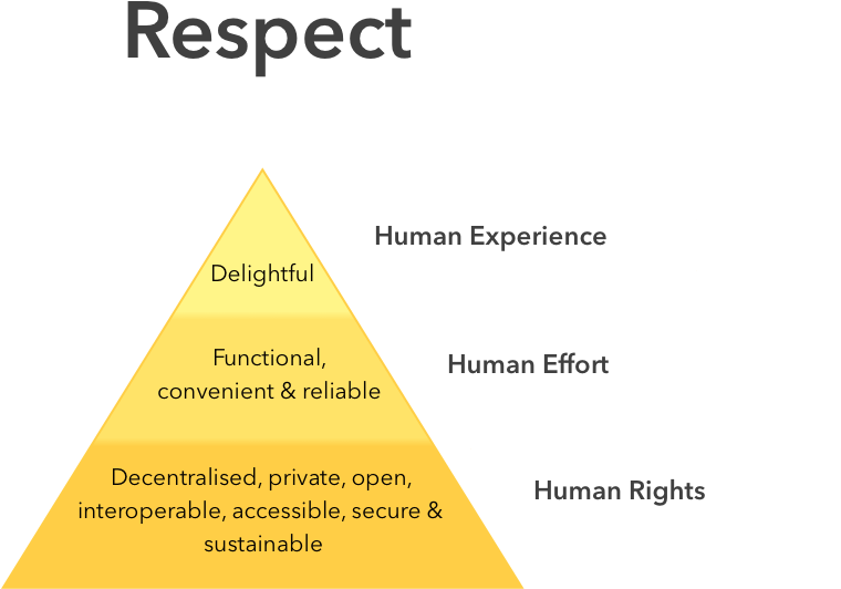
Respecting rights should be a fundamental feature of any product, so it is reasonable to start there. There is a long way to go for GDPR in that section of the pyramid. Nevertheless, we should also discuss the top two sections, as digital products rapidly devour our time and attention.
The context of ethical design
One of the largest organizations fighting for a better digital world, the Center for Humane Tech says:
“What began as a race to monetize our attention is now eroding the pillars of our society: mental health, democracy, social relationships, and our children.”
Wow, heavy… According to the Center, we have come to a possible turning point in how we approach product design.
In order for that to happen in a preferable way, they outline four tasks:
- Inspiring companies
- Applying political pressure
- Creating a cultural awakening
- Engaging employees
Read more about the way forward here.
The purpose of this article
We at, UX studio, care deeply about the world around us, and the people in it. Our vision is to create products that satisfy client and user needs, but we also strive to do this in an ethical way. This article seeks to contribute to two of those points.
First, engage employees. You likely work close to product development in some sort of tech company. We would like you to advocate for ethical design decisions and non-extraction based business models.
Second, we want to contribute towards a cultural awakening. Like the GDPR has, we can raise awareness. People can make changes and stop our digital products from abusing our most vulnerable human instincts.
Next, follow some practical examples focusing on Facebook, the platform on everybody’s mind to move the discussion from the abstract towards a real and relatable one.
These examples apply to Facebook but many would carry over to lots of other social platforms as well. We do not want to anger the design gods in California. We know a robust UX process and extremely conscious decision making based on complex and well-researched information form their decision. We also understand that Facebook, after all, is a profit-driven enterprise.
Nevertheless, we won’t avoid critical ideas that can help us better understand where we stand and where we are going as an industry.
Respecting human time and effort
The regulations on visual merchandising in the tobacco industry set a good example from a different industry.

As many smokers can relate, big bold texts about the harmful effects, the ugly pictures obligatory in most European countries, and the removal of excessive branding can get very annoying. They have an aesthetically unpleasant effect and generally diminish the experience of smoking one way or another. Think of the below examples as a self-imposed digital version, based on the same principle.
Applying these ethical design ideas would create that discomfort, not in the users but in the companies that “consume” user data, time, and attention while relying too heavily on extraction-based business models. In turn, it would force these companies to find new ways to satisfy users.

Profit versus ethics
The above-described utopian situation premises the users becoming much more conscious about their rights and possibilities. Besides, companies try hard to serve their increasingly conscious users in a social context where the real price for ethically poor design in products and services is very well understood.
Here, people would better understand the real price they pay for products and services of ethically poor design. This resembles the realization of product-makers that users would just turn off notifications altogether if bombarded with unnecessary notifications.
These self-regulations should make financial sense, after all. After seeing the 2018 WWDC in June, with all the attention paid to promoting focus, conscious usage, and other related values, this utopia might lie closer than you think.
Example: Facebook’s ethical redesign?
Facebook can serve as an example of how simple features could make a big difference and the ease (or difficulty) in applying ethical design principles even on something as ethically loaded as a social media network.
Here we present some mockups we created at UX studio, the reasoning why they are not occurring yet, and why they should. They should facilitate a conversation about the larger context of ethical design as well as some specifics. Here are some of our ideas:
- Time spent indicator and usage data
- Newsfeed filtering options
- Killing the infinite scroll
- Why I see what I see
- Raising saved item prominence
- Notification grouping (system and human)
- Notification mute scheduling / “mutification” / notification bundles
- “Chetics” – ethical messaging features
1. “Time spent” indicator and usage data
One of Facebook’s biggest traps is that it “forces” time waste.
The below example could fall into the second section of the Ethical Design Pyramid, “respect human effort”. It helps make users aware of how they use the core product and directs them towards the functionalities of actual value to them.
Our suggestion, based on ethical design principles:
One idea approaches this problem placing a counter underneath the profile picture and name in the top left corner. It shows the time spent actively browsing in the last 12 or 24 hours.
That’s all! OK, also if clicked on, an overlay window could open to give a more detailed look at statistics and general knowledge about time spent scrolling and browsing. While it should feature hiding the counter, it would helpfully remind people how much time they unintentionally spend.
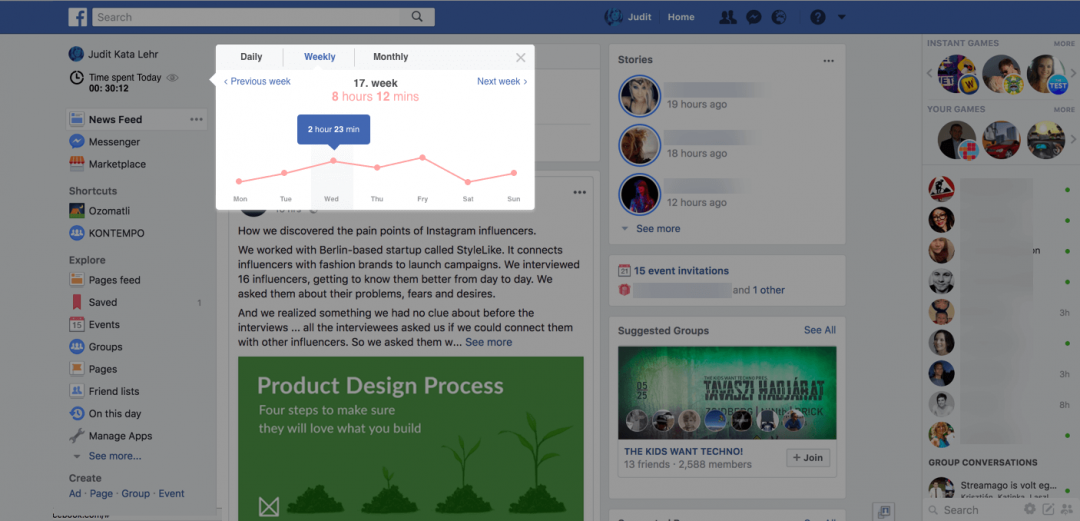
Mockup of the “spent time” feature created by UX studio
2. Newsfeed filtering options
This feature came up very often with the brainstorming team at UX studio. Facebook seems to have very consciously chosen not to include direct filtering options for the newsfeed.
In a 2013 FB post, one of their researchers wrote that they identified “clutter” as the main problem. She rightly mentions,
“Stopping at literal interpretations is one of the easiest ways to end up with a product that fails to benefit the people whom it’s built for.”
So, they unwrapped the meaning of clutter and realized it mainly related to content and not visuals. However, they never truly implemented the obvious solution mentioned as “multiple feeds” in the post above. Controlling newsfeed content has never become directly available.
The “news feed preferences” menu item lies hidden in the top right dropdown menu with extremely limited options. It doesn’t really follow user needs other than just giving a false sense of agency.
Our suggestion, based on ethical design principles:
Some simple filtering options at the top of the feed would obviously solve things. They could select for activity from all your friends or just a close circle. They could show pages promoting products and services or pages sharing news related content or entertainment.
This ability would empower users to spend their time more efficiently and consciously. It would also likely improve a lot at the platform’s addictiveness ground zero, the news feed. It might also give support to users who feel more in control also feel safer, thus more likely to share and spend time.
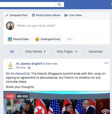
Mockup of the news feed filtering feature created by UX studio
3. Killing the infinite scroll
The research has focused on the difference between an infinite scrolling feed and one that requires action like pressing a “load more” or “next page” button.
A well-known example features the bottomless soup bowl experiment by Cornell professor Brian Wansik. Participants took in 73% more calories when the bowl refilled itself. Replication tested against servers refilling versus a self-refilling bowl and the difference remained significant. The empty bowl represents a stopping cue, when the mind has to wake up and ask, “Do I really want more?”
Our suggestion, based on ethical design principles:
We suggest a “Load more” button at the bottom of the feed (news or profile) which would also allow Facebook to display content in the footer area, a positive.
Also, a text underneath the “Load more” button could provide information in an unobstructive way about the amount of content consumed and how much more comes with clicking.
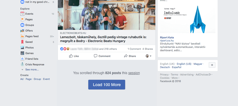
Mockup of the “Load more” button and the post counter, created by UX studio
4. Why I see what I see
The order and selection of posts displayed on the news feed is getting ever more confusing. Users remembering they just recently saw a post from a page they scrolled past find themselves scrolling even more when visiting the page because the post they believed to be the last actually comes from way back in the past.
Intermittent variable rewards represent an important similarity between these platforms and slot machines. Assuming we all like cake (Fact: We all do), if a different cake appeared every time the fridge opened, I’d open it constantly with great excitement. On the other hand, if I found the same cake every time, I’d open it only when I wanted to eat cake, and with no excitement whatsoever.
The intermittent variable reward, makes us open these apps much more frequently than we realize. It relates to many aspects of how companies design them. They certainly don’t stop at the content selection in the news feed but it provides a good example as people do not think about it much.
Although I certainly understand that the algorithm’s complexity and robustness complicate rendering it transparent for the users (…do I really?), they exert absolutely no effort making it more understandable or predictable. That may feed into our gambling instinct.
Our suggestion, based on ethical design principles:
We suggest signaling on the post the reason for its appearance in at least broad terms. Like the popular Netflix “Because you watched this” category, but this gets more specific.
Categories could include but need not stop at:
“Because:
- you likethis hobby / that activity / this politician / lot of these kinds of pages / etc.”
- you friended SOMEONE”
- you went here / did that / liked this / tried that / etc.”
- your network likes it”
- it’s trending now”
- it’s important”
- of whatever other reason I cannot know because the algorithm is “surprisingly inelegant, maddeningly mercurial, and stubbornly opaque.”
As a matter of fact, I would also like to know what I don’t see and why! But let’s not go there just now.
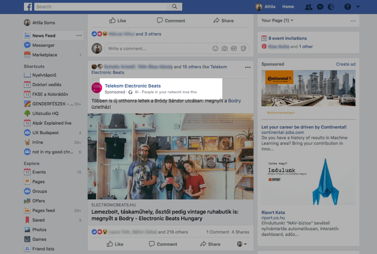
Mockup of the “Why am I seeing this?” section created by UX studio
5. Raising saved item prominence
Content on Facebook virtually never ends and constantly changes, not necessarily a bad thing. It presents several challenges if we think about how to find content we value.
Saved items already exist on the platform so what is preventing this big idea? For one, it doesn’t support offline saving. One opinion posits it would make advertisements on external sites useless, possibly triggering a chain reaction for those sites to stop paying for sponsored advertisements. Facebook thus chose not to implement this feature that was developed and tested otherwise, so the issue cannot lie with technicalities.
It is more likely to involve pushing users towards scrolling on the newsfeed without aiming to help them find the desired content. At the same time, it keeps them disoriented from their original goal as much as possible so they remain more malleable to the content getting displayed.
Right now “Saved” on the desktop resides in the section on the left called “Explore” and the option to save something hides in the top right corner of a post in a drop-down. On mobile, it lies under the hamburger menu in the bottom right corner.
Our suggestion, based on ethical design principles:
How could saved items compete visually with the kaleidoscope of fresh content? They don’t have to bear the same visual weight of course (business is business) but plenty of available space lies right next to the newsfeed which could display more than a single link with an icon.
Thumbnails with short titles could help remind us and spark that original interest that caused us to save it. Like the section on the profile page with nine friends, it could also pop up over there.
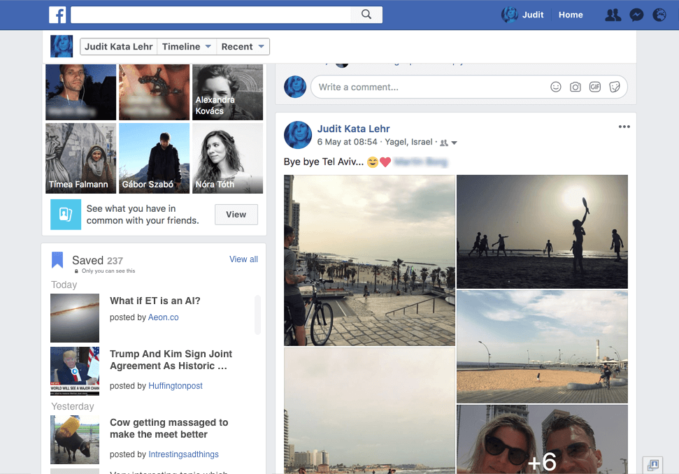
Mockup of the upgraded Saved Items section, created by UX studio
6. Notification management
a) Notification grouping
Notification handling also notoriously features overly much in discussions of ethical design. Remember intermittent variable reward and how your phone resembles a slot machine? Well, this feature is one of the slot-mechanization flagships on your phone.
Notifications can come from several different sources in different apps imparting varying emotional rewards. The simple act of looking at the phone hooks with an emotional gamble.
When it arrives, you never know if you care (your crush commenting under your 5-year-old profile picture) or not (a status update from an old high school classmate you never cared about in the first place).
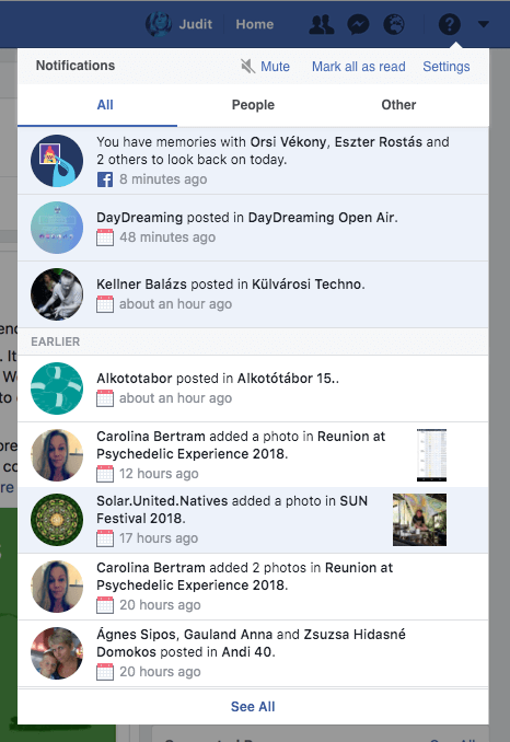
Mockup of notification grouping, created by UX studio
b) Notification mute scheduling and bundles
The option to modify where you get your notifications from and how already features here but not really helpful. Mostly it only mutes notifications from the platform altogether in the operating system or does little about it. Neither does it do much good for Facebook.
Muting notification on an OS-level obviously reduces the level of engagement. Bombarding user attention if they “don’t do much about it” also does no good in the utopia of conscious users we imagine now, as those users will jump on the first possible substitute that treats users better.
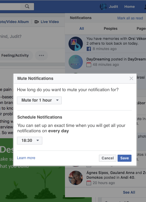
Mockup of the notification muting feature, created by UX studio
We suggest muting notifications, scheduling notifications bundles, muting, and notification groups.
7. “Chathics”
Remember what “available”, “away”, “busy”, “do not disturb” and “incognito mode” used to mean? Pepperidge Farm remembers.
What we don’t remember is when these features disappeared from most messaging platforms, so worse probably could have happened. Nevertheless, that doesn’t mean Messenger has no room for improvement.
Slack proves itself the top student in this regard. This stems from the difference in their target audience. Messenger has an incredibly diverse user base with 1.3 billion users worldwide in 2018. Slack, on the other hand, had 6 million daily active users in 2017, with a much more specific context of use centered around productivity.
Not that Messenger should copy everything, but small changes in some places could greatly improve how people use it in their daily life.
Our suggestions, based on ethical design principles:
Menu choices matter a lot when discussing ethical design. They influence what the user perceives as possible choices, and frames their thinking. In Slack, clicking your name in the top right corner lets you edit status to contain any desired emoji and an optional couple of words. This gives colleagues a better idea of current activity and availability. Clicking the prominently displayed bell icon next to your name will give the option to snooze notifications or set a Do Not Disturb schedule.
On top of that, if Do Not Disturb mode is activated, you don’t have to worry about not getting an emergency message, as the sender can choose to disturb you anyway. Now you may think no one pays attention and cuts through any time. But, as Slack users can tell you, that does not usually happen.
However strong text messaging has grown in the last 26 years, we still don’t type to call an ambulance. This little speed bump makes the sender aware of their actions instead of letting them disrupt the receivers’ attention mindlessly.
Many other ways make a messaging platform more attuned to different use cases. These include optional end-to-end encryption or self-destructing messages, which they applied. Also, putting a highly-visible bell icon on the front and not hiding it behind boring settings menus could go a long way in making users aware of the choices they have to protect their attention.
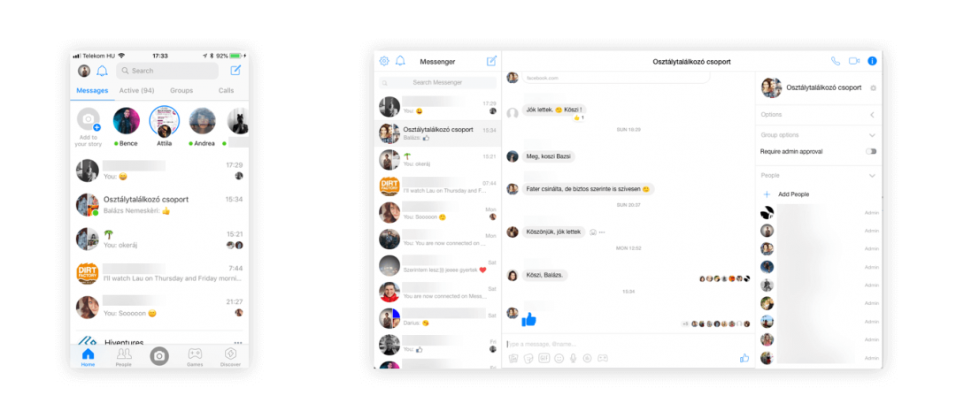
Mockup of an “ethically improved” Messenger, created by UX studio
The future lies closer than you think
I hope you have enjoyed this little thought experiment.
Sometimes, discussions with people from the tech industry about ethical design thinking are met with cynicism and disbelief that an industry as a whole can change its values so dramatically over a short period of time.
Our arguments can not only build on morality but they should also make sense from a business perspective. Users are getting more and more aware. This has happened in many industries before, like organic food, and lowering the ecological footprint in households, appliances, electric cars, etc.
The tech industry looks back on less history than the auto does, for example, but it innovates far more. Changes that took a decade for others might take a couple of years or months here.
So, buckle up, lean back, and share this article to make the world a better place, today.
Attila Somos
T-shaped product designer working in Amsterdam located in Groningen. I love working together with people to solve business problems and create meaningful products that answer real demand. I am a fierce advocate of humans, be it users, business owners, or colleagues.


