Save

During the 2020 pandemic, we were confronted as a society with the tremendous challenges our Educational system faces. How we learn and the role technology plays in learning were noticed and criticized on a global scale. This long-overdue spotlight shown by investors, founders, and the government is allowing UX designers the golden opportunity to reimagine what learning experiences look like, at last. Now, the EdTech market is expected to reach $605.40 billion by 2027. That shocking number needs to be supported by a UX and visual design workforce every step of the way.
Most technology companies we work with at Gallardo Labs share a similar mission–to positively shape the future and improve the lives of others. EdTech plays a foundational role in this type of mission across all industries. But because of the vast diversity of users, lack of accessible best practices, and historical inequity, designing successful learning products requires much more patience, skill, and responsibility than usual.
Here are 5 foundational, and often overlooked, tips to help UX designers create better learning experiences for the EdTech industry.
1. Don’t design for EdTech. Design for education, using technology.

Designing for tech sounds cool, doesn’t it?
Today the Education industry has adopted a new name to signify that they put technology and innovation at the forefront: EdTech. Physiologically, this seems to separate the progressive industry from an older version of itself. Some examples of other industries that have followed this trend are FinTech, MedTech, AgriTech, and BioTech.
Those of us working in Education and EdTech are all trying to help the same people. We are just approaching our problem-solving from different angles. As UX designers, we must think of technology as something completely connected to its original industry in order to ensure we are truly advocating for the right end-users.
Try this experiment to check your bias:
Close your eyes and imagine the type of person you might design for within the Education industry. What are some of their characteristics? What might their typical day look like? What are their likes and dislikes, dreams and worries?
Now do the same thing for a different person whom you might design for within the EdTech industry? Do you see someone with the same traits as the Education user?
Perhaps you pictured the Education user as a student or teacher in a classroom or a working parent. Maybe the EdTech user is younger, trendier, and more tech-savvy. They may even dress better.
When we assume Educational users are different from those within EdTech, we are designing solutions that are biased and subconsciously assuming EdTech users are more technologically advanced. The end-users of Education and EdTech industry products–the ones actually using the digital experiences we’re designing for–are the same.
Takeaway:
Make the mental shift to focus on designing for Education as a whole. When you do this, your design process may not feel as sleek and sexy to you as a professional designer, but the outcomes will be to your users and the organization supporting them. That’s what matters.
2. Co-create with your learning community

EdTech users need good UX design that represents them
In EdTech, the end-user is rarely the person who commissions our work. They usually don’t have a choice in the products they’re using on a daily basis and they are most likely underrepresented in their organization’s design process.
As UX designers, it is our responsibility to create easy-to-use and beautiful solutions that are equitable, inclusive, and accessible for an extremely wide array of humans. To achieve this successfully we should identify, understand, and empathize with users and then co-create the solution with them. While co-creating may be a challenging task, in EdTech it is what drives the most progressive solutions and seizes the biggest opportunities. By designing successful products with the people who need them, we are empowering and enabling them to influence and shape the outcomes. Through co-creation, we have the ability to directly improve the lives of those within our learning community alongside the community members themselves. It is the most powerful way to design equitable learning products for this ever-evolving industry.
Takeaway:
Take a look at these resources gathered from a Getting Smart design sprint to get you started on the co-creation process:
- How Do You Include Your Community in Creating Your Vision for Personalized Learning?
- Why Students Should Co-author Learning
- Crosstown Students on Co-authorship (Podcast)
- Student Voice and Co-authorship: What They Mean to Students
3. Learn to speak business
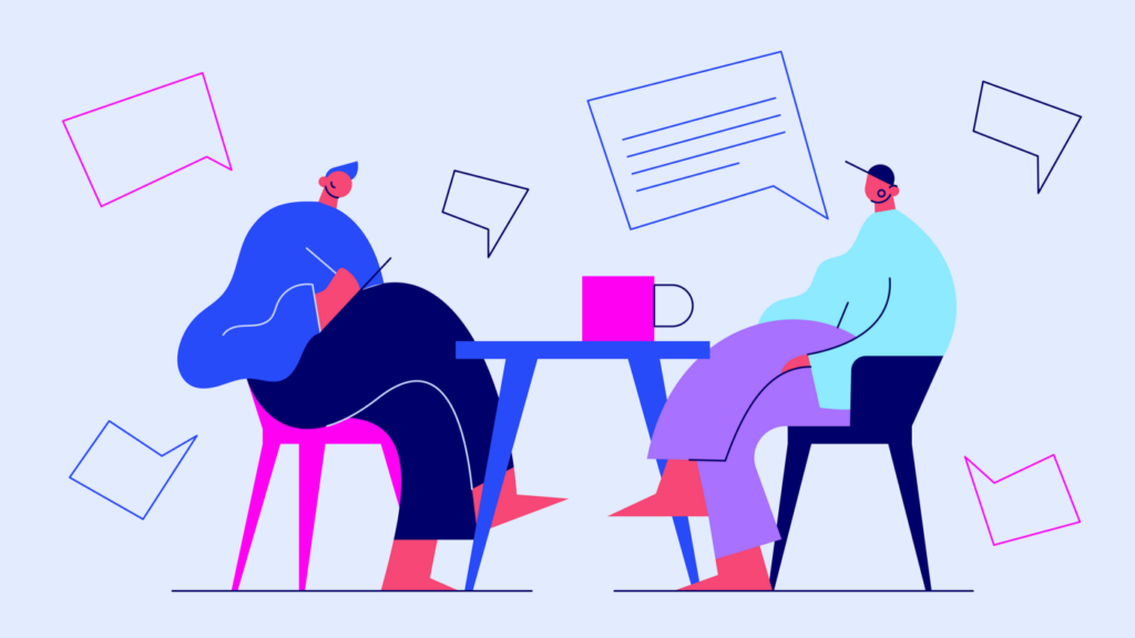
Aside from helping the learning community, UX design also needs to drive business value
When a consumer app is badly designed, the average user can delete it or ignore it. But when an EdTech app is badly designed, often its users are still required to use it on a daily basis. Although Education decision-makers may be the ones purchasing EdTech products, the community is made up of consumers and they’ve earned the right to expect consumer-level design in all the tools they use in the classroom.
The vast number of EdTech product users magnifies the effects of good and bad UX design alike. Small inefficiencies in a community of people this size results in extra costs due largely to time spent training, an increase in teacher turnover rate, and money lost exploring workaround solutions. We may understand the value of our work as UX professionals, but the only way we’ll truly be successful at implementing our design solutions is to gain buy-in from Education decision-makers. We must demonstrate that UX isn’t just good for users–it’s also good for business. The ROI (return of investment) of good UX can be especially hard to define for the EdTech industry for several reasons:
- The majority of the tools used in EdTech are behind a login and not available to the public for case studies, comparison, or natural competition.
- Most of the funding for public schools is heavily influenced by politics, government contracts, and public opinion. This can mean enormous amounts of red tape bureaucracy.
- As UX designers in EdTech, we tend to focus so much of the experience on the learner, yet not enough on the business goals behind the tools.
Calculating the ROI of your EdTech design solution is just as important as co-creation and pixel-perfect implementation. Without business buy-in, you build nothing. It’s important that you put your passions aside to think practically, allowing yourself to understand how to balance the business needs with those of the users to ensure alignment across the board.
Takeaway:
Include business stakeholders and school decision-makers in your co-creation design process. Treat the school board leaders and government officials as you would a student. Empathize with them and find compassion for their unique and important position in creating a better learning experience.
4. Look outside of EdTech for inspiration

By identifying best practices from other industries and design professionals, you’ll be able to bring fresh ideas to EdTech
A fundamental technique we teach as educators, parents, mentors, and design leaders is to “think outside the box.” But within Education, digital products are notoriously known to stay safely inside the box when it comes to UX and design.
It’s a healthy practice for UX designers working within any industry–not only EdTech–to look beyond our direct sector to ensure continuous innovation and evolution of best practices and strategy.
If we can’t dig up the right inspiration in the broader landscape, we can use our voice within our own community to get EdTech leaders to be more transparent about their UX and design best practices. Platforms like EdTech Impact let learning community members compare products and toolsets side-by-side, but these platforms have to go to great lengths to get EdTech companies to actively participate. If more pressure was applied by the right people, a healthy competition could begin to take place, making designing a lot easier.
Takeaway:
Are you designing an LMS (learning management system) for high-schoolers? Look closely at apps for social media, television streaming, and project management. Working on an educational tool for K-5 students? Follow some popular children on YouTube or subscribe to a successful hands-on learning company like KiwiCo. What if you’re designing an operational tool for school admins? Explore other tools in the finance and travel industries. Inspiration is everywhere.
5. Diversify your experiences

UX is a practice that gets better with diversity
The more diverse your experiences are, the more perspectives you bring to the design table.
One of the biggest misconceptions within the EdTech industry is that only those who come with specific experience will be great EdTech UX designers. But our profession requires the unique skill of adaptability and constant learning. We must feel comfortable with and motivated by what we don’t know because our relentless curiosity is what allows us to co-create successful design solutions for humans unlike ourselves. We are trained to apply our design thinking and UX process to any industry.
For example, this year alone our team has successfully designed the following types of experiences:
- Transportation operational platform
- Travel booking engine
- E-commerce website for baby products
- Medical software and marketing website
- Non-profit website for affordable housing
- Hospitality app
We do not claim to be experts in transportation, travel, babies, medical, affordable housing, or hospitality. But with collaboration and a proven UX and design process, we are able to gain such a profound understanding of the user and business goals that we can design successful solutions with them at the center of our work.
If you want to truly bring the best version of yourself to your craft in EdTech, you must explore as many other industry types and company sizes as possible. The switching of applications will train you to be flexible in your UX process, allow you to be more self-aware of your skills, and help reduce the number of inherent biases you carry from one initiative to the next. It also expands your net for catching inspiration.
Takeaway:
If you are already working in EdTech, take on a freelance gig or volunteer project in an industry that is completely unfamiliar to you. If you are just starting out, apply for jobs outside of EdTech and take notice of how the UX and design process is applied there. Know that any experience you’re gaining–no matter the industry–will allow you to bring more ideas and skills back to EdTech in the future.
Advancing the quality of UX and design is a shared responsibility
While applying these tactics to design better digital EdTech products, we must also think of advancing the industry standards themselves. The best way to improve learning experiences on a grander scale is to gather and share our research, designs, ideas, and feedback with others. The more transparent and supportive we can be as a design community, the more successful we will be at a transformation on a higher level.
Originally published by UX of EdTech
Written by Nicole Gallardo
Edited by Sarah Mondestin
Nicole Gallardo
I help founders create successful and equitable digital products with UX. I improve the way design is applied within new organizations in order to make companies grow and communities soar. I've spent the last decade building Gallardo Labs, a digital product design agency that is known for its user experience and design system expertise. I've pioneered a culture here where different is better, mistakes are opportunities, and the design process is rooted in compassion. Prior to co-founding Gallardo Labs, I gained experience as an accomplished creative director, UX/UI designer, e-commerce entrepreneur, and team builder for industry icons including Publicis Sapient, Quicken Loans, and Norwegian Cruise Line. Throughout my career, I've designed over 80 digital products for Fortune 500s and industry leaders.
- The author unpacks 5 foundational tips to help UX designers create better learning experiences for the EdTech industry:
- Don’t design for EdTech. Design for education, using technology.
- Co-create with your learning community.
- Learn to speak business.
- Look outside of EdTech for inspiration.
- Diversify your experiences.
- Designers need to remember that advancing the quality of UX design and advancing the industry standards themselves is a shared responsibility.


