We’ve just passed the two-year mark of the iPad being on the market. And with a second milestone of 200,000 iPad applications on the App Store nearing, there’s no better time than now to reassess how to approach the UX of iPad applications.
Some of the ideas in this article are relevant to all tablets, not just the iPad. But in consideration of the tremendous success of the iPad (73% of all tablet sales last year), it does warrant specific attention and focus. So, without further ado, here are five interface guidelines to (re)consider when approaching the UX and design of iPad applications.
1. Retiring the Tab Bar
When it comes to the iPad, tab bars are simply passé. Leftover from the task-driven, “get in get out” mentality of the smartphone, tab bars aren’t needed on a “lean-back” device like the iPad. In other words, the more relaxed mode of use of iPads means there’s no hurry to quickly change views by having all navigation options front and center, which is what tab bars are meant to do. Unlike an iPhone app, people immerse themselves in iPad applications for longer periods of time and with a more relaxed mindset.
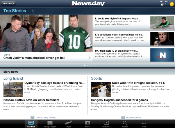
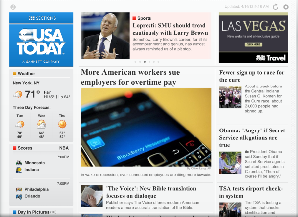
Tab bars are also less usable on a larger screen. They aren’t reachable with thumbs and require a change in hand position. Visually they’re eyesores, and from a layout perspective they often take up precious real estate. More elegant alternatives to the tab bar include slide-out (see Facebook), gesture-based (see Paper), or content-driven (see USA Today) navigation. Beyond being more usable and aesthetically pleasing, an added benefit of these options is that they are particularly complementary to the crisp new Retina displays on the iPad 3.
Short version: Just say no to tab bars!
2. Stop Pinching Me
Gestures are one reason why touch devices are special. They make apps feel personal, fun, and intuitive. Unfortunately, they also can lead to frustration when conventions aren’t followed or if non-standard gestures aren’t kept consistent in the app itself. Gesture consistency is a general mobile problem that’s more evident on the iPad, where additional gestures are available such as multi-finger taps, pinches, and swipes.
When working with gestures on the iPad:
- Remember that one hand will usually remain on the device.
- Introduce non-standard gestures through onboarding and first-time walkthroughs.
- Consider reinforcing non-standard gestures through visuals or animations either the first several times they are used, or every time.
- Be aware of iOS-level gestures, including the four-finger swipe up, five-finger swipe left or right, and five-finger pinch, so the app’s gestures do not compete or conflict with iOS.
3. Over-Heightened Realism
Heightened realism and skeuomorphic design became more popular with the introduction of the iPad, which in turn influenced applications on Macs (e.g., iCal). In it’s Human Interface Guidelines, Apple writes, “When virtual objects and actions in an application are metaphors for objects and actions in the real world, users quickly grasp how to use the app.” It sounds great in theory, but doesn’t work well in practice.
The first issue with this approach is that a UX designer’s perception and usage of a real-world object may not be the same as users. Secondly, unless all aspects of the physical object are translated, the metaphor can break, leading to unexpected behaviors in the application.
These problems can be seen even in Apple’s own apps, such as Notes on the iPad. Notes visually resembles a traditional notepad, but its pages cannot be flipped. To start a new page, one must tap the “+” button, and the sidebar or a popover is used to navigate between each note. Ultimately, it’s not clear which parts of the interface are supposed to function like an application and which like a real a notebook.
Due to these kinds of problems, when it comes to skeuomorphic design or heightened realism, the general recommendation is to avoid them. In the not too distant future, application interfaces are going to be the more common and known interaction models. So there’s no need for the UX of iPad applications to be hampered by old, aging, or historical metaphors.
4. Split (Headache) Views
While not a holdover from the iPhone, split views come from the first days of the iPad, resulting in their over-used as a primary landscape view and way to navigate an application.
The classic example of the split view (which also helped popularize it) is Mail on the iPad. The split view is typically represented with a smaller master pane on the left that aides in navigation, along with a larger detail pane on the right, which focuses on displaying content. The split view is so prevalent on Apple’s own iPad applications (it appears in Mail, Notes, Messages, Reminders, and Settings) that it almost feels like the default view for the iPad when in landscape orientation.
The major shortcoming of the split view is it creates a busy and unfocused screen. That’s not a big deal in the Settings application, but in Mail, where every email that must be responded to, filed, or deleted is always a tap away, users shouldn’t have to rotate into portrait to get a more focused mode.
The split view isn’t going anywhere just yet though, so here are some takeaways:
- Don’t simply default to using a split view when designing landscape views on the iPad.
- Although it’s not recommended by Apple yet, consider an option to hide the master pane when using a split view. A more daring approach would be to follow the portrait model of using a popover for showing a list view even when in landscape (see iA Writer).
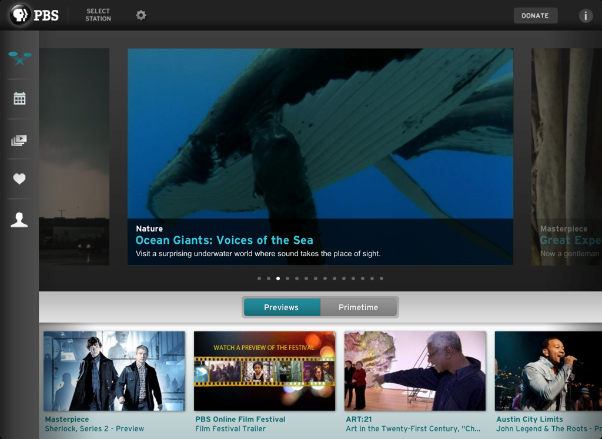
- If a list view is not needed but it’s helpful to keep navigation visible, consider putting the navigation in a sidebar (see PBS for iPad) or in the toolbar.
5. Think Different, Think iPad
As a concluding thought, some of the best iPad apps to date have looked at the larger iPad screen as a blank canvas, creating new and innovative user experiences. Apps that showcase fresh perspectives on what’s possible with one of Apple’s most “magical” products ever include:
- Pennant (a 2011 Apple Design Award Winner)
- Nursery Rhymes
- The History of Jazz
- Paper
- and Magic Piano
These apps follow Apple’s slogan, “think different,” while still embracing human interface guidelines and community-established standards.
With the iPad already in classrooms, kitchens, automobiles, offices, and coffee shops, it’s an exciting time to be creating iPad applications. The only way for UX and design professionals to keep up with the ever-changing iPad landscape is to be as obsessive as consumers about trying the latest apps to see what works and what doesn’t work. At least for the time being, it’s the age of the iPad, so it’s time to truly think different.