Save

Lorum Ipsum was a great way to make a design look realistic without spending your time actually creating content.
At this point in my life, it wouldn’t be presumptuous for me to say 80% of designs in the Photoshop era had some form of filler text in them. Lorum Ipsum being the main culprit, and Bacon Ipsum being the runner up if I was feeling adventurous.
When I talk of content, I’m referring to the entire design, icons, images, text. But as text content is usually the one people struggle to create the most I focused my attention there.
So why don’t we use lorum ipsum as much anymore? Well, the rise of sprints, prototyping, user testing and the idea of the iterative design process has definitely impacted usage.
In the early stages of a product the very first draft of the wireframes, you will probably see some lorum ipsum used as a placeholder for when the designer gets round to that next iteration and implements/asks for content. As the designs progress through the iterative stages the look of the product becomes more complex, more realistic and this, in turn, means the use of lorum ipsum as titles and paragraphs, doesn’t quite cut it anymore.
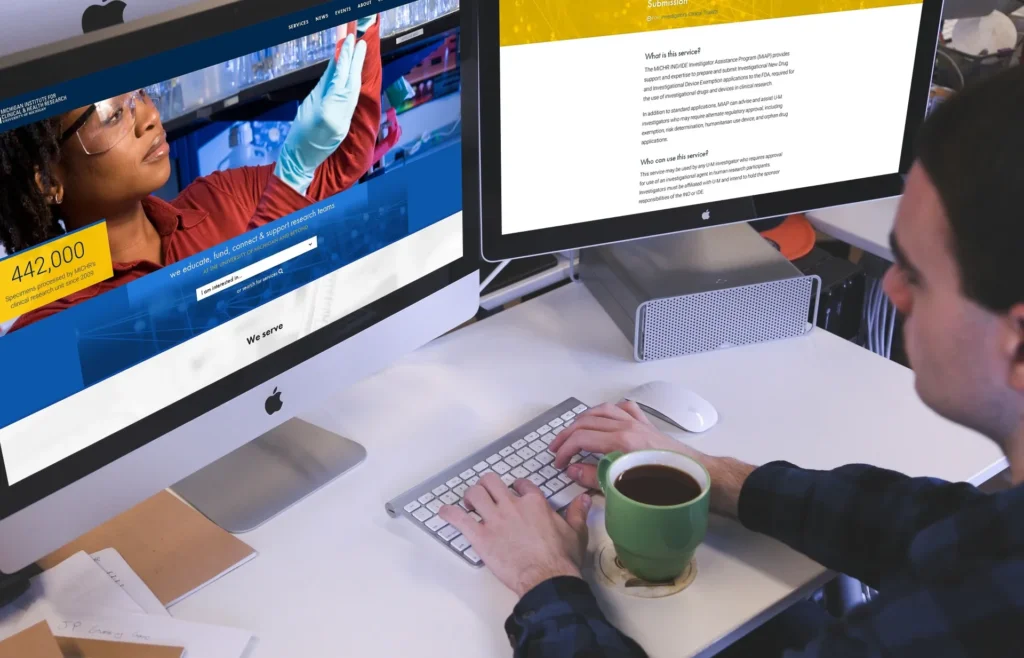
Not only when the design’s progress, does it not work to use filler content but if it comes to showcasing the product at any stage to the client, or user testing, how would someone get a feel for the product they have no understanding of if they can’t read anything? If all they can see is Lorem ipsum dolor sit amet. This would just lead to more confusion. It’s better to at least make it look real even if the content isn’t 100% correct.
For some clients, it can be hard to see the value of what you’re getting without real content. Adding in the content makes it easier for you to sell it to them and for them to sign it off.
Speaking of real content, I don’t mean the finalised copy for every title, all the images to be used. I just mean content that you have decided to use is relevant and at a minimum makes sense.
Designing with real content helps ensure we know the product. Having to read the content to see where it will be used gives us more knowledge of the goal of the product this, in turn, helps us to know how we can design the product better.
In a perfect world the client would provide the goldilocks-amount of content (Not too little, not too much, just right) As it happens this is rarely the case, you are usually left with ‘this is what you have to design’ and content is an afterthought. So as an exercise what would we do in this instance? Say we had an onboarding process for a product but wanted to also to show benefits and why they should sign up to the product, we can deduce these from the USP’s of the product and then figure out some relevant wording for underneath, this then shows the client we feel something like this should be shown here and they then have the option to come back and say here is the correct wording for this section.
Personally, my strong suit has never been creative writing (which is why I torture myself with these articles) I find it much easier to work with what I’m given. But as a designer, it means I have to at least try as the client is expecting us to tell them what they need.
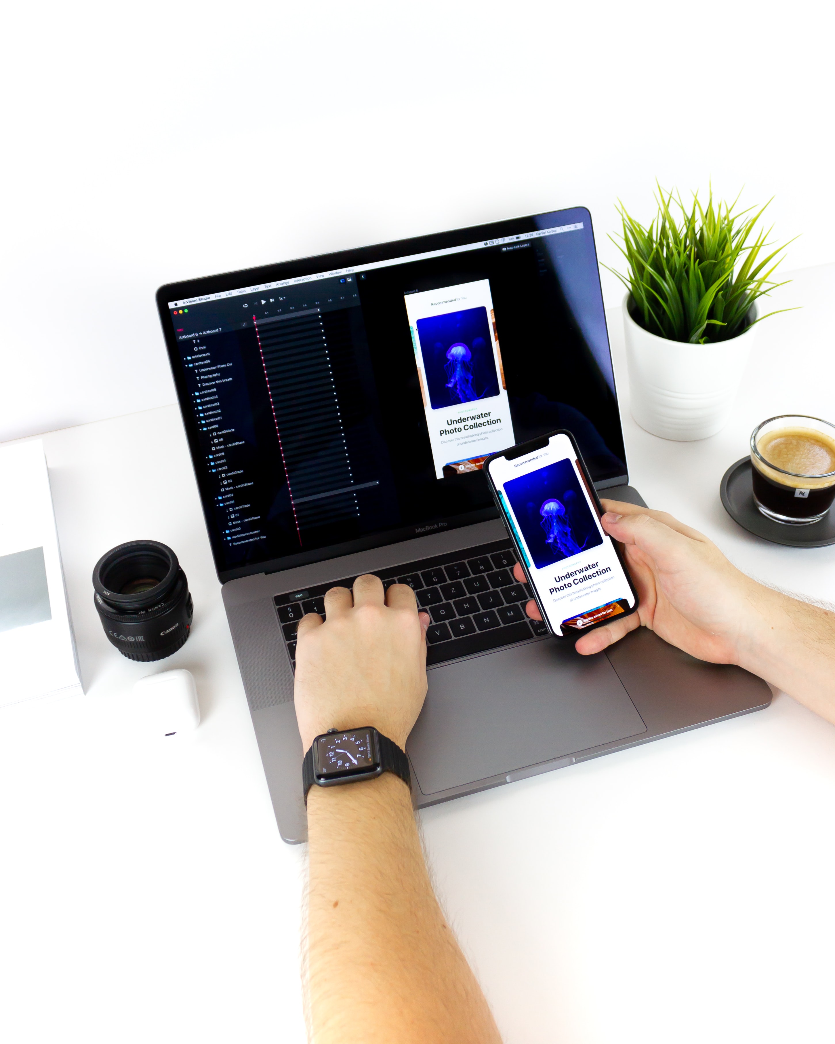
Post photoshop we now have applications such as Sketch and Figma who do a really good job of making your design life easier, with plugins that can add fake ‘real content’ meaning you can create blog post titles, name, dates, data of that nature, quickly and easily.
Conclusion
I’ve spoken about adding in real content when designing a product but this still stands when designing anything in general, from marketing sites to brochures,
The best way to show value to your client is to make them believe what they are seeing is what it will look like when it’s built and ready to be used. We can accomplish this with informed decisions, as a designer it is our role to guide the client towards the best possible design for them, which means sometimes pushing back or suggesting better content for the designs.
Adam is a freelance designer and developer based in London with over 4 years working within the Design Industry, collaborating with ambitious companies, brands and people to create something great.


