Quality primary care sets people up for a healthier life — critical to that is optimizing the patient experience around communication. At One Medical, when traditional messaging paradigms didn’t meet expectations, I turned to research, creative prototyping, and testing to design a better solution.
To design a solution that met our users’ needs better, I first needed to understand why communication in healthcare was broken. To do this, I did a deep dive in researching how the average American was currently communicating their health needs to their medical providers. For many people, they had to call their doctor’s office because not even email was an option. For those that had some form of messaging available to them, it was barebones and outdated to fit the needs and lifestyle of healthcare users today. We weren’t content with the status quo, we wanted an experience that was central to how our members took care of their health and reflected how our medical providers took care of our members — elevating the quality of care and delivering it in a way that’s personalized and tailored to a member’s lifestyle. This led us to reimagining what messaging meant and the “job” a user would hire messaging for in context to their health.
The Research Journey
To start, we needed to understand how, when, and why someone would communicate with us. We had an existing Patient Journey Map that we populated with post-it’s to indicate pain points in communication, potential pitfalls in lack of transparency, and delightful moments in experiences. This informed some of the problems we would need to solve for.
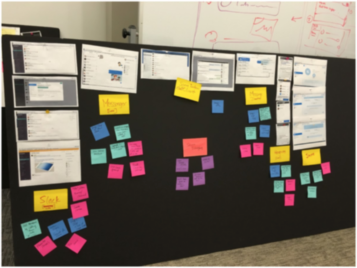
Deep analysis of various existing messaging platforms.
I took the additional step of dissecting various messaging clients that were both consumer and enterprise-facing but were not exclusive to the healthcare industry (many thanks to the countless friends and colleagues I inundated with messages on these platforms!). We didn’t want to redesign the wheel completely— messaging is a problem that numerous companies have solved for, so we wanted to understand what design patterns were being used, what would make the most sense for One Medical member needs, and what “next generation” messaging meant in that context.
Initially, we hypothesized that a team communication structure would likely make the most sense for us to look into further — we could have private “channels” set up for our members depending on who they wanted to reach out to. I ran a bodystorming exercise (also known as, “experience prototyping” — and an inexpensive way to quickly surface problems) where I had one of our iOS engineers play the part of a One Medical member. I was the automated bot that triaged inquiries. One of our web engineers played the part of a medical provider, and an engineer on another team played the part of a second provider. We quickly found some major holes in the experience. If the bot collects important information and a provider jumps into that room, does it create a new room? How did the medical provider gain that important information? When the user spoke to the second provider, where did they come from? Would it be awkward to the user if someone just started chatting with them out of the blue about their inquiry without any context on how and why they know the information that they do?
Prototyping Outside the Proverbial Box
We had to test this out further, but we wanted to learn quickly in the least resource-intensive way possible, while maximizing on our learnings. This is where we got really creative with our prototyping, using Slack to prototype our hypotheses. Our Product Manager set up a session where we found three One Medical team members outside of the Product Development team to hop on Zoom (a video conferencing tool) with us so we could observe the experience during our test. We had a script and a few scenarios to follow. What we learned was that a communication tool based around the team collaboration experience is great for organizations, but for our needs, the model of having multiple channels could potentially mean unnecessary cognitive load and confusion for our users — and potentially our medical providers.
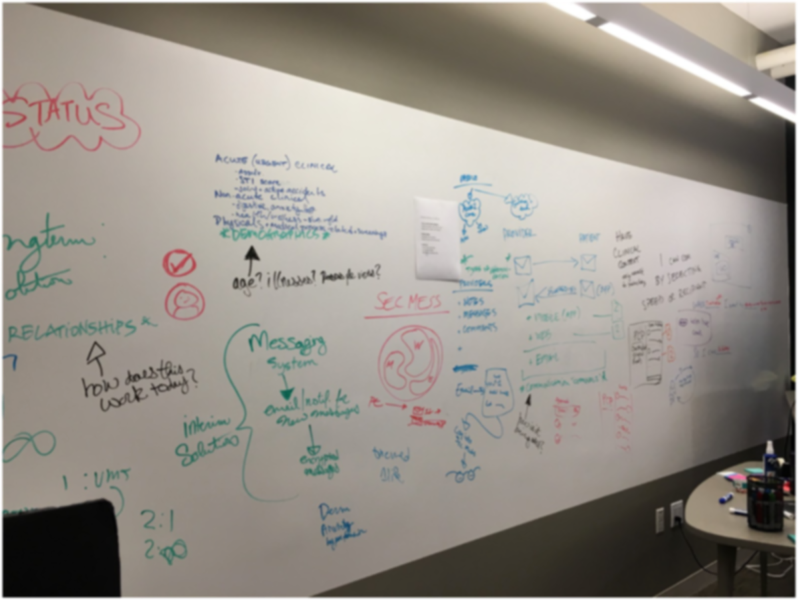
Organizing information as it relates to user behavioral patterns (photo is intentilnally blurred).
We took our learnings to further refine the Slack model to fit our constraints, but we also wanted to explore other approaches to solve messaging in the context of healthcare. Going back to the (figurative and literal) drawing board, we came up with three potential approaches:
- Allow users to create as many channels as they’d like (analogous to Slack or Hipchat).
- We provide a limited number of channels that a user can direct their messages to based on their needs (Eg: any available provider, their specific care provider, etc).
- We only have one input channel which gets triaged appropriately to the necessary team.
Myself, and the other designer on the consumer-facing team then worked on creating wireframes and prototypes for each of these approaches. Using Engineering time to build each of the three options wasn’t a viable solution, so it made the most sense for us to use Invision to prototype and design the prototypes for the web experience. We also had prototypes in Principle for iOS to get a sense of what the interaction on mobile would feel like.
Getting the Whole Team Involved
On usability test day, I invited everyone on my team, as well as team members from the other product teams to hop in, observe, and share notes with us. We had participants hop on Zoom, and share their screen so the observers in the room could take notes. Each participant tested two of the three solutions. One of our key learnings that affected each of the solutions is that it was difficult for participants to suspend disbelief on using a prototype because the text box wasn’t interactive. The need to test a messaging product with an interactive prototype that felt more real was a key learning that we brought into future usability tests.

Usability Testing Day – we invited the wider Product Development team to observe our sessions.
We also learned that while many people know what the credentials M.D. signify, they didn’t know what PA-C or NP was. However, these acronyms gave a sense of trust to participants that they were communicating with a medical professional and someone qualified to give clinical care — when no credentials were present, it caused ambiguity on who the participant was communicating with and broke trust. Additionally, the images of the providers next to their names solidified the sense of trust and humanized the experience. For a healthcare product, designing for trust and humanizing the experience is core to everything that we do, so this was important.
Option 1: our learnings from previous user research sessions (body storming, and using Slack as a means of prototyping) taught us that we needed to iterate from learnings from previous sessions if we were to learn anything new. The version we tested was a version that incorporated learnings from the previous prototype testing sessions. What we learned is that perhaps the biggest positive from this option is in most instances, the user knew who they would send a message to— we also learned that this was more of a nice to have than need to have. A negative was that the pane that held all of the messages caused confusion, and creating a new message wasn’t particularly intuitive.
Option 2: this is where we had a finite number of channels that a user could hop into based on the topic of their question. This option had positives and negatives. The biggest positive takeaway was that the context of the messages were very clear based on which room the participant was in. Perhaps the biggest negative takeaway was the friction in navigating between channels to get medical care or questions answered — it was unclear when to use each of the specific channels.
Option 3: this option was the least confusing. The UI was easily understood, groupings of messages in chronological order worked well, and the solution fit well with the long-term vision of delivering care through messaging. However, we found not letting people choose their recipient and forcing messages to go to a general queue first, wasn’t an optimal experience and caused frustration.
Designing the Messaging Experience
We chose to lead with the format of Option 3, but incorporated the best aspects of Options 1 and 2 as it made sense. This version of messaging that I researched, prototyped, tested, and designed, is available to all members in all markets. The first of our incorporated learnings has already rolled out. We saw that patients needed to know if a provider was out of the office and wouldn’t be able to respond to their message (this is especially helpful when communicating with the Primary Care Provider). So I designed a solution that let the user know when a medical provider was out of the office so that it helps them decide who to send their message to.
Integral to transforming the delivery of care are deep explorations, research, and prototyping.
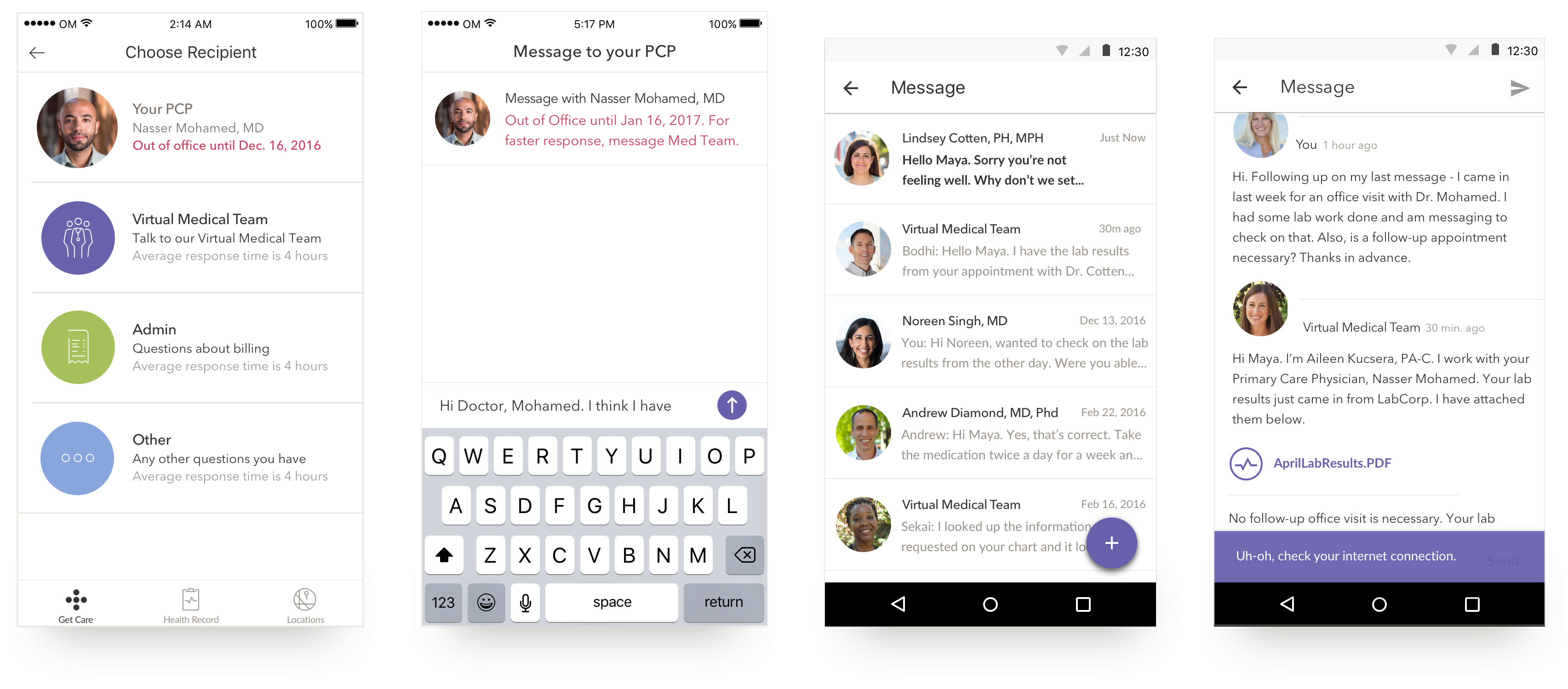
The first two are of the iOS experience where we notify users when their PCP is out of the office. The second two screens are of the Android experience.
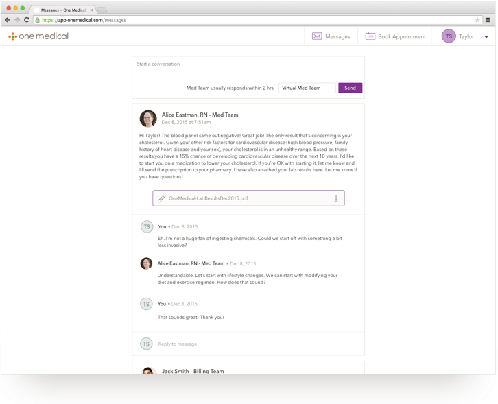
Secure Messaging on web
This article was originally published on Medium.


