Save
The opinions which we hold of one another, our relations with friends and kinsfolk are in no sense permanent, save in appearance, but are as eternally fluid as the sea itself.
– Marcel Proust
Whether it’s a Fortune 500 Company, a knitting circle, or a terrorist cell, anytime a group interacts, a complex and constantly shifting set of social relationships and behavioral patterns emerge. Some of these interconnections may be apparent, but others are not. Who are the experts, connectors, influencers, proliferators, obstructionists, implementers, and other types of members in the group? Tracking the shifting tides of influence carried in the ebbs and flows of communication is like monitoring the ocean currents—often hard to see, but powerful in their effects.
Emerging social network analysis and visualization techniques can fundamentally change the way we see our relationships with others. These perspectives offer new ways for companies to operate more effectively, for marketers to delve deeper into consumers’ minds, for law enforcement to tracking criminal enterprises, and for individuals to help manage their online reputations. Although technology offers unprecedented ways to capture, analyze, and display rich information about social networks, the potential benefits will only be fully realized by skillfully blending data handling with effective visualizations.
The Big Picture
Irrespective of our conscious convictions, each of us, without exceptions, being a particle of the general mass is somewhere attached to, colored by, or even undermined by the spirit which goes through the mass.
– Carl Jung
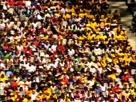
2010 FIFA World Cup Soccer City Crowd (VOA) [image credit]
We’ve all seen aerial views of crowds at sports events, political gatherings and protests. These images can tell a story about who is attending and, at a certain level, the general interests and likely interactions of the group. Maybe the image shows a wide swath of people wearing a certain team color, or two groups standing in confrontation with one another in the streets.
Similarly, data visualization techniques can reveal interesting patterns in online crowds and communities, and can tease out layers of rich and detailed information about them. Marc Smith, Chief Social Scientist for the Connected Action Consulting Group and a co-author of Analyzing Social Media Networks with NodeXL, says the “shape of a crowd”—its physical arrangement, along with its, movements, and context—can reveal a lot of interesting information. Smith wonders what new insights and patterns will emerge with the ability to have a bird’s eye view of an online crowd with the ability to zoom in and zoom out at will.
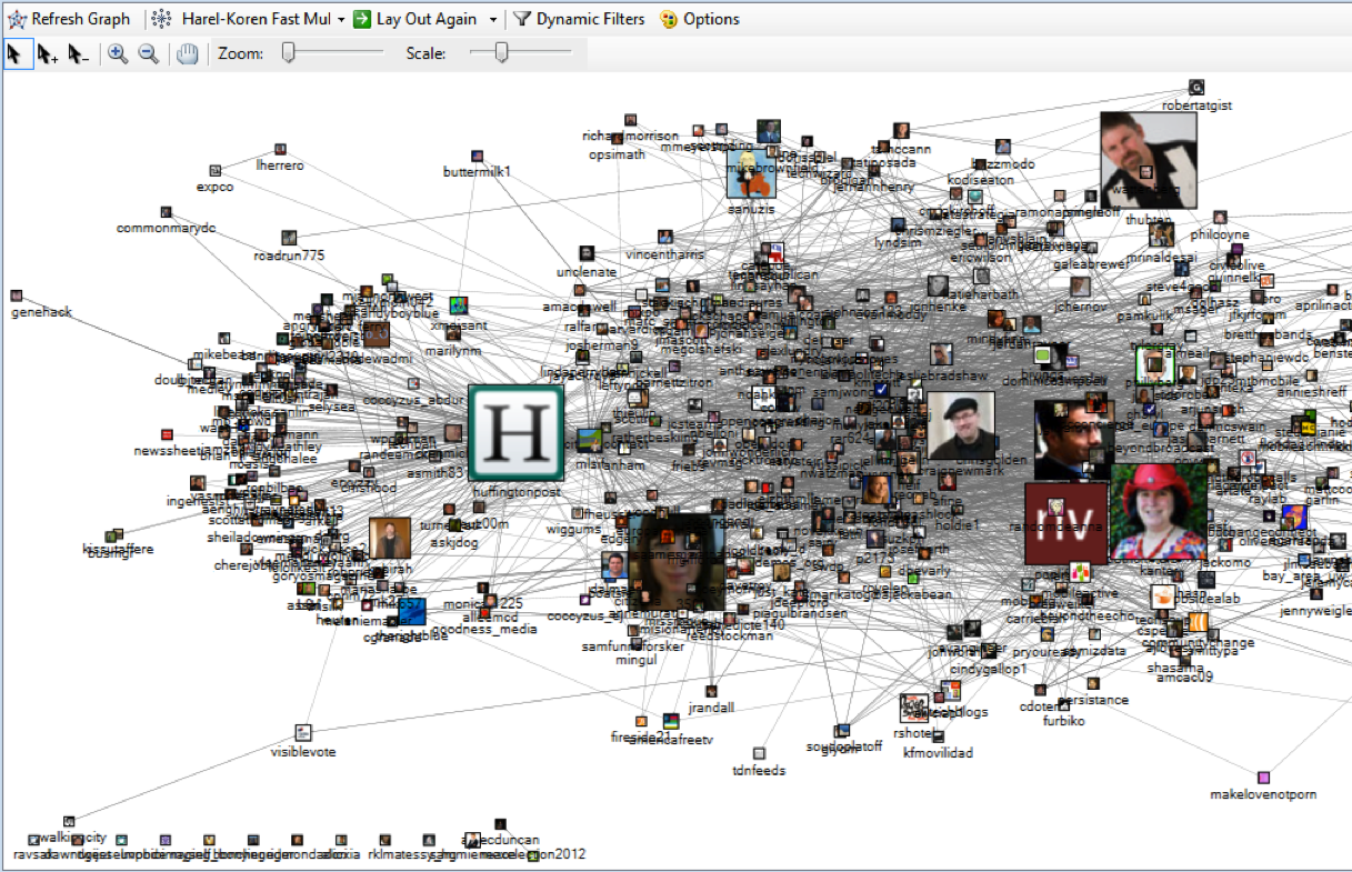
The social network diagram below, created with NodeXL, shows the connections among Twitter users who tweeted the hashtag “#PDF2010” relating to the Personal Democracy Forum on June 3, 2010, with the profile images scaled by the number of followers. Smith says, “This is a kind of social landscape, and this landscape has peaks (people who can be the most popular), valleys (the more peripheral people in a network), and bridges (the people who are essential connecting points in a network). Social cartographers are defining the meaning of the map.”
Untangling Hairballs
The product of the scientific imagination is a new vision of relations—like that of artistic imagination.
– Edmund Wilson
Social networks have long been visually depicted as diagrams comprised of dots and connecting lines, referred to respectively (and perhaps not entirely intuitively) as nodes and edges. Nodes represent entities, such as individual people, companies, institutions, etc. The lines, or edges, that connect the nodes represent connections such as who is referring to whom, and friendship/follower connections.
The information embedded in diagrams is only useful if people are able to make sense of the often complex and tangled masses of lines and dots, semi-affectionately referred to as “hairballs.” There are several ways to address this problem, including data-crunching to comb out key strands of information from these hairy creatures, and UI controls that allow people to selectively display and dive through layers of information. Professor Ben Shneiderman, author and founding director of the Human Computer Interaction Lab at the University of Maryland says, “It’s not just the picture, but also the control panels that are necessary to gain insights from data.” These controls should allow users to “get an overview, filter out extraneous details, zoom in on what they want, and then view the details.”
Strong analytic and visualization tools, and a broad selection of data sources, can help fill in the picture of a social network. “Many social networking systems, such as Facebook, Flicker, and Twitter expose only parts of a person’s social connections,” says Shneiderman. “Email, blogs, and discussion groups are also important sources of insights about relationships and activities.”
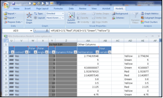
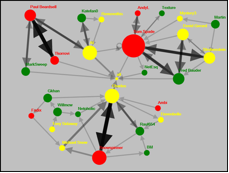
Figures used with permission from Analyzing Social Media Networks with NodeXL, Morgan Kaufmann Publishers
Top Rung or Center of Influence?
We are searching for some kind of harmony between two intangibles: a form which we have not yet designed and a context which we cannot properly describe.
– Christopher Alexander
Company organization charts tell only a small part of the complex and dynamic underlying stories of how a business actually operates. Static, hierarchical boxes and arrows only go so far. Adam Perer, a Research Scientist at IBM’s Visual Communications Lab, thinks that more accurate reflections of the organization can be captured by social network visualizations. These can help identify important connecting points such as pre-established relationships, shared expertise, and who may have information or skills that aren’t obvious from their current roles.
“An org chart,” says Perer, “cannot really reflect that depth of information because influence is not always correlated to hierarchy.” Newer visualization methods can show rich and useful dimensions that would not be possible to glean from a traditional org chart. In these new forms, key players reside at the centers of the network diagram showing them as hubs of communication and influence in the group.
As people begin to expect and want more from socially oriented data and recognize previously unseen value in their relationships, more visual-analytic tools will likely emerge to meet the demand. Perhaps visual representation can add temporal dimensions and insights to a person’s roles within business groups. There are many ways to reveal important social structures within a company beyond their org charts. Sophisticated search tools can help, but Perer says, ”Most search engines are very document-focused, but we wanted to put the emphasis on exposing the connections between people in terms of roles and relations. I think we are in the early stages of social network analysis and visualization.”
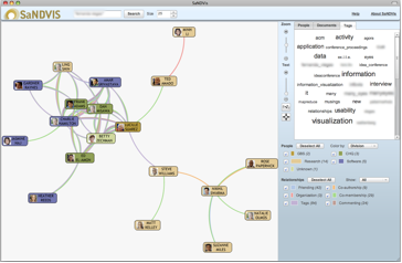
The scale of the challenges to be addressed can be mindboggling. The professional social network at IBM, where Perer works, comprises 500,000 people, and despite being “a relatively small network,” as Perer sees it, “the complexity level is still high because there are over 70 million relationships connecting these individuals.” Using IBM’s SaNDVis System, Perer’s lab is using statistical algorithms to help simplify visualizations of the company’s social connections. They are also thinking of new ways to display meaningful connections within networks without making the visualizations too complex. The example below combines a social graph and tag cloud of various connecting points for some IBM employees with specific shared interests.
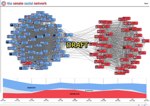
Many social-behavioral networks, including those in the U.S. Senate, change over time. This graphic below shows the voting patterns of U.S. senators (red Republicans are, for the most part, on the right, and the blue Democrats are mostly on the left.)
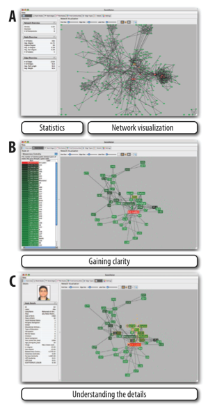
The next example shows the roles and influence individuals have in a terrorist network, viewed from many different angles ranging from gatekeeping to friendships to religious ties. These dimensions can provide insights into the potential involvement in an attack. The statistics side of the interface allows users to choose statistical algorithms to find attributes of interests that are visualized on the right. Users can filter out the unimportant dots and lines using a dynamic slider to simplify the visualization while still preserving the structure of the network.
It’s Not What You Know…
Let us forget things and consider only relations.
– Georges Braque
Derek Hansen, Assistant Professor at Maryland’s iSchool and Co-Author of Analyzing Social Media with NodeXL, says that social network analysis differs from traditional social science because it places greater emphasis on relationships between individuals versus the characteristics of a single individual. In this context, group members’ particular connections are a more important factor than their roles within the group. Hansen says network analysis, at its core, “is relational, and many people are not yet used to thinking in those terms.“ As the use of social media expands, he says, relational thinking is getting more common.
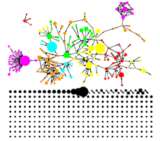
Hansen has found that even at the elementary school level, experience with Twitter and Facebook is helping to instill in students the concepts of relational data. Additionally, tools like NodeXL make it increasingly easy to capture relational data, which has historically only been accessible to programmers. Hansen and his colleagues use this social media data to create “EventGraphs,” which are diagrams illustrating the structure of connections and communications among people discussing an event, such as a news story. These EventGraphs help identify sub-groups within the larger conversation, as well as individuals with unique social signatures.
You Are What You Tweet
I present myself to you in a form suitable to the relationship I wish to achieve with you.
– Luigi Pirandello
In Rashomon, the classic film by Akira Kurosawa, four people who became caught up in a crime each offered radically different descriptions of the event. These accounts were shaped by their roles and vantage points (attacker, victim, etc.) as well as their individual social and psychological needs. Sometimes, gaining the fullest understanding of the dynamics of social networks requires multiple viewpoints. The perception of any social interaction, and the parts people play in it, are often multifaceted, ephemeral and subject to many internal and external forces.
Gilad Lotan, a Program Manager with Microsoft’s FUSE Labs, says although Facebook captures a lot of data about individual personal social networks, “You can never assume you have the full picture because people’s relationships are changing all the time.”
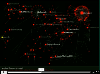
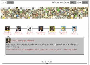
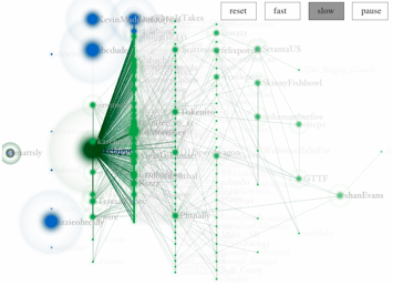
Below are three visualizations of the same social interaction about the spread of a Twitter hashtag – #cheeringfortheyankeesislike, the full story of which is recounted here. From the visualizations, Lotan was better able to understand the dynamics of the spread of a specific meme based on social connections and the activities of key participants.
Network Graph
Twitter Icon Timeline
Mapping Social “Distance” and Influence
Lotan says many people wonder about their effect on their networks and there is growing interest in an area called “personal analytics.” These are ways to measure an individual’s impact on online communities. For instance, analysis tools can reveal how many people see and like the pictures you’ve posted on Flickr or how many times your pithy commentary is retweeted. Lotan says, “Personal analytics and visualizations provide ways to understand yourself in an online social context.”
Face in the Crowd
The newest computer can merely compound, at speed, the oldest problem in the relations between human beings, and in the end the communicator will be confronted with the old problem of what to say and how to say it.
– Edward R. Murrow
Like the proverbial tree falling in the forest, what does it mean if you make a comment on Facebook and no one responds? Many of us put a lot of ourselves on the line, online, every day. How do we know what the aggregated information reflects about us among our families, friends, co-workers and others? How do we fit in the various forms of communities that we join and are sometimes unwitting members of? The photo taken by someone else and tagged by yet another person is now part of your public identity. Your online persona, in some respects, is another entry in a great social and personal wiki that is continually expanding and changing. In the evolving online environment, to paraphrase the Scottish poet Robert Burns, the ability to see yourself as others see you is increasingly important.
Our online reputation is simply not fully in our control. Bart Munro, VP of Products with ReputationDefender, an online reputation management service, says one of his biggest challenges is making the case for online image and identity management to people who may not yet see its value and importance. “One of the reasons we like Facebook is that it provides an environment with structured data that can tell at least part of your identity and reputation story.” All the highly structured Facebook data, Munro says, is great for this use. “We’re interested in visualizations that can handle the ambiguity of unstructured data.”
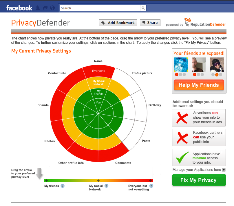
The tool below, called PrivacyDefender, gives users a simple visual representation of the current state of a user’s privacy settings on Facebook, and controls for modifying them. For many users, Facebook privacy settings can be cryptic, and getting a clear sense of how they are “seen” in context of this social network can be difficult. Visualizations like this can help to provide a clearer picture of our place in the crowd.
Netting It Out
In the future, everybody will be famous to 15 people.
– David Weinberger
Digital media is not only accelerating and amplifying social interactions, it is also providing new ways to view and understand these relationships. This article is part of an ongoing series on data visualization. Future articles will dive deeper into this sea change.
Hunter Whitney
Hunter Whitney is a consultant, author, and instructor who brings a distinct UX design perspective to data visualization. He has advised corporations, start-ups, government agencies, and NGOs to achieve their goals through a thoughtful, strategic design approach to digital products and services.
Hunter is the author of "Data Insights: New Ways to Visualize and Make Sense of Data”. He was also asked to contribute a chapter in the book, “Designing for Emerging Technologies: UX for Genomics, Robotics, and the Internet of Things”. Additionally, Hunter has written numerous articles covering a range of subjects for various online and print publications including UX Magazine.


