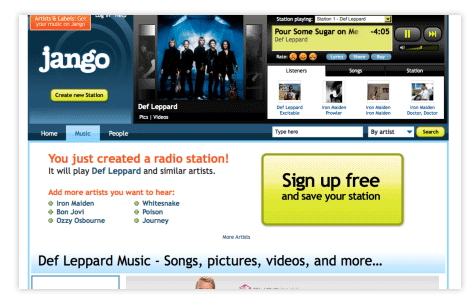
Microsoft recently announced an upcoming price increase for the XBox Live Gold membership fee. When this news broke, a few retailers such as NewEgg responded by pushing their existing stock of gift cards (selling the membership at the older, lower price). It was fascinating to watch people scramble to get their hands on the remaining gift cards. Even people who hadn’t yet tried XBox Live purchased some of the gift cards, explaining, “they won’t be around for long—now’s the last chance to buy a year membership at the current price.”
But why?
The simple answer is that people infer special value in something that has limited availability. This is true in dating, commerce, gaming and other fields. Everything from gold and diamonds to “limited edition” candy bars to baseball cards prove this point.
But what about web applications? In most cases, we’re not dealing with physical goods, but rather with digital content that be copied or throttled as needed with little to no costs. Where everything is digital and scarcity should be a quaint notion, does this same idea hold true? And can we use this to influence behaviors? Or get people to do more than just purchase something?
Using Scarcity in Commerce
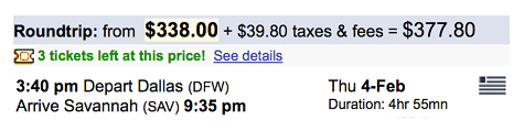
The most obvious application of scarcity is in retail and e-commerce. A retailer may only have few shirts left in your size. A car dealership may only have one car on the lot with the features you want. Collectible items fetch a lot more money in aftermarket auctions. These same sales tactics apply to online shopping as well: A travel site shows “only three tickets left at this price,” or an artist only has “six copies of this print remaining.”
This idea has also been used in domain name “land grabs.” There is a very real scarcity of domain names on the Web. But custom URLs, such as stephen.somereallycoolnewsite.com can also leverage this scarcity to encourage signups.
But scarcity can be used for more than simply encouraging purchasing behaviors; because people value things that are scarce (the reason we feel pressured to purchase something), this same principle can be applied in other creative ways.
Using Scarcity to Increase Quality
Foodspotting is a site where people share photos of their favorite dishes. Rather than review a restaurant, you can see and share favorite dishes at a restaurant. You like the Pad Woon Sen at that Thai place? Let people know by taking a photo of the dish next time you eat there. Foodspotters, as Foodspotting users are called, love sharing these photos. In fact, before there was Foodspotting, there have been photo groups on Flickr where people shared interesting photos of dishes.
So how is Foodspotting using scarcity?
If you’re making the effort to photograph your dinner, you probably at least enjoy that dish. But what about your favorite dishes—the ones you rave about to your friends? For these, all users get “noms”—special ribbons reserved for those dishes you’ve tried and loved best. But there’s a catch: Foodspotting states, “You only get 5 noms to start with and must earn the right to nom more foods after that!”
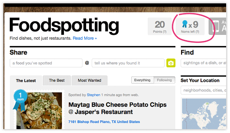
By limiting noms, Foodspotting encourages people to be more selective about which foods deserve special recognition. The site claims “the blue ribbon (the ‘nom’) means more because it’s hard to get.” People won’t give every dish a nomination lest they have no remaining noms to give to a dish that really is exceptional.
This idea could be applied in other, more familiar contexts. Imagine YouTube limiting each person to a handful of five-star ratings per month. Or what if Facebook limited the number of “likes” a user can use per day? While this isn’t the behavior Facebook wants to encourage, introducing a limited supply would change how people use the “like” button.
Here’s another way designers are using scarcity to encourage quality:
Remember “show and tell” from elementary school? Dribbble is a new site where designers, developers, and other creative pros can share sneak peeks (or “shots”) of their current work. Just as Foodspotting encourages people to be selective about their noms, Dribbble encourages people to be selective about what they share by limiting how many shots users can share each month.
Dribbble’s founders don’t hide their use of scarcity to encourage high quality submissions:
In case it isn’t obvious, the reason we throttle shots is to encourage players to post with care— we hope scarcity induces quality. (So far, so good.) We’ll be introducing other ways to accrue
shots for meritorious behavior, but we want everyone to know that you’ll always have a base of 24 shots to work with each month.
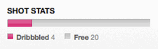 shots for meritorious behavior, but we want everyone to know that you’ll always have a base of 24 shots to work with each month.
So far, the high quality of the submissions that have accumulated on Dribbble is impressive. This is partly attributable to the caliber of the designers who were among the first to contribute to the site, but also to conscious planning by the site founders. Through scarcity and other intentional design decisions, they hope that people will post with care and maintain the quality of images shared.
Using Scarcity to Encourage Participation
There’s another twist on scarcity, one that may seem contrary everything stated so far. This twist is one of creating artificial limits—specifically, character limits. By enforcing a scarcity of characters, you can actually encourage participation (this is different from creating desire as with the examples above). Twitter is the perfect example of this.
The technical limits of mobile text messaging were the original constraint behind Twitter’s 140-character limit. But it is precisely this character limit that has driven a new form of written expression. Prior to Twitter, there were blogging tools such as Blogger, WordPress, and SixApart. Anyone could certainly have written short, 1–2 sentence blog posts. But we didn’t. I would have never written a blog post about eating my last piece of Leonidas chocolate, but I can certainly tweet about that. It’s this character limit that allows people to be more casual about what they write—after all, it’s only 140 characters! It’s okay to say less, speak informally, or make typos in such brief messages; this isn’t an essay paper, after all. The context lowers the bar on what can be “published” on the Web. It’s liberating to have none of the expectations inherent in other forms of written communication.
To be clear, this is a very different kind of scarcity than if you were allowed say only one tweet per week. If this were the case, we might see much more thoughtful 140-character exclamations. But the character limit has made it much easier to post (and, in doing so, lowered expectations). Tweets are unlimited, more like words in a conversation. Why? Because a tweet can’t exceed 140 characters. By making this number so low, Twitter is essentially saying, “It’s easy, what’s stopping you?” Scarcity encourages participation, by making it that much easier to join in.
Rypple uses this same insight to make feedback and coaching easy. With Rypple, users can request peer reviews to help them get better at their jobs. If you want candid feedback on that presentation you just gave or your management skills, Rypple creates a safe environment to solicit and give such critiques. Co-founder Daniel Debow observed that “the most senior people tend to send very brief emails.” While people would like to give feedback to others, there isn’t always the time to do so. By limiting comments to 400 characters, the “cost [in terms of time] to the reviewer is much lower, especially in contrast to long surveys and other corporate tools.
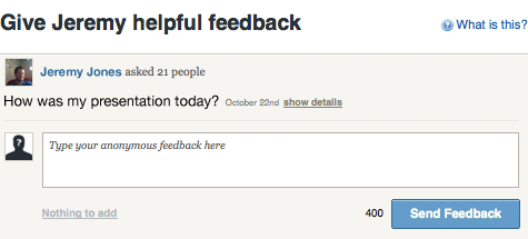
This number, along with other variables, has been iteratively tested over the past year. Rypple wants to encourage people to respond, and to do this the team has tested limits as low as 120 characters. However, they also want to leave enough room for constructive feedback, so the team has tested much higher limits. 400 characters seems to strike the best balance between increasing the number of responses while still allowing for substantive feedback. Debow also adds that “when you encourage and design for brevity, you also encourage people focus their feedback.”
This idea of using scarcity to increase participation isn’t limited to characters. What if email inboxes could only receive 15 mail items at a time before they were literally full? Would that encourage us to clean out our inboxes? Or what if a signup form allowed users to list only three of their favorite movies in a signup form? Would that limit be less intimidating to complete than a big, empty textbox?
Why Does Scarcity Work?
One explanation of why scarcity works so well on us has to with decision-making. It’s easier to “go along with the crowd” and buy the thing that is scarce. Why? According to persuasion expert Robert Cialdini, things “that are difficult to possess are typically better than those that are easy to possess.” (Influence: The Psychology of Persuasion, 1998). People use this defining attribute—limited availability—to aid in their decision-making processes. If a bakery is running low on one kind of pastry but has plenty of the alternatives, that might be a good indication of what is popular (and what’s to be avoided!). Scarcity is often a shortcut to the best choice.
This helps explain scarcity as a selling tactic, and possibly why character limits might help people choose a restrictive format over an open-ended one that offers no constraints. But what about the kind of scarcity (as with Foodspotting or Dribbble) that improves quality?
Another explanation of why scarcity works has to do with freedom—or rather loss of freedom. If something is scarce, it may be unavailable in the near future. And that idea doesn’t sit too well with people—it violates our sense of control over a situation: “If I don’t act today, I won’t be able to…” Psychologist Jack Brehm writes about “psychological reactance,” or the ways people fight against restrictions on their freedom. Brehm explains why teenagers who are only mildly interested in each other will continue dating as protest to their parents disapproval, or why people rush to protest government restrictions on their rights, even when the issue means very little to them personally. Scarcity of something is essentially a threat to freedom of choice. But this threat isn’t necessarily a bad thing; it can be a useful means of encouraging desirable user behaviors.
Scarcity and UX
While the aim of this article has been to suggest creative ways to use scarcity, this idea shouldn’t be used to the detriment of your users. Scarcity is a powerful persuasive tactic, one that’s frequently used in sales. Whether people feel pressured or pleased depends on how scarcity is applied. Customers might feel regret after purchasing something they didn’t really want. But they might also feel relieved to have made the right choice or to have gained something exclusive. Scarcity has value beyond being a sales tactic; it can encourage participation and quality as well. Many games create a thrill by making something scarce. Imagine Monopoly with unlimited cash or any arcade game with unlimited lives. Yes, there’s certainly a pressure that’s coupled with scarcity. But it’s the kind of pressure that creates a appropriate level of anxiety, which can actually make things more fun, playful and exciting. Scarcity is a useful psychological tool that can be applied to software and web design in many creative, constructive ways. We can cause people to value something more by introducing simple economics into our designs.