Save
In many industries, prototyping is an effective way of modeling a system to test it and gather feedback from engineers, other designers, stakeholders and, most importantly, end users.
Practitioners in the UX field are familiar with prototyping when designing physical devices, web, and mobile applications. UX designers can use Flash, HTML, or other robust programming languages to build prototypes that closely resemble the final product, allowing test participants to interact with the prototype more realistically to generate valuable feedback for designers.
Unfortunately, these types of prototypes aren’t generally used early in a product’s lifecycle because they can be difficult and slow to produce. UX designers trying to build these prototypes may need the help of software engineers or developers in the team. Besides taking considerable time and effort to create, implementing any changes on these type of prototypes can also be time-consuming.
Low-Fidelity Prototyping
To produce prototypes that are low cost, fast and easy to recreate, designers can turn to low-fidelity prototyping techniques such as paper prototyping. This technique involves creating rough drawings or sketches of interfaces that can be used as models of a design in usability tests. Paper prototyping is practical and useful because it allows for input by end users in early stages of the design cycle. The feedback gathered in these usability tests in turn informs design iterations before a design goes into full production.
But unlike high-fidelity prototypes, paper prototypes lack the context of the physical device the product will ultimately be deployed to. For example, a paper prototype of a website can only be experienced on the piece of paper that it was created on, whereas an HTML/CSS-based prototype can be experienced in a web browser. Paper prototypes also depend on a facilitator to act “as the computer,” changing different states of the UI in response to a participant’s actions.
The lack of physical context of paper prototypes is particularly problematic when designing mobile experiences. Because mobile applications are inside mobile devices, they can be experienced in many possible positions and contexts. Showing prototypes in an unusual setting (such as a flat piece of paper on a table) doesn’t give users a full and accurate experience of the design. Simple paper prototypes can test a product’s UI and content, but leave much of the broader product experience untested.
If we could replicate more of the mobile user experience using low-fidelity prototypes, we could get more of the feedback that would otherwise be more difficult and take longer to obtain. This can be done using a mixed-fidelity prototyping technique called paper-in-screen prototyping.
What is Paper-in-Screen Prototyping?
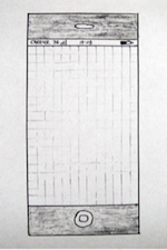
The idea behind this technique is simple: place the paper prototype of the mobile application inside the mobile device. This is achieved by adapting images of low-fidelity (paper) prototypes to display on a mobile device’s screen. This allows users to get closer to experiencing aspects of the mobile user experience that are absent with paper UI sketches alone.
This prototyping technique is practical since it leverages prototypes that are likely to have been previously made for testing. If a designer has sketched a number of paper prototypes to conduct a usability test or a heuristic evaluation, these can be easily turned into paper-in-screen prototypes.
These mixed-fidelity prototypes share some important characteristics with paper prototyping. They are still relatively easy to create and discard. They also look “sketchy” and “unfinished,” which allows participants to provide feedback they otherwise might not have shared for fear of criticizing a design that appears to have many hours of work behind it.
Paper-in-screen prototyping and regular paper prototyping both have a similar place in the overall lifecycle of the design of an application. They both allow for quick production testing and iterative design.
How to Create a Paper-in-Screen Prototype
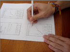
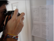
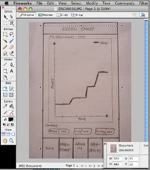
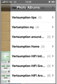
The following are the keys steps to produce a paper-in-screen prototype, taking the design of an iPhone application as an example:
Testing a Design Using Paper-in-Screen Prototypes
It is important to establish linear scenarios before conducting a test using paper-in-screen prototypes because the prototypes aren’t fully interactive. Test participants should go through a series of pre-defined scenarios during in the same way they would with paper prototypes.
It is evident that paper-in-screen prototypes are not as realistic as high-fidelity prototypes, but they have the important advantage over low-fidelity prototypes in that users can hold the prototype in their hands in the same way they would hold the product in their hands.
Besides bringing a paper prototype to a more adept context of use, this makes it more practical for practitioners to carry all the scenarios and their corresponding prototypes in one place: the mobile device itself.
Visceral, Behavioral, and Reflective Levels of Design
The value of testing a design prototype extends beyond just evaluating UI elements and interactions; behavioral and emotional feedback are also valuable insights that prototypes draw out of test users. Although a paper prototype can allow a user to experience the way an application might look, it doesn’t generate the immediate emotional impact that the product ultimately will. These are things that matter at the visceral level of design, one of the three levels of design (along with behavioral and reflective) that Don Norman explains in his book, Emotional Design. Failing to account for the visceral level of design results in failing to anticipate the real mobile user experience because it dismisses the level of affect, or emotional response, that a prototype could elicit in the participant in a particular context.
Paper-in-screen prototyping also accounts in part for Norman’s behavioral level of design, which should be of main interest to UX professional as it deals directly with interaction and usability. With this prototyping technique, practitioners can easily get closer to contextually relevant behaviors of participants interacting with a low-fidelity prototype that would otherwise not be possible. For example, a paper-in-screen prototype of a mobile application can easily allow a UX designer to see where a participant is placing a finger on the screen, which sections may be getting overlooked, and even how the mobile device is being held.
Paper-in-Screen and UX Practitioners
The benefits of paper-in-screen are clear from a test participant’s perspective. To find out whether UX professionals would find paper-in-screen valuable, this technique was tested with ten UX professionals as part of the study behind my master’s thesis project at Indiana University. The goals were to discover whether this prototyping technique is able to effectively replicate the mobile user experience, and whether UX professionals would be willing to adopt it.
The majority of the UX professionals in the study found paper-in-screen prototyping to be engaging and suitable for early design stages. Some wished it could be even more interactive like higher-fidelity prototypes. However, the most interesting finding was that paper-in-screen was regarded as providing better user feedback compared to paper prototyping, despite being more difficult to achieve.
The perception of better feedback was based on how paper prototypes can’t approximate the mobile user experience as well as paper-in-screen prototypes can. The perception of such better feedback being more difficult to achieve with paper-in-screen prototypes came from the fact that they can’t be annotated or written on in the way paper prototypes can.
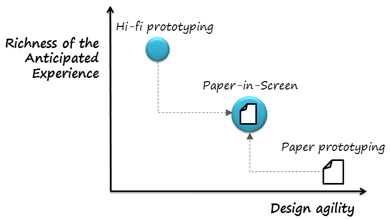
As a result, paper-in-screen prototyping falls somewhere between low-fidelity and high-fidelity prototyping in terms of the tradeoff between the richness of the test experience and the rapidity with which prototypes can be created.
Paper-in-screen prototyping also allowed for the discovery of some essential elements than can help simulate the mobile user experience: contextual interaction experience, a better sense of realism, a focus on visceral and behavioral levels of design, the prototype-digitizing speed, and overall interactivity are all key benefits of this mid-fidelity approach.
Paper-in-screen doesn’t come without its drawbacks. This technique requires test participants to follow a predetermined scenario, which leads to a strictly linear experience that inhibits any spontaneous actions. If paper prototypes could be easily scanned into image files with clickable “hot spots” that could be rendered by a mobile browser (displaying the image in full screen), the usefulness of paper-in-screen prototypes would be improved.
Clearly, this prototyping technique could be improved in order to get more realistic feedback from lower-fidelity prototypes. It is important, however, to make sure any modifications of this technique don’t result in making mixed-fidelity prototypes more difficult to create than necessary, or as time consuming to create as full-fledged high-fidelity prototypes.
This technique aims to bridge the gap between low- and high-fidelity prototyping in providing a contextually relevant user experience early during the test of a design idea. From one UX designer to another, I hope you find this technique useful by including in your personal and professional design process.
I would like to formally thank Dr. Davide Bolchini and Dr. Anthony Faiola at IUPUI’s School of Informatics for their contribution and assistance on developing this concept.
Diego Pulido is an Interaction Designer at Dell in Austin, TX. Prior to moving to Texas, Diego worked as an Interaction Designer at Pearson Education in Indianapolis and as a User Experience Designer at Roundarch in New York. He is passionate about Mobile UX, prototyping and sustainable design. While his background is in humanities, Diego always had a keen interest in technology and web design. It was through the field of Human-Computer Interaction that he was able to bridge the gap between his BA degree in Psychology and French from the University of Nevada, Reno and the world of User Experience Design. He earned a Masters degree in Human-Computer Interaction from Indiana University. You can find him on Twitter: @ixDiego and his website: https://diegopulido.com


