Save
From a drop of water… a logician could infer the possibility of an Atlantic or a Niagara without having seen or heard of one or the other. So all life is a great chain, the nature of which is known whenever we are shown a single link of it.
From a drop of water… a logician could infer the possibility of an Atlantic or a Niagara without having seen or heard of one or the other. So all life is a great chain, the nature of which is known whenever we are shown a single link of it.
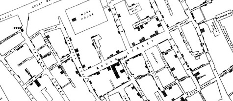
-Sherlock Holmes in Sir Arthur Conan Doyle’s A Study in ScarletA thick and fetid atmosphere blanketed London in the summer of 1854. The miasma drifted up from the urban slaughterhouses, cesspools, factories, and countless other sources of filth, and filled the streets. When a vicious outbreak of cholera suddenly hit the Broad Street area, many believed the foul air was the culprit. John Snow, an anesthesiologist, thought otherwise; he believed the source of the infection was waterborne. He created a map that showed where the cases occurred and their proximity to a water pump, which he used to convince officials to remove the pump handle, and the outbreak subsided. While there is much more complexity to that story, it became a classic illustration of the power of visual representation to help trace and stop the course of a deadly infection.
Part of John Snow’s cholera map. Click to view the full-sized version.Snow’s creative approach found its expression in paper and ink, but today’s medium is digital. Emerging digital data collection and visualization tools serve a wide range of purposes in medicine, from disease tracking to physician decision-making. From microscopes to MRIs to epidemiological monitoring, some of the most important tools in medicine extend the ability of clinicians and researchers to see patients and populations at various levels of resolution.
This article will touch on medical data visualization projects from various perspectives, from individual patient records to global populations, and how they can give form to and highlight vital but otherwise invisible patterns.
The Doctor Will See You Now
The artist does not draw what he sees, but what he must make others see.
-Edgar DegasAs we collect more medical information, emerging data visualization techniques can help put it all into context. Michael Ackerman of the National Library of Medicine, through his work with the Visible Human Project, has helped create a highly detailed digital representation of the human body. This literal representation is tremendously useful—it makes it possible to virtually dissect digital human anatomy to find new insights—but Ackerman notes, “Data visualization tells the story with visual metaphors rather than literal representations.” Capturing and conveying the unseen and abstract aspects of life have “traditionally been the domain of artists, but the art of displaying underlying patterns and relationships [using data visualization] of such things as drug cross-reactivity can now advance medical science.”
The ability to statistically analyze anonymized electronic health records of large populations offers vast promise to advance medicine. Ackerman says, “The mother lode is what is buried in all the medical records.” But those benefits will only be realized when the interoperability of medical records improves.
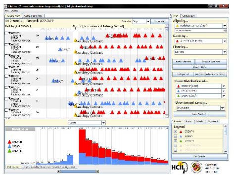
In his description of LifeLines, an interactive visualization tool that lets healthcare workers explore patterns and trends across multiple health records, Ben Shneiderman, founder of the Human Computer Interaction Laboratory at the University of Maryland, has written that all the efforts to solve technical and policy challenges will only succeed if the design of the UIs for accessing health information work well. “Long lists to scroll, clumsy searches, endless menus, and lengthy dialogs will lead to user rejection.”
However, he believes that “rapid access to essential data is possible with careful design, and techniques are being developed to summarize, filter, and present large amounts of information… Often when physicians and other healthcare professionals first encounter information visualization systems they are intrigued. However, it takes them a little time to get used to them and think in a new way, but once they do, they get excited about the possibilities.”
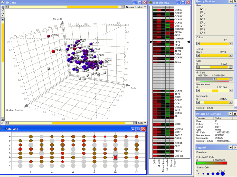
The LifeLines2 Application[1]View Two Histograms and Call Me in the Morning
Medicine is a science of uncertainty and an art of probability.
-Sir William OslerApplied data visualization can improve medication tracking and decision support. But Jon Duke, a Research Scientist at Regenstrief Institute, says, “There are a lot of good patient resources on the Web, but doctors have a very low tolerance for time-wasting and a specific set of needs.”
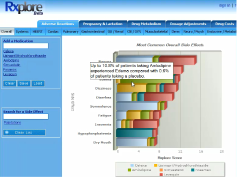
He’s been developing a visualization tool called Rxplore to help reduce the risk of drug side effects or cross-reactions in patients taking multiple medications. In hectic hospital settings, seconds count. Review of a single medication’s potential effects demands time that is often in short supply. Harried healthcare workers can be hard-pressed to review the side effects, cross-interactions, and contraindications for patients who might take 10, 15 or even more medications. Duke says, “I take care of a lot of older patients and it is difficult for them to keep track of all their medications. It can get complicated.” This problem isn’t exclusive to elderly patients; premature infants and children with chronic illnesses can have healthcare regimens that involve taking a large number of medications.
Duke points out that current drug information resources have several limitations. The drugs can only be reviewed one at a time and the data is presented in dense text and tables that can be difficult to review. There are some efforts to simplify the data for easier scanning, but this simplification process can leave out vital information. “For the doctors who make this effort, there is typically not a single obvious way to synthesize that information and make a decision.”
Where in the World Does It Hurt?
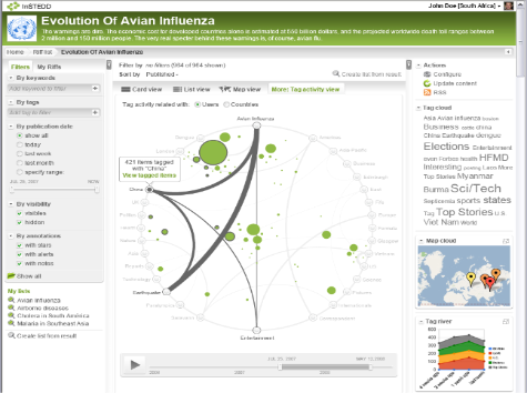
“Diseases don’t respect political borders,” says Nicolas di Tada of InSTEDD, a non-governmental organization that has been an innovative contributor in the area of global health concerns such as flu pandemics and bioterrorism. InSTEDD provides technology tools and platforms for public health, crisis response and environmental concerns. Among other efforts, di Tada says they are currently working with local public healthcare workers in Southeast Asia to develop visualization approaches for early detection of disease.
InSTEDD is using data visualization to help determine if the number of reported diseases reflects reality. Di Tada notes, “We are trying to come up with ways to highlight different cities near each other but are reporting very different disease outbreak numbers.” For instance: “Why is the occurrence of malaria very much higher in one area than another nearby location?”
In the tradition of John Snow, di Tada says visualizing disease cases on a map can offer clues about the source of the outbreak, provided there actually is a geographic linkage. However, it can be a far greater challenge to trace the sources or outbreaks. The key, he says, is to be able to see if the problem lies in a city’s reporting practices, or if the cause actually stems from a specific water or food supply issue.
In his work, Di Tada believes flexible thinking is essential. “We try to keep an open mind and try not to see everything as a nail just because we happen to have a hammer.” He adds, “We have a set of tools that we adapt and evolve, we use third-party tools when they fit, and when there’s a need for something new, we build it from scratch.”
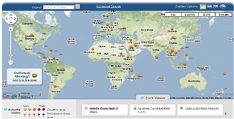
John Brownstein, with the Harvard-MIT Division of Health Sciences and Technology and the HealthMap project, which provides a global view of infectious disease outbreaks, says there is increased training and interest in academia about blending and visualizing geospatial information system (GIS) data with public heath data. “One of the real issues in health mapping is that we are trying to map things at different scales.” He adds,”How do we focus people’s attention on the most significant aspects of the data and balance the technical capabilities with the user types? There are many trade-offs.”
The 999-Year-Old Patient
Be careful about reading health books. You may die of a misprint.
-Mark TwainAccording to Ben Shneiderman, “Organizations haven’t realized until recently, the majority of their data sets have something wrong with them. Using visualization allows us to sometimes see potentially dangerous errors and omissions.”
He was asked to review some hospital data, and when he put it up on Spotfire (a data visualization application) he noticed that three patients were listed as 999 years old. Undetected, this kind of error could have skewed any information from those data.
When properly visualized, problems with a data set “just pop out at you,” Shneiderman says. “Data visualization is worthwhile if for the data cleaning capabilities alone.”
There are many challenges in migrating large and complex medical data sets to visualization tools. Jon Duke notes, “It’s not always nice and neat to represent an entire medication regimen in a single image. How do you take ‘occasionally’ or “some” and translate that into quantitative data? You really have to be sure to match your visual answer to the right question.”
A Metric a Day…
What is the meaning of it all, Mr. Holmes?
Ah, I have no data. I cannot tell.
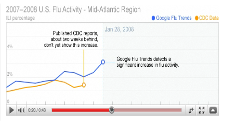
-Sherlock Holmes in The Adventure of the Copper BeechesAccording to Roni Zeiger, Chief Health Strategist at Google, “It’s important to be inspired and guided by the stories shown in the data.” For example, he says, a simple graphic representation of a Google Flu Trends case-study captures a “fantastically interesting narrative.” By using flu-related search request data, Google was able to track the disease’s spread as effectively as more traditional disease surveillance methods employed by the Centers for Disease Control and Prevention (CDC), but Google did it faster. “Because it was easier for us to collect search data than the CDC to collect clinical data, there was a one to two week advantage in terms of time.” From the simple to the complex, perhaps visualizations can help evaluate, explain, and show the effectiveness of using various abstract models for data mining.
Zeiger says, “It’s exciting that more public health data is being made available for various kinds of data visualizations.” This trend could set in motion “virtuous cycles.” For example, if agencies such as the U.S. Department of Health and Human Services (HHS) publish more of the research and allow the data visualization community to work with it and bring it to life and show real value, Zeiger believes “it will encourage HHS and others to make even more data available.”
As a case in point, the Institute of Medicine and HHS published data about communities, hospitals, and nursing homes and made it available for download. As a demonstration project, Google combined some of this information using Fusion Tables (a database service to visualize and share structured data). The end result was a mashup that shows the locations of “heart-friendly” and “people-friendly” hospitals that could help health care consumers make better decisions.
To be continued…
The world is full of obvious things, which nobody by any chance ever observes.
-Sherlock Holmes in The Hound of the Baskervilles“Data visualization tools may require a way to assess them from a usability perspective”, says Ben Shneiderman. “The tools can change the way people think about problems. You have to reformulate your strategies in making discoveries.”
The next part of this series on data visualization will expand on data visualization for health and medical information, including a look at visualizing personal health diaries so that people can better track and monitor their own health and share that with their doctors.
[1] Lifelines2 was developed as the dissertation research of David Wang, mentored by Catherine Plaisant and Ben Shneiderman, University of Maryland, Human-Computer Interaction Lab, www.cs.umd.edu/hcil/lifelines2.
Hunter Whitney
Hunter Whitney is a consultant, author, and instructor who brings a distinct UX design perspective to data visualization. He has advised corporations, start-ups, government agencies, and NGOs to achieve their goals through a thoughtful, strategic design approach to digital products and services.
Hunter is the author of "Data Insights: New Ways to Visualize and Make Sense of Data”. He was also asked to contribute a chapter in the book, “Designing for Emerging Technologies: UX for Genomics, Robotics, and the Internet of Things”. Additionally, Hunter has written numerous articles covering a range of subjects for various online and print publications including UX Magazine.


