There was a Google Analytics video making the rounds back in the fall that resonated strongly with many UXers. In the video, a customer in a supermarket attempts to check out and is greeted with all of the standard components that constitute the online checkout process. He’s asked for his user name, asked to read a CAPTCHA code, and watches as the cashier “times out” and then proceeds to ask him the same list of questions all over again. This video struck a chord with many in the UX community because it makes explicit something than many UXers have known implicitly for a long time: when users interact with a computer, they are engaging in a conversation. When the computer behaves in a way that no human would, it confuses the whole process. The end result: a bad user experience.
Human–computer interaction as a two-way conversation is not a new idea. George Lakoff famously wrote that we are able to understand complex concepts through metaphor; in this case, the metaphor is “interacting with a computer is having a conversation with a person.” Voice recognition software like Siri or customer service IVR systems attempts to bring this metaphor to life by allowing you to actually speak to a computer and have it talk back (even if sometimes we find ourselves screaming “I want to talk to a human!” into the phone). And Luke Wroblewski has written in detail about how forms that phrase questions in natural language tend to work better than forms that speak in computer-ese. This is partly because these types of forms are immediately understandable as a two-way conversation.
There is no doubt that users instinctively act as though computers and other electronic devices are in fact people. How many times have you yelled at your DVR, rolled your eyes at a website, or said something like “I love my phone”? One study demonstrated this beautifully by asking people to perform a task on a computer and then evaluate the computer’s performance. Participants who completed the evaluation on the same computer they were assessing gave higher marks than those who used a different computer or pencil and paper to record their evaluation, as though they didn’t want to offend the computer.
Thinking about UX design as a two-way conversation can be the key to creating smart sites and apps that meet users expectations, because when you begin to think about all design as a conversation, you are able to apply the rules of basic conversation to your design process. The philosopher Paul Grice has proposed that human interactions follow the cooperative principle: “Make your contribution such as it is required, at the stage at which it normally occurs, by the accepted purpose or direction of the talk exchange in which you are engaged.” The cooperative principle enumerates four key conversational maxims, which work equally well when applied to UX design:
Maxim of Quality: Be Truthful
- Do not say what you believe to be false.
- Do not say that for which you lack adequate evidence.
Maxim of Quantity: Quantity of Information
- Make your contribution as informative as is required (for the current purposes of the exchange).
- Do not make your contribution more informative than is required.
Maxim of Relevance: Be Relevant
Maxim of Manner: Be Clear
- Avoid obscurity of expression.
- Avoid ambiguity.
- Be brief
- Be orderly.
The overarching principle that governs these maxims is that both parties involved in the conversation agree implicitly to adhere to the maxims. But when we interact with a digital entity these maxims get consistently violated, and the result is that we’re forced to interact in a way that is unnatural and confusing. It is worth noting that in human-to-human conversation, these maxims are frequently violated on purpose in order to convey subtext or irony, or to make a joke. But when we interact with a computer, we are not expecting it to make jokes, be ironic, or communicate in a way that necessitates reading between the lines, so those types of purposeful violations aren’t really relevant here.
Maxim of Quality
I recently worked on a banking site for which there was a very long enrollment form. We naturally wanted to make the form as short and easy to use as possible, but it also needed to gather a large amount of data. So someone proposed a solutions that I’ve seen many times in this type of scenario: pretend there are only X number of steps when in reality there are Y. One banking site that does this is Ally Bank’s.
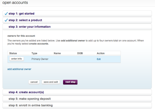
When you start to open a bank account you are presented with what appears to be a six-step process. However when you click “next step” in the step-3 pane, a lengthy modal window opens—a sneaky seventh step. Now let’s put this in terms of conversation:
User: I’d like to open a bank account.
Computer: Okay. I just need you to fill out these six forms.
User: All right. Here’s forms one, two and three. Can I have form four please?
Computer: Not yet. First you need to fill out this other form that I didn’t mention earlier.
At this point, the customer might begin to wonder what else the computer hasn’t mentioned. What’s behind steps four, five, and six? While this may seem like a plausible resolution to a design problem during the design stage (we want to keep the number of steps to a minimum so users won’t be scared off, thus we will simply handle extra information via modal windows) when placed into a conversational format it becomes an obvious deception that violates standard conversational norms.
Maxim of Quantity and Maxim of Relevance
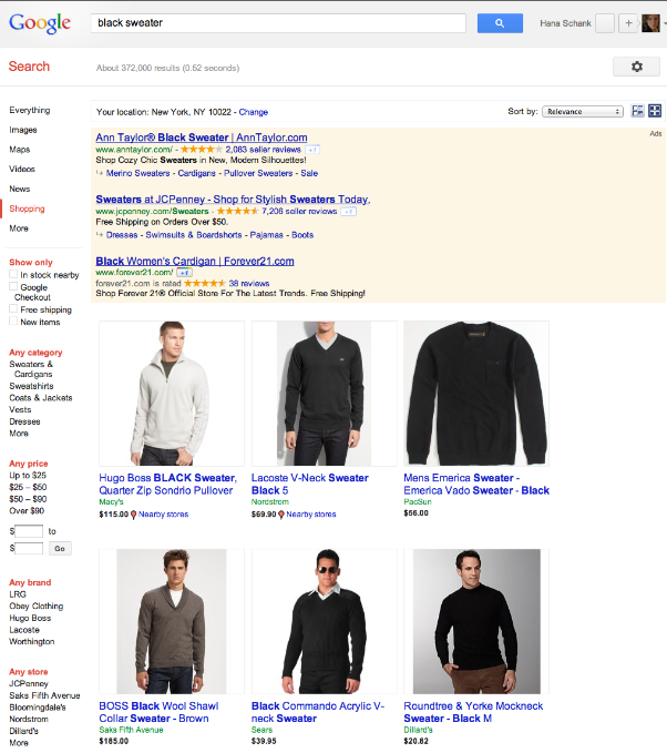
Violations of these maxims occur most frequently with sites that use search, where the system can provide too much information and not enough information all at the same time, along with providing completely extraneous pieces of information. Google Shopping provides an excellent example of both violations simultaneously. Let’s say, for example, that I am looking for a black sweater. I might go to a large department store in search of one. On the off chance that I’m able to find a sales clerk to help me, the conversation might go like this:
Me: I’m looking for a black sweater.
Sales Clerk: What type of black sweater?
Me: Something dressy that I can wear to work, but not too expensive.
Sales Clerk: Do you have any brands you usually wear?
Me: I like Theory and Three Dots.
Sales Clerk: I’ll pull some sweaters for you.
By contrast, here are the Google shopping results for “black sweater.”
And here’s what that conversation looks like:
User: I am looking for a black sweater.
Computer: Here’s the first sweater I’ve found for you. It’s a white men’s sweater.
User: I am looking for a black sweater.
Computer: Here are 87 pages of black sweaters. Which one would you like?
User: Uhhh…
At this point, I want to say that I am a woman and am looking for a woman’s sweater (a fact that Google likely already knows but hasn’t applied to the search results) but there is no place to do that. There is also no place for me to specify brands I like or in what settings I want to wear the sweater. One of my few options is selecting “free shipping,” but that isn’t relevant to me yet when I haven’t seen anything that remotely qualifies as something I might want to purchase.
Maxim of Manner
I recently attempted to book a flight for my oldest child to visit his grandmother. The error message I got on Expedia does an excellent job of illustrating what happens when you violate this maxim:
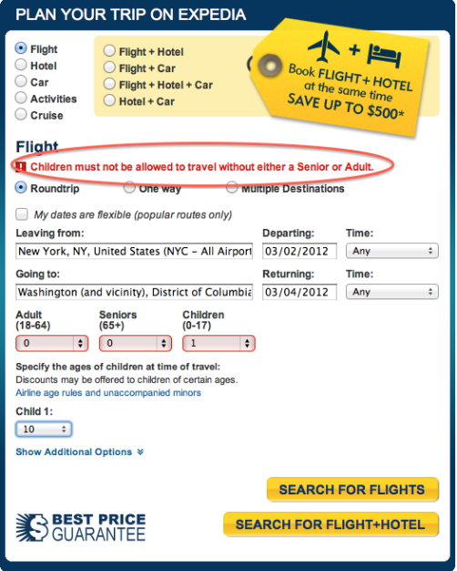
While the error message is brief, it is also wildly ambiguous. Because Expedia won’t let me proceed any further unless I also book a ticket for an adult to accompany the child on this flight, I’m able to draw the conclusion that Expedia does not allow users to purchase unaccompanied minor tickets on the site. The error message makes even less sense when put into the context of a conversation:
User:I’d like to book a flight for an unaccompanied minor from New York to DC.
Expedia: Children must not be allowed to travel without either a senior or an adult.
User: What if my child is ten years old?
Expedia: You must also purchase a ticket for an adult or a senior.
User: But the airlines sell unaccompanied minor tickets for an additional fee. Can I purchase that kind of ticket?
Expedia: We don’t think children should travel by themselves.
Is this a philosophical point of view? A corporate philosophy? Why not just say, “Unaccompanied minor tickets must be purchased directly from the airlines?”
Conclusion
As demonstrated above, applying Grice’s maxims to UX design by either writing out the actual conversation users and computers engage in, or at least taking note of the conversation, can help guide design decisions.
In addition to being aware of the maxims, it is also important to note that there is a difference between machine-initiated conversations and human-initiated conversations. On a site like Ally Bank’s, for example, the machine is initiating the conversation. The user is interested in opening a bank account, but most likely has only a vague idea what the required steps might be. Other machine-driven conversations include social networking sites such as Pinterest, where users essentially show up and see what the computer is saying today. In this case, the Pinterest conversation could look something like the following:
Computer: Here’s a bunch of interesting things people have found on the Web.
User: This picture of a living room looks interesting. I’d like to know more about it.
Computer: Let me take you to the site it came from. If you really like it you can also tell your friends about it or comment on it.
In this case the computer is driving the conversation and, therefore, it is up to the computer to offer possible options that a user might rely on to continue the conversation.
On the other hand, a user-driven conversation occurs commonly on sites where users have clearly defined needs and goals, such as an e-commerce site or a web application. FreshBooks, for example, relies primarily on the user to start the conversation. Users may say things like, “I need to create an invoice,” “How many hours have been billed against Acme Inc?” or “How much money do I have coming in this month?” This may not sound radically different from looking at a site with a standard needs-and-goals approach, but again clearly articulating the conversation can illuminate how the computer should respond to things the user “says.”
In the case of FreshBooks, the statement “I need to create an invoice” isn’t really given a clear response. Here’s the site’s main navigation:

A user looking to create an invoice might think to look under the Invoices section, as that makes sense from a conversational point of view:
User:I’d like to create an invoice.
Computer: Here’s everything you can do related to invoices.
Although there is a hard-to-find button for creating invoices in the Invoices section, it unfortunately turns out that the more direct route is in the Time Tracking section. This makes sense from the point of view of the system’s structure in that you can only invoice for a project for which you have tracked time, but is confusing within the context of a conversation. Because this is a user-driven conversation, it is up to the site to respond to what the user “says” in a reasonable way that corresponds with Grice’s maxims. Instead, the conversation looks something like this:
User: I’d like to create an invoice.
Computer: Would you like to look at a list of clients and staff, view existing invoices you’ve created …[long list of other unrelated questions]?
If you were talking to a person who did this you would assume they either weren’t listening or were slightly unhinged. When a computer does it you’re likely to assume that using the site isn’t going to be a pleasant experience, or worse, you may leave.
Avoid a bad conversation by using Grice’s maxims as a simple checklist as you design a site’s user experience. Determine whether your site‘s conversation is user driven or computer driven, and observe how the conversation flows. Your designs will be better for it.