This is settled law, right?
When designing a shopping experience for anything remotely complex, present the user with general information first, then help them dive into the details.
Well, something has been niggling at me over the last few months as Bolt | Peters has observed people shopping for furniture, laptops, enterprise software, audio equipment, clothes, cars, business course content, restaurant reservations… and probably a few other categories we’ve forgotten. Tons of users tell us they want to find general product information first when shopping, but when pressed on what that key general information is, none of it is actually general—not for one user among the hundreds we’ve spoken to. Instead, early-stage shoppers—those still assembling the 3-10 options of a consideration set—need specifics first, and specifics are often very hard to come by.
General information is that top paragraph people skip over and scroll by when looking for the specific details, which are usually placed at the bottom of the page. It’s often called an “overview,” and it’s usually found at the top of a product page, occupying prime screen real estate next to the main “hero” photo. Some of the words our research participants have used to describe it are “fluff,” “marketing,” and “bullshit.” Our clients usually call it “copy” or “description.” Another common location for it is on the default tab of a set of options below a summary graphic.
Take a look at these product pages for surfboards:
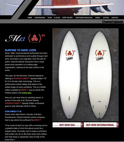
This page starts with information about the company, then a paragraph of text that includes dimensions, descriptions like “performance hybrid design,” and brand names like “Double Helix technology.”
There’s no link to further specs at all. This is certain to be a frustrating page for any user who hasn’t researched the board thoroughly elsewhere.
Imagine instead if the page provided a single sentence of description, something along the lines of “Limited edition performance board, purchases benefit AIDS elimination in Africa,” followed by a clean, bulleted presentation of the dimensions, weight, materials, colors, appropriate wave conditions, the designer’s name, and how much of each sale goes to the charity. Then, under a separate heading (or even behind a link), the history of the company and some of the story of this special board could appear. This structure would support the user’s natural information-gathering flow.
Many product pages have similar problems and would be improved by equally simple changes.
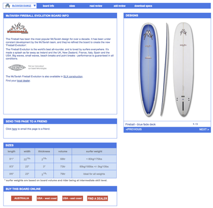
This one, too, dedicates a lot of space to telling the history of the design, and provides anchor links (in the blue nav bar at the top) to the dimensions and to download a PDF with detailed specs. It’s definitely better to have those available, but the extra scrolling and linking make it hard for a shopper.
Interestingly, there is a better page on this site, in the online store:
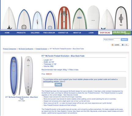
This page presents specs at the top and description at the bottom in a reversal of the usual order. Details are scarce, though.
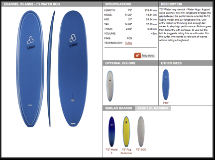
This similar one, while not necessarily an example of elegant visual design, provides a short, descriptive paragraph next to a few key specs. This is an excellent start, but it’s not clear where to find further details.
These issues exist across all product categories. For example, this page is for the latest version of Photoshop:
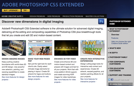
It takes two clicks into the very quiet right-rail navigation to get to system specs and detailed information.
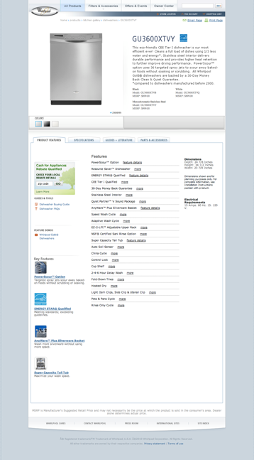
Or this one, for a dishwasher. Notice how scrolling past the paragraph of descriptive copy rewards the user with a long list of feature names, but it’s still one more click (for each feature!) to find out what it actually does. If a potential customer is trying to decide whether to include this model in the set of options they’ll share with their spouse, it’s a tedious process to get to that initial decision.
Consideration Sets Explained
Consideration set is a term for situations in which a shopper isn’t sure exactly what he wants to buy—which hiking boots, which sci-fi novel, which cubicle system, which digital camera, which mid-size SUV. Undecided shoppers typically put together a shortlist of options that satisfy their most critical requirements before getting into detailed comparisons. It usually isn’t worth the effort to do serious research on hundreds or even tens of products, so shoppers need to come up with a reasonable number of ideas to look into more deeply. The number of items in a consideration set varies depending on the product and shopper, but most of the time it’s 3-10 possibilities.
This concept isn’t terribly controversial as far as I know, but developing a consideration set isn’t discussed much in shopping or search studies. And it should be, because the kind of information shoppers need to make decisions about whether something belongs in their consideration sets is not the type of information that’s presented on most online product information pages. General information won’t do the trick although, again, users will tell researchers that “general” is what they need. This is a classic user lie, because users aren’t consciously aware of this need in the abstract.
Here’s the tricky bit: if a researcher conducts a qualitative session with someone who’s not actually shopping at that moment (someone who doesn’t have a native task), they’re very likely to get positive feedback about the general information. “Oh this is great—an overview!” This is the user lie, and is really where Time-Aware Research earns it stripes. Bolt | Peters has seen plenty of instances in which time-related considerations have a big impact on user feedback. Someone evaluating tax preparation software will have less patience for reading general information two days before his taxes are due, and an IT manager trying to spend out the department budget before the fiscal year ends will want to skip straight to the details. Sometimes the last thing a person needs is a general overview.
Don’t Listen to the Lies. Give ‘Em Specifics.
What are users really looking for in early phases of the shopping process?
A couple of critical, deal-breaking details.
Every user is different, but many of these critical details are extremely specific, and users often don’t find this information on product landing pages—they have to dig into specs.
- Does this car have a third row and does it come in a stick shift?
- Is this piece of software going to be compatible with two others and is it in my approximate budget range?
- Can I use generic memory cards for this camera?
- Can I get this chair in a special height and does it offer a fabric upholstery option?
- Does this dress have the right “vibe” I’m looking for?
Okay, that last one’s a bit of a red herring. In cases like fashion, the need for immediate detail is very well served by images. But in products that can’t be as easily represented by a photograph, the challenge is much harder.
Take, for example, two shoppers who are looking at the same camera model with very different needs in mind. Natasha wants a digital camera with a huge storage capacity and a sturdy exterior because she’s going on a long backcountry trip; Marco wants a camera capable of extra-high resolution and lens switching because he’s shooting for print. Unless they are new to photography, they have a pretty good idea of what they’re looking for and they know the major brands by reputation, at least a little.
So while both may be interested in the same model, when it comes down to it, the last thing Natasha and Marco want when they hit the product page is a brochure about the manufacturer or marketing language about what makes it a good camera. One user wants to know about the body specs, and the other wants to know about the resolution. And until they find that information, everything else is “fluff,” “BS,” or “in the way.”
Those words may sound harsh, but they came directly from the mouths of a few of the hundreds of users we’ve watched scroll irritatedly past carefully designed overviews and photo layouts. Most of the time, users have to scroll way down to the bottom of the page to find the details they care about. In some cases, they have to click into a second page. In the worst case, they have to download a PDF. Actually, in the very worst case (most commonly seen in enterprise software) they can’t get this detail without contacting a rep and formally entering the sales cycle. They often still find what they’re looking for and if they’re highly motivated they’ll put up with the hassle, but they don’t understand why it has to be so hard.
I’ll underline that point: if users are highly motivated they’ll put up with the hassle, but users are typically not highly invested in a particular product or brand before the consideration set has been assembled. Natasha and Marco are much more hassle-sensitive right now than in later decision stages. They’re correspondingly more likely to abandon research on a product (and thus leave it out of their set and their eventual purchase decision) if it requires extra effort to find key specifics. Designers of product pages could greatly enhance the user experience and conversion rates by incorporating as many details as possible into the main body of project pages, and providing easy access to more.
But Don’t Completely Ditch the General!
Somewhat counterintuitively, Bolt | Peters research has found that users are more receptive to brand and marketing information for items that are already part of the consideration set. Once they’ve done their check and verified that the desk chair comes in red and has a seat-tilt adjustment, it’s useful to know about the company’s philosophy, especially if they’re now going to need to convince someone else about the purchase. In fact, those elements may be critical to the final decision, but they don’t help companies that don’t make it into the consideration set in the first place.
So what to do? Don’t take strong images off product pages, but do flip the traditional model on its head a bit. Give more focus at the top of the page to specs, and less to descriptive copy. Above all, make easy access to the nitty-gritty details a top priority, and don’t assume that any detail is too specialized to need that easy access. If it’s part of the product, it’s probably important to some shoppers. At the end of the day, if users leave a site having quickly found the details they’re looking for—even if the result is that they now know the company doesn’t have what they’re looking for—the company gains credibility. And if the company does have what they’re looking for, they’ll know it and will add that company’s product to their consideration sets, which is, after all, the only way to get them eventually to convert.
If you get a chance to put these ideas into practice, report back on how it works out for you!
For more:
- What people see before they buy: Design guidelines for e-commerce product pages with eyetracking data – cxpartners
- Most of the literature on consideration sets is academic but here’s a quick review of a subset.
- This is from an SEO perspective, but has some great points on creating strong product pages.