Amidst Apple’s recent flurry of announcements, one in particular will affect nearly all users: iOS 5, released yesterday. To date, it marks the system’s most significant revamping since the original iOS, bringing changes that will be felt within even the most basic functions.
For designers, particularly those concerned with UX, the overhaul is significant in ways everyday users may not realize. The release will bring about redefinition in a range of forms: the addition of new functions, the redesign of existing functions, and the integration of previously independent applications and services. In turn, it will simultaneously open and close doors for designers while eliminating some of Apple’s app competition entirely, requiring that designers take into account their own methods of consolidation.
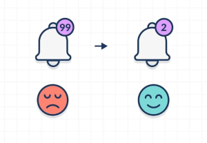
It goes without saying that Apple just made a few enemies. The addition of these features has rendered a number of private apps largely meaningless. More importantly, though, this is the first redesign to significantly make iOS 4-friendly apps function poorly. In short, it has the potential to define, in some ways, a shift between the old and the new—above all else, with the Notification Center.
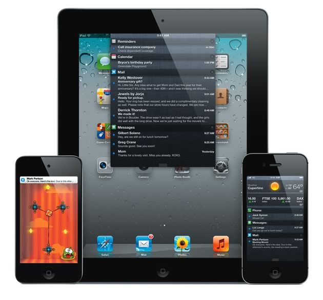
As Apple is wont to do, the Notification Center takes the somewhat arduous task of cycling between multiple apps to view notifications (new text messages, emails, and alerts from apps) and simplifies it; in this case, by taking all notifications and placing them in a list accessible with a swipe from the top of the screen. But Apple, seemingly taking a cue from Android, has gone a step further: messages, which previously appeared in a modal dialog while an app was in use, will now appear in a scrolling banner at the top of the screen.
The benefit is messages can now be read without interrupting the task or app currently in process. While this feature is both overdue and promising, it nevertheless poses a number of problems from the perspective of designers. In earlier versions of iOS, the navigational buttons in most apps were located at the top of the screen. For apps developed before iOS 5, as well as those not updated, this will still be the case. But in iOS 5, receiving a message while one of these apps is in use will disable that area. Although the previous approach to notifications was disruptive to the user, it at least affected all apps consistently. Now, if you reach for the navigation and accidentally hit a message notification, you’ll be removed from the app. This will require designers to come up with other possible placements of navigation controls without sacrificing ease of use.
The notifications themselves will be customizable, furthermore, and they’ll also be accessible from the Lock screen. As a consequence of the landscape expanding, designers will be required to address previously minor details. Even the swipe gesture, perhaps now intrinsic in the mind of a user, is unraveling: in the iOS 5 Lock screen, swiping a notification to the left opens that application, but in iOS 4, that same gesture over an item in a list of messages displays the option to delete that message. Particularly in the context of the legendarily easy to use Apple product set, this change to even a simple function places pressure on designers—they must now maintain simplicity in a more nonstandardized environment. More simply, the redefinition of gestures requires those in charge of UX and UI design to adjust to a completely open landscape, finding common interaction paradigms despite their creative independence.
The Notification Center is already fully functional, but some of the other new iOS 5 features feel like initial steps into new territory. Twitter, for example, is now deeply integrated and can be utilized by Safari, Photos, Camera, YouTube, and Apps simply by signing in to system settings. Presumably, services such as Facebook and Tumblr will eventually follow in Twitter’s footsteps, eliminating the need for some independent clients. Integration of the Twitter API, which includes the OAuth single sign-on (SSO) authentication protocol, will potentially simplify app design and development by eliminating the need to custom-develop a sign-in system. As this is extended to other SSO options such as Facebook Connect, the simplification for app developers and for users will continue to improve.
The changing landscape has allowed for customization in a manner that will require users to adjust to more liberal design standards. Placement of navigation, as well as customizable swipe options, among others, simultaneously eases the job of designers while requiring that they find some common ground amidst a changing platform, responding to the opportunity without sacrificing the clarity Apple users have come to expect.