Save
It seems like every few weeks, we hear about a new field that falls under the umbrella of “design.” Though it is a great time to be a designer, we are not taking full advantage of the learning and techniques that stem from other design fields. With all the exciting new divergences in design and with the pressures of deadlines and deliverables, we can lose sight of the past and forget to combine traditional design methods in innovative ways to keep the field moving forward.
It seems like every few weeks, we hear about a new field that falls under the umbrella of “design.” Though it is a great time to be a designer, we are not taking full advantage of the learning and techniques that stem from other design fields. With all the exciting new divergences in design and with the pressures of deadlines and deliverables, we can lose sight of the past and forget to combine traditional design methods in innovative ways to keep the field moving forward.
My colleague Lindsay Moore and I wondered if there was a way to design better. We wanted to know what would happen if we combined the best aspects of interaction design and product design, as well as a little service design. This would hopefully allow us to create a holistic experience that transcends definition, and thus create better user experiences. To test this idea, we set out to create design concepts for two common household products. This article chronicles our process of combining disciplines and making decisions, and the lessons learned along the way.
How Physical Influences Digital
Through the years, interaction designers have borrowed and implemented a number of principles from our industrial design (ID) counterparts. People figure out how to interact with digital interfaces by using their experience interacting with products in the physical world, so there are a number of ID principles that translate directly to interaction design.
One such principle is affordance. This involves using visual analogies from the physical world to indicate to a user how a system behaves. Things that are meant to be grabbed should have handles, and things that are meant to be turned should be round. In the digital world, we see this manifested in graphical buttons for pushing and slide bars for scrolling.
We also use feedback to provide clues about the status of a system. The knob for a deadbolt lock on a door, or the high-beam indicator in a car are simple examples from the world of ID. The purpose of feedback is to keep the user informed and aware of the system’s status. Interaction designers frequently leverage feedback in digital interfaces. Alert messages in software tell users what went wrong and how to fix it—a big improvement over the very ambiguous “Check Engine” light in cars.
Other feedback examples within a digital interface include the spinning indicator to show something is loading or processing, a status bar indicating the progress of a download, or an icon bouncing in the dock on a Mac to get your attention.
Constraints are often used to prevent accidents from happening. For example, a car engine cannot be started if any gear is engaged, thus preventing the car from moving as soon as it is started. When dealing with digital interactions, options can be removed or obscured to constrain the user without actually having to do much reengineering. Online tax forms are a great example of the constraining power of a digital process compared to its real-world counterpart. The user is taken through steps that guide the process and hide irrelevant information, whereas on the physical forms every field is exposed at all times, often leading to confusion and greater opportunity for error.
How Digital Influences Physical
Industrial design—the design of physical things—currently struggles to take advantage of some of the newer concepts that have come about as a result of exploration of digital interaction. But more complex and loosely defined “systems”—those that integrate physical products, digital interfaces, and complex mechanisms into one product—can really be the best of both worlds, as they leverage the finest ideas of the well-established industrial design realm with exciting new aspects of digital interface design.
Adaptive interfaces are an example of a modern tactic that can be applied to a complex system to increase its utility. For example, some ATMs remember users’ most commonly chosen withdrawal amount and offer that as a quick option ahead of default menu items. This expedites the process, without preventing the more complex operations from being accessed when they are necessary.
Gaming and social media add another dimension of utility and complexity to systems and services, allowing users to share, collaborate and compete. These factors encourage users to not only use a system, but also to use it better and more often.
Finally, while many analog systems were once used to display data one parameter at a time (e.g., the gauge cluster in a car or the banks of dials in a ship’s engine room), modern digital interfaces allow data to be combined, compared, analyzed and thus turned into more digestible, meaningful information in the form of visual representations and trends. This allows users to better engage with products and grasp complexity more easily.
When Digital and Physical Converge, and What We Learned
With a goal of discovering how we could “design better,” my colleague and I decided to experiment with two real-world products to see if we could redesign them incorporating both longstanding tenets and emerging techniques and combining our unique backgrounds and perspectives.
With the ability to incorporate modern techniques and practices to add value, we examined how we could make a dishwasher and a home thermostat more useful, usable, and desirable. These products tend to work just fine for most users, but fall short when it comes to providing a genuinely pleasant, compelling user experience. While some of the things we learned in this experiment could easily be applied to any product or digital interface, these were simulations only and did not result in any new products.
Eco-Friendly Dishwasher
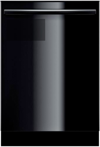
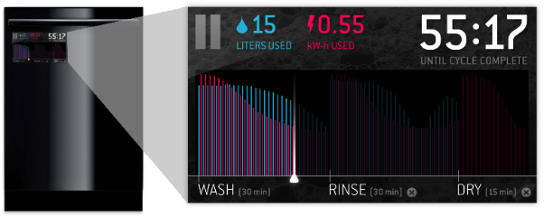
First we took a look at what could be done to improve the experience of using a dishwasher. To begin, we added a touchscreen behind a single glass panel that covered the whole front surface of the appliance, making it easy to clean, and giving it a “clean” aesthetic. This includes status displays for a clock, a time remaining indicator, and an efficiency display. The touchscreen not only looks sharp, but it also disappears when not needed and displays only relevant information when the user wants to see it.
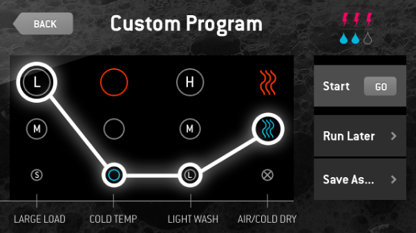
Adaptive interfaces are not as common in physical products as in digital interfaces, but knowing the potential advantages, we set out to learn how we could leverage it here. We decided that our dishwasher would recognize how the owner tends to use the appliance, then expedite and simplify the process by offering the most commonly used settings in an easy-to-access list. Of course, the regular functions (temperature, cycle intensity, and drying mode) are available for the user to quickly select with just the swipe of a finger.
Reexamining a product that, on the surface, seems to work just fine resulted in some interesting takeaways in terms of design principles.
First, information is interesting and valuable. Whether it’s on a website or an appliance, people are interested in learning, but more importantly, they are often interested in the results of learning. Building an adaptive interface into certain physical products can help people be more efficient and better informed. Especially in physical products, an adaptive interface allows repeat tasks to be performed quickly without sacrificing the ability to customize interactions.
Additionally, when designing products, aligning the conceptual model with the mental model can provide users the opportunity for deeper understanding of how the product works and how it can benefit them.
Finally, the principle of providing feedback played an important role in our dishwasher redesign. While home appliances have made huge gains in efficiency, what actually happens during a wash cycle and the effects that different settings have on overall energy use are often mysterious. By seeing how much additional water or electricity a given cycle would use, the user can make a more informed decision.
Simplifying the Home Thermostat
The second product we examined was the home thermostat system. Like the dishwasher, a thermostat gets the job done, but in many cases inelegantly or insufficiently.
We focused on three aspects of the product and the experience: energy consumption, making the entire programming experience easy to understand for the “perpetual beginner” (setting up a schedule for a thermostat happens so rarely that it usually feels new to the user), and allowing for simplicity in common functions like temperature adjustment.
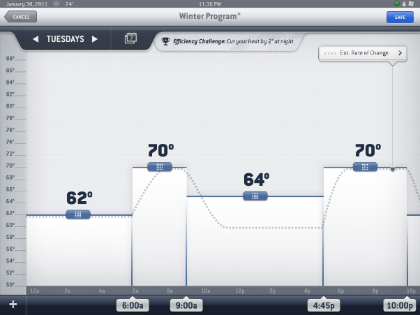
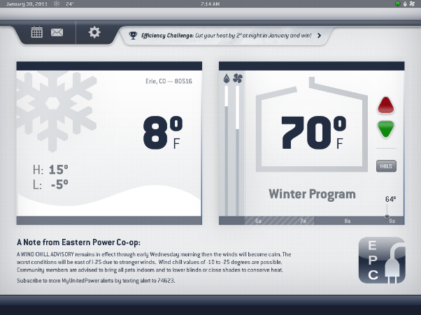
First, we implemented a large, high-resolution touchscreen that turns data into information and eliminates the ugly, confusing array of buttons found on typical thermostats. This approach allows users to see trends in their energy consumption, compare their schedule to the forecasted weather, and receive updates and incentives from an energy co-op or power company.
Making information available, relevant and actionable confers a huge advantage to a rich experience, whether for a digital interface or physical product. In the case of our thermostat, simple tasks such as changing the temperature were brought front and center, minimizing the amount of learning and thinking a user would need to do, while more complex tasks (setting up schedules, for instance) were broken down step-by-step. Additionally, user settings were presented in the form of real-time graphs. These illustrated not only the intended temperature change, but also the time it would take to achieve that the temperature, with the intent spurring the user to be more conscious about energy use.
We also leveraged the power of social media and gaming to encourage users to compete with themselves and their neighbors to further reduce their impact on the environment. By turning an otherwise humdrum task into something that can be won or lost, it gains importance and relevance to the user and can be made more enjoyable. Positive reinforcement through rewards, incentives, and shared benefits leads to positive changes in behavior, and while it may not always be obvious, this idea can be incorporated into a physical product through a well-designed interface.
Conclusion
Design has always been about reconciling and leveraging old paradigms and patterns to make things easier for people to grasp. As new technologies and devices have become vastly more complex, the need has arisen for designers to focus on specific facets of each, forcing us to lose sight of the big picture. Interestingly, this comes at a time when we finally have the computing power and technology to be able to recombine things in interesting ways. By thinking outside the proverbial boxes of product design, interaction design, or graphic design, we have cracked the surface of such interesting and innovative fields as experience design and service design.
We are now capable—through new ways of thinking, new tools and new combinations of the same—of designing experiences that defy definition. Products, websites, and services can’t be narrowly defined as such. They should all be human-centered, experience-driven solutions to complex, multi-faceted problems.
Austin Brown is a Product Manager of Android products at MapQuest. Previously, he was employed as a User Experience Designer for mobile products at MapQuest - specifically the redesign of MapQuest's core navigation apps on iOS and Android, and follow on features and enhancements post-launch.
Prior to his tenure at MapQuest, he was a User Experience Designer at EffectiveUI where he was responsible for designing digital interactions and experiences for clients such as Microsoft, Boeing, and Navy Federal Credit Union. Before joining EffectiveUI, Austin lived and worked in Hong Kong as an industrial design intern for VTech Communications, where he helped design consumer electronic devices for the European market.
Austin received his Bachelor of Fine Arts in Industrial Design from the Savannah College of Art and Design and he is a speaker for industry events such as the Interaction Design Association (IxDA) Interaction conference.
When he isn’t designing useful, usable and desirable interactions for clients, he can be found rock climbing and snowboarding in Colorado’s mountains.


