Save
I look back on going into second-hand stores and finding little treasures and that actually meant more to me ‘cause it was more of a stab in the dark, you didn’t know if you could afford it or even know what you were really looking for. – Kurt Cobain
As smartphones continue to cement their position as the digital hub of the consumer universe, and people engage with digital experiences across an increasingly diverse range of devices, the term “user experience” encompasses an ever-growing array of interfaces and contexts. We read recipes on iPads in the kitchen, dance with a virtual Michael Jackson in front of the TV, swipe an Oyster card in the London Underground, co-create a business document using Google Docs, and comment on friends’ pictures on Facebook. We are constantly assimilating new ways of interacting across the digital landscape through an evolving language of pinches swipes, and “likes.”
Designing within this context requires a willingness to explore and employ a wide set of design tools and methodologies that reflect the multi-dimensional context of contemporary digital service design. At the heart of it, there remains a co-dependent relationship between rational functionality and emotional experience. This remains true even though we are now no longer designing digital experiences restricted to the confines of a computer screen. In this article, I propose some key tenets for designing beyond the screen, supported by projects I have produced.
Art and Science
Design is built on relationships—between people mostly, but also between skillsets and knowledge areas. As Eric Schmidt, Google’s CEO, articulated during a speech in Edinburgh two years ago:
You need to bring art and science back together. Think back to the glory days of the Victorian era. It was a time when the same people wrote poetry and built bridges. Lewis Carroll didn’t just write one of the classic fairytales of all time, he was also a mathematics tutor at Oxford. James Clerk Maxwell was described by Einstein as among the best physicists since Newton—but was also a published poet… We need to reignite children’s passion for science, engineering and maths… Your IT curriculum focuses on how to use software, but gives no insight into how it’s made.
Although Eric Schmidt was referring to the state of education in the UK, his words resonated with me in the context of digital experience design. To create humane digital services that engage their users and “touch” people, you need to combine creative vision with technical prowess, backed up by business rationale. This requires a group of people working together that bring a diverse but complementary range of skills to the table: storytelling, business analysis, technical strategy, design (interaction and visual), user research, and psychology, among others.
Collaboration
Before working at Fjord, I lived and worked in Milan for ten years, creating interactive installations with thebigspace. We explored and developed digital experiences that attempted to blend seamlessly within real-world physical environments, re-interpreting architectural space. We worked closely with architects, upholsterers, product designers, filmmakers, software developers, musicians, 3D artists, and AV engineers to create hybrid experiences that combined traditional craftsmanship with digital technology.
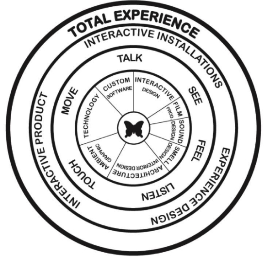
In parallel to internal team-member collaborations, projects relied on a collaborative working model with each client. To explore new ideas and experiment with new paradigms on commercial projects, clients need to buy into the vision. The importance of whoever is responsible for building and managing client relationships cannot be overstated. The success of a commercial project in terms of design innovation relies on the symbiotic relationship between project team, client manager, and client.
A Seamless End-to-End Experience
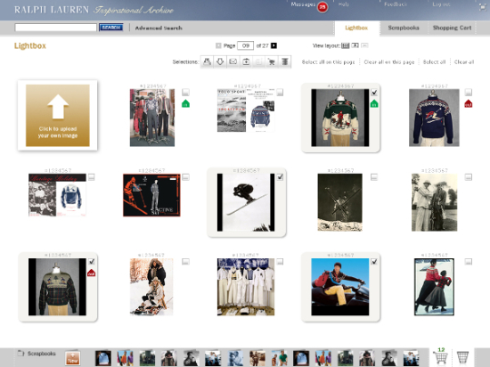
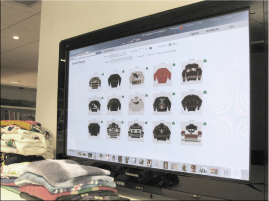
Working with Polo Ralph Lauren, we used radio-frequency identification (RFID) technology to provide their designers with ways to tag and manage garments in the real world whilst being able to browse and create virtual collections of the garments through a specially designed digital asset management system in their computer browser.
We were keen that the browser experience reflect the creative process that designers were used to following in the real world when researching new design ideas: being able to create moodboards of different imagery, share work with other designers, and reserve garments to borrow from the physical archive space.
Once in the physical archive, designers interact with the virtual library simply by placing garments of interest on a smart surface, triggering a retrieval of item details and related content. Each garment is tagged with an RFID chip enabling it to be individually detected when placed near an RFID antenna. We designed custom furniture fittings for the physical library containing the RFID hardware technology.
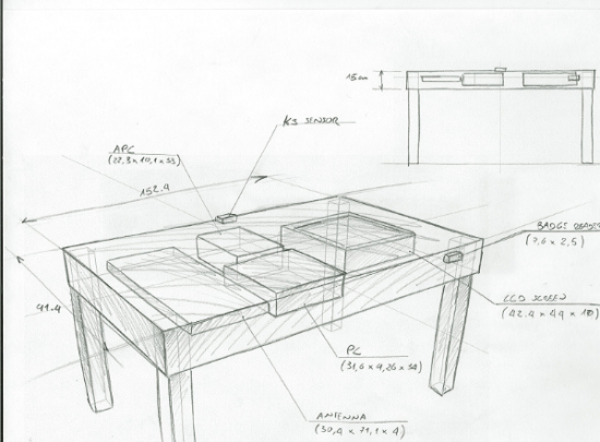
The objective was to provide Polo Ralph Lauren’s designers with a seamless end-to-end experience, from the point when they browse their computer screens for inspiration, through to physically searching and borrowing garments in the Polo physical archive library. Taking the best from both worlds, virtual and physical.
Slow Design
While living in Italy, I discovered the Slow Food movement, which champions the use of seasonal, local foods cooked in traditional ways, not zapped in a microwave. This can be used as a metaphor for how we approach digital experience design: we deliver solutions based on collective knowledge and experience gathered over time, as opposed to the “fast food” of homogenous, mass-produced design solutions. It is important to allow time to prepare new recipes rather than just rehashing the same old fare, time and again.
Recipe For a Brand
To design a brand experience means breaking down the task into three key areas:
- The physical experience – using all or a combination of the five senses to deconstruct the brand.
- The intellectual message – which memories, images, and mental associations does the brand evoke?
- The emotional content – relating the brand through a language of emotions and senses that bring the experience to life, empowering people to feel and act. Inviting public interaction through empathy.
Sensing Space, Changing Space
Twenty five years ago, Toyo Ito created his Wind Tower in Yokohama, transforming a non-descript, reinforced concrete tower into a landmark interactive light sculpture. Two computers controlled the lighting system, modifying the intensity and direction of various light sources based on natural light, weather conditions, wind speed, and external noise.
2061 years earlier, Andronicus of Cyrrhus created his Tower of Winds in Athens, an octagonal clock tower on the Roman agora featuring a combination of sundials, a water clock, and a wind vane.
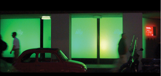
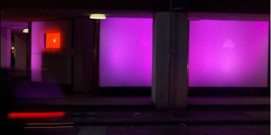
These two structures both depended on the measurement of ambient information to display time-based data that served to enhance the local experience and provide a sense of time and place. They also share the quality of providing a shared, beautiful experience in real-time. Inspired by the work of Toyo Ito, we worked with Illy Coffee to launch the design of their new aluminium coffee tin in Milan by creating a dialogue between the brand, the city and its inhabitants.
Passers-by were encouraged to answer questions displayed on a shop window, by touching a word. Each time they answered a question, the shop windows changed color.
If we are to continue pushing the boundaries between digital experience design and our physical environment, we need to play more within the threshold space between physical and virtual experience where digital and physical experiences intersect.
Space and Place
In Yi-Fu Tuan’s seminal work, Space and Place: The Perspective of Experience, he makes the case that experience consists of a blend between knowledge and feeling. When moving to a new area, we rely on a map to find our way around. The longer we stay in the same area, the more our perception of that area changes. Space becomes place. This transition is based on a dual process of increased knowledge and the range of experiences amassed, both good and bad, while living there.
In 1989, Rachel and Stephen Kaplan published The Experience of Nature, which reported the results of research they had conducted on the relationship between people and nature. A key principle it contains is that perception and preference are closely related, and that perception is strongly influenced by prior experience. They note that while preference is concerned with two basic informational needs, understanding and exploration, the combination of these two domains results in four distinct patterns:
- Coherence
- Consistency
- Legibility
- Mystery
When designing digital experiences, these four patterns are just as relevant to consider as they are when designing a new shopping mall or park. A good experience encourages people to explore further by combining clear pathways with unexpected, pleasant surprises. Mystery refers to the hidden information in locales that provides a measure of delight in their contemplation. The Kaplans point out that humans prefer an information level neither too high nor too low for the data that comprise complexity and coherence, a concept that oddly reflects Gombrich`s comment that delight lies between chaos and boredom.
When the Kaplans published their report in 1989, digital technology was all about laser discs and CD-ROMs. The context for their work was people’s relationship with their environments. Their target audience was a combination of environmental psychologists and architects. Today, their work assumes new relevance when considered within the context of digital user experience; as digital designers working within increasingly diverse user contexts, we need to ask the same questions around users’ relationships with the services we are developing.
Conclusion
As Kurt Cobain noted in the quote at the beginning of this article, there are few feelings as good as when you discover something by chance, when you are least expecting it. In order to design digital experiences that accommodate this intrinsically human value, we need to embrace the metaphor of the second-hand store; creating experiences that allow for serendipity, open-ended exploration and warmth. Experiences that reflect the world of the user, a world that is far from perfect but with the promise of magic always around the next corner.
Technology continues to change the way we relate to and engage with the spaces we inhabit and the people we encounter. Through exploring and designing solutions that combine practitioners from across the environmental sciences, technology, design and art, we stand a chance of creating moments that not only increase people’s efficiencies but also add some poetry to everyday life.
Rob works as a design consultant at Fjord London. His background combines interactive installation design and film. After college, He was a co-founder of the ground-breaking multimedia collective Antirom in London, before working at Razorfish in London and Milan. He co-founded thebigspace, to focus on digital design solutions that exist in the physical space. His focus lies in designing digital experiences for physical spaces. At Fjord, Rob manages the delivery of projects across the entire ecosystem of digital touchpoints. Having spent 10 years in Milan, Italy, Rob returned to London intent on applying the 'slow food' philosophy to digital design.


