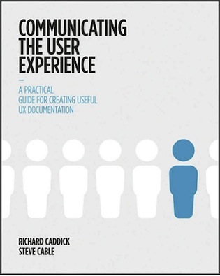
I’ll admit it. I haven’t spent a lot of time in my career creating beautiful wireframes. For the past four years I’ve been designing mobile apps for internal use in a large corporation and the first casualty in every project has been design documentation. I’ve been able to successfully communicate my designs using sketches, dry erase boards, and/or rapid prototyping, but the downside of this approach became quite clear when our small team disbanded. As a new team was formed, the frequently asked question of “so where is the documentation for this project” was met with my sheepish gaze.
So I was very curious to read Communicating the User Experience and perhaps learn some practical methods for creating UX documentation on a shoestring time budget. What’s the verdict? Have I seen the documentation light and decided to turn over a new leaf? Read on.
What the Book Covers
The book is divided into eight main sections covering the following types of documentation:
- Personas
- Task Models
- User Journeys
- Content Requirements
- Sitemaps
- Wireframes
- Usability Test Reports
- Funnel Diagrams
Each section gives a 4-6 page overview of the document, when it should be used, and what you can do to make the document most effective. This is followed up with research and workshop ideas. Each section concludes with step-by-step instructions on how to create a document using various software.
What’s Good
Communicating the User Experience is a solid introduction for people who are new to the user experience profession. If you are not familiar with the different types of documents and how and when they are used, you’ll have a good understanding after finishing this book (it’s a very quick read, as more than half of it is illustrations—more on that later). You are guided through when to use each document by learning what you want to communicate and who your audience will be.
Some of the best information here is found in the Research and Workshop section, with useful analysis of topics like gathering content requirements. The book’s advice about how to listen to and observe users would be great reading for someone new to user experience. These tips could also be helpful for those who are working as a “UX team of one,” where a sole designer is doing the user research, the interaction design, the user testing, and everything else in-between.
Additionally, the step-by-step instructions on how to create UX documentation using Powerpoint, Omnigraffle Pro, Microsoft Word, Microsoft Excel, and Axure could be helpful for people with no prior experience. Omnigraffle Pro in particular can be daunting at first, so having someone hold your hand through the process makes the application less intimidating.
What Could Be Better
The book makes heavy use of diagrams, but unfortunately the text is so tiny that they are quite difficult to read. Having full-page, easy-to-read diagrams would have helped me become more engaged with the content.
Before I read any book, I always want to know how many pages there are and I do a quick flip-through to get a sense of the book’s style. Communicating the User Experience is 332 pages, of which 158 pages offer detailed instructions, with each section providing step-by-step instructions for two or three different software programs. When you subtract the diagrams, you only have about 85 pages of reading about the topic. The section on how to create a wireframe in Omnigraffle Pro alone is 54 pages.
Unfortunately, these step-by-step instructions take away from the focus of the book. In real life, one would never uses a single wireframe template for every project, and showing some good examples would have sufficed. Even a novice UX designer should be able to look at a picture and understand how to replicate it using the recommended software. This book’s intended audience would likely not be expecting a software instruction manual.
Should you read it?
For anyone new to UX who would like a good overview of the different types of documentation used throughout a project lifecycle, this is a great introduction. Anyone who’s been in the field for several years will probably find this information too basic to be useful. For those working in mobile design, agile, or lean UX, this type of formal documentation will probably seem like more than what is necessary to communicate your design concepts.
I’ll stick with my sharpies and dry erase markers for now. That counts as documentation, right?


