Save
This is the first in a series of articles for UX Magazine about data visualization and related disciplines. Future articles will explore emerging ways to visually represent massive volumes of dynamic data in areas ranging from business, medicine and government to journalism, education and games. Along the way, the articles will also address some key issues confronting the field as a whole.
The New Treasure Maps
If a picture’s worth a thousand words, what’s the value of an image representing a terabyte of data?
Much of the vast sea of data flowing around the world every day is left unexplored because the existing tools and charts can’t help us effectively navigate it. Data visualization, interactive infographics, and related visual representation techniques can play a key part in helping people find their way through the wide expanses of data now opening up. There’s a long history of depicting complex information in graphical forms, but the gusher of data now flowing from corporations, governments and scientific research requires more powerful and sophisticated visualization tools to manage it.
Just as a compass needle can give us direction in physical space, a chart line can direct our way through data. As effective as these simple lines may be, they can only take us so far. For many purposes, advanced data visualization methods may never replace Excel, but in our data-saturated world, they might well be the best tools for the job. UX designers can play a key role in creating these new tools and charts. In these treasure maps of data, perhaps UX marks the spot.
Coming to Terms
There are many definitions for the term “data visualization” and related phrases such as “interactive infographics.” The nuances are subject to debate and philosophical inquiry, but here’s a concise version crafted by pioneers in the field:
The use of computer-generated, interactive, visual representations of data to amplify cognition.
– Card, Mackinlay, and Shneiderman, 1999.
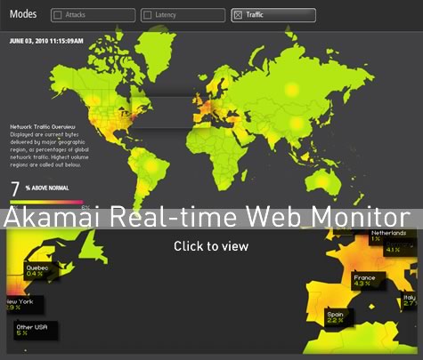
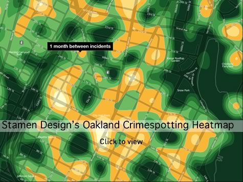
From heat maps that graphically represent dynamic patterns of activity such as crime in a specific region or actively traded areas of the stock market, to hypertrees that look at a complex network system with a fisheye lens, there are many different kinds of data visualizations.
In this fluid and rapidly changing area, technology is blurring the distinctions for some of the basic terms. What may once have been considered raw “data” may now be so quickly aggregated and organized that it can been seen as “information” in its own right.
According to Michal Migurski, Partner and Director of Technology for Stamen Design in San Francisco, there are some relatively informal distinguishing characteristics between emerging data visualization and more traditional methods of representing data. These new visualization forms are expected to handle massive volumes of data in more dynamic ways—users can see changes in real-time, and can interact with the data in a more immediate way. Data visualization will probably also incorporate more movement and animation that helps people understand, at a more visceral level, changes in the patterns of information.
Migurski says people want to “find the narrative in the constantly shifting and changing flows of data.” He thinks one of the powerful implications of data visualization tools is the ability to capture a lot of information in real time and then be able to rewind, to essentially turn back the clock, from critical events, to find causes and triggers.
You’ve Got Something in Your Eyes
When asked why visualization can play such a key role in working with massive data sets, Ben Fry, a Cambridge, MA-based designer and leader in the field of data visualization, answers simply: “We’ve evolved that way.” Humans developed a highly refined visual acuity and cognitive capacity to quickly help identify immediate threats, find sustenance, and distinguish what was safe to eat from what was not. Some of the same attributes, such as pattern recognition and color differentiation, which may have helped people hunt and forage for food long ago, may now be used to help see key information in a thicket of data.
“In some cases, human beings are better pattern-matchers than computers,” says Jeffrey Heer, an Assistant Professor of Computer Science at Stanford University, where he works on human-computer interaction, visualization, and social computing. “There are images that simply jump out at us.”
People have many different learning styles and ways that they best absorb new information, so data visualization tools may not always be ideal for everyone. But the tools can provide an effective adjunct in helping many of us see and process information. Further, data visualization can be a part of a multi-modal approach to grappling with large, complex data sets and could be useful from the expert level to broader user segments. It can be a singularly powerful intermediary for, as Fry puts it, “using computers for what they are good at, and people for what they do best.”
Data Viz Abilities
While they may be beautiful to look at, many data visualizations can seem more like abstract paintings—esoteric imagery that is only interesting or useful to a handful of people. This does not need remain the case. We should unleash the power of these visualizations to make them useful in the day-to-day world. Creating data visualization tools for a range of users and purposes will require both evolutionary and revolutionary approaches in design thinking.
The necessity of a multi-disciplinary approach in an emerging and amorphous field to solve challenges presented by digital technology is familiar to UX practitioners. Like UX, the field of data visualization requires an amalgam of various skills, backgrounds and professions. Barbara Tversky, Professor Emerita of Psychology at Stanford University and a Professor of Psychology and Education at Teachers College, Columbia University, notes that while there are principles and practices for visual communications, “much of it is domain and user dependent.” She says, for example, a strictly minimalist approach to this field “just doesn’t always work.”
Because of this, perhaps there will be increasing connections between UX and data viz. Both areas share some of the same fundamental goals of helping people more effectively work with information and each field could benefit from some of the approaches and practices. For example, data visualization could use more consideration of tailoring tools for a range of clearly defined users and contexts. Heer thinks of data visualization as “fostering a conversation with the data.” UX practitioners might be able to make more use of tools, techniques and ideas from data visualization to make interfaces more intuitive and effective.
“Beauty is Truth” – Aesthetics v. Utility
“Beauty is truth, truth beauty”, – that is all
Ye know on earth, and all ye need to know.
– John Keats
Keats’ words are loaded. While the word “elegant” is something of a term of art in science and math used to describe theories and proofs, Fry says it can sometimes be tough to sell the idea of an aesthetic representation of scientific data. He recalls one researcher he worked with on a scientific visualization project confiding to him: “This is too beautiful; I don’t think I am doing science with this.” There are some good reasons to be skeptical, because a strong visual image may give a false sense of meaning or validity to information that is fundamentally flawed. Then again, it may be that a truly elegant visualization gives the viewer a stronger and truer sense of the patterns in data.
Can dynamic, data-driven images help people relate, at a gut level, to information? Can this connection help us to make better or quicker decisions in critical moments? Large amounts of data exists and is waiting to be made available, but it also needs to be made more engaging and appealing, and memorable.
There is something to be said about the emotional impact of well-crafted visualizations and their ability to help with engagement, recall, and understanding. Fry says there could be benefits to helping users develop “an emotional connection to the data.” A future article will examine this topic in more depth and explore some interesting new research around information visualization icon Edward Tufte and his often austere, stripped down approach to information visualization and USA Today’s whimsical infographics.
Data Cloudy With an 80% Chance of Meaning
Figures often beguile me, particularly when I have the arranging of them myself; in which case the remark attributed to Disraeli would often apply with justice and force: “There are three kinds of lies: lies, damned lies, and statistics.”
– Mark Twain
As Twain notes, there’s a long tradition of lying with numbers. While the capacity and sophistication to shape large-scale statistical data into compelling imagery increases, so too does the ability to distort the facts. Effective visualizations could help lend a sense of credibility to a collection of data that is somehow corrupted or otherwise problematic. Questionable collection methods, incorrect assumptions or various other flaws (unintentional or otherwise) can generate the raw materials of misinformation that, in turn, are magnified by the lens of visualization. Sometimes, charts with faulty math or logic speak for themselves, and provide a little geeky humor:
Seeing the Possibilities
Effective data visualization can help decision-makers in various domains arrive at better, faster, and more insightful solutions. For people whose work depends on increasingly complex technical infrastructures, data visualization can be an indispensible part of planning, execution, monitoring, and crisis management.
“There is an insane need for data visualization approaches, tools, and methods for business metrics in general and in Web operations”, says John Allspaw, VP of Technical Operations at Etsy.com. “We’re still largely stuck in the 90’s”, he laments. Allspaw says it is sometimes hard to tell what data is important until it is laid out graphically. Infrastructure planning for everything from cities and tech start-ups can be like “driving a car with no dashboard and the windshield blacked out.”
In this series, we will look at how data visualization can help many of us see more clearly and navigate whatever lies ahead.
A Few Data Visualization Examples and Resources
- Thinkmap’s Demo Page
- Processing
- UC Berkeley’s Visualization Lab
- Tableau Software
- Ben Fry’s Visualizing Data: Exploring and Explaining Data with the Processing Environment
- Edward Tufte’s The Visual Display of Quantitative Information
- Toby Segaran and Jeff Hammerbacher’s Beautiful Data
- John Allpsaw’s The Art of Capacity Planning: Scaling Web Resources
- Stanford Visualization Group’s Protovis
Hunter Whitney
Hunter Whitney is a consultant, author, and instructor who brings a distinct UX design perspective to data visualization. He has advised corporations, start-ups, government agencies, and NGOs to achieve their goals through a thoughtful, strategic design approach to digital products and services.
Hunter is the author of "Data Insights: New Ways to Visualize and Make Sense of Data”. He was also asked to contribute a chapter in the book, “Designing for Emerging Technologies: UX for Genomics, Robotics, and the Internet of Things”. Additionally, Hunter has written numerous articles covering a range of subjects for various online and print publications including UX Magazine.


